
Weekend Hackathons
Use your design chops to improve real world products. One screen, One product, One weekend!

A Hiring Hackathon event for Designers

A Hiring Hackathon event for Product Managers

A Fun Quiz to Test your Product Knowledge. A new Quiz Every Friday!

All the events lined up @UXHack

Our Goldmine of the Top Solutions from all Product & Design challenges

A place to network & discuss on Product and Design as well as keep yourself updated about everything happening on UXHack

Join our growing community on Whatsapp

Subscribe us on Telegram
Discord Coming Soon
We are also on Discord now.

Apply to Jobs
View and apply to design and product jobs

Tap into our talent pool of 7000+ designers and product managers

Get guidance from mentors to improve your CV, portfolio, take mock interviews

Check out some interesting nuggets from us @UXHack. Apart from important updates, we try to also share some best practices & case studies. We cover topics like Startups, Career Advice & Products.
Newsletter - UXH Mixology
A weekly newsletter on Substack where we share some interesting reads, curated jobs, events & more stuff related to Product & Design

Spark Ideas, Improve your Product, Discover Awesome Talent and Engage Employees

Find Quality Product and Design Talent
App Redesign Assignment on Zomato
- 1.76k 85 Solutions 6
- Solutions 6 1.76k 85
- View Free Solution Add to Portfolio
About Zomato Assignment
Zomato has fast emerged as the go to app for food, be it ordering or discovering food. With intense competition between Zomato and Swiggy (and to some extent Uber Eats), delivering a great user experience matters even more so.
While Zomato offers its users a rich platter of data to aid purchases, since its redesign it has ended up collecting a lot of clutter. This becomes even more apparent when compared to its rivals.
In this challenge you need to find clear ways in which Zomato’s app can be ‘decluttered’ while preserving functionality.
You can choose any one screen to de-clutter (we recommend the home screen).
You can either list out the changes that will aid a better user experience or choose to redesign the screen with low fidelity designs/wire frames.
Do note that important functionality and data points must be retained. In essence you will need to decide what is important and what is not.
We also recommend research through user tests and observations, so as to remove any bias. Extra points if you can justify the changes you are making.
Android: Click Here
iOS: Click Here
Important points:
- If you are using screenshots, it’s a good practice to annotate them
- We are NOT looking for beautiful redesigns, but low fidelity designs/wire frames ONLY
- You can solve for any one platform: Android or iOS
- Zomato is NOT hosting this challenge. This is a Learning exercise
- For those outside India or if you are unable to use Zomato for any reason, please drop us a line at [email protected] so that we can share screens with you
Take this Assignment now
Solve this case study and add to your portfolio, get score & certificate. additionally you can also opt to get feedback from mentor, choose a mode to unlock ✨ special powers ✨, ⏱ you will have 1 week to complete this challenge.
- 💯 Get UXP, Overall Score & Leaderboard Rank
- Access to Discussion forum
- 🔖 Certificate of Appreciation
- 📊 Detailed Scorecard
- ✅ View All Solutions if you Submit
Leaderboard

Want to know how to solve this Case Study?
What does ‘take this assignment’ mean.
It is a way for you to practice and test your skills in solving real world product problems, on-demand. These challenges are featured problems from our Hackathons, Weekly Challenges, Events and Learning Hackathon initiatives and are based on solving real world UX problems. When you take one of these challenges. Based on the plan opted, you get various benefits: - You will be able to solve for these problems and see how your solution ranks amongst peers submissions - View the Top solutions given by Product and Design professionals - All submissions are graded by UXHack and you get a detailed scorecard for your submission alongwith a Certificate of Participation - Get one-on-one feedback for improvement areas, which our participants love
Why should I take a challenge?
Various benefits which you can get by taking challenges: Improve your skills - Test your skills on a real world product problem and identify your strengths and weaknesses Peer based Learning - Refine your thinking by viewing other top solutions Hiring - You can add this case study to your portfolio and showcase it to potential recruiters. We have had users leverage this to publish their submissions on various sites like UXPlanet.org - Gain knowledge about the said product & industry that can help you prepare for an interview for similar companies. Most companies do give out similar case studies to solve as part of their hiring process - We help companies hire through our community and they seek our recommendations on who is the best fit. Thus, your submissions help us to recommend your profile wherever it fits in best and we don't have to just rely on your CV/past portfolio Compete - You get UXPs for your submission which helps you improve reputation on UXHack platform and improve your ranking in overall leaderboard. We have an annual leaderboard which we announce in January where we promote top 10 across our newsletter and social media platforms.

What skills do your challenges cover?
Our challenges cover a gamut of Product & Design skills such as User Research, Competition Analysis, Wireframing, Prioritization, Information Architecture, Interaction Design and more
How does scoring work?
The grading of submission is done by the UXHack team. We grade any submission on various parameters on a 10 point scale (few parameters change basis the challenge in consideration). However, some common parameters usually are: Problem Solving, Research & Solution Detailing An overall score is calculated for the submission which is not the average of scoring parameters. Overall score is also on a 10 point scale.
How do I submit my solution?
Once you register for a challenge, a submission window is available on the same challenge page. You can submit your solution on the challenge page itself and if need be attach documents (PDF recommended)
What happens after I submit my solution?
Once you submit a solution, and after the end of the due date, your submission is evaluated by the UXHack team. It takes us maximum of 3 days to share your scores with you. Based on the plan you avail, after your scores are published, you get to view a detailed scorecard as well as see other solutions. If you have opted for a feedback, you also get personalized feedback. Please note: Once submitted, you can make unlimited changes to the solution, before the due date.
I don't understand the problem statement, what should I do?
You can opt for Assist mode as shown above where our experts will guide you on how to approach. Also, you get access to a Whatsapp group of previous participants where you can also post your queries.
How can I view solutions for this challenge?
There are two ways to do that: - You can take this challenge and opt for Zen or a Booster. Provided you submit your solution, post the due date, you will be able to see other solutions. - Or, if you just want to view solutions, Click Here
Explore more assignments
Welcome back, login to your account to continue.
Thank You! Payment received and Registration complete Your Registration is complete
Some error in registration. please reach out to [email protected] for more assistance, thank you your 7-day free trial is now active, solutions unlocked, free slots are only available for new users. select another mode, view free solution for zomato challenge.


Zomato Redesign - UX case study

Creative Fields

- Advertising
- concept design
- product design
- user experience
- user interface
- user interface design
No use is allowed without explicit permission from owner

Enhancing User Experience in the Zomato App
A UX Case Study
In the era of modern convenience, food delivery apps have become an integral part of our daily lives. With the recent surge in their usage, particularly in the wake of the pandemic, ordering food through mobile apps has emerged as the go-to solution for countless individuals.
In this case study, I delve into the UX issues I encountered while using the widely popular Zomato food delivery app.
Imagine trying to order your favorite meal online, only to be confronted with a confusing and frustrating user experience. In this case study, I delve into the UX issues I encountered while using the Zomato food delivery app, highlighting the challenges faced by users and the solutions I proposed to enhance their overall experience.
The app lacked intuitive navigation options, making it difficult to go back or move to different sections within the app seamlessly.
While there was a back button for searching results, there were no clear options to navigate back or navigate to other areas within the app, leading to a frustrating user experience.
As part of my research to understand the user experience of the Zomato app, I have conducted user interviews to gather valuable insights and identify pain points. their feedback and experiences are crucial in helping me to improve the search function and navigation within the app.
There are some colleagues of mine who frequently use the Zomato app to order food. So, I asked some questions to them.
- How often do you use food delivery apps like Zomato:
- Can you describe your typical experience when searching for a specific restaurant or food item on Zomato?
- Have you encountered any difficulties or frustrations when navigating within the Zomato app?
- Search Function Questions:
-How do you typically search for a specific restaurant or food item on Zomato?
-Can you describe any challenges or issues you’ve encountered during the search process?
-Do you feel that the search results are relevant and accurate to your search queries?
-What options or features would you expect to see after viewing the search results?
- Navigation Questions:
-After viewing the search results, how do you usually navigate within the Zomato app?
-Have you ever encountered any difficulties or confusion when trying to go back or explore other sections within the app?
-Are there any specific situations where you felt the lack of clear navigation options was particularly frustrating?
- User Feedback Questions:
- Is there anything specific you would like to see improved in the search function or navigation within the Zomato app?
- Can you suggest any ideas or features that would make it easier for you to navigate within the app after viewing search results?
- Have you used any other food delivery apps with better navigation features? If so, what aspects did you find more intuitive or user-friendly?
Based on the user’s interview I found out their pain points, problems with going back to the respective tab are irritating when the shows the search results.
- Enhanced Search Visibility:
- Users often struggled to locate the search function within the app.
- Placing the search bar at the top of the screen significantly improves its visibility and accessibility.
- Consistent Navigation:
- Retaining the bottom navigation menu in its default position maintains consistency and minimizes disruption to the existing user flow.
-Users appreciated the familiar bottom navigation menu and its ease of use.
- Improved Search Results Display:
- Users expressed difficulty in focusing on search results due to cluttered or distracting layouts.
The proposed solutions aim to address the identified pain points and challenges in the search function and navigation of the Zomato app. By implementing these enhancements, users will benefit from improved search accuracy, enhanced navigation options, and a seamless user experience.
These solutions focus on optimizing the user journey, providing clear navigation cues, and empowering users with greater control and flexibility within the app.
- Placing Search Bar at the Top:
Move the search bar to the top of the screen for improved visibility and easy access. By placing the search bar prominently at the top, users can quickly initiate their search queries without the need for excessive scrolling or hunting for the search option.
This ensures that the search function remains a primary and easily discoverable feature of the Zomato app.
- Retaining Bottom Navigation Menu:
Keep the bottom navigation menu unchanged to maintain consistency and familiarity for existing users.
The bottom navigation menu, which typically includes options like Home, Discover, Orders, etc., serves as a reliable and accessible way for users to navigate between different sections of the app.
Retaining the bottom navigation menu in its default position ensures that users can easily switch between app sections without any disruption to their accustomed navigation pattern.
- Central Content Display:
After performing a search, display the search results and related content in the central section of the app’s interface.
This ensures that users can focus on the search results without distractions and provides a clear visual hierarchy that highlights the relevant information.
By presenting the search results centrally, users can easily browse through the options and make informed decisions regarding their restaurant or food choices.

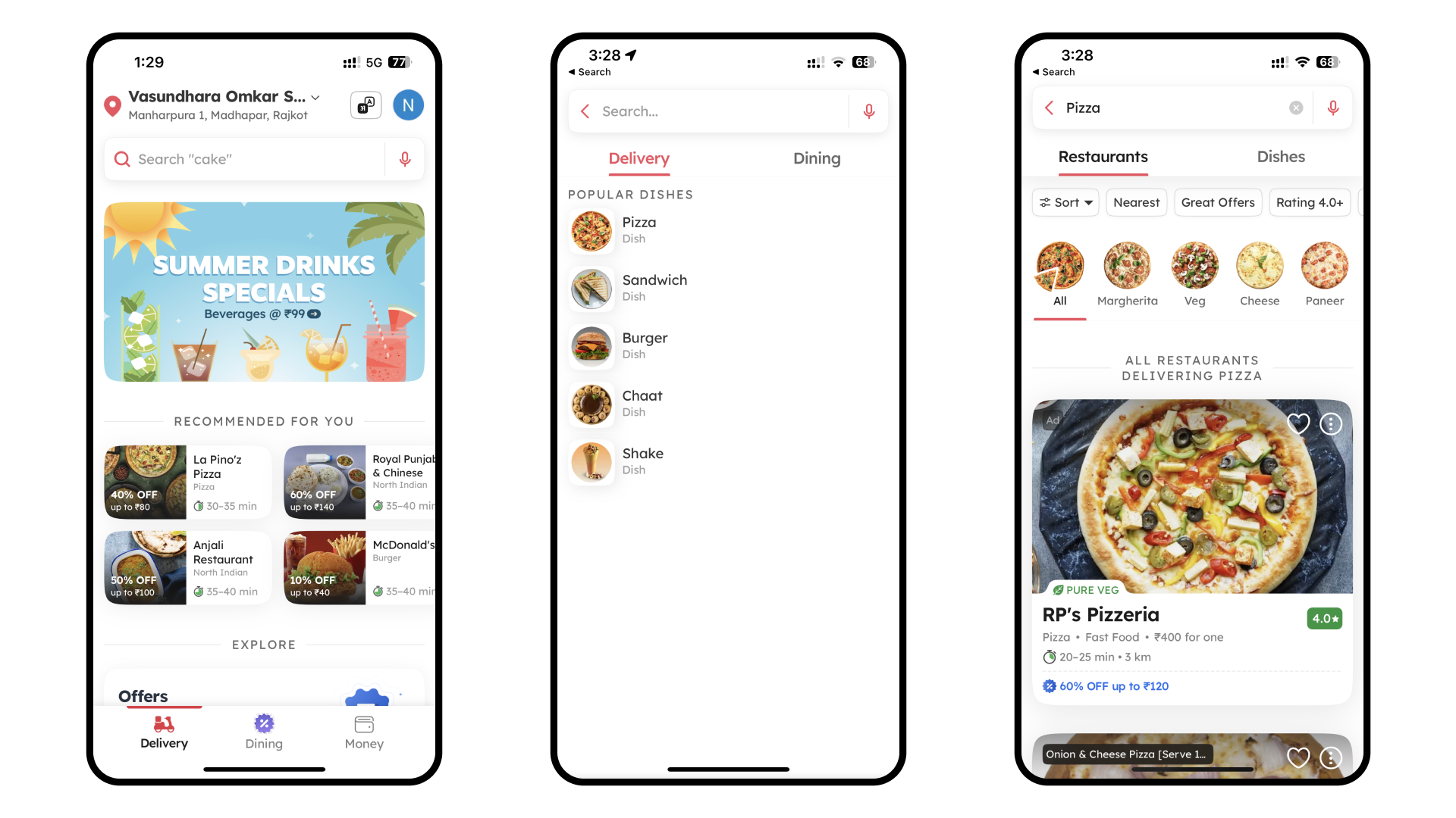
This screenshot displays the current search function UI within the Zomato app. Users enter their desired restaurant or food item in the search bar at the top.
- However, upon retrieving the search results, the UI lacks clear navigation options to go back or explore other sections within the app.
- If the user wants to access their wallet or profile screen then, they can not find the respective buttons or the navigation at the time of the result showing screen.
- For eg. The first time I search for food and it displays a variety of results but after that, I change my mind to change my address. so, from where I can access that?
- This absence of intuitive navigation elements can result in a frustrating user experience.
This section presents visual representations of the proposed solutions and enhancements for the search function and navigation within the Zomato app.
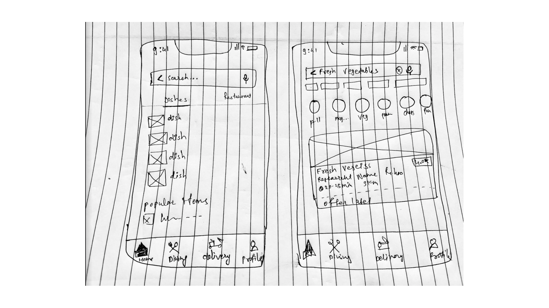
Through wireframes or hand-drawn app designs, I illustrate the intended changes, including the placement of the search bar at the top of the screen while retaining the unchanged bottom navigation menu.
These visuals provide a tangible representation of the proposed improvements and help readers envision the enhanced user experience within the app.

This wireframe showcases the proposed placement of the search bar at the top of the screen in the Zomato app.
- The wireframe shows the familiar icons and labels representing different sections of the app, such as Home, Dining, Delivery, etc. By keeping the bottom navigation menu unchanged, users can continue to rely on this consistent and easily accessible navigation option.
- By placing the bottom navigation sticky within the app, the user can be able to access anything in the app.
- For example: When the user searches for something the results appear with many filters. Now, if the user changes their mind and wants to go back to the Home screen, they can directly go to the respective tab by clicking on the navigation buttons as per requirements.
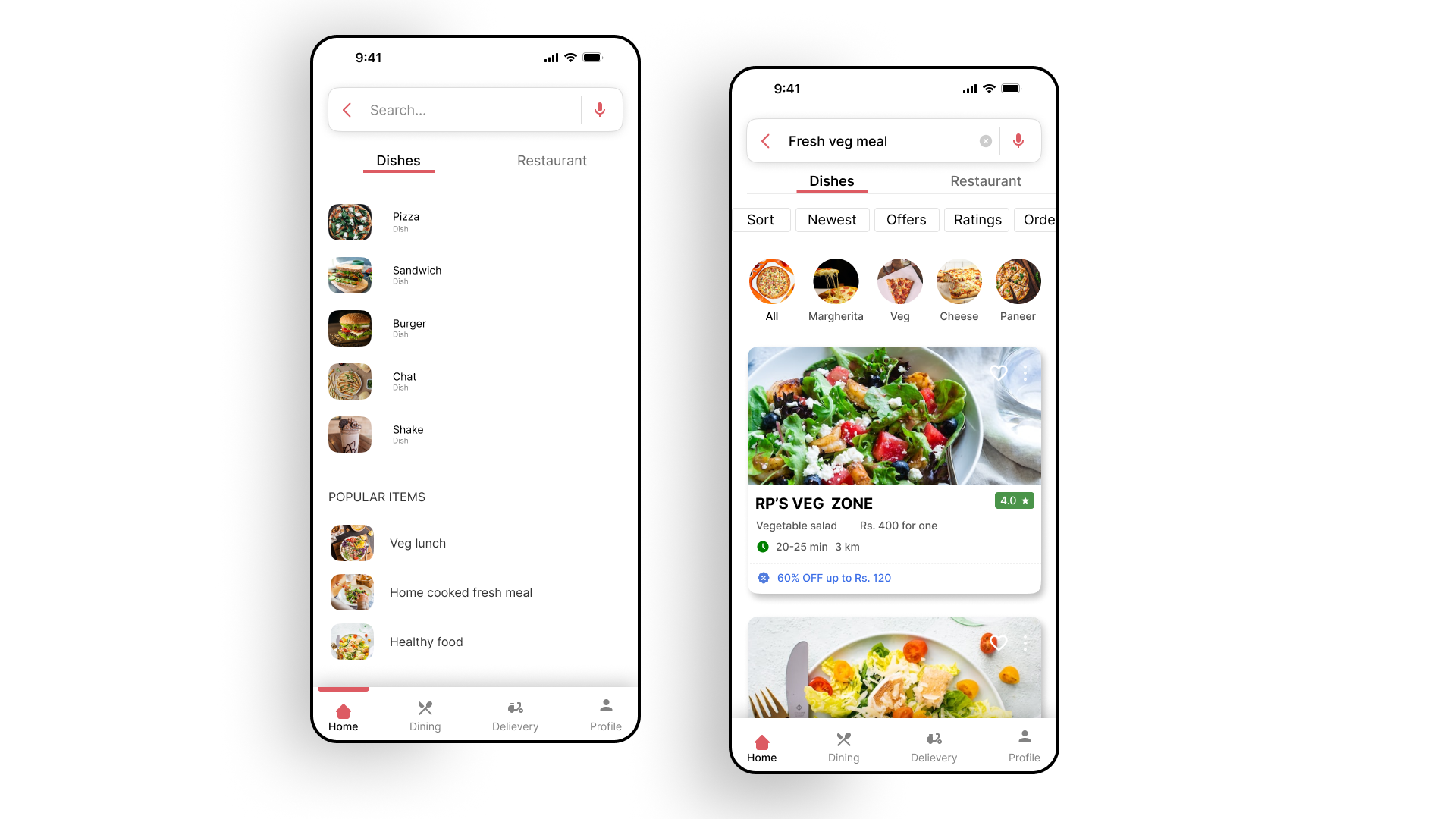
After creating the wireframes it’s time to give a final touch to the screens. That is how it looks when all the elements are gathered.
I added some shapes, and colors (that Zomato has in their app), giving corner radius, giving same feel and same look that has now within the app.

After creating the wireframes it’s time to give a final touch to the screens. I have gained invaluable insights and knowledge throughout my first UX case study, and I have put my best efforts to address the issues faced by users in the app and its elements. It has been a fulfilling experience to dive deep into user research, propose solutions, and create useful design improvements.
A Understanding the pain points and frustrations of users during the search process in the Zomato app, I have been able to propose enhancements such as placing the search bar at the top of the screen and retaining the bottom navigation menu. These changes aim to improve user experience and make the app more intuitive and user-friendly. improvements.
I hope you find this UX case study valuable and informative. I welcome your feedback and suggestions, as they will greatly contribute to further refining and strengthening my design approach.
Thank you for taking the time to review this case study, and I hope it inspires further discussions and improvements in the realm of UX design for any other apps.

IMAGES
VIDEO
COMMENTS
This case-study presents qualitative research data that defines recommendations and suggests insights to the existing application derived from the pain-points of users. It presents two categories as proposed design solutions that could play a ' deal-breaker' role for the prospective customers of Zomato.
In this case study, I delve into the UX issues I encountered while using the widely popular Zomato food delivery app. Imagine trying to order your favorite meal online, only to be confronted with ...
Feb 5, 2024. --. I recently revamped both the mobile and website versions of Zomato, bringing a fresh and user-friendly design to enhance the dining experience. I dedicated my efforts to refining ...
2. Case Study by Rishav KUMAR. UX Feedback was written in response to Zomato " Hunt for the best UX feedback " based upon the Research of User Feedback, app review on PlayStore and tweets to Zomato. Keeping in my mind the following objective of this UX Teardown: Identify opportunities. Substantiate design changes. Identify technical issues.
THE FLYWHEEL EFFECT: ZOMATO. I won the FIRST PLACE in the ' Design Jam ' organized by IEEE RIT-B on 31st of October 2021 .🥳 And the following is a brief case study and design I created and ...
So, This project is going to be on Zomato. One of India's foremost food delivering apps. Gestalt's law of Common region can be seen through categories such as different offers being offered, restaurants previously ordered from, various cuisines, etc, Makes it easier to categorize and browse. This also follows Recognition over recall heuristic.
Zomato Food Delivery App - Case Study UI/UX Design. 1.3k. 9.9k. 544. Published: January 16th 2024 +2. Multiple Owners. Follow All Following All Unfollow All. Owners.
UI/UX,Interaction Design,Web Design,Adobe XD,Adobe AfterEffects,Adobe Media Encoder
Zomato and Swiggy have visible system statuses at all times as far as I have observed. Zomato includes 2 toggle switches for veg and non-veg whereas Swiggy has the "veg only" toggle which filters food choices. The items in the cart, if any, are always visible as a card at the bottom of the screen. The menu shows "+ ADD" if the item isn ...
Zomato Design Principles. These design principles helped our team conclude a framework for the UIkit and further helped us get all businesses, product holders, developers, designers, and marketing team on the same page. 2. Made a sketch library with all components to make collaboration easier and faster. 3.
Let's delve into some compelling case studies that highlight Zomato's product successes from a nuanced perspective. ... Riding the UX Wave: A Bike-Sharing App Makeover Story. Picture this: It ...
Discover Case Studies for Zomato on UXHack. Events. ... we try to also share some best practices & case studies. We cover topics like Startups, Career Advice & Products. Newsletter - UXH Mixology ... Rate UX for Zomato. Overall Rating. Ease of Use. Design. Your UX Review: Submit You will need to Sign in to submit
About Zomato Assignment. 1 week Medium. Case Study brief: You will need to redesign Zomato's mobile app (1 screen) to declutter the UI and make it more user friendly. Difficulty: Medium. Skills Evaluated: Analytical Ability, Communication Skills, Design, Ideation, Prioritization. View More . Close.
MSRTC Website Redesign. Soham Aher. 9 123. UI Case study Android Version - Bag Planet. Soham Aher. 11 265. UX Case study - Bag Planet. Soham Aher. 20 420.
A case study on Zomato - The online Food king of India Journal of Manag ement Rese arch and Ana lysis, Jan uary-March, 2020 ;7(1):25- 33 31 utilizing the application and site, there ar e m ore ...
In this case study, I delve into the UX issues I encountered while using the widely popular Zomato food delivery app. Imagine trying to order your favorite meal online, only to be confronted with a confusing and frustrating user experience. In this case study, I delve into the UX issues I encountered while using the Zomato food delivery app ...
UX Design case study- Post purchase user journey. Although e-commerce has successfully brought buying and selling of goods at the fingerprint of its potential users. But in that process complex digital products have been built to add more and more features. Keeping things simple yet valuable is the biggest challenge towards great user experience.
Menu Button or Icon: Swiggy strategically places the menu icon on the bottom right corner of the screen, ensuring ease of use with just one hand. In contrast, Zomato positions its menu icon at the ...
Cravvy Food App — A UX Case Study. Building a 'food community'. Cravvy's on a mission to shake up how we find, order, and savor food, all while sparking joy and connection among fellow foodies! 🚀 . Conducted thorough research and surveys, including interviews and data analysis, to understand user preferences.
2. Visual clarity: A clear and uncluttered interface with well-defined sections for different portfolios helps in reducing cognitive load. 3. Manage multiple portfolios with ease and make them feel more personalized. 4. Adding more value to the page by giving actionable insights on all the portfolios connected.
Upon selecting the wished parking and ticket type, the user has three payment option to choose from — by bank card, by SMS or through the app's wallet. Explore tab. The explore tab is the tab in which the user can easily find a parking spot using a map and locator pins. One is able to click on the pin and a parking infocard will appear on ...