Graphical Representation of Data
Graphical representation of data is an attractive method of showcasing numerical data that help in analyzing and representing quantitative data visually. A graph is a kind of a chart where data are plotted as variables across the coordinate. It became easy to analyze the extent of change of one variable based on the change of other variables. Graphical representation of data is done through different mediums such as lines, plots, diagrams, etc. Let us learn more about this interesting concept of graphical representation of data, the different types, and solve a few examples.

Definition of Graphical Representation of Data
A graphical representation is a visual representation of data statistics-based results using graphs, plots, and charts. This kind of representation is more effective in understanding and comparing data than seen in a tabular form. Graphical representation helps to qualify, sort, and present data in a method that is simple to understand for a larger audience. Graphs enable in studying the cause and effect relationship between two variables through both time series and frequency distribution. The data that is obtained from different surveying is infused into a graphical representation by the use of some symbols, such as lines on a line graph, bars on a bar chart, or slices of a pie chart. This visual representation helps in clarity, comparison, and understanding of numerical data.
Representation of Data
The word data is from the Latin word Datum, which means something given. The numerical figures collected through a survey are called data and can be represented in two forms - tabular form and visual form through graphs. Once the data is collected through constant observations, it is arranged, summarized, and classified to finally represented in the form of a graph. There are two kinds of data - quantitative and qualitative. Quantitative data is more structured, continuous, and discrete with statistical data whereas qualitative is unstructured where the data cannot be analyzed.
Principles of Graphical Representation of Data
The principles of graphical representation are algebraic. In a graph, there are two lines known as Axis or Coordinate axis. These are the X-axis and Y-axis. The horizontal axis is the X-axis and the vertical axis is the Y-axis. They are perpendicular to each other and intersect at O or point of Origin. On the right side of the Origin, the Xaxis has a positive value and on the left side, it has a negative value. In the same way, the upper side of the Origin Y-axis has a positive value where the down one is with a negative value. When -axis and y-axis intersect each other at the origin it divides the plane into four parts which are called Quadrant I, Quadrant II, Quadrant III, Quadrant IV. This form of representation is seen in a frequency distribution that is represented in four methods, namely Histogram, Smoothed frequency graph, Pie diagram or Pie chart, Cumulative or ogive frequency graph, and Frequency Polygon.

Advantages and Disadvantages of Graphical Representation of Data
Listed below are some advantages and disadvantages of using a graphical representation of data:
- It improves the way of analyzing and learning as the graphical representation makes the data easy to understand.
- It can be used in almost all fields from mathematics to physics to psychology and so on.
- It is easy to understand for its visual impacts.
- It shows the whole and huge data in an instance.
- It is mainly used in statistics to determine the mean, median, and mode for different data
The main disadvantage of graphical representation of data is that it takes a lot of effort as well as resources to find the most appropriate data and then represent it graphically.
Rules of Graphical Representation of Data
While presenting data graphically, there are certain rules that need to be followed. They are listed below:
- Suitable Title: The title of the graph should be appropriate that indicate the subject of the presentation.
- Measurement Unit: The measurement unit in the graph should be mentioned.
- Proper Scale: A proper scale needs to be chosen to represent the data accurately.
- Index: For better understanding, index the appropriate colors, shades, lines, designs in the graphs.
- Data Sources: Data should be included wherever it is necessary at the bottom of the graph.
- Simple: The construction of a graph should be easily understood.
- Neat: The graph should be visually neat in terms of size and font to read the data accurately.
Uses of Graphical Representation of Data
The main use of a graphical representation of data is understanding and identifying the trends and patterns of the data. It helps in analyzing large quantities, comparing two or more data, making predictions, and building a firm decision. The visual display of data also helps in avoiding confusion and overlapping of any information. Graphs like line graphs and bar graphs, display two or more data clearly for easy comparison. This is important in communicating our findings to others and our understanding and analysis of the data.
Types of Graphical Representation of Data
Data is represented in different types of graphs such as plots, pies, diagrams, etc. They are as follows,
Related Topics
Listed below are a few interesting topics that are related to the graphical representation of data, take a look.
- x and y graph
- Frequency Polygon
- Cumulative Frequency
Examples on Graphical Representation of Data
Example 1 : A pie chart is divided into 3 parts with the angles measuring as 2x, 8x, and 10x respectively. Find the value of x in degrees.
We know, the sum of all angles in a pie chart would give 360º as result. ⇒ 2x + 8x + 10x = 360º ⇒ 20 x = 360º ⇒ x = 360º/20 ⇒ x = 18º Therefore, the value of x is 18º.
Example 2: Ben is trying to read the plot given below. His teacher has given him stem and leaf plot worksheets. Can you help him answer the questions? i) What is the mode of the plot? ii) What is the mean of the plot? iii) Find the range.
Solution: i) Mode is the number that appears often in the data. Leaf 4 occurs twice on the plot against stem 5.
Hence, mode = 54
ii) The sum of all data values is 12 + 14 + 21 + 25 + 28 + 32 + 34 + 36 + 50 + 53 + 54 + 54 + 62 + 65 + 67 + 83 + 88 + 89 + 91 = 958
To find the mean, we have to divide the sum by the total number of values.
Mean = Sum of all data values ÷ 19 = 958 ÷ 19 = 50.42
iii) Range = the highest value - the lowest value = 91 - 12 = 79
go to slide go to slide

Book a Free Trial Class
Practice Questions on Graphical Representation of Data
Faqs on graphical representation of data, what is graphical representation.
Graphical representation is a form of visually displaying data through various methods like graphs, diagrams, charts, and plots. It helps in sorting, visualizing, and presenting data in a clear manner through different types of graphs. Statistics mainly use graphical representation to show data.
What are the Different Types of Graphical Representation?
The different types of graphical representation of data are:
- Stem and leaf plot
- Scatter diagrams
- Frequency Distribution
Is the Graphical Representation of Numerical Data?
Yes, these graphical representations are numerical data that has been accumulated through various surveys and observations. The method of presenting these numerical data is called a chart. There are different kinds of charts such as a pie chart, bar graph, line graph, etc, that help in clearly showcasing the data.
What is the Use of Graphical Representation of Data?
Graphical representation of data is useful in clarifying, interpreting, and analyzing data plotting points and drawing line segments , surfaces, and other geometric forms or symbols.
What are the Ways to Represent Data?
Tables, charts, and graphs are all ways of representing data, and they can be used for two broad purposes. The first is to support the collection, organization, and analysis of data as part of the process of a scientific study.
What is the Objective of Graphical Representation of Data?
The main objective of representing data graphically is to display information visually that helps in understanding the information efficiently, clearly, and accurately. This is important to communicate the findings as well as analyze the data.
- Business Essentials
- Leadership & Management
- Credential of Leadership, Impact, and Management in Business (CLIMB)
- Entrepreneurship & Innovation
- Digital Transformation
- Finance & Accounting
- Business in Society
- For Organizations
- Support Portal
- Media Coverage
- Founding Donors
- Leadership Team

- Harvard Business School →
- HBS Online →
- Business Insights →
Business Insights
Harvard Business School Online's Business Insights Blog provides the career insights you need to achieve your goals and gain confidence in your business skills.
- Career Development
- Communication
- Decision-Making
- Earning Your MBA
- Negotiation
- News & Events
- Productivity
- Staff Spotlight
- Student Profiles
- Work-Life Balance
- AI Essentials for Business
- Alternative Investments
- Business Analytics
- Business Strategy
- Business and Climate Change
- Design Thinking and Innovation
- Digital Marketing Strategy
- Disruptive Strategy
- Economics for Managers
- Entrepreneurship Essentials
- Financial Accounting
- Global Business
- Launching Tech Ventures
- Leadership Principles
- Leadership, Ethics, and Corporate Accountability
- Leading with Finance
- Management Essentials
- Negotiation Mastery
- Organizational Leadership
- Power and Influence for Positive Impact
- Strategy Execution
- Sustainable Business Strategy
- Sustainable Investing
- Winning with Digital Platforms
17 Data Visualization Techniques All Professionals Should Know

- 17 Sep 2019
There’s a growing demand for business analytics and data expertise in the workforce. But you don’t need to be a professional analyst to benefit from data-related skills.
Becoming skilled at common data visualization techniques can help you reap the rewards of data-driven decision-making , including increased confidence and potential cost savings. Learning how to effectively visualize data could be the first step toward using data analytics and data science to your advantage to add value to your organization.
Several data visualization techniques can help you become more effective in your role. Here are 17 essential data visualization techniques all professionals should know, as well as tips to help you effectively present your data.
Access your free e-book today.
What Is Data Visualization?
Data visualization is the process of creating graphical representations of information. This process helps the presenter communicate data in a way that’s easy for the viewer to interpret and draw conclusions.
There are many different techniques and tools you can leverage to visualize data, so you want to know which ones to use and when. Here are some of the most important data visualization techniques all professionals should know.
Data Visualization Techniques
The type of data visualization technique you leverage will vary based on the type of data you’re working with, in addition to the story you’re telling with your data .
Here are some important data visualization techniques to know:
- Gantt Chart
- Box and Whisker Plot
- Waterfall Chart
- Scatter Plot
- Pictogram Chart
- Highlight Table
- Bullet Graph
- Choropleth Map
- Network Diagram
- Correlation Matrices
1. Pie Chart

Pie charts are one of the most common and basic data visualization techniques, used across a wide range of applications. Pie charts are ideal for illustrating proportions, or part-to-whole comparisons.
Because pie charts are relatively simple and easy to read, they’re best suited for audiences who might be unfamiliar with the information or are only interested in the key takeaways. For viewers who require a more thorough explanation of the data, pie charts fall short in their ability to display complex information.
2. Bar Chart

The classic bar chart , or bar graph, is another common and easy-to-use method of data visualization. In this type of visualization, one axis of the chart shows the categories being compared, and the other, a measured value. The length of the bar indicates how each group measures according to the value.
One drawback is that labeling and clarity can become problematic when there are too many categories included. Like pie charts, they can also be too simple for more complex data sets.
3. Histogram

Unlike bar charts, histograms illustrate the distribution of data over a continuous interval or defined period. These visualizations are helpful in identifying where values are concentrated, as well as where there are gaps or unusual values.
Histograms are especially useful for showing the frequency of a particular occurrence. For instance, if you’d like to show how many clicks your website received each day over the last week, you can use a histogram. From this visualization, you can quickly determine which days your website saw the greatest and fewest number of clicks.
4. Gantt Chart

Gantt charts are particularly common in project management, as they’re useful in illustrating a project timeline or progression of tasks. In this type of chart, tasks to be performed are listed on the vertical axis and time intervals on the horizontal axis. Horizontal bars in the body of the chart represent the duration of each activity.
Utilizing Gantt charts to display timelines can be incredibly helpful, and enable team members to keep track of every aspect of a project. Even if you’re not a project management professional, familiarizing yourself with Gantt charts can help you stay organized.
5. Heat Map

A heat map is a type of visualization used to show differences in data through variations in color. These charts use color to communicate values in a way that makes it easy for the viewer to quickly identify trends. Having a clear legend is necessary in order for a user to successfully read and interpret a heatmap.
There are many possible applications of heat maps. For example, if you want to analyze which time of day a retail store makes the most sales, you can use a heat map that shows the day of the week on the vertical axis and time of day on the horizontal axis. Then, by shading in the matrix with colors that correspond to the number of sales at each time of day, you can identify trends in the data that allow you to determine the exact times your store experiences the most sales.
6. A Box and Whisker Plot

A box and whisker plot , or box plot, provides a visual summary of data through its quartiles. First, a box is drawn from the first quartile to the third of the data set. A line within the box represents the median. “Whiskers,” or lines, are then drawn extending from the box to the minimum (lower extreme) and maximum (upper extreme). Outliers are represented by individual points that are in-line with the whiskers.
This type of chart is helpful in quickly identifying whether or not the data is symmetrical or skewed, as well as providing a visual summary of the data set that can be easily interpreted.
7. Waterfall Chart

A waterfall chart is a visual representation that illustrates how a value changes as it’s influenced by different factors, such as time. The main goal of this chart is to show the viewer how a value has grown or declined over a defined period. For example, waterfall charts are popular for showing spending or earnings over time.
8. Area Chart

An area chart , or area graph, is a variation on a basic line graph in which the area underneath the line is shaded to represent the total value of each data point. When several data series must be compared on the same graph, stacked area charts are used.
This method of data visualization is useful for showing changes in one or more quantities over time, as well as showing how each quantity combines to make up the whole. Stacked area charts are effective in showing part-to-whole comparisons.
9. Scatter Plot

Another technique commonly used to display data is a scatter plot . A scatter plot displays data for two variables as represented by points plotted against the horizontal and vertical axis. This type of data visualization is useful in illustrating the relationships that exist between variables and can be used to identify trends or correlations in data.
Scatter plots are most effective for fairly large data sets, since it’s often easier to identify trends when there are more data points present. Additionally, the closer the data points are grouped together, the stronger the correlation or trend tends to be.
10. Pictogram Chart

Pictogram charts , or pictograph charts, are particularly useful for presenting simple data in a more visual and engaging way. These charts use icons to visualize data, with each icon representing a different value or category. For example, data about time might be represented by icons of clocks or watches. Each icon can correspond to either a single unit or a set number of units (for example, each icon represents 100 units).
In addition to making the data more engaging, pictogram charts are helpful in situations where language or cultural differences might be a barrier to the audience’s understanding of the data.
11. Timeline

Timelines are the most effective way to visualize a sequence of events in chronological order. They’re typically linear, with key events outlined along the axis. Timelines are used to communicate time-related information and display historical data.
Timelines allow you to highlight the most important events that occurred, or need to occur in the future, and make it easy for the viewer to identify any patterns appearing within the selected time period. While timelines are often relatively simple linear visualizations, they can be made more visually appealing by adding images, colors, fonts, and decorative shapes.
12. Highlight Table

A highlight table is a more engaging alternative to traditional tables. By highlighting cells in the table with color, you can make it easier for viewers to quickly spot trends and patterns in the data. These visualizations are useful for comparing categorical data.
Depending on the data visualization tool you’re using, you may be able to add conditional formatting rules to the table that automatically color cells that meet specified conditions. For instance, when using a highlight table to visualize a company’s sales data, you may color cells red if the sales data is below the goal, or green if sales were above the goal. Unlike a heat map, the colors in a highlight table are discrete and represent a single meaning or value.
13. Bullet Graph

A bullet graph is a variation of a bar graph that can act as an alternative to dashboard gauges to represent performance data. The main use for a bullet graph is to inform the viewer of how a business is performing in comparison to benchmarks that are in place for key business metrics.
In a bullet graph, the darker horizontal bar in the middle of the chart represents the actual value, while the vertical line represents a comparative value, or target. If the horizontal bar passes the vertical line, the target for that metric has been surpassed. Additionally, the segmented colored sections behind the horizontal bar represent range scores, such as “poor,” “fair,” or “good.”
14. Choropleth Maps

A choropleth map uses color, shading, and other patterns to visualize numerical values across geographic regions. These visualizations use a progression of color (or shading) on a spectrum to distinguish high values from low.
Choropleth maps allow viewers to see how a variable changes from one region to the next. A potential downside to this type of visualization is that the exact numerical values aren’t easily accessible because the colors represent a range of values. Some data visualization tools, however, allow you to add interactivity to your map so the exact values are accessible.
15. Word Cloud

A word cloud , or tag cloud, is a visual representation of text data in which the size of the word is proportional to its frequency. The more often a specific word appears in a dataset, the larger it appears in the visualization. In addition to size, words often appear bolder or follow a specific color scheme depending on their frequency.
Word clouds are often used on websites and blogs to identify significant keywords and compare differences in textual data between two sources. They are also useful when analyzing qualitative datasets, such as the specific words consumers used to describe a product.
16. Network Diagram

Network diagrams are a type of data visualization that represent relationships between qualitative data points. These visualizations are composed of nodes and links, also called edges. Nodes are singular data points that are connected to other nodes through edges, which show the relationship between multiple nodes.
There are many use cases for network diagrams, including depicting social networks, highlighting the relationships between employees at an organization, or visualizing product sales across geographic regions.
17. Correlation Matrix

A correlation matrix is a table that shows correlation coefficients between variables. Each cell represents the relationship between two variables, and a color scale is used to communicate whether the variables are correlated and to what extent.
Correlation matrices are useful to summarize and find patterns in large data sets. In business, a correlation matrix might be used to analyze how different data points about a specific product might be related, such as price, advertising spend, launch date, etc.
Other Data Visualization Options
While the examples listed above are some of the most commonly used techniques, there are many other ways you can visualize data to become a more effective communicator. Some other data visualization options include:
- Bubble clouds
- Circle views
- Dendrograms
- Dot distribution maps
- Open-high-low-close charts
- Polar areas
- Radial trees
- Ring Charts
- Sankey diagram
- Span charts
- Streamgraphs
- Wedge stack graphs
- Violin plots

Tips For Creating Effective Visualizations
Creating effective data visualizations requires more than just knowing how to choose the best technique for your needs. There are several considerations you should take into account to maximize your effectiveness when it comes to presenting data.
Related : What to Keep in Mind When Creating Data Visualizations in Excel
One of the most important steps is to evaluate your audience. For example, if you’re presenting financial data to a team that works in an unrelated department, you’ll want to choose a fairly simple illustration. On the other hand, if you’re presenting financial data to a team of finance experts, it’s likely you can safely include more complex information.
Another helpful tip is to avoid unnecessary distractions. Although visual elements like animation can be a great way to add interest, they can also distract from the key points the illustration is trying to convey and hinder the viewer’s ability to quickly understand the information.
Finally, be mindful of the colors you utilize, as well as your overall design. While it’s important that your graphs or charts are visually appealing, there are more practical reasons you might choose one color palette over another. For instance, using low contrast colors can make it difficult for your audience to discern differences between data points. Using colors that are too bold, however, can make the illustration overwhelming or distracting for the viewer.
Related : Bad Data Visualization: 5 Examples of Misleading Data
Visuals to Interpret and Share Information
No matter your role or title within an organization, data visualization is a skill that’s important for all professionals. Being able to effectively present complex data through easy-to-understand visual representations is invaluable when it comes to communicating information with members both inside and outside your business.
There’s no shortage in how data visualization can be applied in the real world. Data is playing an increasingly important role in the marketplace today, and data literacy is the first step in understanding how analytics can be used in business.
Are you interested in improving your analytical skills? Learn more about Business Analytics , our eight-week online course that can help you use data to generate insights and tackle business decisions.
This post was updated on January 20, 2022. It was originally published on September 17, 2019.

About the Author
- Artificial Intelligence
- Generative AI
- Business Operations
- Cloud Computing
- Data Center
- Data Management
- Emerging Technology
- Enterprise Applications
- IT Leadership
- Digital Transformation
- IT Strategy
- IT Management
- Diversity and Inclusion
- IT Operations
- Project Management
- Software Development
- Vendors and Providers
- Enterprise Buyer’s Guides
- United States
- Middle East
- Italia (Italy)
- Netherlands
- United Kingdom
- New Zealand
- Data Analytics & AI
- Newsletters
- Foundry Careers
- Terms of Service
- Privacy Policy
- Cookie Policy
- Copyright Notice
- Member Preferences
- About AdChoices
- Your California Privacy Rights
Our Network
- Computerworld
- Network World
What is data visualization? Presenting data for decision-making
Data visualization is the presentation of data in a graphical format to make it easier for decision makers to see and understand trends, outliers, and patterns in data..

Data visualization definition
Data visualization is the presentation of data in a graphical format such as a plot, graph, or map to make it easier for decision makers to see and understand trends, outliers, and patterns in data.
Maps and charts were among the earliest forms of data visualization. One of the most well-known early examples of data visualization was a flow map created by French civil engineer Charles Joseph Minard in 1869 to help understand what Napoleon’s troops suffered in the disastrous Russian campaign of 1812. The map used two dimensions to depict the number of troops, distance, temperature, latitude and longitude, direction of travel, and location relative to specific dates.
Today, data visualization encompasses all manners of presenting data visually, from dashboards to reports, statistical graphs, heat maps, plots, infographics, and more.
What is the business value of data visualization?
Data visualization helps people analyze data, especially large volumes of data, quickly and efficiently.
By providing easy-to-understand visual representations of data, it helps employees make more informed decisions based on that data. Presenting data in visual form can make it easier to comprehend, enable people to obtain insights more quickly. Visualizations can also make it easier to communicate those insights and to see how independent variables relate to one another. This can help you see trends, understand the frequency of events, and track connections between operations and performance, for example.
Key data visualization benefits include:
- Unlocking the value big data by enabling people to absorb vast amounts of data at a glance
- Increasing the speed of decision-making by providing access to real-time and on-demand information
- Identifying errors and inaccuracies in data quickly
What are the types of data visualization?
There are myriad ways of visualizing data, but data design agency The Datalabs Agency breaks data visualization into two basic categories:
- Exploration: Exploration visualizations help you understand what the data is telling you.
- Explanation: Explanation visualizations tell a story to an audience using data .
It is essential to understand which of those two ends a given visualization is intended to achieve. The Data Visualisation Catalogue , a project developed by freelance designer Severino Ribecca, is a library of different information visualization types.
Some of the most common specific types of visualizations include:
2D area: These are typically geospatial visualizations. For example, cartograms use distortions of maps to convey information such as population or travel time. Choropleths use shades or patterns on a map to represent a statistical variable, such as population density by state.
Temporal: These are one-dimensional linear visualizations that have a start and finish time. Examples include a time series, which presents data like website visits by day or month, and Gantt charts, which illustrate project schedules.
Multidimensional: These common visualizations present data with two or more dimensions. Examples include pie charts, histograms, and scatter plots.
Hierarchical: These visualizations show how groups relate to one another. Tree diagrams are an example of a hierarchical visualization that shows how larger groups encompass sets of smaller groups.
Network: Network visualizations show how data sets are related to one another in a network. An example is a node-link diagram, also known as a network graph , which uses nodes and link lines to show how things are interconnected.
What are some data visualization examples?
Tableau has collected what it considers to be 10 of the best data visualization examples . Number one on Tableau’s list is Minard’s map of Napoleon’s march to Moscow, mentioned above. Other prominent examples include:
- A dot map created by English physician John Snow in 1854 to understand the cholera outbreak in London that year. The map used bar graphs on city blocks to indicate cholera deaths at each household in a London neighborhood. The map showed that the worst-affected households were all drawing water from the same well, which eventually led to the insight that wells contaminated by sewage had caused the outbreak.
- An animated age and gender demographic breakdown pyramid created by Pew Research Center as part of its The Next America project , published in 2014. The project is filled with innovative data visualizations. This one shows how population demographics have shifted since the 1950s, with a pyramid of many young people at the bottom and very few older people at the top in the 1950s to a rectangular shape in 2060.
- A collection of four visualizations by Hanah Anderson and Matt Daniels of The Pudding that illustrate gender disparity in pop culture by breaking down the scripts of 2,000 movies and tallying spoken lines of dialogue for male and female characters. The visualizations include a breakdown of Disney movies, the overview of 2,000 scripts, a gradient bar with which users can search for specific movies, and a representation of age biases shown toward male and female roles.
Data visualization tools
Data visualization software encompasses many applications, tools, and scripts. They provide designers with the tools they need to create visual representations of large data sets. Some of the most popular include the following:
Domo: Domo is a cloud software company that specializes in business intelligence tools and data visualization. It focuses on business-user deployed dashboards and ease of use, making it a good choice for small businesses seeking to create custom apps.
Dundas BI: Dundas BI is a BI platform for visualizing data, building and sharing dashboards and reports, and embedding analytics.
Infogram: Infogram is a drag-and-drop visualization tool for creating visualizations for marketing reports, infographics, social media posts, dashboards, and more. Its ease-of-use makes it a good option for non-designers as well.
Klipfolio: Klipfolio is designed to enable users to access and combine data from hundreds of services without writing any code. It leverages pre-built, curated instant metrics and a powerful data modeler, making it a good tool for building custom dashboards.
Looker: Now part of Google Cloud, Looker has a plug-in marketplace with a directory of different types of visualizations and pre-made analytical blocks. It also features a drag-and-drop interface.
Microsoft Power BI: Microsoft Power BI is a business intelligence platform integrated with Microsoft Office. It has an easy-to-use interface for making dashboards and reports. It’s very similar to Excel so Excel skills transfer well. It also has a mobile app.
Qlik: Qlik’s Qlik Sense features an “associative” data engine for investigating data and AI-powered recommendations for visualizations. It is continuing to build out its open architecture and multicloud capabilities.
Sisense: Sisense is an end-to-end analytics platform best known for embedded analytics. Many customers use it in an OEM form.
Tableau: One of the most popular data visualization platforms on the market, Tableau is a platform that supports accessing, preparing, analyzing, and presenting data. It’s available in a variety of options, including a desktop app, server, and hosted online versions, and a free, public version. Tableau has a steep learning curve but is excellent for creating interactive charts.
Data visualization certifications
Data visualization skills are in high demand. Individuals with the right mix of experience and skills can demand high salaries. Certifications can help.
Some of the popular certifications include the following:
- Data Visualization Nanodegree (Udacity)
- Professional Certificate in IBM Data Science (IBM)
- Data Visualization with Python (DataCamp)
- Data Analysis and Visualization with Power BI (Udacity)
- Data Visualization with R (Dataquest)
- Visualize Data with Python (Codecademy)
- Professional Certificate in Data Analytics and Visualization with Excel and R (IBM)
- Data Visualization with Tableau Specialization (UCDavis)
- Data Visualization with R (DataCamp)
- Excel Skills for Data Analytics and Visualization Specialization (Macquarie University)
Data visualization jobs and salaries
Here are some of the most popular job titles related to data visualization and the average salary for each position, according to data from PayScale .
- Data analyst: $64K
- Data scientist: $98K
- Data visualization specialist: $76K
- Senior data analyst: $88K
- Senior data scientist: $112K
- BI analyst: $65K
- Analytics specialist: $71K
- Marketing data analyst: $61K
Related content
Cios in transition: 5 tips for landing your next it leadership job, what it leaders need to know about the eu ai act, how ai is reshaping saudi aramco’s oil exploration and underwater operations strategy, the ai cat and mouse game has begun, from our editors straight to your inbox, show me more, capitalizing on technology budgets: a cio’s story.

Microsoft can’t keep up with demand for AI in the cloud — for now

Data protection activists accuse ChatGPT of GDPR breach

CIO Leadership Live Australia with Geoff Quattromani, Head of Technology, Johnson & Johnson MedTech ANZ

CIO Leadership Live Middle East with Ahmed Wattar, Group Information Technology Director at Alfa Medical Group

CIO Leadership Live Middle East with Dr. Mohammad Alshehri, CISO and Cybersecurity Consultant

How Does GenAI Fit into the Enterprise?

3 Leadership Tips: Renate Cuneen, Vice President, Global Corporate Technology, Canada Life

Sponsored Links
- Everybody's ready for AI except your data. Unlock the power of AI with Informatica
- Graphic Presentation of Data
Apart from diagrams, Graphic presentation is another way of the presentation of data and information. Usually, graphs are used to present time series and frequency distributions. In this article, we will look at the graphic presentation of data and information along with its merits, limitations , and types.
Suggested Videos
Construction of a graph.
The graphic presentation of data and information offers a quick and simple way of understanding the features and drawing comparisons. Further, it is an effective analytical tool and a graph can help us in finding the mode, median, etc.
We can locate a point in a plane using two mutually perpendicular lines – the X-axis (the horizontal line) and the Y-axis (the vertical line). Their point of intersection is the Origin .
We can locate the position of a point in terms of its distance from both these axes. For example, if a point P is 3 units away from the Y-axis and 5 units away from the X-axis, then its location is as follows:

Browse more Topics under Descriptive Statistics
- Definition and Characteristics of Statistics
- Stages of Statistical Enquiry
- Importance and Functions of Statistics
- Nature of Statistics – Science or Art?
- Application of Statistics
- Law of Statistics and Distrust of Statistics
- Meaning and Types of Data
- Methods of Collecting Data
- Sample Investigation
- Classification of Data
- Tabulation of Data
- Frequency Distribution of Data
- Diagrammatic Presentation of Data
- Measures of Central Tendency
- Mean Median Mode
- Measures of Dispersion
- Standard Deviation
- Variance Analysis
Some points to remember:
- We measure the distance of the point from the Y-axis along the X-axis. Similarly, we measure the distance of the point from the X-axis along the Y-axis. Therefore, to measure 3 units from the Y-axis, we move 3 units along the X-axis and likewise for the other coordinate .
- We then draw perpendicular lines from these two points.
- The point where the perpendiculars intersect is the position of the point P.
- We denote it as follows (3,5) or (abscissa, ordinate). Together, they are the coordinates of the point P.
- The four parts of the plane are Quadrants.
- Also, we can plot different points for a different pair of values.
General Rules for Graphic Presentation of Data and Information
There are certain guidelines for an attractive and effective graphic presentation of data and information. These are as follows:
- Suitable Title – Ensure that you give a suitable title to the graph which clearly indicates the subject for which you are presenting it.
- Unit of Measurement – Clearly state the unit of measurement below the title.
- Suitable Scale – Choose a suitable scale so that you can represent the entire data in an accurate manner.
- Index – Include a brief index which explains the different colors and shades, lines and designs that you have used in the graph. Also, include a scale of interpretation for better understanding.
- Data Sources – Wherever possible, include the sources of information at the bottom of the graph.
- Keep it Simple – You should construct a graph which even a layman (without any exposure in the areas of statistics or mathematics) can understand.
- Neat – A graph is a visual aid for the presentation of data and information. Therefore, you must keep it neat and attractive. Choose the right size, right lettering, and appropriate lines, colors, dashes, etc.
Merits of a Graph
- The graph presents data in a manner which is easier to understand.
- It allows us to present statistical data in an attractive manner as compared to tables. Users can understand the main features, trends, and fluctuations of the data at a glance.
- A graph saves time.
- It allows the viewer to compare data relating to two different time-periods or regions.
- The viewer does not require prior knowledge of mathematics or statistics to understand a graph.
- We can use a graph to locate the mode, median, and mean values of the data.
- It is useful in forecasting, interpolation, and extrapolation of data.
Limitations of a Graph
- A graph lacks complete accuracy of facts.
- It depicts only a few selected characteristics of the data.
- We cannot use a graph in support of a statement.
- A graph is not a substitute for tables.
- Usually, laymen find it difficult to understand and interpret a graph.
- Typically, a graph shows the unreasonable tendency of the data and the actual values are not clear.
Types of Graphs
Graphs are of two types:
- Time Series graphs
- Frequency Distribution graphs
Time Series Graphs
A time series graph or a “ histogram ” is a graph which depicts the value of a variable over a different point of time. In a time series graph, time is the most important factor and the variable is related to time. It helps in the understanding and analysis of the changes in the variable at a different point of time. Many statisticians and businessmen use these graphs because they are easy to understand and also because they offer complex information in a simple manner.
Further, constructing a time series graph does not require a user with technical skills. Here are some major steps in the construction of a time series graph:
- Represent time on the X-axis and the value of the variable on the Y-axis.
- Start the Y-value with zero and devise a suitable scale which helps you present the whole data in the given space.
- Plot the values of the variable and join different point with a straight line.
- You can plot multiple variables through different lines.
You can use a line graph to summarize how two pieces of information are related and how they vary with each other.
- You can compare multiple continuous data-sets easily
- You can infer the interim data from the graph line
Disadvantages
- It is only used with continuous data.
Use of a false Base Line
Usually, in a graph, the vertical line starts from the Origin. However, in some cases, a false Base Line is used for a better representation of the data. There are two scenarios where you should use a false Base Line:
- To magnify the minor fluctuation in the time series data
- To economize the space
Net Balance Graph
If you have to show the net balance of income and expenditure or revenue and costs or imports and exports, etc., then you must use a net balance graph. You can use different colors or shades for positive and negative differences.
Frequency Distribution Graphs
Let’s look at the different types of frequency distribution graphs.
A histogram is a graph of a grouped frequency distribution. In a histogram, we plot the class intervals on the X-axis and their respective frequencies on the Y-axis. Further, we create a rectangle on each class interval with its height proportional to the frequency density of the class.

Frequency Polygon or Histograph
A frequency polygon or a Histograph is another way of representing a frequency distribution on a graph. You draw a frequency polygon by joining the midpoints of the upper widths of the adjacent rectangles of the histogram with straight lines.

Frequency Curve
When you join the verticals of a polygon using a smooth curve, then the resulting figure is a Frequency Curve. As the number of observations increase, we need to accommodate more classes. Therefore, the width of each class reduces. In such a scenario, the variable tends to become continuous and the frequency polygon starts taking the shape of a frequency curve.
Cumulative Frequency Curve or Ogive
A cumulative frequency curve or Ogive is the graphical representation of a cumulative frequency distribution. Since a cumulative frequency is either of a ‘less than’ or a ‘more than’ type, Ogives are of two types too – ‘less than ogive’ and ‘more than ogive’.

Scatter Diagram
A scatter diagram or a dot chart enables us to find the nature of the relationship between the variables. If the plotted points are scattered a lot, then the relationship between the two variables is lesser.

Solved Question
Q1. What are the general rules for the graphic presentation of data and information?
Answer: The general rules for the graphic presentation of data are:
- Use a suitable title
- Clearly specify the unit of measurement
- Ensure that you choose a suitable scale
- Provide an index specifying the colors, lines, and designs used in the graph
- If possible, provide the sources of information at the bottom of the graph
- Keep the graph simple and neat.
Customize your course in 30 seconds
Which class are you in.

Descriptive Statistics
- Nature of Statistics – Science or Art?
2 responses to “Stages of Statistical Enquiry”
Im trying to find out if my mother ALICE Desjarlais is registered with the Red Pheasant Reserve, I applied with Metie Urban Housing and I need my Metie card. Is there anyway you can help me.
Quite useful details about statistics. I’d also like to add one point. If you need professional help with a statistics project? Find a professional in minutes!
Leave a Reply Cancel reply
Your email address will not be published. Required fields are marked *
Download the App


An official website of the United States government
The .gov means it’s official. Federal government websites often end in .gov or .mil. Before sharing sensitive information, make sure you’re on a federal government site.
The site is secure. The https:// ensures that you are connecting to the official website and that any information you provide is encrypted and transmitted securely.
- Publications
- Account settings
Preview improvements coming to the PMC website in October 2024. Learn More or Try it out now .
- Advanced Search
- Journal List
- Patterns (N Y)
- v.1(9); 2020 Dec 11
Principles of Effective Data Visualization
Stephen r. midway.
1 Department of Oceanography and Coastal Sciences, Louisiana State University, Baton Rouge, LA 70803, USA
We live in a contemporary society surrounded by visuals, which, along with software options and electronic distribution, has created an increased importance on effective scientific visuals. Unfortunately, across scientific disciplines, many figures incorrectly present information or, when not incorrect, still use suboptimal data visualization practices. Presented here are ten principles that serve as guidance for authors who seek to improve their visual message. Some principles are less technical, such as determining the message before starting the visual, while other principles are more technical, such as how different color combinations imply different information. Because figure making is often not formally taught and figure standards are not readily enforced in science, it is incumbent upon scientists to be aware of best practices in order to most effectively tell the story of their data.
The Bigger Picture
Visuals are an increasingly important form of science communication, yet many scientists are not well trained in design principles for effective messaging. Despite challenges, many visuals can be improved by taking some simple steps before, during, and after their creation. This article presents some sequential principles that are designed to improve visual messages created by scientists.
Many scientific visuals are not as effective as they could be because scientists often lack basic design principles. This article reviews the importance of effective data visualization and presents ten principles that scientists can use as guidance in developing effective visual messages.
Introduction
Visual learning is one of the primary forms of interpreting information, which has historically combined images such as charts and graphs (see Box 1 ) with reading text. 1 However, developments on learning styles have suggested splitting up the visual learning modality in order to recognize the distinction between text and images. 2 Technology has also enhanced visual presentation, in terms of the ability to quickly create complex visual information while also cheaply distributing it via digital means (compared with paper, ink, and physical distribution). Visual information has also increased in scientific literature. In addition to the fact that figures are commonplace in scientific publications, many journals now require graphical abstracts 3 or might tweet figures to advertise an article. Dating back to the 1970s when computer-generated graphics began, 4 papers represented by an image on the journal cover have been cited more frequently than papers without a cover image. 5
Regarding terminology, the terms graph , plot , chart , image , figure , and data visual(ization) are often used interchangeably, although they may have different meanings in different instances. Graph , plot , and chart often refer to the display of data, data summaries, and models, while image suggests a picture. Figure is a general term but is commonly used to refer to visual elements, such as plots, in a scientific work. A visual , or data visualization , is a newer and ostensibly more inclusive term to describe everything from figures to infographics. Here, I adopt common terminology, such as bar plot, while also attempting to use the terms figure and data visualization for general reference.
There are numerous advantages to quickly and effectively conveying scientific information; however, scientists often lack the design principles or technical skills to generate effective visuals. Going back several decades, Cleveland 6 found that 30% of graphs in the journal Science had at least one type of error. Several other studies have documented widespread errors or inefficiencies in scientific figures. 7 , 8 , 9 In fact, the increasing menu of visualization options can sometimes lead to poor fits between information and its presentation. These poor fits can even have the unintended consequence of confusing the readers and setting them back in their understanding of the material. While objective errors in graphs are hopefully in the minority of scientific works, what might be more common is suboptimal figure design, which takes place when a design element may not be objectively wrong but is ineffective to the point of limiting information transfer.
Effective figures suggest an understanding and interpretation of data; ineffective figures suggest the opposite. Although the field of data visualization has grown in recent years, the process of displaying information cannot—and perhaps should not—be fully mechanized. Much like statistical analyses often require expert opinions on top of best practices, figures also require choice despite well-documented recommendations. In other words, there may not be a singular best version of a given figure. Rather, there may be multiple effective versions of displaying a single piece of information, and it is the figure maker's job to weigh the advantages and disadvantages of each. Fortunately, there are numerous principles from which decisions can be made, and ultimately design is choice. 7
The data visualization literature includes many great resources. While several resources are targeted at developing design proficiency, such as the series of columns run by Nature Communications , 10 Wilkinson's The Grammar of Graphics 11 presents a unique technical interpretation of the structure of graphics. Wilkinson breaks down the notion of a graphic into its constituent parts—e.g., the data, scales, coordinates, geometries, aesthetics—much like conventional grammar breaks down a sentence into nouns, verbs, punctuation, and other elements of writing. The popularity and utility of this approach has been implemented in a number of software packages, including the popular ggplot2 package 12 currently available in R. 13 (Although the grammar of graphics approach is not explicitly adopted here, the term geometry is used consistently with Wilkinson to refer to different geometrical representations, whereas the term aesthetics is not used consistently with the grammar of graphics and is used simply to describe something that is visually appealing and effective.) By understanding basic visual design principles and their implementation, many figure authors may find new ways to emphasize and convey their information.
The Ten Principles
Principle #1 diagram first.
The first principle is perhaps the least technical but very important: before you make a visual, prioritize the information you want to share, envision it, and design it. Although this seems obvious, the larger point here is to focus on the information and message first, before you engage with software that in some way starts to limit or bias your visual tools. In other words, don't necessarily think of the geometries (dots, lines) you will eventually use, but think about the core information that needs to be conveyed and what about that information is going to make your point(s). Is your visual objective to show a comparison? A ranking? A composition? This step can be done mentally, or with a pen and paper for maximum freedom of thought. In parallel to this approach, it can be a good idea to save figures you come across in scientific literature that you identify as particularly effective. These are not just inspiration and evidence of what is possible, but will help you develop an eye for detail and technical skills that can be applied to your own figures.
Principle #2 Use the Right Software
Effective visuals typically require good command of one or more software. In other words, it might be unrealistic to expect complex, technical, and effective figures if you are using a simple spreadsheet program or some other software that is not designed to make complex, technical, and effective figures. Recognize that you might need to learn a new software—or expand your knowledge of a software you already know. While highly effective and aesthetically pleasing figures can be made quickly and simply, this may still represent a challenge to some. However, figure making is a method like anything else, and in order to do it, new methodologies may need to be learned. You would not expect to improve a field or lab method without changing something or learning something new. Data visualization is the same, with the added benefit that most software is readily available, inexpensive, or free, and many come with large online help resources. This article does not promote any specific software, and readers are encouraged to reference other work 14 for an overview of software resources.
Principle #3 Use an Effective Geometry and Show Data
Geometries are the shapes and features that are often synonymous with a type of figure; for example, the bar geometry creates a bar plot. While geometries might be the defining visual element of a figure, it can be tempting to jump directly from a dataset to pairing it with one of a small number of well-known geometries. Some of this thinking is likely to naturally happen. However, geometries are representations of the data in different forms, and often there may be more than one geometry to consider. Underlying all your decisions about geometries should be the data-ink ratio, 7 which is the ratio of ink used on data compared with overall ink used in a figure. High data-ink ratios are the best, and you might be surprised to find how much non-data-ink you use and how much of that can be removed.
Most geometries fall into categories: amounts (or comparisons), compositions (or proportions), distributions , or relationships . Although seemingly straightforward, one geometry may work in more than one category, in addition to the fact that one dataset may be visualized with more than one geometry (sometimes even in the same figure). Excellent resources exist on detailed approaches to selecting your geometry, 15 and this article only highlights some of the more common geometries and their applications.
Amounts or comparisons are often displayed with a bar plot ( Figure 1 A), although numerous other options exist, including Cleveland dot plots and even heatmaps ( Figure 1 F). Bar plots are among the most common geometry, along with lines, 9 although bar plots are noted for their very low data density 16 (i.e., low data-ink ratio). Geometries for amounts should only be used when the data do not have distributional information or uncertainty associated with them. A good use of a bar plot might be to show counts of something, while poor use of a bar plot might be to show group means. Numerous studies have discussed inappropriate uses of bar plots, 9 , 17 noting that “because the bars always start at zero, they can be misleading: for example, part of the range covered by the bar might have never been observed in the sample.” 17 Despite the numerous reports on incorrect usage, bar plots remain one of the most common problems in data visualization.

Examples of Visual Designs
(A) Clustered bar plots are effective at showing units within a group (A–C) when the data are amounts.
(B) Histograms are effective at showing the distribution of data, which in this case is a random draw of values from a Poisson distribution and which use a sequential color scheme that emphasizes the mean as red and values farther from the mean as yellow.
(C) Scatterplot where the black circles represent the data.
(D) Logistic regression where the blue line represents the fitted model, the gray shaded region represents the confidence interval for the fitted model, and the dark-gray dots represent the jittered data.
(E) Box plot showing (simulated) ages of respondents grouped by their answer to a question, with gray dots representing the raw data used in the box plot. The divergent colors emphasize the differences in values. For each box plot, the box represents the interquartile range (IQR), the thick black line represents the median value, and the whiskers extend to 1.5 times the IQR. Outliers are represented by the data.
(F) Heatmap of simulated visibility readings in four lakes over 5 months. The green colors represent lower visibility and the blue colors represent greater visibility. The white numbers in the cells are the average visibility measures (in meters).
(G) Density plot of simulated temperatures by season, where each season is presented as a small multiple within the larger figure.
For all figures the data were simulated, and any examples are fictitious.
Compositions or proportions may take a wide range of geometries. Although the traditional pie chart is one option, the pie geometry has fallen out of favor among some 18 due to the inherent difficulties in making visual comparisons. Although there may be some applications for a pie chart, stacked or clustered bar plots ( Figure 1 A), stacked density plots, mosaic plots, and treemaps offer alternatives.
Geometries for distributions are an often underused class of visuals that demonstrate high data density. The most common geometry for distributional information is the box plot 19 ( Figure 1 E), which shows five types of information in one object. Although more common in exploratory analyses than in final reports, the histogram ( Figure 1 B) is another robust geometry that can reveal information about data. Violin plots and density plots ( Figure 1 G) are other common distributional geometries, although many less-common options exist.
Relationships are the final category of visuals covered here, and they are often the workhorse of geometries because they include the popular scatterplot ( Figures 1 C and 1D) and other presentations of x - and y -coordinate data. The basic scatterplot remains very effective, and layering information by modifying point symbols, size, and color are good ways to highlight additional messages without taking away from the scatterplot. It is worth mentioning here that scatterplots often develop into line geometries ( Figure 1 D), and while this can be a good thing, presenting raw data and inferential statistical models are two different messages that need to be distinguished (see Data and Models Are Different Things ).
Finally, it is almost always recommended to show the data. 7 Even if a geometry might be the focus of the figure, data can usually be added and displayed in a way that does not detract from the geometry but instead provides the context for the geometry (e.g., Figures 1 D and 1E). The data are often at the core of the message, yet in figures the data are often ignored on account of their simplicity.
Principle #4 Colors Always Mean Something
The use of color in visualization can be incredibly powerful, and there is rarely a reason not to use color. Even if authors do not wish to pay for color figures in print, most journals still permit free color figures in digital formats. In a large study 20 of what makes visualizations memorable, colorful visualizations were reported as having a higher memorability score, and that seven or more colors are best. Although some of the visuals in this study were photographs, other studies 21 also document the effectiveness of colors.
In today's digital environment, color is cheap. This is overwhelmingly a good thing, but also comes with the risk of colors being applied without intention. Black-and-white visuals were more accepted decades ago when hard copies of papers were more common and color printing represented a large cost. Now, however, the vast majority of readers view scientific papers on an electronic screen where color is free. For those who still print documents, color printing can be done relatively cheaply in comparison with some years ago.
Color represents information, whether in a direct and obvious way, or in an indirect and subtle way. A direct example of using color may be in maps where water is blue and land is green or brown. However, the vast majority of (non-mapping) visualizations use color in one of three schemes: sequential , diverging , or qualitative . Sequential color schemes are those that range from light to dark typically in one or two (related) hues and are often applied to convey increasing values for increasing darkness ( Figures 1 B and 1F). Diverging color schemes are those that have two sequential schemes that represent two extremes, often with a white or neutral color in the middle ( Figure 1 E). A classic example of a diverging color scheme is the red to blue hues applied to jurisdictions in order to show voting preference in a two-party political system. Finally, qualitative color schemes are found when the intensity of the color is not of primary importance, but rather the objective is to use different and otherwise unrelated colors to convey qualitative group differences ( Figures 1 A and 1G).
While it is recommended to use color and capture the power that colors convey, there exist some technical recommendations. First, it is always recommended to design color figures that work effectively in both color and black-and-white formats ( Figures 1 B and 1F). In other words, whenever possible, use color that can be converted to an effective grayscale such that no information is lost in the conversion. Along with this approach, colors can be combined with symbols, line types, and other design elements to share the same information that the color was sharing. It is also good practice to use color schemes that are effective for colorblind readers ( Figures 1 A and 1E). Excellent resources, such as ColorBrewer, 22 exist to help in selecting color schemes based on colorblind criteria. Finally, color transparency is another powerful tool, much like a volume knob for color ( Figures 1 D and 1E). Not all colors have to be used at full value, and when not part of a sequential or diverging color scheme—and especially when a figure has more than one colored geometry—it can be very effective to increase the transparency such that the information of the color is retained but it is not visually overwhelming or outcompeting other design elements. Color will often be the first visual information a reader gets, and with this knowledge color should be strategically used to amplify your visual message.
Principle #5 Include Uncertainty
Not only is uncertainty an inherent part of understanding most systems, failure to include uncertainty in a visual can be misleading. There exist two primary challenges with including uncertainty in visuals: failure to include uncertainty and misrepresentation (or misinterpretation) of uncertainty.
Uncertainty is often not included in figures and, therefore, part of the statistical message is left out—possibly calling into question other parts of the statistical message, such as inference on the mean. Including uncertainty is typically easy in most software programs, and can take the form of common geometries such as error bars and shaded intervals (polygons), among other features. 15 Another way to approach visualizing uncertainty is whether it is included implicitly into the existing geometries, such as in a box plot ( Figure 1 E) or distribution ( Figures 1 B and 1G), or whether it is included explicitly as an additional geometry, such as an error bar or shaded region ( Figure 1 D).
Representing uncertainty is often a challenge. 23 Standard deviation, standard error, confidence intervals, and credible intervals are all common metrics of uncertainty, but each represents a different measure. Expressing uncertainty requires that readers be familiar with metrics of uncertainty and their interpretation; however, it is also the responsibility of the figure author to adopt the most appropriate measure of uncertainty. For instance, standard deviation is based on the spread of the data and therefore shares information about the entire population, including the range in which we might expect new values. On the other hand, standard error is a measure of the uncertainty in the mean (or some other estimate) and is strongly influenced by sample size—namely, standard error decreases with increasing sample size. Confidence intervals are primarily for displaying the reliability of a measurement. Credible intervals, almost exclusively associated with Bayesian methods, are typically built off distributions and have probabilistic interpretations.
Expressing uncertainty is important, but it is also important to interpret the correct message. Krzywinski and Altman 23 directly address a common misconception: “a gap between (error) bars does not ensure significance, nor does overlap rule it out—it depends on the type of bar.” This is a good reminder to be very clear not only in stating what type of uncertainty you are sharing, but what the interpretation is. Others 16 even go so far as to recommend that standard error not be used because it does not provide clear information about standard errors of differences among means. One recommendation to go along with expressing uncertainty is, if possible, to show the data (see Use an Effective Geometry and Show Data ). Particularly when the sample size is low, showing a reader where the data occur can help avoid misinterpretations of uncertainty.
Principle #6 Panel, when Possible (Small Multiples)
A particularly effective visual approach is to repeat a figure to highlight differences. This approach is often called small multiples , 7 and the technique may be referred to as paneling or faceting ( Figure 1 G). The strategy behind small multiples is that because many of the design elements are the same—for example, the axes, axes scales, and geometry are often the same—the differences in the data are easier to show. In other words, each panel represents a change in one variable, which is commonly a time step, a group, or some other factor. The objective of small multiples is to make the data inevitably comparable, 7 and effective small multiples always accomplish these comparisons.
Principle #7 Data and Models Are Different Things
Plotted information typically takes the form of raw data (e.g., scatterplot), summarized data (e.g., box plot), or an inferential statistic (e.g., fitted regression line; Figure 1 D). Raw data and summarized data are often relatively straightforward; however, a plotted model may require more explanation for a reader to be able to fully reproduce the work. Certainly any model in a study should be reported in a complete way that ensures reproducibility. However, any visual of a model should be explained in the figure caption or referenced elsewhere in the document so that a reader can find the complete details on what the model visual is representing. Although it happens, it is not acceptable practice to show a fitted model or other model results in a figure if the reader cannot backtrack the model details. Simply because a model geometry can be added to a figure does not mean that it should be.
Principle #8 Simple Visuals, Detailed Captions
As important as it is to use high data-ink ratios, it is equally important to have detailed captions that fully explain everything in the figure. A study of figures in the Journal of American Medicine 8 found that more than one-third of graphs were not self-explanatory. Captions should be standalone, which means that if the figure and caption were looked at independent from the rest of the study, the major point(s) could still be understood. Obviously not all figures can be completely standalone, as some statistical models and other procedures require more than a caption as explanation. However, the principle remains that captions should do all they can to explain the visualization and representations used. Captions should explain any geometries used; for instance, even in a simple scatterplot it should be stated that the black dots represent the data ( Figures 1 C–1E). Box plots also require descriptions of their geometry—it might be assumed what the features of a box plot are, yet not all box plot symbols are universal.
Principle #9 Consider an Infographic
It is unclear where a figure ends and an infographic begins; however, it is fair to say that figures tend to be focused on representing data and models, whereas infographics typically incorporate text, images, and other diagrammatic elements. Although it is not recommended to convert all figures to infographics, infographics were found 20 to have the highest memorability score and that diagrams outperformed points, bars, lines, and tables in terms of memorability. Scientists might improve their overall information transfer if they consider an infographic where blending different pieces of information could be effective. Also, an infographic of a study might be more effective outside of a peer-reviewed publication and in an oral or poster presentation where a visual needs to include more elements of the study but with less technical information.
Even if infographics are not adopted in most cases, technical visuals often still benefit from some text or other annotations. 16 Tufte's works 7 , 24 provide great examples of bringing together textual, visual, and quantitative information into effective visualizations. However, as figures move in the direction of infographics, it remains important to keep chart junk and other non-essential visual elements out of the design.
Principle #10 Get an Opinion
Although there may be principles and theories about effective data visualization, the reality is that the most effective visuals are the ones with which readers connect. Therefore, figure authors are encouraged to seek external reviews of their figures. So often when writing a study, the figures are quickly made, and even if thoughtfully made they are not subject to objective, outside review. Having one or more colleagues or people external to the study review figures will often provide useful feedback on what readers perceive, and therefore what is effective or ineffective in a visual. It is also recommended to have outside colleagues review only the figures. Not only might this please your colleague reviewers (because figure reviews require substantially less time than full document reviews), but it also allows them to provide feedback purely on the figures as they will not have the document text to fill in any uncertainties left by the visuals.
What About Tables?
Although often not included as data visualization, tables can be a powerful and effective way to show data. Like other visuals, tables are a type of hybrid visual—they typically only include alphanumeric information and no geometries (or other visual elements), so they are not classically a visual. However, tables are also not text in the same way a paragraph or description is text. Rather, tables are often summarized values or information, and are effective if the goal is to reference exact numbers. However, the interest in numerical results in the form of a study typically lies in comparisons and not absolute numbers. Gelman et al. 25 suggested that well-designed graphs were superior to tables. Similarly, Spence and Lewandowsky 26 compared pie charts, bar graphs, and tables and found a clear advantage for graphical displays over tabulations. Because tables are best suited for looking up specific information while graphs are better for perceiving trends and making comparisons and predictions, it is recommended that visuals are used before tables. Despite the reluctance to recommend tables, tables may benefit from digital formats. In other words, while tables may be less effective than figures in many cases, this does not mean tables are ineffective or do not share specific information that cannot always be displayed in a visual. Therefore, it is recommended to consider creating tables as supplementary or appendix information that does not go into the main document (alongside the figures), but which is still very easily accessed electronically for those interested in numerical specifics.
Conclusions
While many of the elements of peer-reviewed literature have remained constant over time, some elements are changing. For example, most articles now have more authors than in previous decades, and a much larger menu of journals creates a diversity of article lengths and other requirements. Despite these changes, the demand for visual representations of data and results remains high, as exemplified by graphical abstracts, overview figures, and infographics. Similarly, we now operate with more software than ever before, creating many choices and opportunities to customize scientific visualizations. However, as the demand for, and software to create, visualizations have both increased, there is not always adequate training among scientists and authors in terms of optimizing the visual for the message.
Figures are not just a scientific side dish but can be a critical point along the scientific process—a point at which the figure maker demonstrates their knowledge and communication of the data and results, and often one of the first stopping points for new readers of the information. The reality for the vast majority of figures is that you need to make your point in a few seconds. The longer someone looks at a figure and doesn't understand the message, the more likely they are to gain nothing from the figure and possibly even lose some understanding of your larger work. Following a set of guidelines and recommendations—summarized here and building on others—can help to build robust visuals that avoid many common pitfalls of ineffective figures ( Figure 2 ).

Overview of the Principles Presented in This Article
The two principles in yellow (bottom) are those that occur first, during the figure design phase. The six principles in green (middle) are generally considerations and decisions while making a figure. The two principles in blue (top) are final steps often considered after a figure has been drafted. While the general flow of the principles follows from bottom to top, there is no specific or required order, and the development of individual figures may require more or less consideration of different principles in a unique order.
All scientists seek to share their message as effectively as possible, and a better understanding of figure design and representation is undoubtedly a step toward better information dissemination and fewer errors in interpretation. Right now, much of the responsibility for effective figures lies with the authors, and learning best practices from literature, workshops, and other resources should be undertaken. Along with authors, journals play a gatekeeper role in figure quality. Journal editorial teams are in a position to adopt recommendations for more effective figures (and reject ineffective figures) and then translate those recommendations into submission requirements. However, due to the qualitative nature of design elements, it is difficult to imagine strict visual guidelines being enforced across scientific sectors. In the absence of such guidelines and with seemingly endless design choices available to figure authors, it remains important that a set of aesthetic criteria emerge to guide the efficient conveyance of visual information.
Acknowledgments
Thanks go to the numerous students with whom I have had fun, creative, and productive conversations about displaying information. Danielle DiIullo was extremely helpful in technical advice on software. Finally, Ron McKernan provided guidance on several principles.
Author Contributions
S.R.M. conceived the review topic, conducted the review, developed the principles, and wrote the manuscript.
Steve Midway is an assistant professor in the Department of Oceanography and Coastal Sciences at Louisiana State University. His work broadly lies in fisheries ecology and how sound science can be applied to management and conservation issues. He teaches a number of quantitative courses in ecology, all of which include data visualization.
- Math Article
Graphical Representation
Graphical Representation is a way of analysing numerical data. It exhibits the relation between data, ideas, information and concepts in a diagram. It is easy to understand and it is one of the most important learning strategies. It always depends on the type of information in a particular domain. There are different types of graphical representation. Some of them are as follows:
- Line Graphs – Line graph or the linear graph is used to display the continuous data and it is useful for predicting future events over time.
- Bar Graphs – Bar Graph is used to display the category of data and it compares the data using solid bars to represent the quantities.
- Histograms – The graph that uses bars to represent the frequency of numerical data that are organised into intervals. Since all the intervals are equal and continuous, all the bars have the same width.
- Line Plot – It shows the frequency of data on a given number line. ‘ x ‘ is placed above a number line each time when that data occurs again.
- Frequency Table – The table shows the number of pieces of data that falls within the given interval.
- Circle Graph – Also known as the pie chart that shows the relationships of the parts of the whole. The circle is considered with 100% and the categories occupied is represented with that specific percentage like 15%, 56%, etc.
- Stem and Leaf Plot – In the stem and leaf plot, the data are organised from least value to the greatest value. The digits of the least place values from the leaves and the next place value digit forms the stems.
- Box and Whisker Plot – The plot diagram summarises the data by dividing into four parts. Box and whisker show the range (spread) and the middle ( median) of the data.

General Rules for Graphical Representation of Data
There are certain rules to effectively present the information in the graphical representation. They are:
- Suitable Title: Make sure that the appropriate title is given to the graph which indicates the subject of the presentation.
- Measurement Unit: Mention the measurement unit in the graph.
- Proper Scale: To represent the data in an accurate manner, choose a proper scale.
- Index: Index the appropriate colours, shades, lines, design in the graphs for better understanding.
- Data Sources: Include the source of information wherever it is necessary at the bottom of the graph.
- Keep it Simple: Construct a graph in an easy way that everyone can understand.
- Neat: Choose the correct size, fonts, colours etc in such a way that the graph should be a visual aid for the presentation of information.
Graphical Representation in Maths
In Mathematics, a graph is defined as a chart with statistical data, which are represented in the form of curves or lines drawn across the coordinate point plotted on its surface. It helps to study the relationship between two variables where it helps to measure the change in the variable amount with respect to another variable within a given interval of time. It helps to study the series distribution and frequency distribution for a given problem. There are two types of graphs to visually depict the information. They are:
- Time Series Graphs – Example: Line Graph
- Frequency Distribution Graphs – Example: Frequency Polygon Graph
Principles of Graphical Representation
Algebraic principles are applied to all types of graphical representation of data. In graphs, it is represented using two lines called coordinate axes. The horizontal axis is denoted as the x-axis and the vertical axis is denoted as the y-axis. The point at which two lines intersect is called an origin ‘O’. Consider x-axis, the distance from the origin to the right side will take a positive value and the distance from the origin to the left side will take a negative value. Similarly, for the y-axis, the points above the origin will take a positive value, and the points below the origin will a negative value.

Generally, the frequency distribution is represented in four methods, namely
- Smoothed frequency graph
- Pie diagram
- Cumulative or ogive frequency graph
- Frequency Polygon
Merits of Using Graphs
Some of the merits of using graphs are as follows:
- The graph is easily understood by everyone without any prior knowledge.
- It saves time
- It allows us to relate and compare the data for different time periods
- It is used in statistics to determine the mean, median and mode for different data, as well as in the interpolation and the extrapolation of data.
Example for Frequency polygonGraph
Here are the steps to follow to find the frequency distribution of a frequency polygon and it is represented in a graphical way.
- Obtain the frequency distribution and find the midpoints of each class interval.
- Represent the midpoints along x-axis and frequencies along the y-axis.
- Plot the points corresponding to the frequency at each midpoint.
- Join these points, using lines in order.
- To complete the polygon, join the point at each end immediately to the lower or higher class marks on the x-axis.
Draw the frequency polygon for the following data
Mark the class interval along x-axis and frequencies along the y-axis.
Let assume that class interval 0-10 with frequency zero and 90-100 with frequency zero.
Now calculate the midpoint of the class interval.
Using the midpoint and the frequency value from the above table, plot the points A (5, 0), B (15, 4), C (25, 6), D (35, 8), E (45, 10), F (55, 12), G (65, 14), H (75, 7), I (85, 5) and J (95, 0).
To obtain the frequency polygon ABCDEFGHIJ, draw the line segments AB, BC, CD, DE, EF, FG, GH, HI, IJ, and connect all the points.

Frequently Asked Questions
What are the different types of graphical representation.
Some of the various types of graphical representation include:
- Line Graphs
- Frequency Table
- Circle Graph, etc.
Read More: Types of Graphs
What are the Advantages of Graphical Method?
Some of the advantages of graphical representation are:
- It makes data more easily understandable.
- It saves time.
- It makes the comparison of data more efficient.
Leave a Comment Cancel reply
Your Mobile number and Email id will not be published. Required fields are marked *
Request OTP on Voice Call
Post My Comment
Very useful for understand the basic concepts in simple and easy way. Its very useful to all students whether they are school students or college sudents
Thanks very much for the information
- Share Share
Register with BYJU'S & Download Free PDFs
Register with byju's & watch live videos.

Home Blog Design How to Make a Presentation Graph
How to Make a Presentation Graph

Visuals are a core element of effective communication, and regardless of the niche, graphs facilitate understanding data and trends. Data visualization techniques aim to make data engaging, easy to recall and contextualize while posing as a medium to simplify complex concepts .
In this article, we’ll guide you through the process of creating a presentation graph, briefly covering the types of graphs you can use in presentations, and how to customize them for maximum effectiveness. Additionally, you can find references on how to narrate your graphs while delivering a presentation.
Table of Contents
What is a Presentation Graph?
Types of graphs commonly used in presentations, how to select a presentation graph type, design principles for effective presentation graphs, working with presentation graph templates, integrating the graph into your presentation, common mistakes to avoid when making a presentation graph, final words.
A presentation graph is a visual representation of data, crafted in either 2D or 3D format, designed to illustrate relationships among two or more variables. Its primary purpose is to facilitate understanding of complex information, trends, and patterns, making it easier for an audience to grasp insights during a presentation.
By visually encoding data, presentation graphs help highlight correlations, distributions, and anomalies within the dataset, thereby supporting more informed decision-making and discussion.
Various types of graphs are commonly used in presentations. Each type serves specific purposes, allowing presenters to choose the most suitable format for conveying their data accurately. Here, we’ll discuss some common examples of presentation graphs.
Check our guide for more information about the differences between charts vs. graphs .
A bar chart is a visual tool that represents data using horizontal bars, where the length of each bar correlates with the data value it represents. This type of chart is used to compare discrete categories or groups, highlighting differences in quantities or frequencies across these categories.
For more information check our collection of bar chart PowerPoint templates .

Column Graphs
Column graphs are a variation of bar charts. They display data through vertical columns, allowing for comparing values across different categories or over time. Each column’s height indicates the data value, making it straightforward to observe differences and trends.

Line Graphs
Line graphs depict information as a series of data points connected by straight lines. They are primarily used to show trends over time or continuous data, with the x-axis typically representing time intervals and the y-axis representing the measured values. Line graphs highlight the rate of change between the data points, indicating trends and fluctuations.
For more information check our collection of line chart PowerPoint templates .

Circle Graphs
Circle graphs, commonly known as pie charts or donut charts, present the data distribution as fractions of an entity. They provide a quick understanding of the relative sizes of each component within a dataset. Pie charts are particularly effective when the goal is to highlight the contribution of each part to the whole data.
For more information check our collection of circle diagram templates .

Area Graphs
Area graphs are similar to line graphs, but the space below the line is filled in, emphasizing the volume beneath the curve. They represent cumulative totals over time through the use of sequential data points, making it easier to see total values and the relative significance of different parts of the data.
For more information check our collection of area chart PowerPoint templates .

Cone, Cylinder, and Pyramid Graphs
Three-dimensional graphs, such as cones, cylinders, and pyramids, create a dynamic visual impact on presentations. While not as common as the other types, they are used for their ability to add depth and dimension to data representation. These graphs create a visually engaging experience for the audience, although sometimes they sacrifice accuracy for the sake of visuals.
For more information check our collection of pyramid diagram PowerPoint templates .
As a presenter, you must be aware of both the topic’s requirements to discuss and your audience’s needs. Different graphs fulfill distinct purposes, and selecting the right one is critical for effective communication.
Line Graphs for Trends Over Time
A line graph is effective when you want to present trends or changes over a continuous period, like sales performance over months. Each point on the line represents a specific time, offering a clear visual representation of the data’s progression.
Bar Graphs for Comparing Quantities
If your goal is to compare quantities or values across different categories, such as sales figures for various products, a bar graph is suitable. The varying lengths of bars make it easy to compare the magnitudes of different categories.
Pie Charts for Showing Proportions
Use pie charts when you want to illustrate parts of a whole. For example, to represent the percentage distribution of expenses in a budget, a pie chart divides the total into segments, each corresponding to a category.
Follow these guidelines to create your presentation graph for the data you intend to represent.
How to Make a Presentation Graph in PowerPoint
Start by opening your presentation slide deck. For this tutorial’s purpose, we’ll work with a blank slide.

Switch to the Insert tab and click on Chart .

A new dialogue window will open, where you have to select the chart type and the specific representation type—i.e., for area charts, you can choose from 2D or 3D area charts and their distribution method.

If you hover over the selected chart, it will zoom in to check the details. Double-click to insert the chosen graph into the slide.

As we can see, a spreadsheet to edit the data is now available. If you accidentally close it, go to Chart Design > Edit Data.
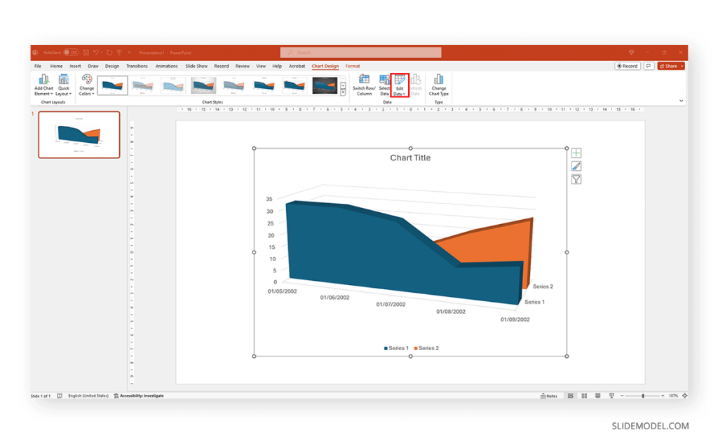
Replace the data in the numbers to reflect the data you need to showcase. The columns’ titles indicate the text the legend shows for each series. Then, we can close the spreadsheet and continue customizing it.

By clicking on the paintbrush, we access the Style options for the graph. We can change the background color, layout style, and more.

If we switch to the Color tab inside of Style , we can modify the color scheme for the presentation graph. And as simple as that is how to make a graph in PowerPoint.

How to Make a Presentation Graph in Google Slides
Now, let’s see how to create a graph in Google Slides. We start once again from a blank slide.

Go to Insert > Chart . Select your desired presentation graph option. In our case, we will work with a Pie Chart.

To change the placeholder data, click on Edit Data .

If you missed the emergent tab, you can go to the three points in the graph, click on them, and select Open Source .

The graph will most likely cover the data spreadsheet, so move it to one side to see the entire data range. In this case, the auto-generated graph is wrong as the sum gives 110%. We’ll correct that now.

And this is how it looks with the corrected data.

Next, we click on the three dots on the chart and select Edit the Chart . This shall open all customization options.

At the Setup tab, we can change the chart style and select from various options.
The data will refresh in that case and adapt its representation to the new style.

If we switch to the Customize tab (it says Customise, as the selected language is UK English), we can fine-tune our presentation graph starting from the background color.

Activate the 3D checkbox to change to a 3D pie chart (applicable to any graph).

We can find tailored settings for the Pie Chart to convert it to a donut chart, with settings like the donut hole size.

The Pie Slice section helps us change the color scheme for each one of the slices.

We can change the title and axis titles in the Chart and axis titles section.

Finally, the Legend section offers many customization options to alter the legend’s format.

Once the customization process is completed, close the Google Spreadsheets tab, go to your presentation chart, and click Update .

Google Slides will refresh the data for your created presentation graph with the last synced data.

Adhering to certain design principles is imperative for creating graphs and communicating information effectively.
Simplicity and Clarity
A graph should be clean and free from unnecessary details. Clear graphs have visible data points and helpful short texts for better understanding. Even if it looks simple, it can still show important information. To make it easy to understand, avoid adding distortions, shading, weird perspectives, too many colors, unnecessary decorations, or 3D effects [2]. It is also essential to ensure the plotted data points are clear, not hidden or covered.
Use of Color and Contrast
Thoughtful use of color and contrast enhances visual appeal and distinguishes different elements within the graph. Colors can effectively improve the chart presentation in three ways: highlighting specific data, grouping items, and encoding quantitative values. However, do not use fancy or varying colors in the background. We suggest resisting decorating graphs excessively, as it can hinder clear data presentation [4]. Only use different colors when they highlight important differences in the data.
Labeling and Legends
Accurate labeling is crucial to provide context and understanding. While designing graphs, we don’t expect the viewer to guess. Instead, we clearly label titles and axes. Clear labeling means displaying both axes on your graph, including measurement units if needed. Identify symbols and patterns in a legend or caption [3]. Legends explain symbols and patterns in a graph.
Scale and Proportion
For more clarity, we keep the measurement scales consistent and avoid distortions for accuracy. This ensures the exact difference between all the values. It will present data relationships and prevent misinterpretation due to skewed visual perceptions.
Tips for Customizing Graphs
PowerPoint provides various customization options—Right-click on elements like axes, data points, or legends to format them. You can also change colors, fonts, and styles to match your presentation’s look.
Coloring Your Data
When you want to make different parts of your chart stand out, click on a bar or line. Then, right-click and choose “Format Data Series.” Here, you can pick a color that helps each set of data pop. Do this for each part of your chart to make it visually appealing.
Changing the Chart Background
If you want to change the background color around your chart, right-click on the white space. Choose “Format Chart Area” and change the background color to something that complements your data.
Customizing Line Styles
Change the appearance of your lines for a unique look. Click on a line in your chart, right-click, and select “Format Data Series.” Experiment with different line styles, such as solid, dashed, or dotted.
Fine-tuning Axis Appearance
To make your chart axes look polished, right-click on the X or Y axis and choose “Format Axis.” Adjust properties like line color, tick marks, and label font to suit your design.
Perfecting Legends
Legends can be tweaked for a more integrated look. Right-click on the legend, select “Format Legend,” and adjust options like placement, font size, and background color to enhance the overall appearance.
Creating graphs in PowerPoint or Google Slides from scratch can be time-consuming, and ultimately, it won’t yield the same results as professional-made designs. We invite you to discover some cool designs for presentation graphs PPT templates made by SlideModel.
1. Dashboard Presentation Graph for PowerPoint & Google Slides

Don’t worry about how to make a graph in PowerPoint – let’s us bring the resources in the shape of a cool dashboard layout. Ideal for any kind of e-commerce business, you can track expenses or income, evaluate metrics, and much more.
Use This Template
2. Infographic Donut Chart Presentation Template

Explain concepts in different hierarchy levels, or processes that require a set of sequential steps by implementing this donut chart PPT template. Each segment has a bubble callout to expand further information for the areas required.
3. Presentation Graph Slide Deck PPT Template

All that’s required to create a data-driven presentation is here. Customize donut charts, funnels, histograms, point & figure charts, and more to create professionally-designed presentation slides.
4. PowerPoint Charts Slide Deck

If you’re looking for clean layouts for column graphs, area charts, line graphs and donut charts, this is the template you need in your toolbox. Perfect for marketing, financial and academic reports.
Consider its relevance to the content when incorporating your graph into the presentation. Insert the graph in a slide where it logically fits within the flow of information.
Positioning the Graph Appropriately in the Presentation
Deciding where to put your graph in the presentation is essential. You want it to be where everyone can see it easily and where it makes sense. Usually, you place the graph on a slide that talks about the data or topic related to the graph. This way, people can look at the graph simultaneously when you talk about it. Make sure it is not too small. If needed, you can make it bigger or smaller to fit nicely on the slide. The goal is to position the graph so that it helps your audience understand your information better.
Ensuring Consistency with the Overall Design of the Presentation
Align the graph with the overall design of your presentation to maintain a cohesive visual appeal. You can use consistent colors, fonts, and styles to integrate the graph seamlessly. The graph must complement the theme and tone of your slides. Therefore, you should avoid flashy or distracting elements that may deviate from the established design. The goal is to create a harmonious and professional presentation where the graph blends naturally without causing visual disruptions. However, we recommend you use bar chart templates already available for presentation.
Narrating Your Graph
When explaining your graph during the presentation, start by providing context. Clearly state what the graph illustrates and its significance to the audience. Use simple and direct language, avoiding unnecessary jargon. It is important to walk through the axes, data points, and any trends you want to highlight. Speaking moderately allows the audience to absorb the information without feeling rushed. You can take pause when needed to emphasize crucial points or transitions.
You can learn more about creative techniques to narrate your graph in our data storytelling guide.
Overloading with Information
One common mistake is presenting too much information on a single graph. Avoid filling the graph with excessive data points or unnecessary details.
Misleading Scales or Axes
Scale mistakes, such as uneven intervals or a bar chart with zero baselines, are common graphical mistakes [5]. Misleading scales can distort the interpretation of the graph and lead to incorrect conclusions. Scales should accurately present the data without exaggerating certain aspects.
Inappropriate Graph Types for the Data
Selecting an inappropriate graph type for your data is a mistake to avoid. Choose a graph type that effectively communicates the nature of your data. For instance, a pie chart for time-based trends might not be the most suitable choice. Match the graph type to the data characteristics to convey information accurately.
Working with presentation graphs may feel challenging for a beginner in presentation design software. Still, practice makes the master. Start by clearly stating your objectives in terms of data representation—this will make the presentation graph-type selection process much easier. Customize the graph by working with appropriate color combinations (you can learn more about this in our color theory guide), as this can also help highlight relevant data sections that may influence an informed decision.
Everything depends on your creative skills and how you want to showcase information. As a final piece of advice, we highly recommend working with one graph per slide, unless you opted for a dashboard layout. Ideally, graphs should be seen from a distance, and working with reduced sizes may hinder accurate data representation.
[1] https://uogqueensmcf.com/wp-content/uploads/2020/BA Modules/Medical Laboratory/Medical Laboratory Courses PPT/Year III Sem II/Biostatistics/lecture 1.pdf (Accessed: 06 March 2024).
[2] Five Principles of Good Graphs. https://scc.ms.unimelb.edu.au/resources/data-visualisation-and-exploration/data-visualisation
[3} Guide to fairly good graphs. Statistics LibreTexts. https://stats.libretexts.org/Bookshelves/Applied_Statistics/Biological_Statistics_(McDonald)/07%3A_Miscellany/7.02%3A_Guide_to_Fairly_Good_Graphs
[4] Practical rules for using color in charts. https://nbisweden.github.io/Rcourse/files/rules_for_using_color.pdf
[5] https://iase-web.org/islp/documents/Media/How%20To%20Avoid.pdf [6] Duquia, R.P. et al. (2014) Presenting data in tables and charts , Anais brasileiros de dermatologia . 10.1590/abd1806-4841.20143388

Like this article? Please share
Data Analysis, Data Science, Data Visualization, Presentation Approaches Filed under Design
Related Articles

Filed under Design • March 20th, 2024
Understanding Data Presentations (Guide + Examples)
Elevate the quality of your message by learning how to work in data presentations effectively. Insights, examples, and PPT templates here.

Filed under Presentation Ideas • February 29th, 2024
How to Make a Fundraising Presentation (with Thermometer Templates & Slides)
Meet a new framework to design fundraising presentations by harnessing the power of fundraising thermometer templates. Detailed guide with examples.

Filed under Presentation Ideas • February 15th, 2024
How to Create a 5 Minutes Presentation
Master the art of short-format speeches like the 5 minutes presentation with this article. Insights on content structure, audience engagement and more.
Leave a Reply
- Graphical Presentation of Data
Table of Contents
Graphical presentation of data is an essential tool for researchers and decision-makers to convey complex information in a clear and concise manner. It involves using different types of charts, graphs, and diagrams to represent numerical data visually. In this blog, we will explore the different types of graphical representation and their applications in research.
Types of Graphs and Charts
- Bar Graphs: Used to compare discrete values, such as sales figures for different products.
- Line Graphs: Used to show trends over time, such as stock prices over a period.
- Pie Charts: Used to represent parts of a whole, such as the percentage of revenue by product category.
- Scatter Plots: Used to show the relationship between two variables, such as the correlation between temperature and ice cream sales.
- Heat Maps: Used to show the density of data, such as the concentration of customer complaints by region.
Choosing the Right Graphical Representation
The choice of graphical representation depends on the nature of the data and the purpose of the analysis. Some factors to consider include:
- Data type (discrete or continuous)
- Data distribution (normal or skewed)
- Number of variables
- Audience preferences
Best Practices for Graphical Presentation of Data
- Keep it simple and uncluttered
- Use appropriate scales and axes labels
- Use colors and patterns judiciously
- Avoid 3D effects and unnecessary embellishments
- Provide clear titles and captions
- Use appropriate fonts and font sizes
- Ensure readability for colorblind individuals
Graphical presentation of data is a powerful tool for visualizing complex information and communicating insights effectively. By selecting the appropriate chart or graph for the data and following best practices for presentation, researchers and decision-makers can make informed decisions and gain a deeper understanding of their data.
How useful was this post?
Click on a star to rate it!
Average rating 0 / 5. Vote count: 0
No votes so far! Be the first to rate this post.
We are sorry that this post was not useful for you! 😔
Let us improve this post!
Tell us how we can improve this post?
Research Methodology for Management Decisions
1 Research Methodology: An Overview
- Meaning of Research
- Research Methodology
- Research Method
- Business Research Method
- Types of Research
- Importance of business research
- Role of research in important areas
2 Steps for Research Process
- Research process
- Define research problems
- Research Problem as Hypothesis Testing
- Extensive literature review in research
- Development of working hypothesis
- Preparing the research design
- Collecting the data
- Analysis of data
- Preparation of the report or the thesis
3 Research Designs
- Functions and Goals of Research Design
- Characteristics of a Good Design
- Different Types of Research Designs
- Exploratory Research Design
- Descriptive Research Design
- Experimental Research Design
- Types of Experimental Designs
4 Methods and Techniques of Data Collection
- Primary and Secondary Data
- Methods of Collecting Primary Data
- Merits and Demerits of Different Methods of Collecting Primary Data
- Designing a Questionnaire
- Pretesting a Questionnaire
- Editing of Primary Data
- Technique of Interview
- Collection of Secondary Data
- Scrutiny of Secondary Data
5 Attitude Measurement and Scales
- Attitudes, Attributes and Beliefs
- Issues in Attitude Measurement
- Scaling of Attitudes
- Deterministic Attitude Measurement Models: The Guttman Scale
- Thurstone’s Equal-Appearing Interval Scale
- The Semantic Differential Scale
- Summative Models: The Likert Scale
- The Q-Sort Technique
- Multidimensional Scaling
- Selection of an Appropriate Attitude Measurement Scale
- Limitations of Attitude Measurement Scales
6 Questionnaire Designing
- Introductory decisions
- Contents of the questionnaire
- Format of the questionnaire
- Steps involved in the questionnaire
- Structure and Design of Questionnaire
- Management of Fieldwork
- Ambiguities in the Questionnaire Methods
7 Sampling and Sampling Design
- Advantage of Sampling Over Census
- Simple Random Sampling
- Sampling Frame
- Probabilistic As pects of Sampling
- Stratified Random Sampling
- Other Methods of Sampling
- Sampling Design
- Non-Probability Sampling Methods
8 Data Processing
- Editing of Data
- Coding of Data
- Classification of Data
- Statistical Series
- Tables as Data Presentation Devices
9 Statistical Analysis and Interpretation of Data: Nonparametric Tests
- One Sample Tests
- Two Sample Tests
- K Sample Tests
10 Multivariate Analysis of Data
- Regression Analysis
- Discriminant Analysis
- Factor Analysis
11 Ethics in Research
- Principles of research ethics
- Advantages of research ethics
- Limitations of the research ethics
- Steps involved in ethics
- What are research misconducts?
12 Substance of Reports
- Research Proposal
- Categories of Report
- Reviewing the Draft
13 Formats of Reports
- Parts of a Report
- Cover and Title Page
- Introductory Pages
- Reference Section
- Typing Instructions
- Copy Reading
- Proof Reading
14 Presentation of a Report
- Communication Dimensions
- Presentation Package
- Audio-Visual Aids
- Presenter’s Poise

- school Campus Bookshelves
- menu_book Bookshelves
- perm_media Learning Objects
- login Login
- how_to_reg Request Instructor Account
- hub Instructor Commons
- Download Page (PDF)
- Download Full Book (PDF)
- Periodic Table
- Physics Constants
- Scientific Calculator
- Reference & Cite
- Tools expand_more
- Readability
selected template will load here
This action is not available.
2.E: Graphical Representations of Data (Exercises)
- Last updated
- Save as PDF
- Page ID 22228

2.2: Stem-and-Leaf Graphs (Stemplots), Line Graphs, and Bar Graphs
Student grades on a chemistry exam were: 77, 78, 76, 81, 86, 51, 79, 82, 84, 99
- Construct a stem-and-leaf plot of the data.
- Are there any potential outliers? If so, which scores are they? Why do you consider them outliers?
The table below contains the 2010 obesity rates in U.S. states and Washington, DC.
- Use a random number generator to randomly pick eight states. Construct a bar graph of the obesity rates of those eight states.
- Construct a bar graph for all the states beginning with the letter "A."
- Construct a bar graph for all the states beginning with the letter "M."
- Number the entries in the table 1–51 (Includes Washington, DC; Numbered vertically)
- Arrow over to PRB
- Press 5:randInt(
- Enter 51,1,8)
Eight numbers are generated (use the right arrow key to scroll through the numbers). The numbers correspond to the numbered states (for this example: {47 21 9 23 51 13 25 4}. If any numbers are repeated, generate a different number by using 5:randInt(51,1)). Here, the states (and Washington DC) are {Arkansas, Washington DC, Idaho, Maryland, Michigan, Mississippi, Virginia, Wyoming}.
Corresponding percents are {30.1, 22.2, 26.5, 27.1, 30.9, 34.0, 26.0, 25.1}.

Figure \(\PageIndex{1}\): (a)

Figure \(\PageIndex{1}\): (b)

Figure \(\PageIndex{1}\): (c)
For each of the following data sets, create a stem plot and identify any outliers.
Exercise 2.2.7
The miles per gallon rating for 30 cars are shown below (lowest to highest).
19, 19, 19, 20, 21, 21, 25, 25, 25, 26, 26, 28, 29, 31, 31, 32, 32, 33, 34, 35, 36, 37, 37, 38, 38, 38, 38, 41, 43, 43
The height in feet of 25 trees is shown below (lowest to highest).
25, 27, 33, 34, 34, 34, 35, 37, 37, 38, 39, 39, 39, 40, 41, 45, 46, 47, 49, 50, 50, 53, 53, 54, 54
The data are the prices of different laptops at an electronics store. Round each value to the nearest ten.
249, 249, 260, 265, 265, 280, 299, 299, 309, 319, 325, 326, 350, 350, 350, 365, 369, 389, 409, 459, 489, 559, 569, 570, 610
The data are daily high temperatures in a town for one month.
61, 61, 62, 64, 66, 67, 67, 67, 68, 69, 70, 70, 70, 71, 71, 72, 74, 74, 74, 75, 75, 75, 76, 76, 77, 78, 78, 79, 79, 95
For the next three exercises, use the data to construct a line graph.
Exercise 2.2.8
In a survey, 40 people were asked how many times they visited a store before making a major purchase. The results are shown in the Table below.
Exercise 2.2.9
In a survey, several people were asked how many years it has been since they purchased a mattress. The results are shown in Table .
Exercise 2.2.10
Several children were asked how many TV shows they watch each day. The results of the survey are shown in the Table below.
Exercise 2.2.11
The students in Ms. Ramirez’s math class have birthdays in each of the four seasons. Table shows the four seasons, the number of students who have birthdays in each season, and the percentage (%) of students in each group. Construct a bar graph showing the number of students.
Using the data from Mrs. Ramirez’s math class supplied in the table above, construct a bar graph showing the percentages.
Exercise 2.2.12
David County has six high schools. Each school sent students to participate in a county-wide science competition. Table shows the percentage breakdown of competitors from each school, and the percentage of the entire student population of the county that goes to each school. Construct a bar graph that shows the population percentage of competitors from each school.
Use the data from the David County science competition supplied in Exercise . Construct a bar graph that shows the county-wide population percentage of students at each school.
2.3: Histograms, Frequency, Polygons, and Time Series Graphs
Suppose that three book publishers were interested in the number of fiction paperbacks adult consumers purchase per month. Each publisher conducted a survey. In the survey, adult consumers were asked the number of fiction paperbacks they had purchased the previous month. The results are as follows:
- Find the relative frequencies for each survey. Write them in the charts.
- Using either a graphing calculator, computer, or by hand, use the frequency column to construct a histogram for each publisher's survey. For Publishers A and B, make bar widths of one. For Publisher C, make bar widths of two.
- In complete sentences, give two reasons why the graphs for Publishers A and B are not identical.
- Would you have expected the graph for Publisher C to look like the other two graphs? Why or why not?
- Make new histograms for Publisher A and Publisher B. This time, make bar widths of two.
- Now, compare the graph for Publisher C to the new graphs for Publishers A and B. Are the graphs more similar or more different? Explain your answer.
Often, cruise ships conduct all on-board transactions, with the exception of gambling, on a cashless basis. At the end of the cruise, guests pay one bill that covers all onboard transactions. Suppose that 60 single travelers and 70 couples were surveyed as to their on-board bills for a seven-day cruise from Los Angeles to the Mexican Riviera. Following is a summary of the bills for each group.
- Fill in the relative frequency for each group.
- Construct a histogram for the singles group. Scale the x -axis by $50 widths. Use relative frequency on the y -axis.
- Construct a histogram for the couples group. Scale the x -axis by $50 widths. Use relative frequency on the y -axis.
- List two similarities between the graphs.
- List two differences between the graphs.
- Overall, are the graphs more similar or different?
- Construct a new graph for the couples by hand. Since each couple is paying for two individuals, instead of scaling the x -axis by $50, scale it by $100. Use relative frequency on the y -axis.
- How did scaling the couples graph differently change the way you compared it to the singles graph?
- Based on the graphs, do you think that individuals spend the same amount, more or less, as singles as they do person by person as a couple? Explain why in one or two complete sentences.
- See the tables above

- Both graphs have a single peak.
- Both graphs use class intervals with width equal to $50.
- The couples graph has a class interval with no values.
- It takes almost twice as many class intervals to display the data for couples.
- Answers may vary. Possible answers include: The graphs are more similar than different because the overall patterns for the graphs are the same.
- Check student's solution.
- Both graphs display 6 class intervals.
- Both graphs show the same general pattern.
- Answers may vary. Possible answers include: Although the width of the class intervals for couples is double that of the class intervals for singles, the graphs are more similar than they are different.
- Answers may vary. Possible answers include: You are able to compare the graphs interval by interval. It is easier to compare the overall patterns with the new scale on the Couples graph. Because a couple represents two individuals, the new scale leads to a more accurate comparison.
- Answers may vary. Possible answers include: Based on the histograms, it seems that spending does not vary much from singles to individuals who are part of a couple. The overall patterns are the same. The range of spending for couples is approximately double the range for individuals.
Twenty-five randomly selected students were asked the number of movies they watched the previous week. The results are as follows.
- Construct a histogram of the data.
- Complete the columns of the chart.
Use the following information to answer the next two exercises: Suppose one hundred eleven people who shopped in a special t-shirt store were asked the number of t-shirts they own costing more than $19 each.
The percentage of people who own at most three t-shirts costing more than $19 each is approximately:
- Cannot be determined
If the data were collected by asking the first 111 people who entered the store, then the type of sampling is:
- simple random
- convenience
Following are the 2010 obesity rates by U.S. states and Washington, DC.
Construct a bar graph of obesity rates of your state and the four states closest to your state. Hint: Label the \(x\)-axis with the states.
Answers will vary.
Exercise 2.3.6
Sixty-five randomly selected car salespersons were asked the number of cars they generally sell in one week. Fourteen people answered that they generally sell three cars; nineteen generally sell four cars; twelve generally sell five cars; nine generally sell six cars; eleven generally sell seven cars. Complete the table.
Exercise 2.3.7
What does the frequency column in the Table above sum to? Why?
Exercise 2.3.8
What does the relative frequency column in in the Table above sum to? Why?
Exercise 2.3.9
What is the difference between relative frequency and frequency for each data value in in the Table above ?
The relative frequency shows the proportion of data points that have each value. The frequency tells the number of data points that have each value.
Exercise 2.3.10
What is the difference between cumulative relative frequency and relative frequency for each data value?
Exercise 2.3.11
To construct the histogram for the data in in the Table above , determine appropriate minimum and maximum x and y values and the scaling. Sketch the histogram. Label the horizontal and vertical axes with words. Include numerical scaling.

Answers will vary. One possible histogram is shown:
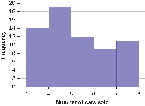
Exercise 2.3.12
Construct a frequency polygon for the following:
Exercise 2.3.13
Construct a frequency polygon from the frequency distribution for the 50 highest ranked countries for depth of hunger.
Find the midpoint for each class. These will be graphed on the x -axis. The frequency values will be graphed on the y -axis values.

Exercise 2.3.14
Use the two frequency tables to compare the life expectancy of men and women from 20 randomly selected countries. Include an overlayed frequency polygon and discuss the shapes of the distributions, the center, the spread, and any outliers. What can we conclude about the life expectancy of women compared to men?
Exercise 2.3.15
Construct a times series graph for (a) the number of male births, (b) the number of female births, and (c) the total number of births.
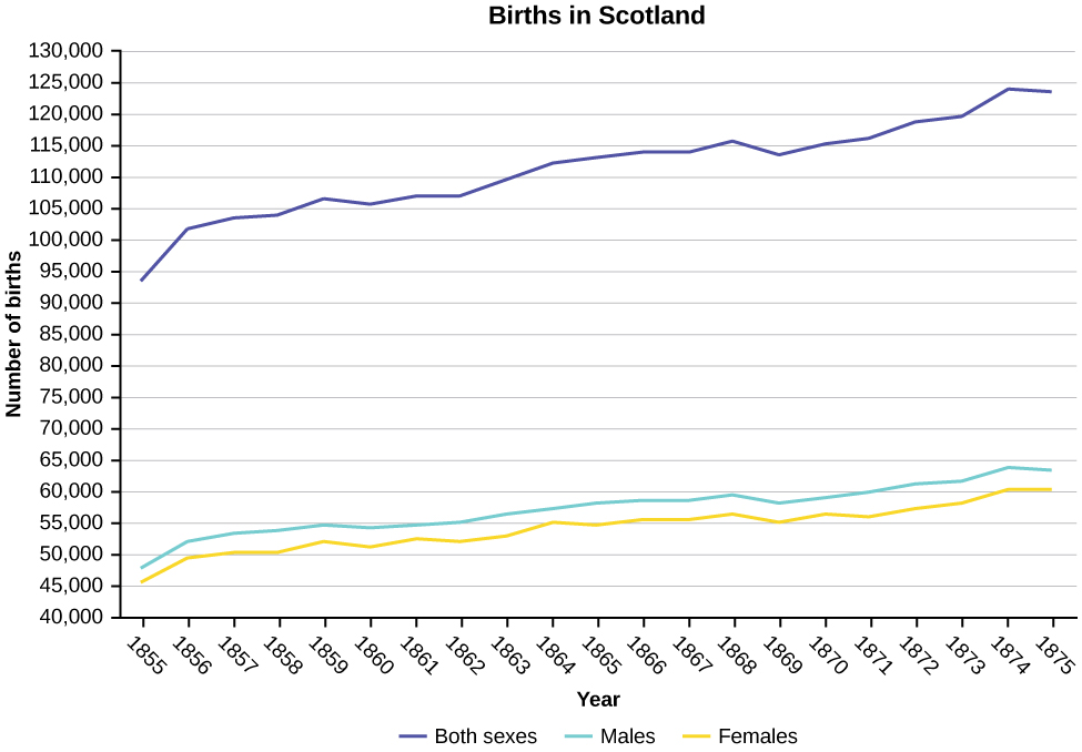
Exercise 2.3.16
The following data sets list full time police per 100,000 citizens along with homicides per 100,000 citizens for the city of Detroit, Michigan during the period from 1961 to 1973.
- Construct a double time series graph using a common x -axis for both sets of data.
- Which variable increased the fastest? Explain.
- Did Detroit’s increase in police officers have an impact on the murder rate? Explain.
2.4: Measures of the Location of the Data
The median age for U.S. blacks currently is 30.9 years; for U.S. whites it is 42.3 years.
- Based upon this information, give two reasons why the black median age could be lower than the white median age.
- Does the lower median age for blacks necessarily mean that blacks die younger than whites? Why or why not?
- How might it be possible for blacks and whites to die at approximately the same age, but for the median age for whites to be higher?
Six hundred adult Americans were asked by telephone poll, "What do you think constitutes a middle-class income?" The results are in the Table below. Also, include left endpoint, but not the right endpoint.
- What percentage of the survey answered "not sure"?
- What percentage think that middle-class is from $25,000 to $50,000?
- Should all bars have the same width, based on the data? Why or why not?
- How should the <20,000 and the 100,000+ intervals be handled? Why?
- Find the 40 th and 80 th percentiles
- Construct a bar graph of the data
- \(1 - (0.02 + 0.09 + 0.19 + 0.26 + 0.18 + 0.17 + 0.02 + 0.01) = 0.06\)
- \(0.19 + 0.26 + 0.18 = 0.63\)
- Check student’s solution.
80 th percentile will fall between 50,000 and 75,000
Given the following box plot:

- which quarter has the smallest spread of data? What is that spread?
- which quarter has the largest spread of data? What is that spread?
- find the interquartile range ( IQR ).
- are there more data in the interval 5–10 or in the interval 10–13? How do you know this?
- 10–12
- 12–13
- need more information
The following box plot shows the U.S. population for 1990, the latest available year.

- Are there fewer or more children (age 17 and under) than senior citizens (age 65 and over)? How do you know?
- 12.6% are age 65 and over. Approximately what percentage of the population are working age adults (above age 17 to age 65)?
- more children; the left whisker shows that 25% of the population are children 17 and younger. The right whisker shows that 25% of the population are adults 50 and older, so adults 65 and over represent less than 25%.
2.5: Box Plots
In a survey of 20-year-olds in China, Germany, and the United States, people were asked the number of foreign countries they had visited in their lifetime. The following box plots display the results.

- In complete sentences, describe what the shape of each box plot implies about the distribution of the data collected.
- Have more Americans or more Germans surveyed been to over eight foreign countries?
- Compare the three box plots. What do they imply about the foreign travel of 20-year-old residents of the three countries when compared to each other?
Given the following box plot, answer the questions.

- Think of an example (in words) where the data might fit into the above box plot. In 2–5 sentences, write down the example.
- What does it mean to have the first and second quartiles so close together, while the second to third quartiles are far apart?
- Answers will vary. Possible answer: State University conducted a survey to see how involved its students are in community service. The box plot shows the number of community service hours logged by participants over the past year.
- Because the first and second quartiles are close, the data in this quarter is very similar. There is not much variation in the values. The data in the third quarter is much more variable, or spread out. This is clear because the second quartile is so far away from the third quartile.
Given the following box plots, answer the questions.

- Data 1 has more data values above two than Data 2 has above two.
- The data sets cannot have the same mode.
- For Data 1 , there are more data values below four than there are above four.
- For which group, Data 1 or Data 2, is the value of “7” more likely to be an outlier? Explain why in complete sentences.
A survey was conducted of 130 purchasers of new BMW 3 series cars, 130 purchasers of new BMW 5 series cars, and 130 purchasers of new BMW 7 series cars. In it, people were asked the age they were when they purchased their car. The following box plots display the results.

- In complete sentences, describe what the shape of each box plot implies about the distribution of the data collected for that car series.
- Which group is most likely to have an outlier? Explain how you determined that.
- Compare the three box plots. What do they imply about the age of purchasing a BMW from the series when compared to each other?
- Look at the BMW 5 series. Which quarter has the smallest spread of data? What is the spread?
- Look at the BMW 5 series. Which quarter has the largest spread of data? What is the spread?
- Look at the BMW 5 series. Estimate the interquartile range (IQR).
- Look at the BMW 5 series. Are there more data in the interval 31 to 38 or in the interval 45 to 55? How do you know this?
- 31–35
- 38–41
- 41–64
- Each box plot is spread out more in the greater values. Each plot is skewed to the right, so the ages of the top 50% of buyers are more variable than the ages of the lower 50%.
- The BMW 3 series is most likely to have an outlier. It has the longest whisker.
- Comparing the median ages, younger people tend to buy the BMW 3 series, while older people tend to buy the BMW 7 series. However, this is not a rule, because there is so much variability in each data set.
- The second quarter has the smallest spread. There seems to be only a three-year difference between the first quartile and the median.
- The third quarter has the largest spread. There seems to be approximately a 14-year difference between the median and the third quartile.
- IQR ~ 17 years
- There is not enough information to tell. Each interval lies within a quarter, so we cannot tell exactly where the data in that quarter is concentrated.
- The interval from 31 to 35 years has the fewest data values. Twenty-five percent of the values fall in the interval 38 to 41, and 25% fall between 41 and 64. Since 25% of values fall between 31 and 38, we know that fewer than 25% fall between 31 and 35.
Twenty-five randomly selected students were asked the number of movies they watched the previous week. The results are as follows:
Construct a box plot of the data.
2.6: Measures of the Center of the Data
The most obese countries in the world have obesity rates that range from 11.4% to 74.6%. This data is summarized in the following table.
- What is the best estimate of the average obesity percentage for these countries?
- The United States has an average obesity rate of 33.9%. Is this rate above average or below?
- How does the United States compare to other countries?
The table below gives the percent of children under five considered to be underweight. What is the best estimate for the mean percentage of underweight children?
The mean percentage, \(\bar{x} = \frac{1328.65}{50} = 26.75\)
2.7: Skewness and the Mean, Median, and Mode
The median age of the U.S. population in 1980 was 30.0 years. In 1991, the median age was 33.1 years.
- What does it mean for the median age to rise?
- Give two reasons why the median age could rise.
- For the median age to rise, is the actual number of children less in 1991 than it was in 1980? Why or why not?
2.8: Measures of the Spread of the Data
Use the following information to answer the next nine exercises: The population parameters below describe the full-time equivalent number of students (FTES) each year at Lake Tahoe Community College from 1976–1977 through 2004–2005.
- \(\mu = 1000\) FTES
- median = 1,014 FTES
- \(\sigma = 474\) FTES
- first quartile = 528.5 FTES
- third quartile = 1,447.5 FTES
- \(n = 29\) years
A sample of 11 years is taken. About how many are expected to have a FTES of 1014 or above? Explain how you determined your answer.
The median value is the middle value in the ordered list of data values. The median value of a set of 11 will be the 6th number in order. Six years will have totals at or below the median.
75% of all years have an FTES:
- at or below: _____
- at or above: _____
The population standard deviation = _____
What percent of the FTES were from 528.5 to 1447.5? How do you know?
What is the IQR ? What does the IQR represent?
How many standard deviations away from the mean is the median?
Additional Information: The population FTES for 2005–2006 through 2010–2011 was given in an updated report. The data are reported here.
Calculate the mean, median, standard deviation, the first quartile, the third quartile and the IQR . Round to one decimal place.
- mean = 1,809.3
- median = 1,812.5
- standard deviation = 151.2
- first quartile = 1,690
- third quartile = 1,935
Construct a box plot for the FTES for 2005–2006 through 2010–2011 and a box plot for the FTES for 1976–1977 through 2004–2005.
Compare the IQR for the FTES for 1976–77 through 2004–2005 with the IQR for the FTES for 2005-2006 through 2010–2011. Why do you suppose the IQR s are so different?
Hint: Think about the number of years covered by each time period and what happened to higher education during those periods.
Three students were applying to the same graduate school. They came from schools with different grading systems. Which student had the best GPA when compared to other students at his school? Explain how you determined your answer.
A music school has budgeted to purchase three musical instruments. They plan to purchase a piano costing $3,000, a guitar costing $550, and a drum set costing $600. The mean cost for a piano is $4,000 with a standard deviation of $2,500. The mean cost for a guitar is $500 with a standard deviation of $200. The mean cost for drums is $700 with a standard deviation of $100. Which cost is the lowest, when compared to other instruments of the same type? Which cost is the highest when compared to other instruments of the same type. Justify your answer.
For pianos, the cost of the piano is 0.4 standard deviations BELOW the mean. For guitars, the cost of the guitar is 0.25 standard deviations ABOVE the mean. For drums, the cost of the drum set is 1.0 standard deviations BELOW the mean. Of the three, the drums cost the lowest in comparison to the cost of other instruments of the same type. The guitar costs the most in comparison to the cost of other instruments of the same type.
An elementary school class ran one mile with a mean of 11 minutes and a standard deviation of three minutes. Rachel, a student in the class, ran one mile in eight minutes. A junior high school class ran one mile with a mean of nine minutes and a standard deviation of two minutes. Kenji, a student in the class, ran 1 mile in 8.5 minutes. A high school class ran one mile with a mean of seven minutes and a standard deviation of four minutes. Nedda, a student in the class, ran one mile in eight minutes.
- Why is Kenji considered a better runner than Nedda, even though Nedda ran faster than he?
- Who is the fastest runner with respect to his or her class? Explain why.
The most obese countries in the world have obesity rates that range from 11.4% to 74.6%. This data is summarized in the table belo2
What is the best estimate of the average obesity percentage for these countries? What is the standard deviation for the listed obesity rates? The United States has an average obesity rate of 33.9%. Is this rate above average or below? How “unusual” is the United States’ obesity rate compared to the average rate? Explain.
- \(\bar{x} = 23.32\)
- Using the TI 83/84, we obtain a standard deviation of: \(s_{x} = 12.95\).
- The obesity rate of the United States is 10.58% higher than the average obesity rate.
- Since the standard deviation is 12.95, we see that \(23.32 + 12.95 = 36.27\) is the obesity percentage that is one standard deviation from the mean. The United States obesity rate is slightly less than one standard deviation from the mean. Therefore, we can assume that the United States, while 34% obese, does not have an unusually high percentage of obese people.
The Table below gives the percent of children under five considered to be underweight.
What is the best estimate for the mean percentage of underweight children? What is the standard deviation? Which interval(s) could be considered unusual? Explain.

Excel Tutorial: How To Make Graphical Presentation In Excel
Introduction.
When it comes to analyzing and presenting data, graphical presentations in Excel can be a game-changer. These visual representations of data not only make it easier to understand complex information but also help in making informed decisions. In this tutorial, we will take you through the process of creating graphical presentations in Excel and explore the benefits of incorporating visuals into your data analysis.
Key Takeaways
- Graphical presentations in Excel are crucial for understanding complex data and making informed decisions.
- Understanding the basics of creating graphical presentations is essential, including the different types of graphs and charts available in Excel.
- Selecting the appropriate data and organizing it effectively is key to creating effective graphical presentations.
- Utilizing Excel's advanced features and customization options can elevate the visual appeal and insights provided by graphical presentations.
- Adding finishing touches such as visual elements and annotations can enhance the overall look and clarity of graphical presentations.
Understanding the basics of creating graphical presentations in Excel
Graphical presentations are an essential tool for visualizing data and conveying information in a clear and concise manner. In Microsoft Excel, creating graphical presentations is a straightforward process that can greatly enhance the impact of your data. In this tutorial, we will explore the basics of creating graphical presentations in Excel.
Excel offers a wide range of graph and chart types, each suited for different data sets and presentation purposes. Some of the most commonly used graph and chart types in Excel include:
- Column and Bar Charts: These charts are used to compare values across different categories.
- Line Charts: Line charts are useful for showing trends and changes over time.
- Pie Charts: Pie charts are ideal for displaying the proportion of different categories in a data set.
- Scatter Plots: Scatter plots are used to show the relationship between two variables.
When creating a graphical presentation in Excel, it's important to include key components that help convey the information effectively.
The title of the graph or chart should clearly indicate the subject of the presentation.
Axis Labels
Axis labels are essential for providing context to the data being presented. The x-axis and y-axis should be clearly labeled to indicate what each represents.
The data being used for the graphical presentation should be clearly defined and organized to ensure accuracy and relevance.
By understanding the different types of graphs and charts available in Excel and the key components of a graphical presentation, you can effectively create visual representations of your data that are both impactful and easy to understand.
Selecting the appropriate data for your graphical presentation
When creating graphical presentations in Excel, it is essential to carefully choose the data that best suits the intended visualization. Here are some key points to consider:
- Look for trends or patterns: Data that shows clear trends or patterns are ideal for graphical representation. This can include sales figures over time, survey responses, or market trends.
- Comparing data: Data that needs to be compared across different categories or variables, such as product sales by region or customer demographics, can be effectively presented graphically.
- Highlighting relationships: If you want to showcase the relationship between different sets of data, such as correlation between variables or cause-and-effect relationships, graphical representation can be very effective.
- Clean and structured data: Ensure that your data is clean and well-structured before importing it into Excel. This includes removing any unnecessary columns or rows, and organizing the data in a logical manner.
- Use proper labels and headers: Clearly label your data and use headers to identify different categories or variables. This will make it easier to interpret and visualize the data in Excel.
- Convert text to numerical values: If your data includes text that needs to be represented graphically, such as categories or labels, consider converting them to numerical values or using a numerical equivalent for easier graphing in Excel.
- Remove outliers or irrelevant data: If there are outliers or irrelevant data points that could skew the visualization, consider removing them or addressing them separately to ensure the accuracy of the graphical presentation.
Step-by-step guide to creating graphical presentations in Excel
Excel is a versatile tool not only for data analysis and calculations but also for creating visually appealing graphical presentations. In this tutorial, we will walk you through the process of creating simple bar or pie charts using Excel's chart tools and then show you how to utilize Excel's graph customization features to enhance the visual appeal of your presentation.
A. Creating a simple bar or pie chart using Excel's chart tools
Excel's chart tools make it easy to create visually stunning bar or pie charts to represent your data. Follow these simple steps:
- Select your data: Start by selecting the data that you want to include in your chart. This will typically be a range of cells containing your data.
- Insert a chart: Once you have selected your data, go to the "Insert" tab and select the type of chart you want to create, such as a bar chart or a pie chart.
- Customize your chart: Excel will automatically generate a basic chart based on your selected data. You can then customize the chart by adding titles, labels, and modifying the colors and styles to suit your presentation.
- Finalize your chart: Once you are happy with the appearance of your chart, you can further customize it by adding data labels, adjusting the axis scales, or adding a trendline.
B. Utilizing Excel's graph customization features to enhance the visual appeal of your presentation
Excel offers a range of graph customization features that allow you to enhance the visual appeal of your presentation. Here's how to make the most of these features:
- Modify chart elements: Excel allows you to modify various elements of your chart, such as the axis titles, data labels, and gridlines. You can also add or remove chart elements to make your chart more visually appealing.
- Change chart styles: Excel provides a range of pre-set chart styles that you can apply to your chart to change its appearance. You can also manually adjust the colors, fonts, and effects to create a custom look for your chart.
- Add visual effects: Excel allows you to add visual effects to your chart, such as shadows and glows, to make it stand out. You can also adjust the transparency of chart elements to create a more subtle and polished look.
- Format data series: Excel enables you to format individual data series within your chart, allowing you to highlight specific data points or make certain elements stand out.
Adding the finishing touches to your graphical presentation
Once you have created your graphical presentation in Excel, it's time to add the finishing touches to make it visually appealing and easy to understand for your audience.
Visual elements play a crucial role in making your graphical presentation stand out. Here are a few tips on how to use colors and fonts effectively:
- Use a cohesive color scheme: Select a color palette that complements your data and helps in conveying your message effectively. Avoid using too many colors that can make the presentation look cluttered.
- Choose readable fonts: Use clear and legible fonts for your titles, labels, and annotations. Make sure the font size is appropriate for the audience to read comfortably.
- Emphasize important data points: Use different colors or fonts to highlight important data points or trends in your presentation.
Titles, legends, and annotations help provide context and clarity to your graphical presentation. Here's how to effectively incorporate these elements:
- Include a descriptive title: A clear and concise title helps the audience understand the purpose of the graphical presentation. It should convey the main message or insight from the data.
- Utilize legends for clarity: If your graphical presentation includes multiple data series or categories, use a legend to provide clarity on what each element represents.
- Add annotations for additional information: Annotations can help provide additional context or explanations for specific data points. They can be used to highlight outliers, trends, or any other important details in the visualization.
Utilizing trendlines, sparklines, and other advanced chart elements to provide deeper insights
When creating graphical presentations in Excel, it's important to go beyond basic charts and graphs to provide deeper insights. Utilizing advanced features such as trendlines and sparklines can help you achieve this.
- Adding trendlines to your charts can help you identify and visualize patterns and trends in your data. This can be especially useful for predicting future values based on historical data.
- Customizing trendlines allows you to further refine your graphical presentation, adjusting the type of trendline (e.g., linear, exponential, polynomial) to best fit your data.
- Interpreting trendlines is essential for understanding the implications of the data. You can use the equation of the trendline to make predictions or analyze the relationship between variables.
- Integrating sparklines into your data tables or dashboards can provide a quick and concise visualization of trends and variations, without taking up too much space.
- Customizing sparklines allows you to adjust the appearance and layout to best suit your graphical presentation, ensuring clarity and effectiveness.
- Interpreting sparklines involves understanding the patterns and variations they display, providing quick insights into the data at a glance.
Exploring additional tools and features to further customize and polish your graphical presentation
Excel offers a range of additional tools and features to help you further customize and polish your graphical presentation, elevating it to a professional level.
Data Labels and Callouts
- Adding data labels to your charts can provide additional context and clarity, allowing viewers to easily interpret the data points.
- Using callouts to highlight specific data points or trends can draw attention to key insights, making your graphical presentation more impactful.
Interactive Elements
- Utilizing interactive elements such as drop-down menus, buttons, or sliders can make your graphical presentation more engaging and dynamic, allowing viewers to interact with the data.
- Creating interactive dashboards with linked charts and tables can provide a comprehensive view of the data, allowing for seamless exploration and analysis.
Formatting and Design
- Applying consistent formatting across all elements of your graphical presentation can create a cohesive and professional look, enhancing visual appeal and readability.
- Using design elements such as color schemes, fonts, and shapes can help convey a specific message or theme, adding depth and personality to your graphical presentation.
In conclusion, this tutorial covered the essential steps for creating graphical presentations in Excel . We discussed the process of selecting the data, choosing the appropriate chart type, customizing the design, and adding final touches to enhance the visual appeal. Now that you have the knowledge and tools at your disposal, I encourage you to start creating your own graphical presentations in Excel. Practice makes perfect, and with a little creativity, you can transform your data into compelling visuals that effectively communicate your message.

Immediate Download
MAC & PC Compatible
Free Email Support
Related aticles

The Benefits of Excel Dashboards for Data Analysts

Unlock the Power of Real-Time Data Visualization with Excel Dashboards

Unlocking the Potential of Excel's Data Dashboard

Unleashing the Benefits of a Dashboard with Maximum Impact in Excel

Exploring Data Easily and Securely: Essential Features for Excel Dashboards

Unlock the Benefits of Real-Time Dashboard Updates in Excel

Unleashing the Power of Excel Dashboards

Understanding the Benefits and Challenges of Excel Dashboard Design and Development

Leverage Your Data with Excel Dashboards

Crafting the Perfect Dashboard for Excel

An Introduction to Excel Dashboards

How to Create an Effective Excel Dashboard
- Choosing a selection results in a full page refresh.
IMAGES
VIDEO
COMMENTS
Graphical representation of data is an attractive method of showcasing numerical data that help in analyzing and representing quantitative data visually. A graph is a kind of a chart where data are plotted as variables across the coordinate. It became easy to analyze the extent of change of one variable based on the change of other variables ...
Bullet Graph. Choropleth Map. Word Cloud. Network Diagram. Correlation Matrices. 1. Pie Chart. Pie charts are one of the most common and basic data visualization techniques, used across a wide range of applications. Pie charts are ideal for illustrating proportions, or part-to-whole comparisons.
Data visualization is the presentation of data in a graphical format such as a plot, graph, or map to make it easier for decision makers to see and understand trends, outliers, and patterns in ...
After reviewing the data, they managed to create this table to help them build a scatter plot graph: Participant ID Daily Hours of Screen Time ... Understanding and choosing data presentation types are pivotal in effective communication. Each method serves a unique purpose, so selecting the appropriate one depends on the nature of the data and ...
Data representations are graphics that display and summarize data and help us to understand the data's meaning. ... A circle graph (or pie chart) is a circle that is divided into as many sections as there are categories of the qualitative variable. The area of each section represents, for each category, the value of the quantitative data as a ...
Data Sources - Wherever possible, include the sources of information at the bottom of the graph. Keep it Simple - You should construct a graph which even a layman (without any exposure in the areas of statistics or mathematics) can understand. Neat - A graph is a visual aid for the presentation of data and information.
A histogram is a graphic version of a frequency distribution. The graph consists of bars of equal width drawn adjacent to each other. The horizontal scale represents classes of quantitative data values and the vertical scale represents frequencies. The heights of the bars correspond to frequency values. Histograms are typically used for large ...
Introduction. Visual learning is one of the primary forms of interpreting information, which has historically combined images such as charts and graphs (see Box 1) with reading text. 1 However, developments on learning styles have suggested splitting up the visual learning modality in order to recognize the distinction between text and images. 2 Technology has also enhanced visual presentation ...
Graphs are a powerful and concise way to communicate information. Representing data from an experiment in the form of an x-y graph allows relationships to be examined, scatter in data to be assessed and allows for the rapid identification of special or unusual features. A well laid out graph containing all the components discussed in this chapter can act as a 'one stop' summary of a whole ...
The Organization and Graphic Presentation of Data—23 A proportion is a relative frequency obtained by dividing the frequency in each category by the total number of cases. To find a proportion (p), divide the frequency (f) in each category by the total number of cases (N):p ¼ f N where f = frequency N = total number of cases Thus, the proportion of foreign born originally from Latin America is
the United States. To make sense out of these data, a researcher must organize and summarize the data in some systematic fashion. In this chapter, we review three such methods used by social scientists: (1) the creation of frequency distributions, (2) the construction of bivar - iate tables and (3) the use of graphic presentation.
Workshop Objectives. To gain an understanding of the basics of graphical data presentation theory and practice in order to create high quality quantitative graphs. To appreciate the usefulness of graphical methods in investigating data. To develop skills in recognizing clarity and objectivity in graphical presentation.
Graphical methods for presenting data 2.1 Introduction We have lookedatways of collectingdataand thencollatingthem intotables. Frequency tables are useful methods of presenting data; they do, however, have their limitations. With large amounts of data graphical presentation methods are often clearer to understand. Here, we look
Graphical Representation is a way of analysing numerical data. It exhibits the relation between data, ideas, information and concepts in a diagram. It is easy to understand and it is one of the most important learning strategies. It always depends on the type of information in a particular domain. There are different types of graphical ...
Graph 2 Same data as in Graph 1, but in 2‐D. Better Representation of the data. •Values are not distorted by the skewed perspective. • Category labels are more space‐efficient. •The graph, not its title, occupies the most space. •Colors can be distin‐ guished, even by a color‐ blind reader Graph 3
A presentation graph is a visual representation of data, crafted in either 2D or 3D format, designed to illustrate relationships among two or more variables. Its primary purpose is to facilitate understanding of complex information, trends, and patterns, making it easier for an audience to grasp insights during a presentation.
Graphical presentation of data is a powerful tool for visualizing complex information and communicating insights effectively. By selecting the appropriate chart or graph for the data and following best practices for presentation, researchers and decision-makers can make informed decisions and gain a deeper understanding of their data.
Construct a histogram of the data. Complete the columns of the chart. Use the following information to answer the next two exercises: Suppose one hundred eleven people who shopped in a special t-shirt store were asked the number of t-shirts they own costing more than $19 each. Figure 2.E. 8 2.
B. Understanding the key components of a graphical presentation (title, axis labels, data, etc.) When creating a graphical presentation in Excel, it's important to include key components that help convey the information effectively. Title. The title of the graph or chart should clearly indicate the subject of the presentation. Axis Labels
Study with Quizlet and memorize flashcards containing terms like An external user of accounting information, A graphical presentation of data to help in understanding their significance is called data, An employee that is having trouble paying his personal bills might exhibit the following fraud factor: and more.
The data in this graph is from 2020. Identify key features. From there, you can describe the key variables that make up the graph. Graphs and charts typically have an x- and y-axis, which represent different variables. Describing these axes will help the audience understand how the graph displays data.
This problem has been solved! You'll get a detailed solution from a subject matter expert that helps you learn core concepts. Question: A graphical presentation of data to help in understanding their significance is called data Need help? Review these concept resources. Read About the Concept I.
A graphical presentation of data to help in understanding their significance is called data _. This problem has been solved! You'll get a detailed solution from a subject matter expert that helps you learn core concepts.