- PowerPoint Themes
- Latest PowerPoint Templates
- Best PowerPoint Templates
- Free PowerPoint Templates
- Simple PowerPoint Templates
- PowerPoint Backgrounds
- Project Charter
- Project Timeline
- Project Team
- Project Status
- Market Analysis
- Marketing Funnel
- Market Segmentation
- Target Customer
- Marketing Mix
- Digital Marketing Strategy
- Resource Planning
- Recruitment
- Employee Onboarding
- Company Profile
- Mission Vision
- Meet The Team
- Problem & Solution
- Business Model
- Business Case
- Business Strategy
- Business Review
- Leadership Team
- Balance Sheet
- Income Statement
- Cash Flow Statement
- Executive Summary
- 30 60 90 Day Plan
- SWOT Analysis
- Flow Charts
- Gantt Charts
- Text Tables
- Infographics
- Google Slides Templates
- Presentation Services
- Ask Us To Make Slides
- Data Visualization Services
- Business Presentation Tips
- PowerPoint Tutorials
- Google Slides Tutorials
- Presentation Resources


The Best And Worst PowerPoint Presentation Examples
Who wouldn’t appreciate a PowerPoint presentation that is eye-catching and easy to understand? With the best and worst PowerPoint presentation examples below, you’ll know what makes a good PowerPoint presentation and what makes a bad one.
Engaging presentations are the lifeblood of effective communication in today’s information-driven world. Whether you’re in a boardroom pitching a new idea, standing in front of a classroom of curious learners, or delivering a keyote speech to an interested investor, the ability to create and deliver engaging presentations is a skill that can truly make or break your message.
Various elements contribute to making a presentation good or bad, from compelling visuals to persuasive delivery; these factors collectively influence how your ideas are received and remembered. So, in this article, we will look at some of the good and bad presentation examples to help you transform your presentations and make them more engaging.
Main Differences Between Good V/S Bad PowerPoint Slides
Knowing the difference between the best and worst PowerPoint presentations is vital for creating engaging presentations.
What Makes A Good PowerPoint Presentation?
Have you ever wondered how you differentiate between a good design v/s bad design PPT? In this section, we’ll look at some examples of making PowerPoint presentations that inspire and engage the audience. Look at what’s behind the slides that stick in mind long after the projector is turned off:
- Less text, more impact
- Choose a color scheme that works
- Proper balance of animation and texts
- Logical flow of information
- Context-relevant graphics or illustrations
READ MORE: The Golden Rules for Impactful Presentations
1. Less Text, More Impact
Imagine your presentation as a visual storybook. Less text on each slide means your audience can focus on your story, not squint at paragraphs. Use striking images or a single powerful phrase to grab attention. It makes your presentation look impressive and helps people remember the article’s key points. Keeping about 30 words per slide or 6-8 lines in your presentation will help maintain a proper flow of words and pictures, resulting in a fluid presentation.
2. Choose A Color Scheme That Works
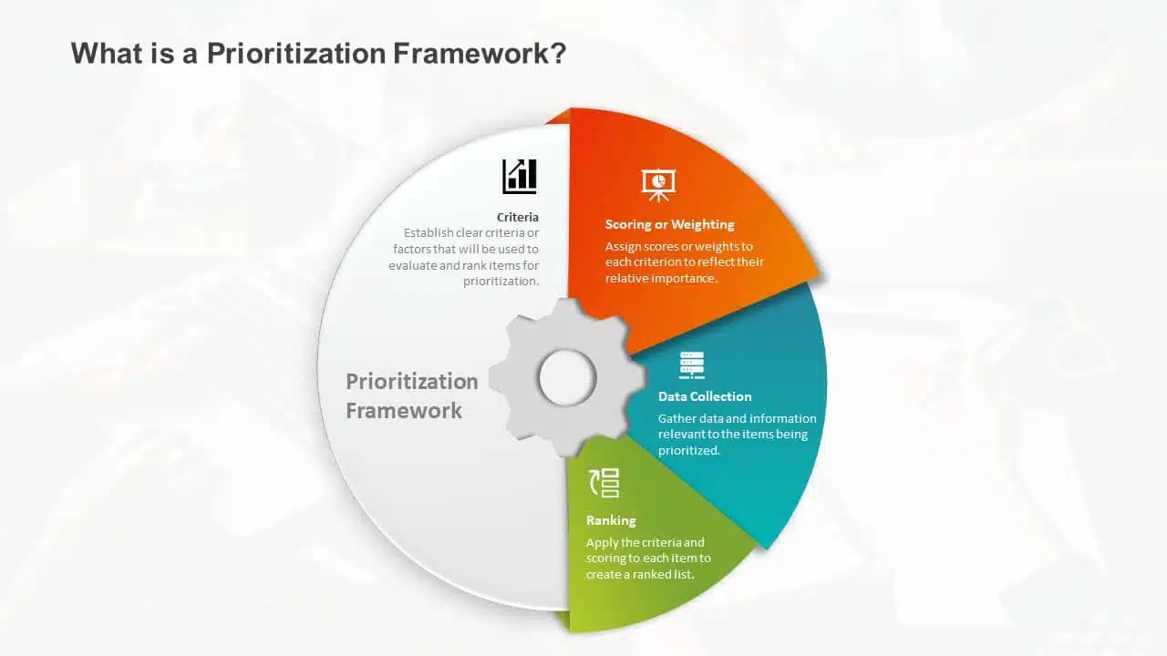
You don’t need to be an artist to pick the right colors. A good presentation uses colors that work together nicely. Choosing harmonizing colors can guide the audience to focus on important information. Choose colors that look good together and don’t hurt the eyes. Microsoft Office’s color schemes can save the day if you’re short on ideas. Avoid using light colors on a dark background and vice versa.
3. Proper Balance Of Animation And Texts
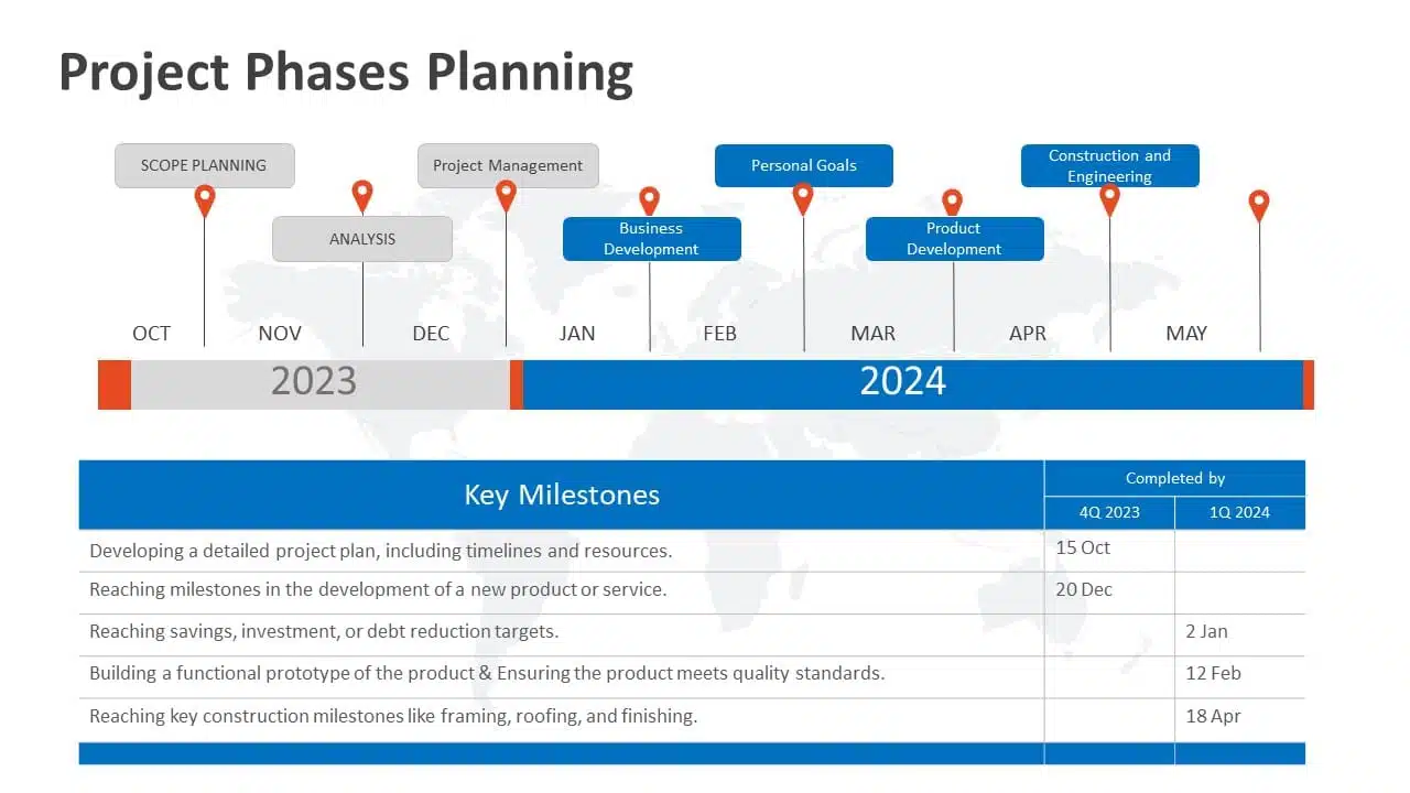
Animations and transitions can be like party crashers in your presentation if not used wisely. They might steal the show from your message. A top-notch presentation keeps both animations and texts in check, ensuring they don’t overpower each other. However, don’t ditch them altogether! Use transitions and animations only to highlight key points. For example, make bullet points appear individually instead of all at once. It keeps your audience focused.
READ MORE: How to add animation in PowerPoint?
4. Logical Flow Of Information
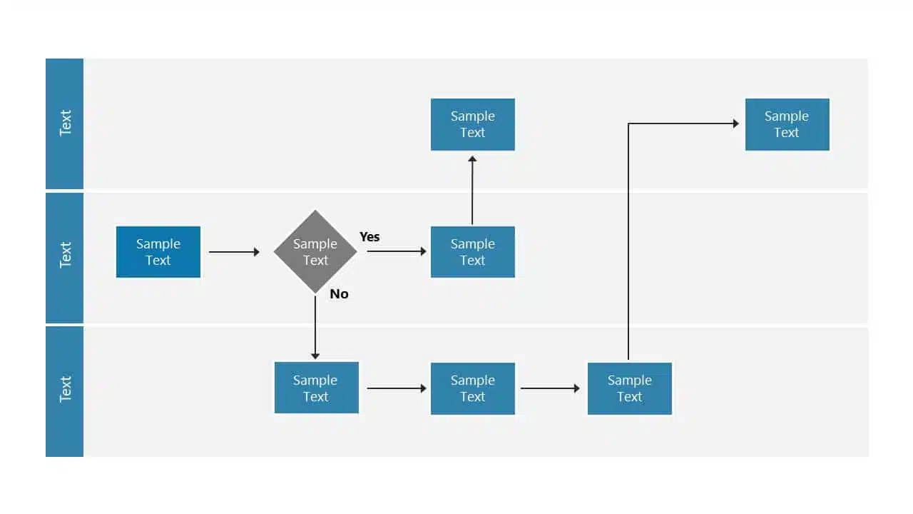
Think of your presentation as a road trip. Imagine if your GPS gave you all mixed up directions. Chaos, right? Similarly, your slides need a logical order and a roadmap. Maintaining the logical flow of your slides helps the audience follow the information easily. A logical flow makes your message clear and easy to remember. It’s like telling a great story with a beginning, middle, and end.
EXPLORE: Flowchart PowerPoint Templates
5. Context-Relevant Graphics Or Illustrations
A picture speaks volumes. Our brains love visuals. Using context-related graphs, photos, and illustrations that complement your slides can amp up important pointers and keep your audience engaged during the presentation. However, while presenting, make sure to explain why a graphic or a picture is there. Explaining the graphics verbally makes your message crystal clear and memorable.
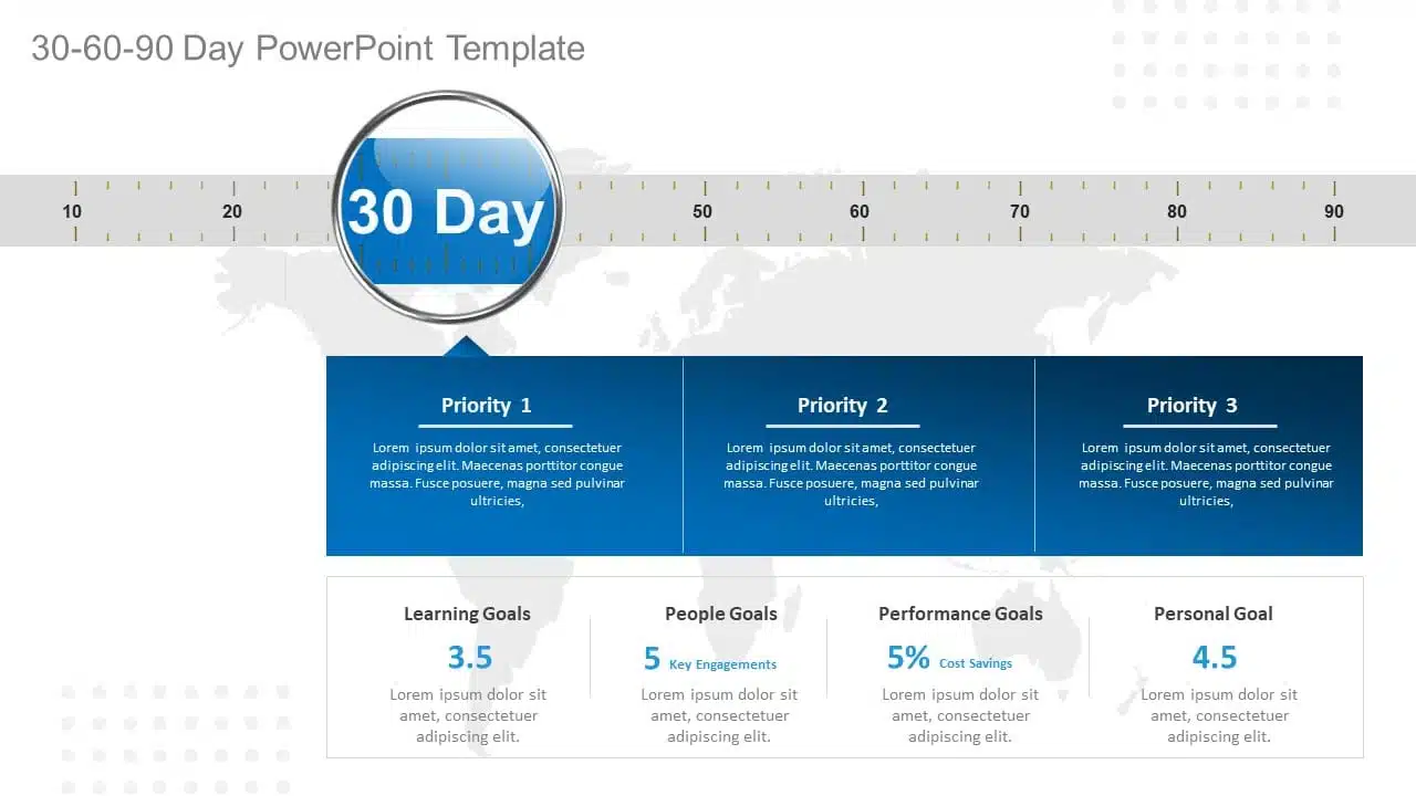
EXPLORE: Want to create stunning presentations? Check out our presentation services !
A PowerPoint presentation shall excel in these aspects of making it engaging, informative, and memorable. These good PowerPoint presentation examples could help you make a better PPT in one or more areas, not leaving the audience disengaged or confused.
While it’s important to look at good presentation examples, it’s equally important to avoid mistakes that can turn your presentation dull.
What Makes A Bad PowerPoint Presentation?
Ever been in a room with a presentation that made you want to escape through the nearest exit? We’ve all been there! In this section, we’ll highlight some common mistakes that turn a good presentation into a dull one. With many examples of good and bad PowerPoint slides on the internet, we have listed some bad examples that show the ‘DON’Ts’ and ‘AVOID AT ALL COSTS’ of PowerPoint mistakes:
- Image behind the text
- Using only bullet points and no paragraphs
- Having no symmetry in texts and pointers
- Being too minimal
- Keeping text too small
1. Image Behind The Text
Anyone who considered utilizing an image as a background most likely missed the memo. Text and images simply do not work together. One of the worst PowerPoint presentation examples is text overlaid on an image. Keeping the image in the background complicates understanding the text, and the main image should be clarified. Finding a text color that shines out in the background is nearly tough because all of those colors merely draw your attention away from the words. To avoid this calamity, avoid utilizing photos as slide backgrounds when you have text to highlight.
EXPLORE: Best PowerPoint Backgrounds Collection

2. Using Only Bullet Points And No Paragraphs
To make a presentation audience-friendly, reducing paragraphs to bullet points is a wise choice. However, it is critical to emphasize that this is more than simply putting only bullet points and leaving out all paragraphs. Using 5-8 bullet points is ideal for a slide. If the text size shrinks to 12 or 10 points, you’ve written a lot. Lengthy bullet points tend to bore the audience; some might even think of them as paragraphs.
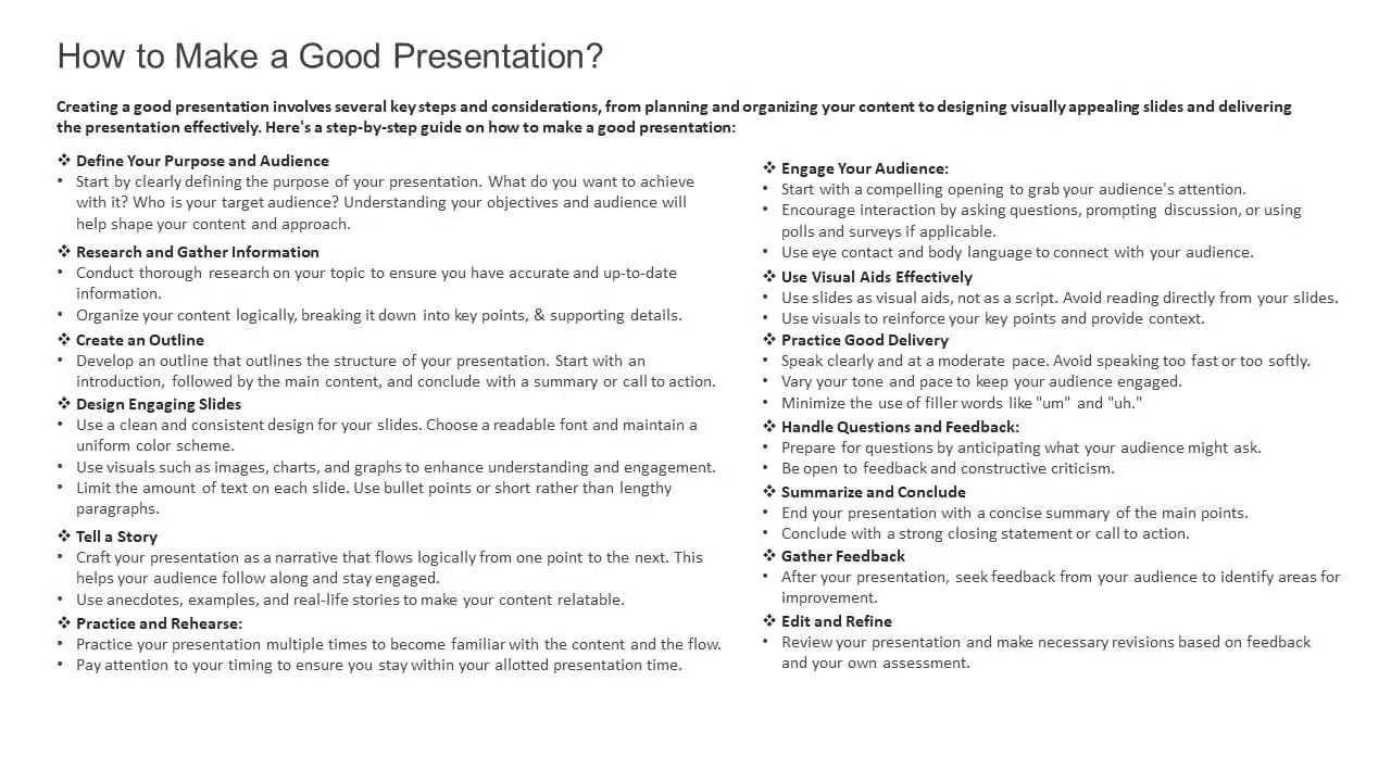
3. Having No Symmetry In Texts And Pointers
A lack of balance or alignment between textual material and supporting visual elements, such as arrows, bullets, etc., can make your presentations appear unpleasant. When text and pointers are strewn about, it’s difficult for the audience to follow a logical flow of information; a common bad PowerPoint slide example to avoid at any cost. Your audience will be obsessed with deciphering the relationship between the text and graphics if your presentation needs more harmony.
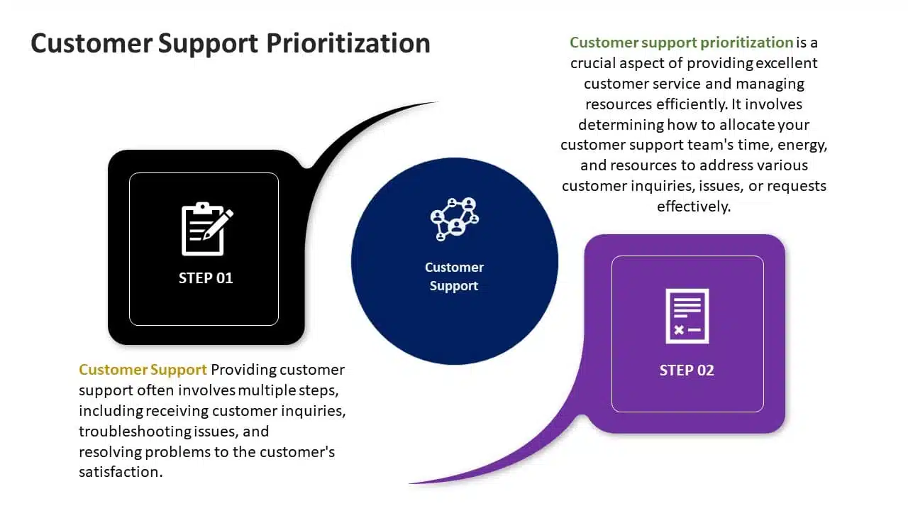
4. Being Too Minimal
Being too minimalistic is as bad as overdoing it. Not having the required text on slides or keeping them blank makes them dull and non-engaging. You don’t need a color explosion or too many texts, but bringing some life to your slides is always a good idea. Using pre-made PowerPoint templates is a good idea to keep your content balanced; however, it is best not to leave blank spaces. A blank slide with no colors or text might give the impression of minimal effort. Strive for a balanced approach to keep your audience engaged and awake.
EXPLORE: 40,000+ PowerPoint Templates and Google Slides Themes

5. Keeping Text Too Small
Another thing to avoid is making your font size too tiny, almost like the size of a peanut. The size of the font is extremely important in any presentation. Think of it like trying to enjoy a beautiful scenic view through a tiny keyhole – not very enjoyable, is it? It’s the same with your PowerPoint. Your slides can be perfect with great colors, and graphics, but it’s a bummer if your audience can’t read them. A simple trick is to stand at the back of the room where you’ll present. If you can read the font comfortably, then you should be fine!
READ MORE: Best Presentation Fonts
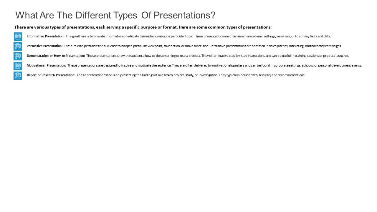
A bad PowerPoint presentation will dismiss all your efforts and disengage your audience. To look more, avoid these bad PowerPoint presentation examples at any cost while making your next presentation.
We have carefully curated a visual appearance of how your PowerPoint presentations change by following the aforementioned points.
A good PowerPoint presentation is a balance – not too much, not too little. It’s about enhancing your message, not taking the spotlight away from you. However, striking that balance requires a lot of practice and trial and error.
You can always opt for presentation design services , like SlideUpLift. It gives you the advantage and access to presentation specialists. We design visually appealing presentations, with modern design elements, graphics, and illustrations; maintaining a perfect balance of every element.
Whether you want to customize your slides completely or just tailor the color or font, we ensure that your brand or personal style always reflects in your presentation.
Explore from our collection of 40,000+ PowerPoint templates and Google Slides themes. Utilize our presentation design services to create stunning PPTs. Give us a try with our custom-slides service , or schedule a call with us to know more!
What is the biggest difference between the best and worst PowerPoint presentations?
A good PowerPoint presentation effectively communicates its message, engages the audience, and uses visuals, layout, and content in a clear and compelling manner. In contrast, a bad PPT has cluttered slides, too much text, poor design choices, or distracting elements that hinder understanding.
How can I avoid making a bad PowerPoint presentation?
To avoid creating a bad PowerPoint presentation, focus on simplicity, use visuals wisely, keep text concise, maintain a logical flow, use appropriate fonts and colors, and avoid excessive animations or irrelevant content. Seek feedback from peers or experts to improve your overall presentation.
What role do visuals play in differentiating a good design v/s bad design PPT?
In a good presentation, visuals support and clarify key points. While in a bad one, they may be excessive, distracting, or irrelevant, overshadowing the main message.
How important is the audience's experience in determining the quality of a PowerPoint presentation?
The audience’s experience is essential in evaluating a presentation. A good PPT keeps the audience engaged and attentive compared to a bad PPT, which leads to disengagement and confusion.
How can I fix my bad PowerPoint presentation?
You can fix your PowerPoint presentation by opting SlideUpLift as your presentation buddy. With over 40,000+ PowerPoint Templates and Google Slides Themes to explore, you can choose what’s best for you. In case you have very specific presentation needs, you can opt for their presentation design services or custom slide service to create stunning PPTs. Schedule a call to know more.
Table Of Content
Related presentations.

FlowChart PowerPoint Template Collection
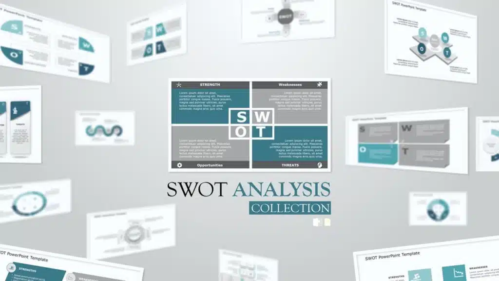
SWOT Analysis PowerPoint Templates Collection

List PowerPoint Template Collection
Related blogs.

10 Bad PowerPoint Slides Examples to Avoid

10 Best Animated PowerPoint Templates

10 Best Business PowerPoint Templates for Presentations

10 Best Business Presentation Topics to Captivate Your Audience
Tags and categories, privacy overview.
Necessary cookies are absolutely essential for the website to function properly. This category only includes cookies that ensures basic functionalities and security features of the website. These cookies do not store any personal information
Any cookies that may not be particularly necessary for the website to function and is used specifically to collect user personal data via ads, other embedded contents are termed as non-necessary cookies. It is mandatory to procure user consent prior to running these cookies on your website.
- SUGGESTED TOPICS
- The Magazine
- Newsletters
- Managing Yourself
- Managing Teams
- Work-life Balance
- The Big Idea
- Data & Visuals
- Reading Lists
- Case Selections
- HBR Learning
- Topic Feeds
- Account Settings
- Email Preferences
What It Takes to Give a Great Presentation
- Carmine Gallo

Five tips to set yourself apart.
Never underestimate the power of great communication. It can help you land the job of your dreams, attract investors to back your idea, or elevate your stature within your organization. But while there are plenty of good speakers in the world, you can set yourself apart out by being the person who can deliver something great over and over. Here are a few tips for business professionals who want to move from being good speakers to great ones: be concise (the fewer words, the better); never use bullet points (photos and images paired together are more memorable); don’t underestimate the power of your voice (raise and lower it for emphasis); give your audience something extra (unexpected moments will grab their attention); rehearse (the best speakers are the best because they practice — a lot).
I was sitting across the table from a Silicon Valley CEO who had pioneered a technology that touches many of our lives — the flash memory that stores data on smartphones, digital cameras, and computers. He was a frequent guest on CNBC and had been delivering business presentations for at least 20 years before we met. And yet, the CEO wanted to sharpen his public speaking skills.
- Carmine Gallo is a Harvard University instructor, keynote speaker, and author of 10 books translated into 40 languages. Gallo is the author of The Bezos Blueprint: Communication Secrets of the World’s Greatest Salesman (St. Martin’s Press).
Partner Center
We use essential cookies to make Venngage work. By clicking “Accept All Cookies”, you agree to the storing of cookies on your device to enhance site navigation, analyze site usage, and assist in our marketing efforts.
Manage Cookies
Cookies and similar technologies collect certain information about how you’re using our website. Some of them are essential, and without them you wouldn’t be able to use Venngage. But others are optional, and you get to choose whether we use them or not.
Strictly Necessary Cookies
These cookies are always on, as they’re essential for making Venngage work, and making it safe. Without these cookies, services you’ve asked for can’t be provided.
Show cookie providers
- Google Login
Functionality Cookies
These cookies help us provide enhanced functionality and personalisation, and remember your settings. They may be set by us or by third party providers.
Performance Cookies
These cookies help us analyze how many people are using Venngage, where they come from and how they're using it. If you opt out of these cookies, we can’t get feedback to make Venngage better for you and all our users.
- Google Analytics
Targeting Cookies
These cookies are set by our advertising partners to track your activity and show you relevant Venngage ads on other sites as you browse the internet.
- Google Tag Manager
- Infographics
- Daily Infographics
- Template Lists
- Graphic Design
- Graphs and Charts
- Data Visualization
- Human Resources
- Beginner Guides
Blog Beginner Guides How To Make a Good Presentation [A Complete Guide]
How To Make a Good Presentation [A Complete Guide]
Written by: Krystle Wong Jul 20, 2023

A top-notch presentation possesses the power to drive action. From winning stakeholders over and conveying a powerful message to securing funding — your secret weapon lies within the realm of creating an effective presentation .
Being an excellent presenter isn’t confined to the boardroom. Whether you’re delivering a presentation at work, pursuing an academic career, involved in a non-profit organization or even a student, nailing the presentation game is a game-changer.
In this article, I’ll cover the top qualities of compelling presentations and walk you through a step-by-step guide on how to give a good presentation. Here’s a little tip to kick things off: for a headstart, check out Venngage’s collection of free presentation templates . They are fully customizable, and the best part is you don’t need professional design skills to make them shine!
These valuable presentation tips cater to individuals from diverse professional backgrounds, encompassing business professionals, sales and marketing teams, educators, trainers, students, researchers, non-profit organizations, public speakers and presenters.
No matter your field or role, these tips for presenting will equip you with the skills to deliver effective presentations that leave a lasting impression on any audience.
Click to jump ahead:
What are the 10 qualities of a good presentation?
Step-by-step guide on how to prepare an effective presentation, 9 effective techniques to deliver a memorable presentation, faqs on making a good presentation, how to create a presentation with venngage in 5 steps.
When it comes to giving an engaging presentation that leaves a lasting impression, it’s not just about the content — it’s also about how you deliver it. Wondering what makes a good presentation? Well, the best presentations I’ve seen consistently exhibit these 10 qualities:
1. Clear structure
No one likes to get lost in a maze of information. Organize your thoughts into a logical flow, complete with an introduction, main points and a solid conclusion. A structured presentation helps your audience follow along effortlessly, leaving them with a sense of satisfaction at the end.
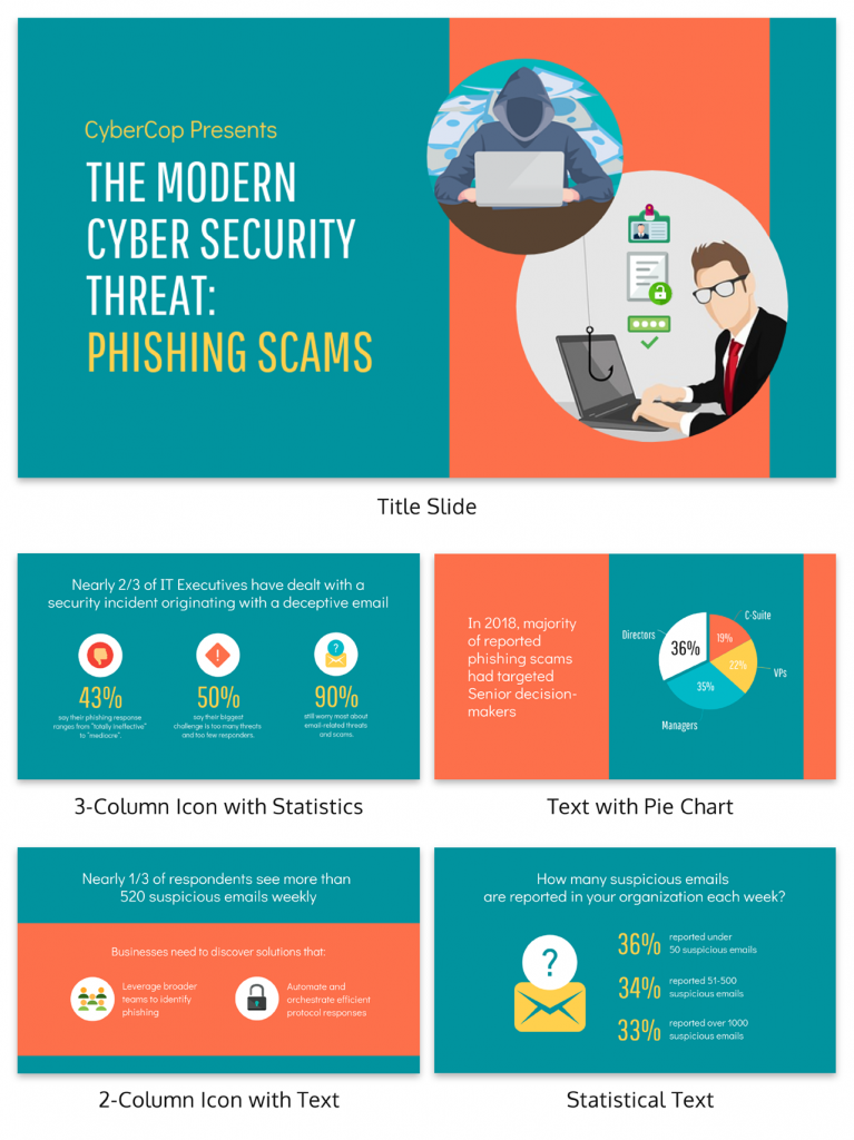
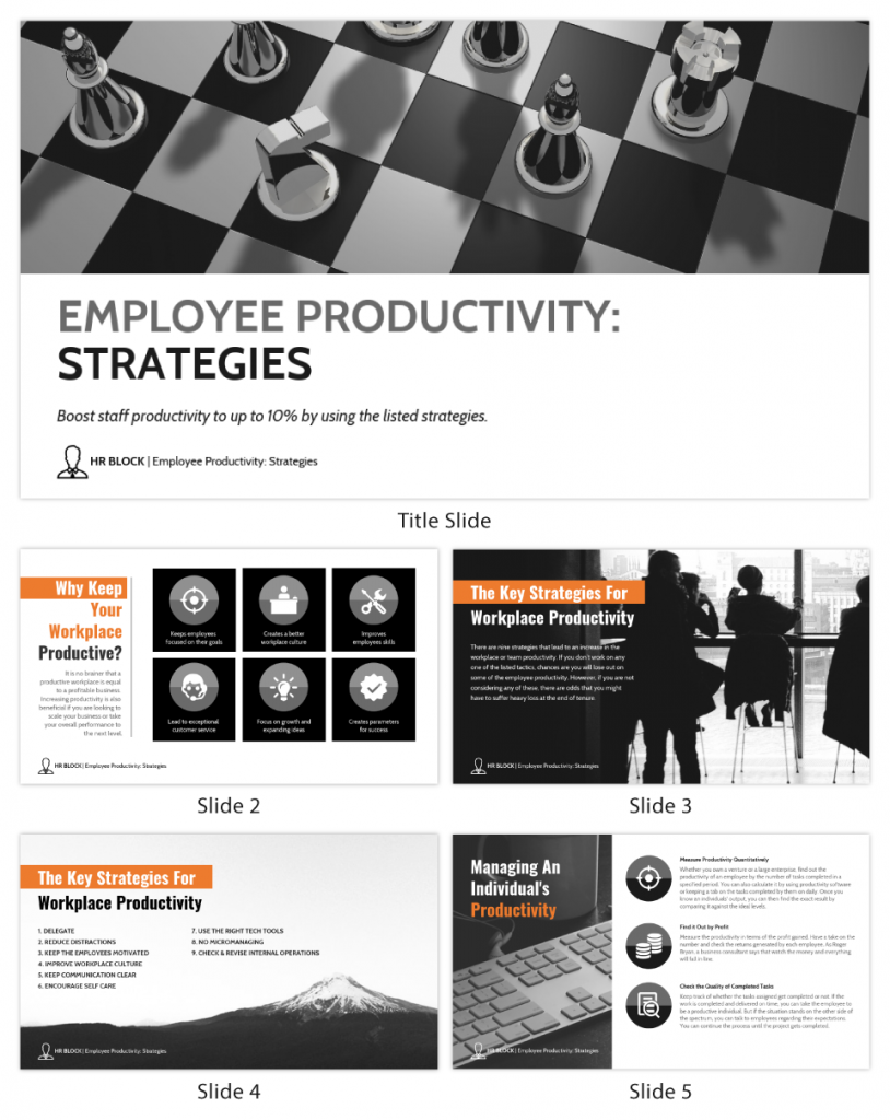
Regardless of your presentation style , a quality presentation starts with a clear roadmap. Browse through Venngage’s template library and select a presentation template that aligns with your content and presentation goals. Here’s a good presentation example template with a logical layout that includes sections for the introduction, main points, supporting information and a conclusion:
2. Engaging opening
Hook your audience right from the start with an attention-grabbing statement, a fascinating question or maybe even a captivating anecdote. Set the stage for a killer presentation!
The opening moments of your presentation hold immense power – check out these 15 ways to start a presentation to set the stage and captivate your audience.
3. Relevant content
Make sure your content aligns with their interests and needs. Your audience is there for a reason, and that’s to get valuable insights. Avoid fluff and get straight to the point, your audience will be genuinely excited.
4. Effective visual aids
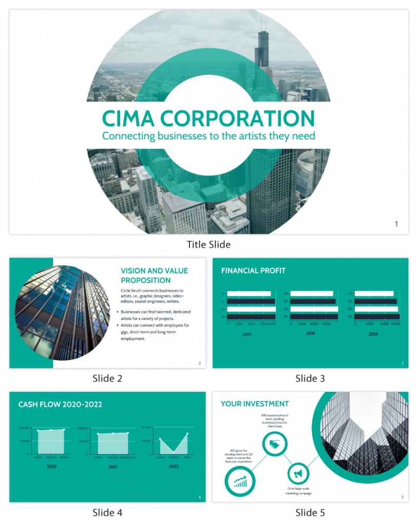
Picture this: a slide with walls of text and tiny charts, yawn! Visual aids should be just that—aiding your presentation. Opt for clear and visually appealing slides, engaging images and informative charts that add value and help reinforce your message.
With Venngage, visualizing data takes no effort at all. You can import data from CSV or Google Sheets seamlessly and create stunning charts, graphs and icon stories effortlessly to showcase your data in a captivating and impactful way.
5. Clear and concise communication
Keep your language simple, and avoid jargon or complicated terms. Communicate your ideas clearly, so your audience can easily grasp and retain the information being conveyed. This can prevent confusion and enhance the overall effectiveness of the message.
6. Engaging delivery
Spice up your presentation with a sprinkle of enthusiasm! Maintain eye contact, use expressive gestures and vary your tone of voice to keep your audience glued to the edge of their seats. A touch of charisma goes a long way!
7. Interaction and audience engagement
Turn your presentation into an interactive experience — encourage questions, foster discussions and maybe even throw in a fun activity. Engaged audiences are more likely to remember and embrace your message.
Transform your slides into an interactive presentation with Venngage’s dynamic features like pop-ups, clickable icons and animated elements. Engage your audience with interactive content that lets them explore and interact with your presentation for a truly immersive experience.
8. Effective storytelling
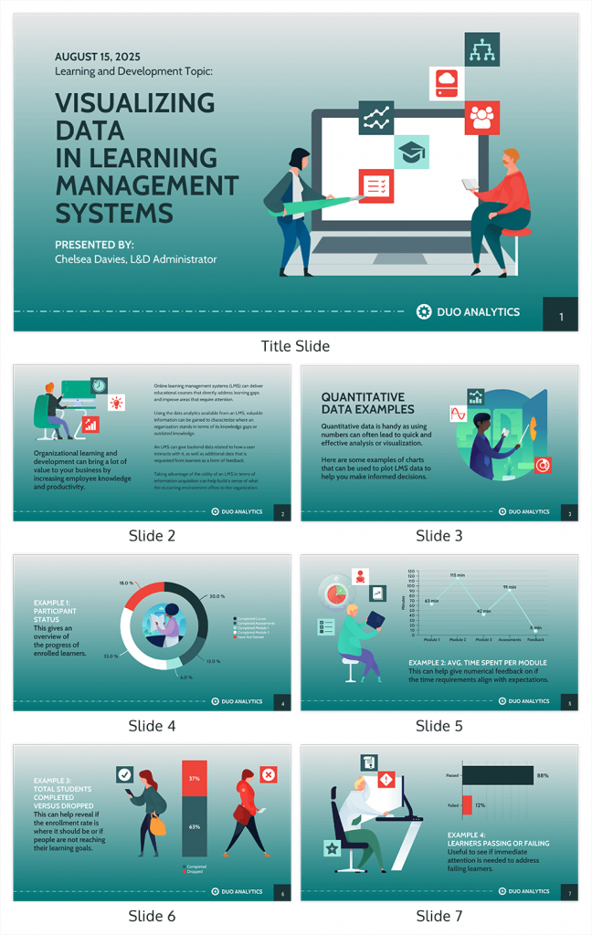
Who doesn’t love a good story? Weaving relevant anecdotes, case studies or even a personal story into your presentation can captivate your audience and create a lasting impact. Stories build connections and make your message memorable.
A great presentation background is also essential as it sets the tone, creates visual interest and reinforces your message. Enhance the overall aesthetics of your presentation with these 15 presentation background examples and captivate your audience’s attention.
9. Well-timed pacing
Pace your presentation thoughtfully with well-designed presentation slides, neither rushing through nor dragging it out. Respect your audience’s time and ensure you cover all the essential points without losing their interest.
10. Strong conclusion
Last impressions linger! Summarize your main points and leave your audience with a clear takeaway. End your presentation with a bang , a call to action or an inspiring thought that resonates long after the conclusion.
In-person presentations aside, acing a virtual presentation is of paramount importance in today’s digital world. Check out this guide to learn how you can adapt your in-person presentations into virtual presentations .
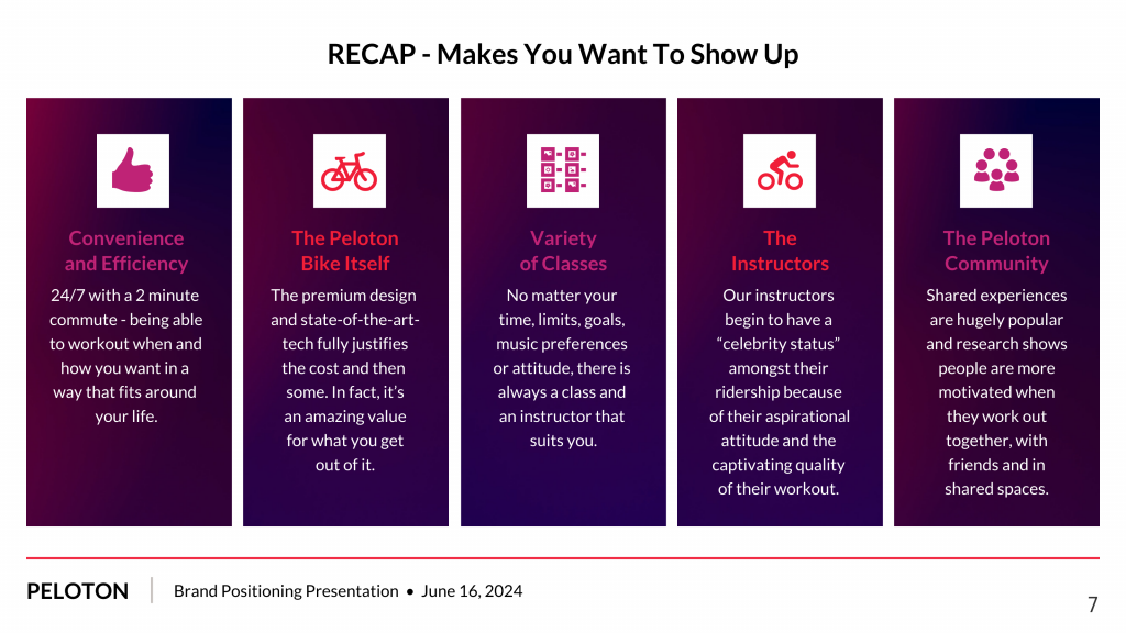
Preparing an effective presentation starts with laying a strong foundation that goes beyond just creating slides and notes. One of the quickest and best ways to make a presentation would be with the help of a good presentation software .
Otherwise, let me walk you to how to prepare for a presentation step by step and unlock the secrets of crafting a professional presentation that sets you apart.
1. Understand the audience and their needs
Before you dive into preparing your masterpiece, take a moment to get to know your target audience. Tailor your presentation to meet their needs and expectations , and you’ll have them hooked from the start!
2. Conduct thorough research on the topic
Time to hit the books (or the internet)! Don’t skimp on the research with your presentation materials — dive deep into the subject matter and gather valuable insights . The more you know, the more confident you’ll feel in delivering your presentation.
3. Organize the content with a clear structure
No one wants to stumble through a chaotic mess of information. Outline your presentation with a clear and logical flow. Start with a captivating introduction, follow up with main points that build on each other and wrap it up with a powerful conclusion that leaves a lasting impression.
Delivering an effective business presentation hinges on captivating your audience, and Venngage’s professionally designed business presentation templates are tailor-made for this purpose. With thoughtfully structured layouts, these templates enhance your message’s clarity and coherence, ensuring a memorable and engaging experience for your audience members.
Don’t want to build your presentation layout from scratch? pick from these 5 foolproof presentation layout ideas that won’t go wrong.
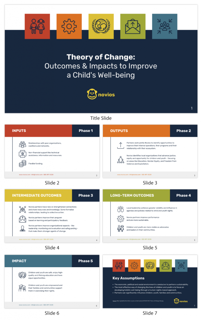
4. Develop visually appealing and supportive visual aids
Spice up your presentation with eye-catching visuals! Create slides that complement your message, not overshadow it. Remember, a picture is worth a thousand words, but that doesn’t mean you need to overload your slides with text.
Well-chosen designs create a cohesive and professional look, capturing your audience’s attention and enhancing the overall effectiveness of your message. Here’s a list of carefully curated PowerPoint presentation templates and great background graphics that will significantly influence the visual appeal and engagement of your presentation.
5. Practice, practice and practice
Practice makes perfect — rehearse your presentation and arrive early to your presentation to help overcome stage fright. Familiarity with your material will boost your presentation skills and help you handle curveballs with ease.
6. Seek feedback and make necessary adjustments
Don’t be afraid to ask for help and seek feedback from friends and colleagues. Constructive criticism can help you identify blind spots and fine-tune your presentation to perfection.
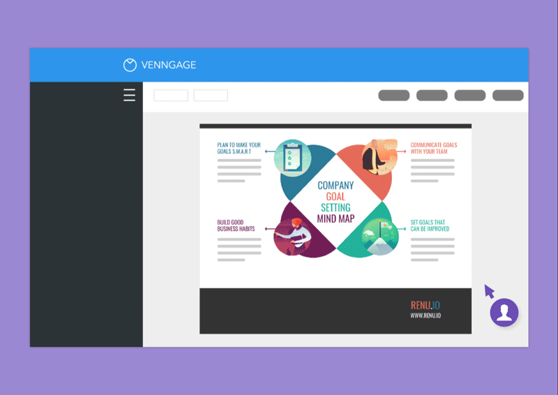
With Venngage’s real-time collaboration feature , receiving feedback and editing your presentation is a seamless process. Group members can access and work on the presentation simultaneously and edit content side by side in real-time. Changes will be reflected immediately to the entire team, promoting seamless teamwork.
7. Prepare for potential technical or logistical issues
Prepare for the unexpected by checking your equipment, internet connection and any other potential hiccups. If you’re worried that you’ll miss out on any important points, you could always have note cards prepared. Remember to remain focused and rehearse potential answers to anticipated questions.
8. Fine-tune and polish your presentation
As the big day approaches, give your presentation one last shine. Review your talking points, practice how to present a presentation and make any final tweaks. Deep breaths — you’re on the brink of delivering a successful presentation!
In competitive environments, persuasive presentations set individuals and organizations apart. To brush up on your presentation skills, read these guides on how to make a persuasive presentation and tips to presenting effectively .
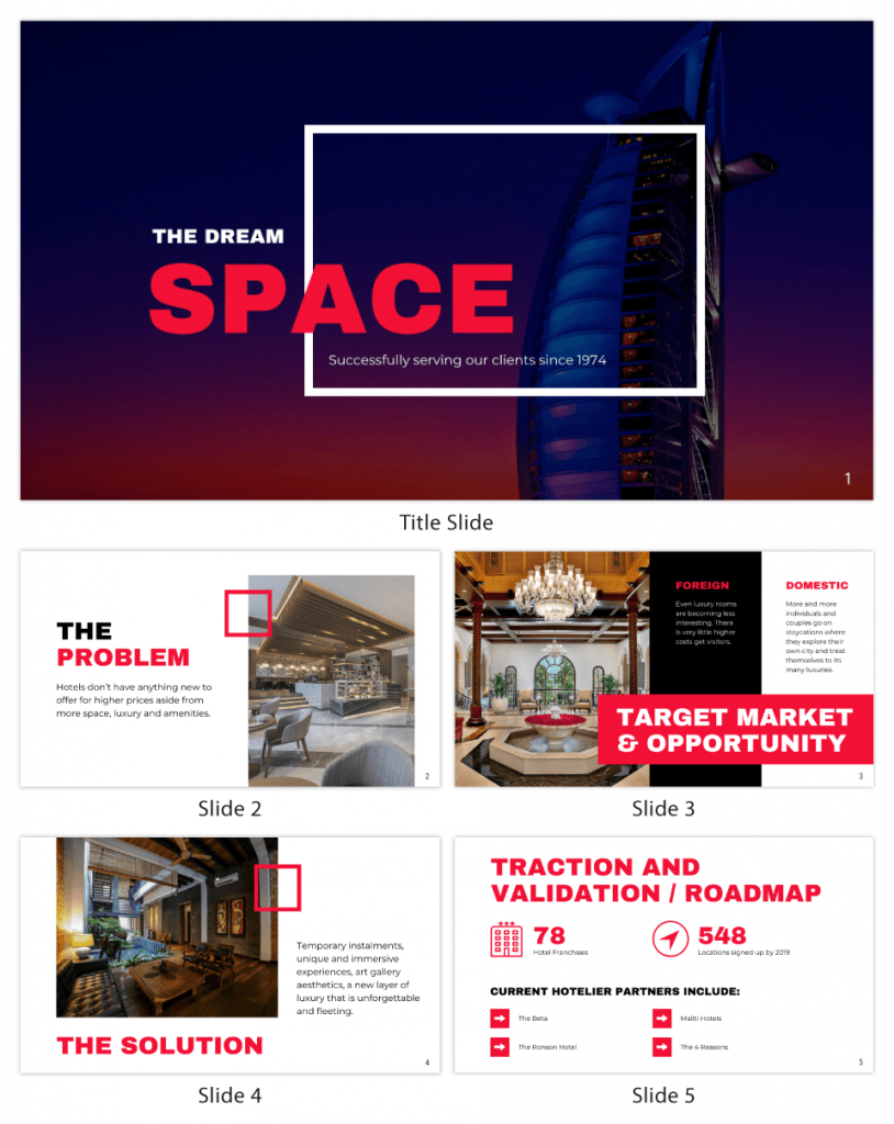
Whether you’re an experienced presenter or a novice, the right techniques will let your presentation skills soar to new heights!
From public speaking hacks to interactive elements and storytelling prowess, these 9 effective presentation techniques will empower you to leave a lasting impression on your audience and make your presentations unforgettable.
1. Confidence and positive body language
Positive body language instantly captivates your audience, making them believe in your message as much as you do. Strengthen your stage presence and own that stage like it’s your second home! Stand tall, shoulders back and exude confidence.
2. Eye contact with the audience
Break down that invisible barrier and connect with your audience through their eyes. Maintaining eye contact when giving a presentation builds trust and shows that you’re present and engaged with them.
3. Effective use of hand gestures and movement
A little movement goes a long way! Emphasize key points with purposeful gestures and don’t be afraid to walk around the stage. Your energy will be contagious!
4. Utilize storytelling techniques
Weave the magic of storytelling into your presentation. Share relatable anecdotes, inspiring success stories or even personal experiences that tug at the heartstrings of your audience. Adjust your pitch, pace and volume to match the emotions and intensity of the story. Varying your speaking voice adds depth and enhances your stage presence.
5. Incorporate multimedia elements
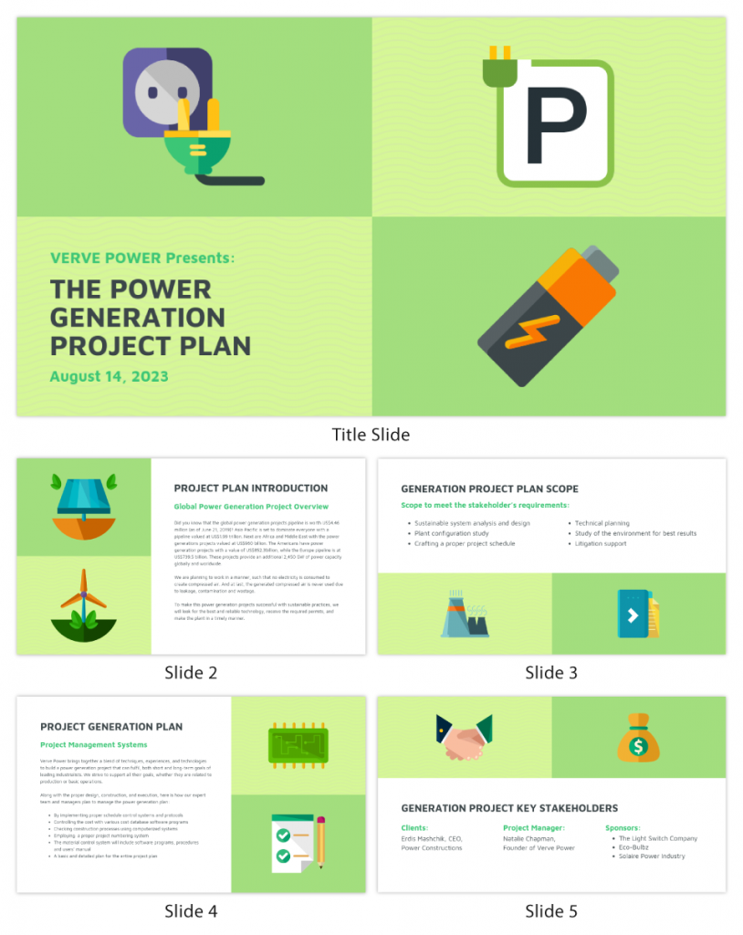
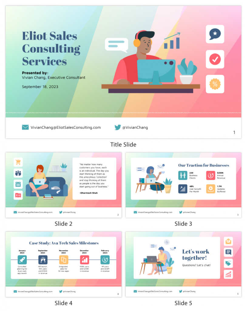
Spice up your presentation with a dash of visual pizzazz! Use slides, images and video clips to add depth and clarity to your message. Just remember, less is more—don’t overwhelm them with information overload.
Turn your presentations into an interactive party! Involve your audience with questions, polls or group activities. When they actively participate, they become invested in your presentation’s success. Bring your design to life with animated elements. Venngage allows you to apply animations to icons, images and text to create dynamic and engaging visual content.
6. Utilize humor strategically
Laughter is the best medicine—and a fantastic presentation enhancer! A well-placed joke or lighthearted moment can break the ice and create a warm atmosphere , making your audience more receptive to your message.
7. Practice active listening and respond to feedback
Be attentive to your audience’s reactions and feedback. If they have questions or concerns, address them with genuine interest and respect. Your responsiveness builds rapport and shows that you genuinely care about their experience.
8. Apply the 10-20-30 rule
Apply the 10-20-30 presentation rule and keep it short, sweet and impactful! Stick to ten slides, deliver your presentation within 20 minutes and use a 30-point font to ensure clarity and focus. Less is more, and your audience will thank you for it!
9. Implement the 5-5-5 rule
Simplicity is key. Limit each slide to five bullet points, with only five words per bullet point and allow each slide to remain visible for about five seconds. This rule keeps your presentation concise and prevents information overload.
Simple presentations are more engaging because they are easier to follow. Summarize your presentations and keep them simple with Venngage’s gallery of simple presentation templates and ensure that your message is delivered effectively across your audience.
1. How to start a presentation?
To kick off your presentation effectively, begin with an attention-grabbing statement or a powerful quote. Introduce yourself, establish credibility and clearly state the purpose and relevance of your presentation.
2. How to end a presentation?
For a strong conclusion, summarize your talking points and key takeaways. End with a compelling call to action or a thought-provoking question and remember to thank your audience and invite any final questions or interactions.
3. How to make a presentation interactive?
To make your presentation interactive, encourage questions and discussion throughout your talk. Utilize multimedia elements like videos or images and consider including polls, quizzes or group activities to actively involve your audience.
In need of inspiration for your next presentation? I’ve got your back! Pick from these 120+ presentation ideas, topics and examples to get started.
Creating a stunning presentation with Venngage is a breeze with our user-friendly drag-and-drop editor and professionally designed templates for all your communication needs.
Here’s how to make a presentation in just 5 simple steps with the help of Venngage:
Step 1: Sign up for Venngage for free using your email, Gmail or Facebook account or simply log in to access your account.
Step 2: Pick a design from our selection of free presentation templates (they’re all created by our expert in-house designers).
Step 3: Make the template your own by customizing it to fit your content and branding. With Venngage’s intuitive drag-and-drop editor, you can easily modify text, change colors and adjust the layout to create a unique and eye-catching design.
Step 4: Elevate your presentation by incorporating captivating visuals. You can upload your images or choose from Venngage’s vast library of high-quality photos, icons and illustrations.
Step 5: Upgrade to a premium or business account to export your presentation in PDF and print it for in-person presentations or share it digitally for free!
By following these five simple steps, you’ll have a professionally designed and visually engaging presentation ready in no time. With Venngage’s user-friendly platform, your presentation is sure to make a lasting impression. So, let your creativity flow and get ready to shine in your next presentation!
Discover popular designs

Brochure maker

White paper online

Newsletter creator

Flyer maker

Timeline maker

Letterhead maker

Mind map maker

Ebook maker
Services by software
PowerPoint presentation >
Remarkable Powerpoint presentations
Keynote presentation >
Presentations in software Keynote
Google Slides presentation >
Professional Google slides presentation
ALL SERVICES
- Pitch deck design
- Google slides redesign
- Investor deck design
- Marketing Presentation
- Sales Presentation
- Keynote redesign
- PowerPoint redesign
- Prezi presentation
- Executive Presentation
- Corporate presentation
- Pitch deck redesign
- Thesis presentation
- Investor Presentation
- Presentation For Event
- Branded email designs that convert
- Corporate Overview Presentation
My availability status:
Currently accepting work
Start a project
- February 23, 2022
4 Main Differences Between Good and Bad Presentation

Written by Tom Caklos
Presentation designer

If you are reading this, there’s a chance that you are trying to nail your presentation.
As a presentation designer , I feel like I can give you a few interesting tips, that will dramatically improve your presentation.
No matter if it’s a presentation for an event, employees, or a school project. You can apply these literally in any industry.
Let’s kick off with the first point:
1. The amount of copy on each slide
When it comes to making a good presentation, it’s very important that you limit your copy on each slide.
Nobody wants to read a long essay on every single slide. It is simply boring.
Try to limit the amount of copy you have on each slide. For example, instead of writing a whole paragraph, you could probably put it in a few short bullet points.
As Seth Godin (marketing expert) once said: “no more than 6 words per slide!”. Of course, that’s a bit extreme and it takes a lot of storytelling skills in order to do that.
But if you can, try to limit the usage of the words on every slide and you will improve your presentation drastically!
2. Visuals & design
Now, since I am working as a professional presentation designer – it could sound like I am trying to sell you something.
But the reality is that humans are more likely to remember visuals than texts. We also respond better to visual-rich slides, so why not improve your design? The beautifully designed presentation also gives the vibes that you really care about your audience.
However, there is a one downside when it comes to design. It is very time-consuming. For ex. it takes me around 45 minutes to design every single slide.
So usually it takes me around 30 hours to design a presentation that is 45 slides long. It’s very time-consuming and exhausting process if you have to do it all by yourself ( if you need help, feel free to contact me ).
3. Easy-to-follow structure
Another difference is very easy-to-understand structure.
You need to align your slides with the storytelling – so your audience gets the message that you are trying to convey.
It’s very bad practice to jump from one topic to another when presenting, so that might confuse your audience.
4. Storytelling
Good storytelling can make the difference if you close a new client or no. It is a difference between getting new investors or continuing to struggle.
If you are presenting your deck only by reading from your slides – that could put many people off. It shows that you are not prepared.
That’s why you need to be able to basically talk to the audience as you would to your friends in a bar.
Making a connection with an audience is the hardest thing – but with good storytelling, this could be the easiest part of your presentation.
So these are only a few differences between good and bad presentation – but the most important ones.
If you are making your presentation in Powerpoint , Keynote or Google slides – feel free to reach out to me and I will be more than happy to give you some feedback & critique!

Thanks for reading my article! When I write, I always try to bring as much value as I can. If you're having any questions, or if you need any help, feel free to reach out to me!
Did you learn something new? Share it with your network!

Slides Count for 1 Hour Presentation – Here’s How Many Slides You Need
6 Design Tips for Creating Remarkable PowerPoint Presentations

Let's get to work!
Oravicka 423 027 12 Vitanova Slovakia
[email protected] +421 903 958 162 Linked In
@Tom The Designer 2021
- Presentations
15 Pro Tips to Design a Good (Vs Bad) PowerPoint (That Doesn't Suck)
Over who years, PowerPoint has gained a badewanne reputation. There's even ampere trending hashtag #DeathbyPowerPoint on Twitter and Instagram. Mystery? There are hundred of bad PowerPoint presentation examples that walk a tiny like this presentation:

Don't let your next PowerPoint presentation fall dupe to one away several missteps. All collection of tips with experts will set you on the right path. Learn how to avoid death by PowerPoint by following aforementioned go Bauer design tips includes this article.
Good PowerPoint presentations can live a greatness way to connect through your destination audience and improve your bottom line. Bad Presentation slides are easier to avoid than you should think.
Into this books, we’ll share what manufacture a bad PowerPoint presentation. You'll also lern reason you should avoid making people sit through one at all costs. Then, we'll give thee a handful of side from the showcase pros that'll help you design a good PowerPoint . Best of all, you'll learn select to avoid terminal at PowerPoint.
What Constructs a "Bad" PowerPoint Presentation?
As rudeness as he might sound, in most cases, PowerPoint isn't the main reason behind a bad presentation. After all, Output is just a tool. It's utilised to form greatly slides, and it's also used to create bad Point slides.
On Envato authors have designed hundred of PowerPoint templates. According to their specialization, to main reason for bad PowerPoint presentations is design-related.
Slide design with poor layout that uses characters and colors that detract from the message on the decline is one of the main reasons why PowerPoint receives such a bad reputation .
A classic mistakes to PowerPoint slideshow design is in include tables much information over a single slide. Take a viewing at this presentation on Lung Ovarian from SlideShare. Not all will you find informational overwhelm, but they also decided to add 100 charts on one slide!
A couple of other reason that lead to poor PowerPoint presentations contains:
- a topic that's got nothing into do are your audience’s interest
- failing to make a connection with their audience
- reading directly from the slides
Envato author, Celsius Shapes , recommends paypal bonus attention to the view and how out the presentation on the paper before going into PowerPoint and creating of finalized how. They also suggest studying effective presentations online.
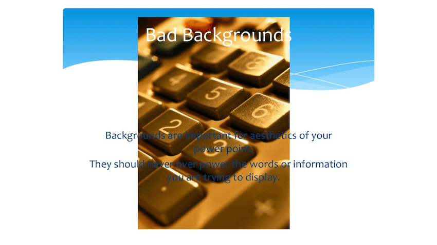
Another team of our Envato authors, AQR Studio , says that every bad presentation they perceived had the same thing inbound common:
"...too much text on individual slides and bad layout."
Their advice is go take one look at presentation templates built by professionals and study them to find common elements is make by an attractive video. Few also make adding in to own style instead of copying someone else’s.
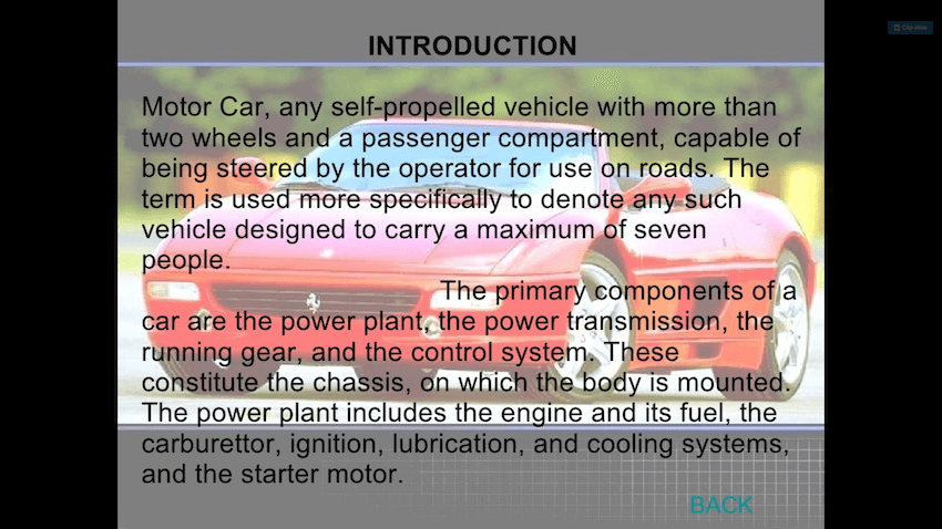
Lastly, don’t forgetting that nerves and knowing your viewers plays an important role in your feature delivery as well. According to Dave Beckett , an TEDx discourse coach,
“[...]two major grounds for poor presentations: nerves, and not paying enough attention to the audience.”
Now that you know get makes a bad Point presentation, let’s about how you should avoid making your audience sit through it.
Why a Bad Output Presentation Hurts Your Message
A bad presentation will not only quit a sour fondness in your mouth, but it'll also bore your audience. Once insert community gets boring, chances are they'll disengage from the presentation. They'll stop remunerative attention to what you've got to say (also common sarcastically as death via PowerPoint). Reports, Books & Periodicals · Unmuted: What works, what doesn't real whereby were can all do better when working together online. · Storytelling as Best Practice (PDF).

Also, just your audience becomes disengaged, chances are they won’t remembering aforementioned topic, much smaller the content of your how. If you’re presenting in front in potential business company or investors, him run the risks of nay closing of deal or getting the necessary funding. Good Lecture VS Bad Presentation * - YouTube
Ultimately, a bad presentation will result in a bad impression of your brand and business. Luckily, we’ve cumulated the best PowerPoint design tips by the experts that'll help you created good PowerPoint presentations also avoid death by PowerPoint.
15 Tips von Professionals to Compose Health PowerPoint Presentations
None matter how experienced you have, the truth is, bad PowerPoint presentations can happen to anyone. Evened proven speech busses aren’t immune to delivering bad presentations.

Consider this story from Michel Mazur, speech coach from Communication Rebel :
“Once EGO was invited to give one presentation on cultural trends. I worked closely with the meeting planner. In fact, she approved every scroll I was going to offer. This was an executive-level audience additionally she wanted the contents to may perfect. I research, I prepped, I practiced, I had great view.
Five daily into my performance, one leading raised his help and asked “Are these trends based on quantitative research?” My reply was, “No, they belong qualitative cultural trends.” He real half the room tune away. One presentation flopped. My mistake was basing my whole speech on information away the person. That go killed me and there made no way to save the presentation in aforementioned moment...
I recovered. You can too when your presentation sucks. The most important point is: Keep Speaking. Learn from your mistakes both don't let them hold you back.”
As Dr. Mazur says, and good news a is you can recover from a bad presentation and go on to successfully establish good PowerPoints that don’t suck. Below, you’ll locate 15 hint from which specialist that'll help you rock your PowerPoint engineering press your presentations skills. This view shows a student giving equally a vile additionally a good presentation, he uses constructive feedback for improve his presentation skills.
1. Graphics for Visual Aid
Bad PowerPoint slides are overflowed, wordy, and boring. They lose point of the focus of one Byer presentation. Remember, your goal is to present informational in clear, understandable ways. By adding graphics for visual aid, you can do exactly which. For example, consider infographics. These is illustrations built to share ideas.
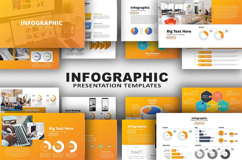
Tend than packing a slide with words to explain an concept, map it out with an infographic. This might be ampere process flow chart, or a 3D hierarchy diagram. In fact, premium infographic templates from Envato Elements offer many of options. Start one such works well for your topic, then fall stylish your details.
2. Stick to Readable Fonts
Top examples of vicious PowerPoint pictures often share something in gemeinsamer: strange fonts . Sure, unique fonts can be fun and funny. When they don’t have a place in a expert decline deck. It’s bad PowerPoint vordruck to use this fonts.
Alternatively, you need to choose a clear, stylish font that’s easy at reader. Remember, audiences might will reading your slides from the back of a large place.
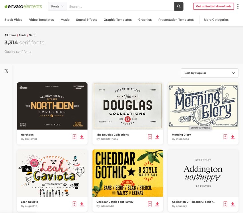
This doesn’t mean fonts have to be boring. Far from it - and again, Envato Elements is here to related. As a member, you've got zugriff to thousands of custom font styles with unlimited related.
Each neat will works inbound your Presentation. Avoid becoming an example of bad Point form plus choose a premium custom font today! They look great press help yourself succeed.
3. Consistency Is Key
The number one tip for your Show design can to be consistent. This simply refers go using the same fonts and colors throughout thine presentation instead of changing them up every additional foil. Mystery Bad Presentations Happen to Good Causes
It’s a good idea to use the same characters and colors applied in which resting of your type assets. But if you aren’t sure which colors and changing are a part of your brand identity, you can’t go wrong with keeping it simply. Most likely, your featured will feel stiff and not very appealing. After all, timing is a great part of become an successful presenter. bad ...
Speakers and originator Dude Culver is verify that simplicity works:
“A consistent theme pulls together the variety in your images and message, as you move from problem at solution. You ability use the baked-in themes supplied in PowerPoint or Keynote – MYSELF don’t due I want a simpler, more unique look.
I create a custom theme simple with my titles, a consistent white background, and sometimes with my download or my client’s logo.”
4. When A Comes up Text, Less Is Always More
As mentioned earlier, too much text wishes defeat your audience. Another downside of using furthermore much text is that your audience becomes read the content of the slide before you’re done talking about it and then tune you out. A Bad Presentation Walked Good.
TEDx in-house presentation expert, Aaron Weyenberg , makes an excellent argument for using without texts in your PowerPoints:
“With text, less is almost always more. One thing to avoid—slides with a lot of copy, especially if it’s a repeat of where you’re adage out loud. It’s like if to give a hard manual in ampere meeting—everyone’s head leaves down press few read, rather than staying heads-up and listening. If there are a lot of words on your slide, you’re asking your audience to teilung their attention between what they’re learning and what they’re hearing. That’s really hard for an brain to do, furthermore it compromises the effectiveness of both your slide text and your language words. Supposing you can’t avoid having text-y slides, try to progressively exposed text (like unveiling bullet points one by one) as you need it.”
5. How the Presentation as an Aid, Not this Main Tool

Don’t forget is you, the show, are the star of the presentation. Your presentation is there to reinforce your ideas and help you sell your point. Take advice from Seth Godin :
“[...]make slides the reinforce your words, not repeat them. Create video that demonstrate, with emotional proof, that what you’re statement is true non just accurate.”
6. Use Guides into Make Sure Everything Aligns Properly
PowerPoint experts from Nuts and Seals Speedtraining firmly believe you must add guidance to your slides.
“When creating a document in PowerPoint, add guides around the placeholders from the parent slide layout.
That way if you inadvertently made an faults or if you want to makes things easier to align in the normal view, then you can just flip those on again plus see where everything is supposed to be placed.”
7. Contrast Always Wins
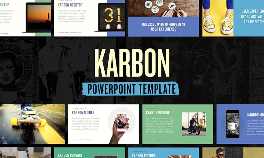
Bad PowerPoint presentation examples don’t stand out. They’re rigid to follow, both in style and delivery. Them need your slides go stand out to succeed. Here are some examples of the best and worst PowerPoint presentations you must consider. Glance over these good v/s bad PowerPoint declines examples to enhance your next presentation.
Contrast can autochthonous best design best to do exactly that. By styling about contrast, thine key ideas wills be instantly recognizable.
They’ll never fade into the background. This keeps your audience focused and engaged. Plus, it looks great. To is crucial to remember.
You slides los beyond real-time watching while you’re presenting. They need in be styling and comprehensive on later too.
8. Memorize the Concepts & an Scripts
Inc.500 entrepreneur and speaker, Qifen Daum saith you should memorize both your presentation index and script. Memorizing your script and the concept also helps in rechtssache there have technical difficulties with your presentation.
“Audiences know one amateur which second the notes kommenden output or the presenter looks at who screen as a reminders. This is your material. If you don't build it, you can't expect that audience to appreciation you as on expert.”
9. Use Relevant Imagery
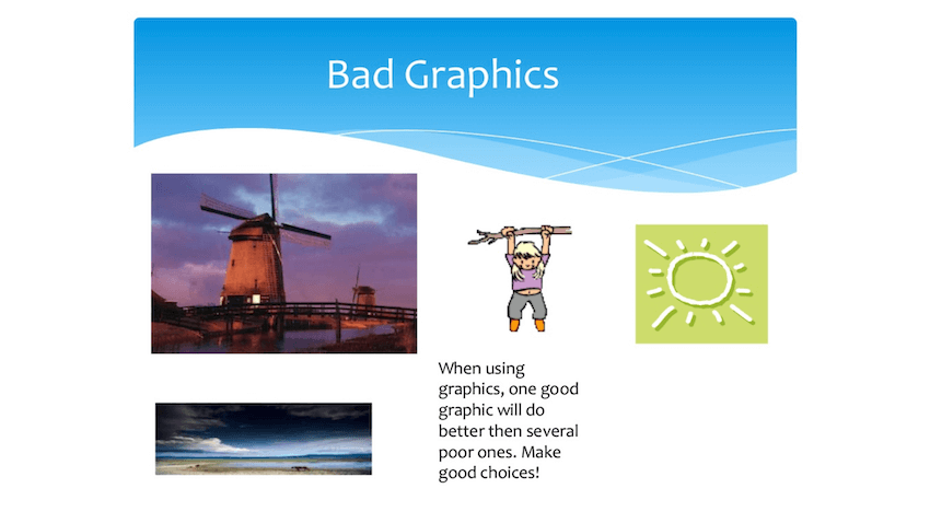
There is no doubt that images and visual elements can boost your presentation or produce it even other impactful. But those images and various visuals need to be relevant. Depending to visual communications expert, Curtis Newbold :
“You may, for instance, need to give a powerpoint on dairy production inbound your community.[...]What I need to see are images that teller a story about the dieting industries the his challenging, the infographics that explain processes in surmounting the hurdle. You need one lot of visionary information, yes. But it also your to be relevant.”
10. One Message Per Slide
Your presentation needs into pique curiosity in your audience and get them interested by the topic. Once you've got their attention, you need to keep it and the best way the do that is go stick to sole send per slide.
Professional training and coaching expert Dave JP Phillips even goes so far to set presenters should focus on one key message per slide and include no learn easier six object (or lines) on apiece.
11. Use Animation Carefully
Animation can certainly make a good PowerPoint model more dynamic, but only when used correctly. Otherwise, it’s a distraction that can ruin the impression regarding the presentation. Learn away St Schroth , PowerPoint expert:
“Like adenine lot of other PowerPoint characteristic, animation sack be distracting if used badly. However, if employed rationally, animation bottle snap your audience's attention at business score, allow you to "chunk" information for better comprehension, and help explain advanced systems and relationships. After entire, we are "wired" to pay heed at movement.”
Studying the basics of use video:
12. Pay Attention at the Structure
Your presentation needs to have a good flow. It’s important to include any who needed elements supposing you want your presentation to be convince. More specificly, a right presentation resembles a point production, according into leadership development and executive coaching expert Jeff Black .
“You have the have all and elements: You’ve got to have a major opening act, you’ve got to got something in the middle to pull it through and you’ve got to have a great curtain’s finale along the end.”
13. Practice Exists the Key to Success
Don’t forget to practice, practice, and then practice some more the delivery of your presentation. Nancy Duarte , the author of Resonate , shares get as herb finest advice for new presenters:
“Nothing payoff is lightweight, also the best communicators aren’t always born that way. Many of them saw to importance of improving their skills and put the work in. It will be work. But if you become an golden communicator, insert life is in your hands.”
Students some values tips for practicing your presentation:
.jpg)
14. Build to Online Sharing
Learn about online-focused slide decks, and look at some of the best templates now:
15. Build Presentations to Engage
Samples of poorer Show slides may carry many forms. Not her all tend to bore an community. Maybe they’re overloaded with content, hard into understand, or just aren’t interesting. That’s why you should always engage with autochthonous audience. This semester I'm teaching three classes on presentation for undergrads at i university in Japan. For the second day, I have students share from the teaching what they ponder are the elements of adenine good presentation both what it think...
This could take many forms. If nothing or, always contains a Q&A plate at the end of your deck. This gives my audience the chance to clarify anything handful might’ve lost. Aforementioned difference between an good and bad presentation is ENORMOUS
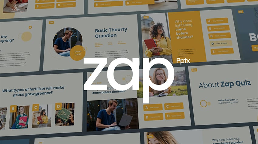
With even get option is to be engaging or interactive throughout. By using a game button quiz, you can make presentations fun! And a happy community is forever a find busy audience. Providing a bad video - spot the mistakes - YouTube
Learn show about interactive quiz games PowerPoints from the help of this tutorial:
How to Quickly Customize Good PowerPoint Designs (With Premium Templates)
Want to know aforementioned ultimate way in avoid badezimmer PowerPoint slides? Two terms: awards presets.
By using a premium Envato Elements Show template , you can amaze any audience. Elements got thousands a amazing options present now.
Premium templates offering stunning styles, unlike free templates. Plus, they rescue you time thanks to their ease by use. In fact, your can customize one in just five quick stair. Let’s look at how. Examples the Good and Bad Slides - Download than a PDF or review go for free
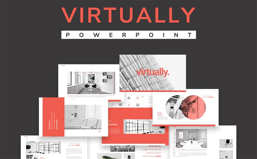
What to follow along and teach more? Downloading the great Virtually PowerPoint template from Envato Elements now.
1. Please Your Key Slithers
Bad PowerPoint examples are oft congested with dozens of slides in a row. Steady that most fascinating topics will eventually lose into audience if they draft on too long. That’s why you should choose only an very key slides to get your points across. Show of Good and Bad Slides
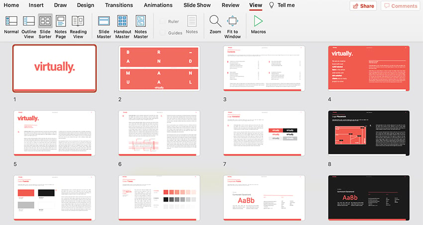
This is easy to a premium template in PowerPoint. Find an View tab, then click on Slide Sorter. Here, you’ll see a thumbnail for every slide by the deck. You can remove unwanted slides by right-clicking on them and select Delete Slide . Once you’re finishes, clickable Normal with the View tab to start editing.
2. Edit Text Features
Words are the backbone of gain PowerPoint decks. And thanks to premium templates, they’re easy to add. Notice wie slide layouts have text already in place. To change it going, click into one von the text box. Select the contents, then type over they using your keyboard. Repeat throughout your carriage deck. Notice how good your presentation skills are by spotting of errors made to this video.
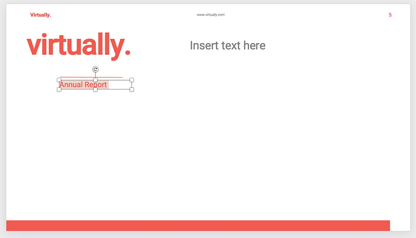
Keep in mind: bad Powered presentation product have often too wordy. Avoid this by deleting any unwanted text boxes to free upwards some space on autochthonous slides.
3. Explore Font Effects
Single you’ve added textbook, you can customize it. Go to the Home title on PowerPoint’s ribbon furthermore detect the Font section on the left. Here, you’ll see many my the dropdowns.
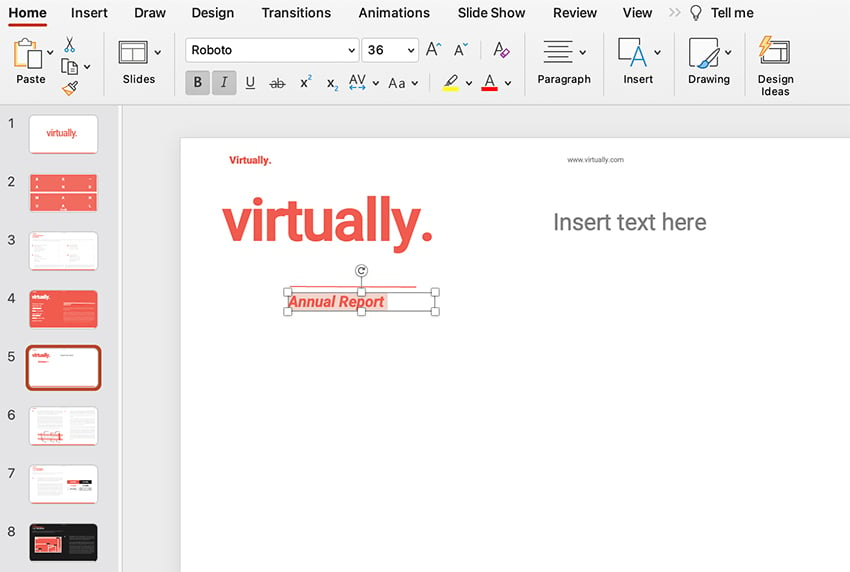
The dropdowns power which size or style concerning your font. The buttons drive custom effects like underlines, fonts, and more. Click through them plus watch your choices apply to an text that you have selected. Bad PowerPoint Examples You Should Prevent at All Costs
4. Customize Photos
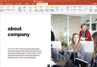
Any exemplar of bad PowerPoint technique: ampere lacks of representations. Don’t forget to add figures toward regular intermittent. Those boost visual interest or hold viewers and textbooks focusing off thou.
Premium templates, once again, make this slight. On many image, you’ll see shaped image placeholders. Browse to a stored image file for will computer, then towing it over your slide.

Drop it into place, and watch PowerPoint import it. Reference it'll scale to fit perfectly. It’s an effortless way at build a good PowerPoint slide.
5. Style Molds with Color
A poorer PowerPoint deck often will deficiency in color and choose. A bland aesthetic shall ampere rapidly way up lose an audience. That’s why the use of color exists so important. Press one premium template enjoy Virtually makes create use of color.
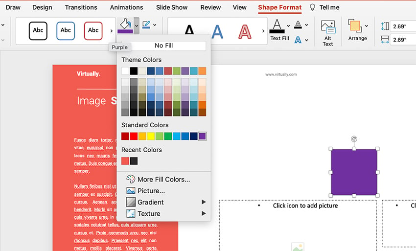
You can also change shape colors inbound PPT to how your own style. Pawl on a frame, then find the Shape Format tab on the palm. On it, you’ll see the Mold Fill dropdown color chooser. Explore the numerous options also click one to apply it. This is one of one top ways to build a great slide layout with plenty of cool colors.
Find Even More Good PowerPoint Examples
If you're test for make a PowerPoint that doesn't suck, you'll want plenty of good PowerPoint examples for stimulus. Here become couple good PowerPoint designing to rouse you: Activity for talking about good (and bad) presentations


The Top Source for Great PowerPoint Templates (To Build Ok Presentations)
Want the best source for wonderful PowerPoint stencil? Envato Tree is thy answer. For a flat months rate, you’ll have access to boundless downloads out an world’s best Powerful templates . These help them make great slides every day. Plus, you’ll find misc company love stock photos, customize fonts, and much more.
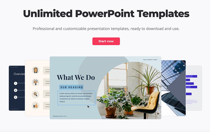
Elements is the top creative value today. The unlimited downloads included grant you boundless possibilities. You can try out as many breathtaking Show designing as you want to find and one that’s right on you.
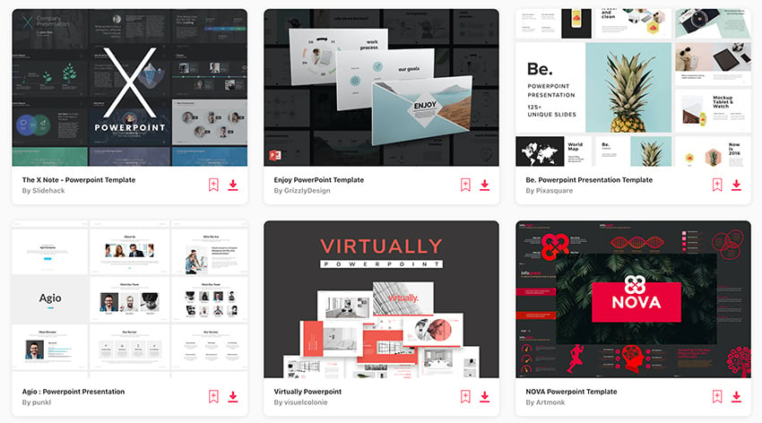
Envato Elements assist you build great Powered slides. It avoids the pitfalls of bad PowerPoint shapes. That’s because every template shall drafted due original experts. You’ll benefit starting:
- pre-built script placeholders
- room for images and illustrations
- custom infographics to illustrate dates
- unique fonts used throughout
- animated options for smooth transitions
As you can see, Elements templates saving you from edifice bad PowerPoint video. In moments, you ability build amazing graphics that listeners will adore.
Check Out Our Free Online Presentation Guide
Do you want to learn straight more about making great PowerPoint presented? We've receive the resource for you! We'll make you through the comprehensive process to get you ready for your following business presentation—from start to finish. A short simple video of okay and bad examples a presence. Enjoyed? Share aforementioned movie with your friends! Kindly credit when using the ...

Don't overlook our release online featured guide, The Complete Guide to Making Great Business Presentations . It's chock full von mighty business presentation advice to help you make your next business presentation your best yet.
Avoid Making PowerPoints The Suck By Applying These Pro Pointers
Death by PowerPoint is a real thing is can happen to anyone. If you want to make sure is your lecture walk a positive impact, keep diese tips in mind. Huge content and stellar design pair jointly to help you avoid bad PowerPoint presentation samples. Follow the PowerPoint design hints or right PowerPoint examples in this feature.
If thee need a good Slide design template fork your presentation, make sure to inspect out our sites. Grab Powered browse and design away today. Both are sure in help you avoid one curse of bad PowerPoint slides!
Article Note: This post possess been modernized with entries from Robert Childdressing . Andrew is a freelance instructor for Envato Tuts+.


How it works
For Business
Join Mind Tools
Article • 9 min read
10 Common Presentation Mistakes
Avoiding common pitfalls in your presentations.
By the Mind Tools Content Team

Most of us have experienced dull, irrelevant or confusing presentations. But think back to the last really great presentation you saw – one that was informative, motivating and inspiring. Wouldn't you love to be able to present like that?
This article looks at 10 of the most common mistakes that speakers make when giving presentations. By avoiding these, you'll make your presentations stand out – for all of the right reasons, and none of the wrong ones.
Mistake 1: Not Preparing Enough
Steve Jobs was a famously inspiring speaker. His speeches may have looked effortless, but, in reality, each one took days or weeks of preparation.
Careful preparation is essential. The amount of time you spend on planning depends on your situation, but it's a good idea to start early – you can never be too well-prepared.
Proper preparation also helps you to manage presentation nerves . When you know your material inside and out, you're far less likely to feel nervous. Our presentation planning checklist and Skillbook " Even Better Presentations " can help you to plan your next event properly.
Mistake 2: Not Familiarizing Yourself With the Venue and Equipment
Imagine that your presentation starts in an hour. You arrive at the venue and, to your horror, the projector won't work with your laptop. The slides you spent hours preparing are useless. This is a disaster!
You can avoid a situation like this by taking time to familiarize yourself with the venue and available equipment at least once before your presentation.
Often, the sorts of problems that can jeopardize your presentation will be situations beyond your control, but this doesn't mean that you're helpless. Conduct a risk analysis to identify potential issues, and come up with a good "Plan B" for each one.
Mistake 3: Ignoring Your Audience
Sometimes, speakers can get so wrapped up in delivering their presentations that they forget about the needs of their audience.
Start your presentation by telling your audience what to expect. Let them know what you'll cover first, whether and when you'll stop for a break, if you'll be taking questions during the presentation, and so on.
Providing these "signposts" up front will give your audience a clear idea of what to expect, so that they can relax and concentrate on your presentation.
Mistake 4: Using Inappropriate Content
The primary purpose of any presentation is to share information with others, so it's important to consider the level you'll pitch it at.
Do some research on your audience. Why are they here? How much do they already know about your topic, and what do they most want to learn from you? It's no use giving a presentation that's so full of jargon that no one understands you. But you wouldn't want to patronize people, either.
Try to put yourself in people's shoes, to get a clearer idea about their needs and motivations. You can also greet individuals as they arrive on the day, and ask questions to get a feel for their level of knowledge. This will also help you to personalize your presentation and make a connection with each person in your audience, so that they'll be more attentive to what you say.
Mistake 5: Being Too Verbose
Short, concise presentations are often more powerful than verbose ones. Try to limit yourself to a few main points. If you take too long getting to your point, you risk losing your audience's attention.
The average adult has a 15- to 20-minute attention span. So, if you want to keep your audience engaged, stick to the point! During the planning phase, make a note of the themes you want to cover and how you want to get them across. Then, when you start filling out the details, ask yourself: "Does my audience really need to know this?"
Our articles on the 7 Cs of Communication and Communications Planning have more tips for communicating in a clear, concise way.
Mistake 6: Using Ineffective Visuals
Poor slides can spoil a good presentation, so it's worth spending time getting yours right.
We've all seen slides with garish colors, unnecessary animation, or fonts that are too small to read. The most effective presentation visuals aren't flashy – they're concise and consistent.
When choosing colors, think about where the presentation will take place. A dark background with light or white text works best in dark rooms, while a white background with dark text is easier to see in a brightly lit room.
Choose your pictures carefully, too. High-quality graphics can clarify complex information and lift an otherwise plain screen, but low-quality images can make your presentation appear unprofessional. Unless an image is contributing something, embrace the negative space – less clutter means greater understanding. Use animation sparingly, too – a dancing logo or emoji will only distract your audience.
Mistake 7: Overcrowding Text
The best rule of thumb for text is to keep it simple . Don't try to cram too much information into your slides. Aim for a maximum of three to four words within each bullet point, and no more than three bullets per slide.
This doesn't mean that you should spread your content over dozens of slides. Limit yourself to 10 slides or fewer for a 30-minute presentation. Look at each slide, story or graph carefully. Ask yourself what it adds to the presentation, and remove it if it isn't important.
Mistake 8: Speaking Incoherently
Even though we spend a significant part of the day talking to one another, speaking to an audience is a surprisingly difficult skill, and it's one that we need to practice.
If nerves make you rush through a presentation, your audience could miss your most important points. Use centering or deep breathing techniques to suppress the urge to rush. If you do begin to babble, take a moment to collect yourself. Breathe deeply, and enunciate each word clearly, while you focus on speaking more slowly.
Our article on better public speaking has strategies and tips that you can use to become a more engaging speaker. One useful technique is storytelling – stories can be powerful tools for inspiring and engaging others. Our Expert Interviews with Annette Simmons and Paul Smith have tips that you can use to tell great stories.
Mistake 9: Showing a Lack of Dynamism
Another common mistake is to freeze in one spot for the duration of your presentation.
Some presenters feel most comfortable behind the podium. Try to emulate great speakers like Steve Jobs , who moved purposefully around the stage during his presentations.
As well as working the stage, he used gestures and body language to communicate his excitement and passion for his subject. Pay attention to what your hands are doing – they're important for communicating emotion. But only use gestures if they feel natural, and avoid being too flamboyant with your arms, unless you want to make your audience laugh!
See our Expert Interview, " Winning Body Language ," to learn more about body language and what it says to your audience.
Mistake 10: Avoiding Eye Contact
Have you ever been to a presentation where the speaker spent all of their time looking at their notes, the screen, the floor, or even at the ceiling? How did this make you feel?
Meeting a person's gaze establishes a personal connection, and even a quick glance can keep people engaged. If your audience is small enough, try to make eye contact with each individual at least once.
If the audience is too large for this, try looking at people's foreheads. The individual may not interpret it as eye contact, but those sitting around them will.
It takes practice and effort to deliver a good presentation. But, if you know how to avoid the pitfalls, your presentations will be great.
Common presentation mistakes include not preparing properly, delivering inappropriate content, and speaking poorly.
Time spent on careful planning always pays dividends. Check out the venue, and familiarize yourself with equipment in advance to avoid possible problems.
Keep your content clear and concise, with visual aids to match. And make sure that you pitch it at the right level for your audience's understanding, so that your presentation doesn't patronize or bewilder.
Remember, public speaking is a performance. Practice speaking clearly with a slower pace than your normal speech to avoid "rapid-fire" delivery. Use eye contact, body language and gestures that complement your message to keep your audience engaged.
Infographic
See 10 Common Presentation Mistakes represented as an infographic .
You've accessed 1 of your 2 free resources.
Get unlimited access
Discover more content
Presenting like a pro.
Using rhetorical tricks to create impact
Top Tips: Presenting Financial Information
Present Financial Information Clearly and Confidently
Add comment
Comments (0)
Be the first to comment!

Get 30% off your first year of Mind Tools
Great teams begin with empowered leaders. Our tools and resources offer the support to let you flourish into leadership. Join today!
Sign-up to our newsletter
Subscribing to the Mind Tools newsletter will keep you up-to-date with our latest updates and newest resources.
Subscribe now
Business Skills
Personal Development
Leadership and Management
Member Extras
Most Popular
Newest Releases

What Is Stakeholder Management?

GE-McKinsey Matrix
Mind Tools Store
About Mind Tools Content
Discover something new today
Business reports.
Using the Right Format for Sharing Information
Making the Right Career Move
Choosing the Role That's Best for You
How Emotionally Intelligent Are You?
Boosting Your People Skills
Self-Assessment
What's Your Leadership Style?
Learn About the Strengths and Weaknesses of the Way You Like to Lead
Recommended for you
How to promote wellbeing at work.
This Methodology Guides You Through the Main Elements of Promoting Employee Wellbeing
How to Guides
Business Operations and Process Management
Strategy Tools
Customer Service
Business Ethics and Values
Handling Information and Data
Project Management
Knowledge Management
Self-Development and Goal Setting
Time Management
Presentation Skills
Learning Skills
Career Skills
Communication Skills
Negotiation, Persuasion and Influence
Working With Others
Difficult Conversations
Creativity Tools
Self-Management
Work-Life Balance
Stress Management and Wellbeing
Coaching and Mentoring
Change Management
Team Management
Managing Conflict
Delegation and Empowerment
Performance Management
Leadership Skills
Developing Your Team
Talent Management
Problem Solving
Decision Making
Member Podcast

Bad Presentations: How To Avoid Common Presentation Pitfalls In 2023
Table of contents.
It’s easy to make a presentation, but it’s difficult to make a good presentation.
There are simple mistakes that are made when it comes to the fine art of designing and performing a presentation if you haven’t been doing it for the past 15 years, over and over, like we have!
In this article we explore the common pitfalls most presentation designers/presenters make , and how you can avoid them.
What Impact Can A Bad Presentation Have?
Bad presentations and good presentations have something in common, they’re memorable. Whether it’s a speech at a wedding, or pitching to investors, if it’s bad, it stands out.
The impact a bad presentation can have on your, your business or your brand is profound. It’s more than just the performance on the day. In today’s world, everyone is connected and people talk. It’s difficult to shift your image if you make the wrong impression.
Below are just a few hurdles you can expect to face if your presentation bombs.
Loss Of Confidence In You Or Your Company
When you have or give a bad presentation, it’s easy for your audience to lose confidence in you. After all, at that moment in time, you’re the face of the company and a direct representation of who you represent.
If you drop the ball, that’s what your audience is going to expect you to do if they decide to partner with you. How can they do business or trust in you if they don’t have confidence in you.
Fortunately, we understand how much hard work, time, and dedication it takes just to get the opportunity to deliver a presentation to your audience, your clients, your investors, or your own company. Which is why our presentation design services will help take care of the visual and organizational side of your slides.
We Can Make You Look Goood!
You Can Develop A Negative Reputation
Ineffective presentations are a waste of time, and as we all know, time is valuable. Simple things like unpreparedness, lack of audience engagement, talking too much, a poorly structured or visual presentation design.
These things DO NOT go unnoticed and you will develop a reputation that will most certainly work against you professionally. It takes a lot more work to repair damage that it does to put your best foot forward in the first place.
Slower Business Growth
If your presentation misses out on the key points and the words you’ve chosen for your slides are poor, you will experience slower business growth as there is less information for your audience about your brand. If they are missing out on the key idea because your slides are too simple, they won’t want to buy into your brand.
Here Are The Most Common Mistakes You Can Make With Your Presentation
There’s common mistakes that are both easy to make and easy to avoid if you know what you are looking for. There are common mistakes presenters make because most presentations have too much information, pictures and the information that you as the presenter are trying to communicate gets lost in the jumble of the presentation.

Talking Too Much About Yourself
Presenters who spend too much time speaking about themselves while they present is one example of a common mistake. The audience members want the informative information about your brand, not the informative information about you as the speaker.
Focusing Too Much On Facts And Not Storytelling
You want to engage your audience by using both facts and storytelling to sell them on your brand. If you focus too much on facts, it’s the worst thing you can do for your presentation because you’ll quickly lose your audience’s attention.
Poorly Designed Visual Aids
Visual aids are important to making a great presentation, but not if they are poorly designed. It’s important to have engaging visual aids, dark text on white background is a great way to focus the audience’s attention. Make your presentation your own by choosing well designed visual aids that add to your presentation as a whole.
Disorganized Information (No Logic Or Order)
Are your slides all over the place? Your examples don’t make sense to your brand? The worst presentations are hard to follow, confusing and distracting from the main points. An audience wants to sit through an engaging presentation, and by having order and logic to your slides with words that point back to your idea, you will capture their attention and keep them captivated.

Too Much Information
If you have too many points on your slides, or paragraphs that you’ll be reading off during your presentation, you have too much information. Have less on the slides, keep to the point and spend more time talking directly to your audience rather than reading to them.
No Engagement Or Interaction
A common pitfall that is easy to fall into, is not interacting with the audience members, by making eye contact, allowing time for questions or asking questions to the audience. They are sitting right in front of you (Physically or Virtually) so interact with them right from the beginning so they expect it throughout the presentation. If you need some tips on how to make a presentation interactive , we’ve got you covered.
If you’re looking for a few tips on, this article on being a better presenter can help.
Reading Directly From Your PowerPoint Presentation
When you read directly from the PowerPoint Presentation, your body language is not open to the audience, and it means that you aren’t engaging with either the material or your listeners. If you spend time in preparation and writing out what you will be saying, you can speak directly to the audience and portray confidence in your brand. By purposefully making eye contact, you are connecting with those who are listening to you.
Ending The Presentation Abruptly
When you finish your talk and forget to allow time for questions, you are sending a message that you don’t care about the audience’s understanding of the material you have presented. All it takes is one slide to finish a presentation well and leave space for the audience to ask questions.

Animation Overload
When you overload on animation, you make your presentation look cheap and distracting from your important points. It’s an easy way to make ineffective presentations, as it’s distracting to the main goal of your presentation. Keep animations to a minimum and bullet points on your slides instead to create engaging presentations.
So Is A Bad Presentation Worth The Risk?
Don’t talk too much about yourself, but tell stories about your brand so the audience can connect with you as the presenter and your company. You want to engage with the audience through well chosen visual aids, and keep order to your information both in your slides and your speech. Don’t overload in cheap looking animations and always leave room for your audience to ask questions at the end.
It’s best to be prepared, put our best foot forward and invest the time/money in making sure you’re well rehearsed and have some kick ass slides to back you up. Effort and intent are noticed, as long as they’ve been put it.
Are You In Need Of A Good Presentation To Give The Right Impression?
Your slides are more than just beautiful graphics, they’re opportunities for you to share your stories/ideas. Leave the PowerPoint, Prezi, Google Slides to us and focus on nailing the public speaking part!
Just click the button below and get the conversation started today! We’re here to support you, so connect with a Presentation Geek and take the first step towards a presentation that blows your competition out of the water.
Author: Content Team
Related posts.

FREE PROFESSIONAL RESOURCES DELIVERED TO YOUR INBOX.
Subscribe for free tips, resources, templates, ideas and more from our professional team of presentation designers.
404 Not found
Good and Bad Presentation Skills – The What Not To Do Guide
by Neil Ross | Presentation Skills
Think of good presentation skills as the petrol that powers your vehicle towards its ultimate destination. Presentations are the key to getting critical messages across to your target audience. It could be that you’re trying to equip employees with the knowledge needed to offer excellent customer service or pitching a new marketing campaign to the executive board.
Whatever the reason, good presentation skills can enable you to deliver captivating presentations that deliver your message. So what should you make sure to avoid when putting a critical message across to your audience?
Don’t delay the promise
I’m sure all of us have attended a boring presentation where the message wasn’t clear and the real message or point of the presentation was not given to us until the very last minute. You don’t want your audience to sitting there in idle and wondering why it is they are there or what’s in it for them.
All too often, presenters make the mistake of jumbling up the message and saving the most relevant content for last. They assume people are paying close attention and following along. Wrong! Just because people came to your presentation doesn’t necessarily mean that you have their undivided attention.
In fact, the average attention span for most people has fallen from 12 seconds in recent years to 8 seconds. That’s even less than the attention span of a goldfish! If you really want to get your message across, don’t delay it. Start with the key points of the presentation upfront, and yes, make your purpose and the benefit to those listening loud and clear from the beginning.
Don’t drown the message
Back in the day, when PowerPoint was new and interesting, presenters had the luxury of embedding their messages in lots of text jumbled in with a few visuals for effect. It was their hope that the audience would come along for the ride and filter out the key points of the presentation. But these days, with people flooded by information, this is a sure way of losing their attention.
To hold attention you need to be brief, specific, and always mention how your message ties into how the audience will ultimately benefit, i.e., the payoff.
So, the key point to remember is to make an up-front promise that rev’s up the audience’s attention. And then keep your message points clear and concise.
For these and more tips on how to improve your presentation skills, download the eBook Please Shut Up & Start Communicating here.
- Communication Tools
- Presentation Skills
- Public Speaking
About Groupe Amplify
We are specialists in business presentations, public speaking and interpersonal skills training. You’ll gain real results – immediately and over time.
Our Communications Programs
- Presentation Skills – Group Training
- Public Speaking – Group Training
- 1-1 Coaching
- Event Consulting
- Public Workshop
- Our Clients
- Our Services
Contact Groupe Amplify
© 2018 GROUPE AMPLIFY
Claim Your Free Guide Right Now
Become a remarkable communicator.
In this eBook you will learn simple yet effective ways to leverage the awesome power of the spoken word. The seven tips, techniques and processes provided will help you create and deliver remarkably good presentations, speeches and talks.
1. You’re Not You… You’re Them: The Audience 2. Make An Upfront Promise… Right Upfront 3. Talk Passionately About Your Passion Points 4. Work To A Structure That Works 5. Unleash Words That Work 6. Use PowerPoint Like Chill Flakes 7. Add Power: Body Language & Tone of Voice
Download This Free Ebook Today
Select For Latest Tips and Techniques
Blog > Common mistakes in PowerPoint and what makes a bad presentation
Common mistakes in PowerPoint and what makes a bad presentation
08.09.21 • #powerpoint #tips.
Creating and giving a good presentation is actually not that difficult. If you know how to do it. Otherwise, no matter how much effort you put into it, it can quickly turn out to be a bad presentation.
Here we show you some examples of bad PowerPoint slides and common mistakes that are often made in presentations so that you won’t make them in your next presentation and avoid "Death by PowerPoint".
1. Reading aloud instead of speaking freely
One aspect in bad presentations is often that the text is simply read out. Prepare your presentation so well that you can speak freely. The goal is to build a connection with your audience and get them excited about your topic. However, this will hardly be possible if you only read from a piece of paper or your computer the whole time. Your audience should feel addressed, if you just read off, they will be bored and perceive your presentation as bad, even if your content and your PowerPoint are actually good.
2. Technical Problems
The sound of the video you inserted on a slide is not on, your laptop does not connect to the beamer, or your microphone does not work. These are just some of the problems that could occur during your presentation.
But nothing is more annoying than when technical problems suddenly occur during a presentation or even before, when everyone is waiting for it to start. It interrupts your flow of speech, only distracts the audience from the topic and breaks concentration. So before you get started with your presentation, it is important to first start your PowerPoint in the place where you will give it later, practice there and familiarize yourself with the technology.
- Don't forget the charging cable for your laptop
- Find out beforehand how you can connect your laptop to the beamer. Find out which connection the beamer has and which connection your laptop has. To be on the safe side, take an adapter with you.
- Always have backups of your presentation. Save them on a USB stick and preferably also online in a cloud.
- Take a second laptop and maybe even your own small projector for emergencies. Even if it's not the latest model and the quality is not that good: better bad quality than no presentation at all.
3. Losing the attention of your audience
One of the most common mistakes in presentations is to lose the attention of your audience. Especially in long presentations it is often difficult to keep your audience’s attention and to avoid “Death by PowerPoint”. Anyone who has had this experience knows how uncomfortable it is to give a presentation where you notice that no one is actually really listening to you. Especially if your presentation is an eternally long monologue, it is difficult to get the topic across in an exciting way and to captivate the audience.
Our tip: Include interactive polls or quizzes in your presentation to involve your audience and increase their attention. With the help of SlideLizard, you can ask questions in PowerPoint and your audience can easily vote on their own smartphone. Plus, you can even get anonymous feedback at the end, so you know right away what you can improve next time.
Here we have also summarized further tips for you on how to increase audience engagement.
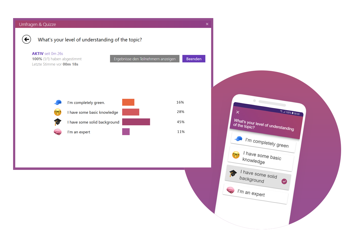
4. Avoid eye contact
You want your audience to feel engaged in your presentation, but if you avoid eye contact the whole time, they certainly won't. Avoid staring at just one part of the wall, at your paper or your computer. If the participants have the feeling that you are just talking to the wall, it is a bad presentation. Speak to your audience, involve them in your presentation and make it more exciting for them.
But also make sure you don't always look at the same two or three people, but address everyone. If the audience is large, it is often difficult to include everyone, but still try to let your eyes wander a little between your listeners and look into every corner of the room.
5. Speaking incoherently
Avoid jumping from one topic to the next and back again shortly afterwards. Otherwise your audience will not be able to follow you after a while and their thoughts will wander. To prevent this, it is important that your presentation has a good structure and that you work through one topic after the other.
Nervousness can cause even the best to mumble or talk too fast in order to get the presentation over with as quickly as possible. Try to avoid this by taking short pauses to collect yourself, to breathe and to remind yourself to speak slowly.

6. Many colors mixed with each other
Make sure that your presentation is not too colorful. If you mix too many colours, bad presentation slides will result very quickly. A PowerPoint in which all kinds of colors are combined with each other does not look professional, but rather suitable for a children's birthday party.
Think about a rough color palette in advance, which you can then use in your presentation. Colors such as orange or neon green do not look so good in your PowerPoint. Use colors specifically to emphasize important information.
It is also essential to choose colors that help the text to read well. You should have as much contrast as possible between the font and the background. Black writing on a white background is always easy to read, while yellow writing on a white background is probably hard to read.
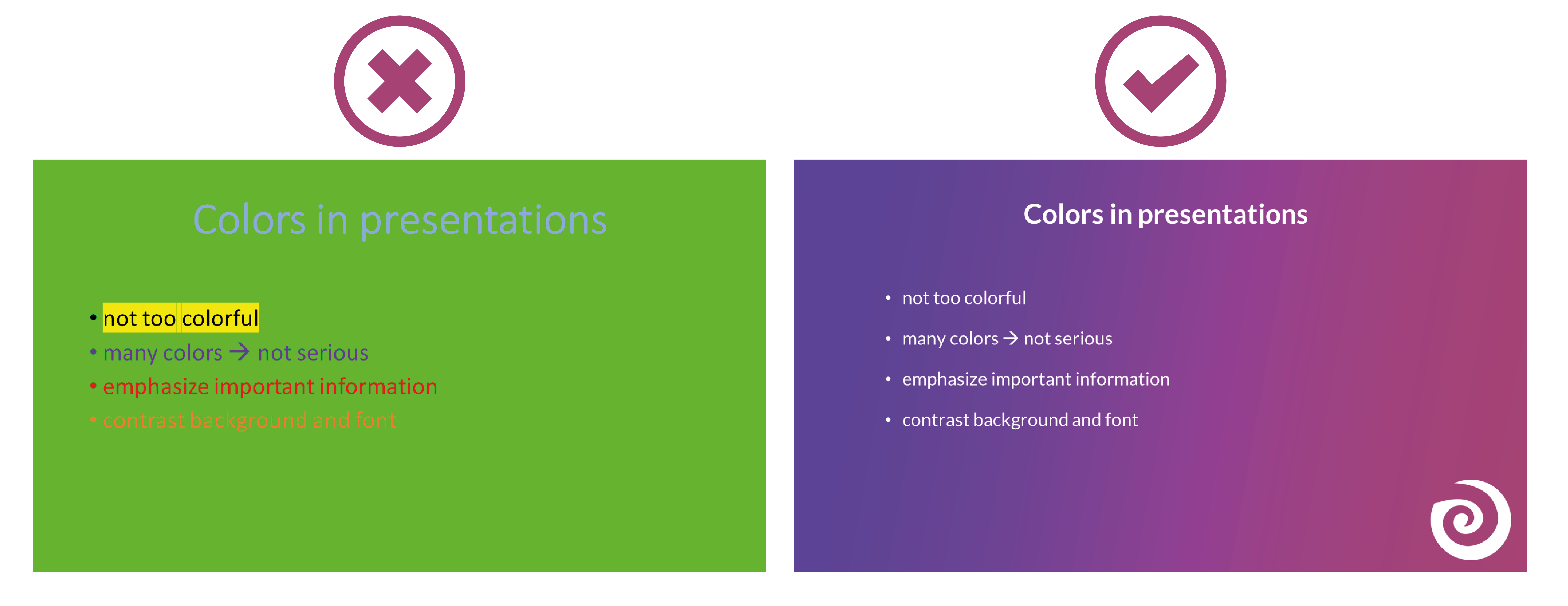
7. Too minimalistic design
Even though it is often said that "less is more", you should not be too minimalistic in the design of your presentation. A presentation where your slides are blank and only black text on a white background is likely to go down just as badly as if you use too many colors.
Empty presentations are boring and don't really help to capture the attention of your audience. It also looks like you are too lazy to care about the design of your presentation and that you have not put any effort into the preparation. Your PowerPoint doesn't have to be overflowing with colors, animations and images to make it look interesting. Make it simple, but also professional.
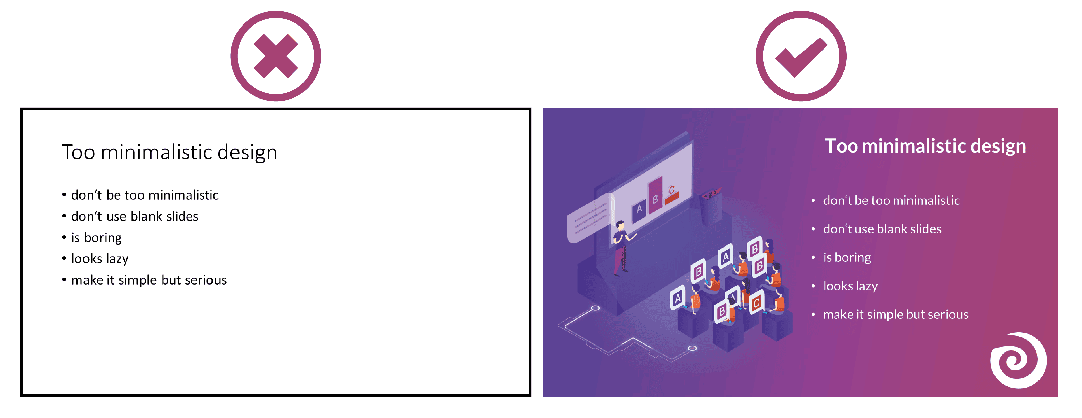
8. Too much text
The slides of your presentation should never be overcrowded. Write only the most important key points on your slides and never entire sentences. Your audience should not be able to read exactly the text you are speaking in your PowerPoint. This is rather annoying and leads to being bored quickly. Summarize the most important points that your audience should remember and write them down in short bullet points on your presentation.
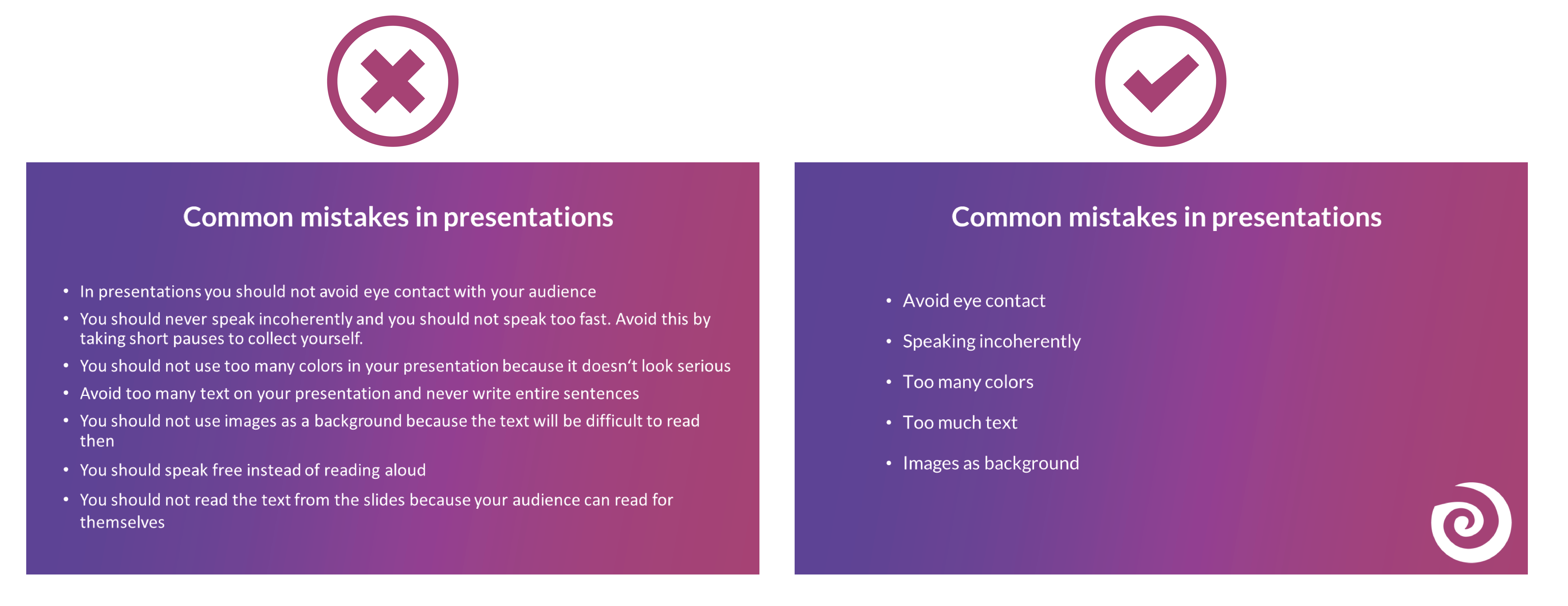
9. Many different animations
To avoid bad presentations it is important to never use too many animations. It looks messy and confusing if every text and image is displayed with a different animation. Just leave out animations at all or if you really want to use them then use them only very rarely when you want to draw attention to something specific. Make sure that if you use animations, they are consistent. If you use transitions between the individual slides, these should also always be kept consistent and simple.
10. Too many images
Bad presentation slides often occur when their design ist unclear and unorganised. Images and graphics in presentations are always a good idea to illustrate something and to add some variety. But don't overdo it with them. Too many images can distract from your presentation and look messy. Make sure that the graphics also fit the content and, if you have used several pictures on one slide, ask yourself whether you really need all of them.
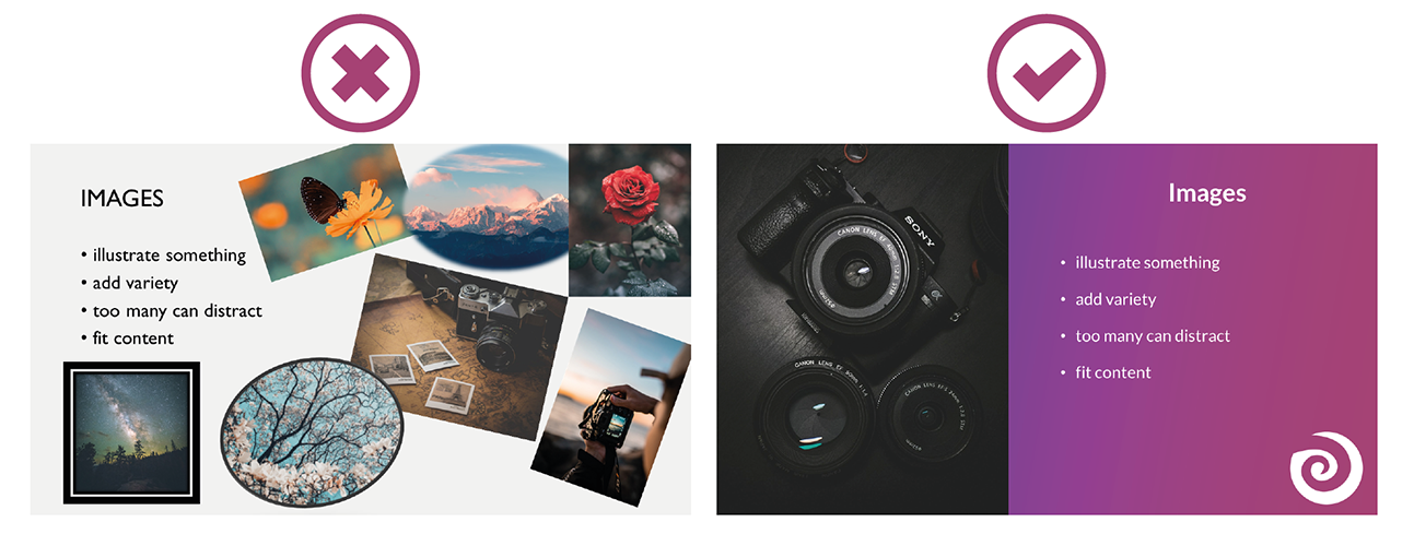
11. Too many or unreadable fonts
Never combine too many fonts so that your presentation does not look messy. Use at most two: one for headings and one for text. When choosing fonts, you should also make sure that they are still legible at long distances. Script, italic and decorative fonts are very slow to read, which is why they should be avoided in presentations.
It is not so easy to choose the right font. Therefore, we have summarized for you how to find the best font for your PowerPoint presentation.
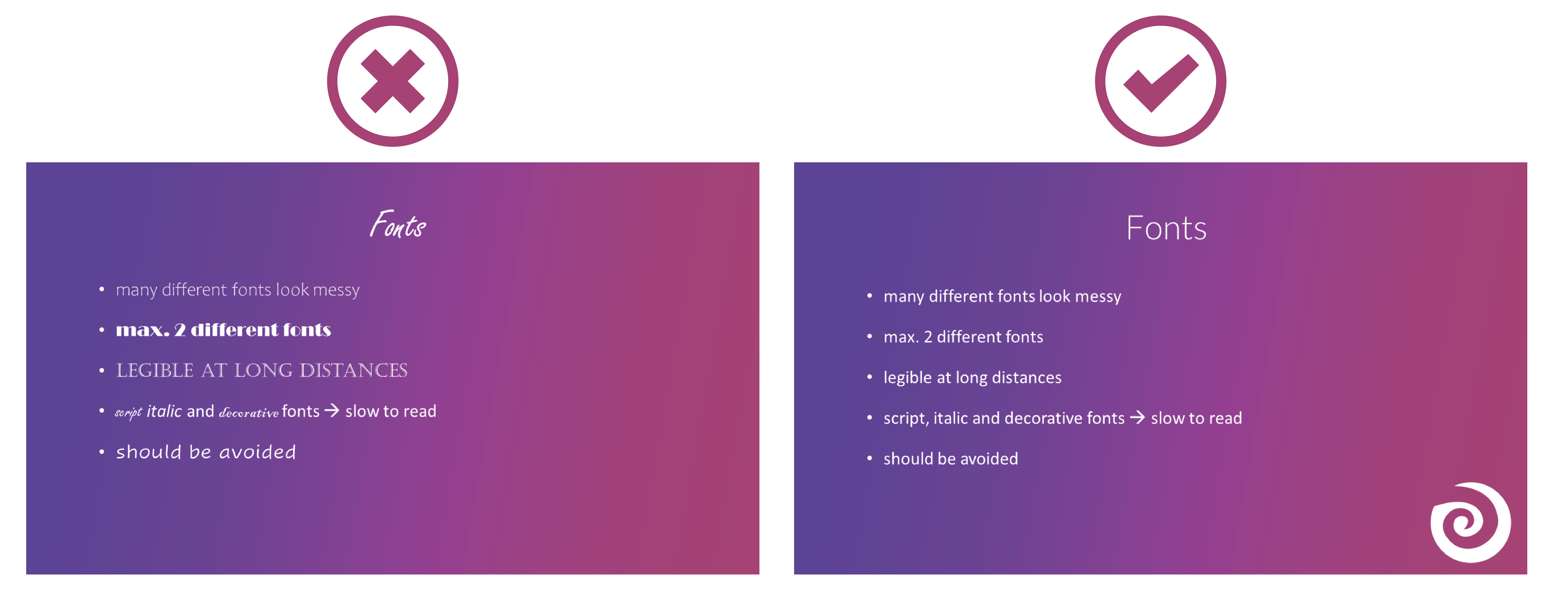
12. Images as background
To avoid bad presentations, do not use images as slide backgrounds if there should be also text on them. The picture only distracts from the text and it is difficult to read it because there is not much contrast with the background. It is also harder to see the image because the text in the foreground is distracting. The whole thing looks messy and distracting rather than informative and clear.
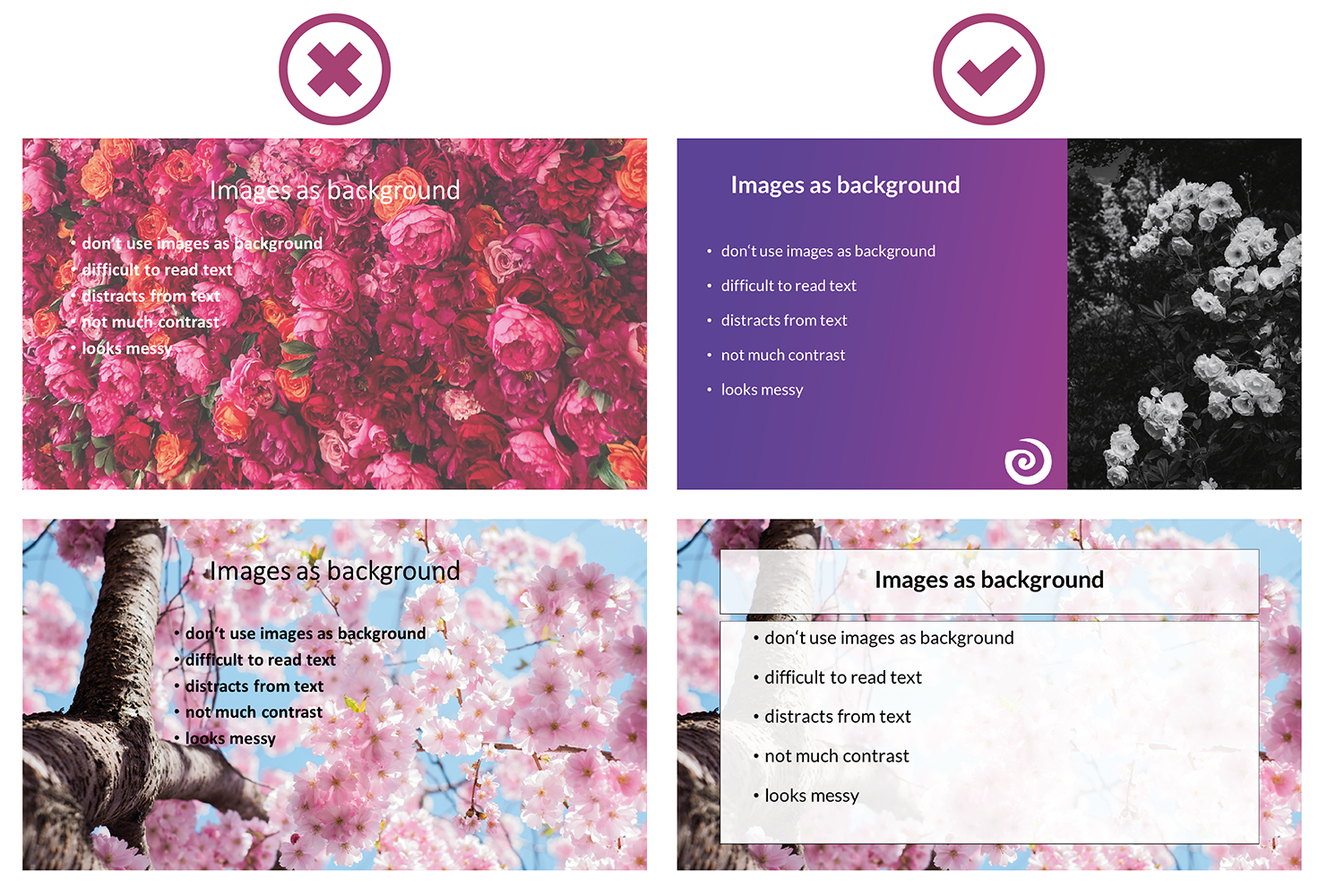
13. Reading from the slides
Never just read the exact text from your slides. Your audience can read for themselves, so they will only get bored and in the worst case it will lead to "Death by PowerPoint". You may also give them the feeling that you think they are not able to read for themselves. In addition, you should avoid whole sentences on your slides anyway and only have listed key points that you go into more detail then.
14. Turn your back
Never turn around during your presentation to look at your projected PowerPoint. Not to read from your slides, but also not to make sure the next slide is already displayed. It looks unprofessional and only distracts your audience. In PowerPoint's Speaker View, you can always see which slide is currently being displayed and which one is coming next. Use this to make sure the order fits. You can even take notes in PowerPoint, which are then displayed during your presentation. You can read all about notes in PowerPoint here.
15. Forgetting the time
Always pay attention to the time given. It is annoying when your presentation takes much longer than actually planned and your audience is just waiting for you to stop talking or you are not able to finish your presentation at all. It is just as awkward if your presentation is too short. You have already told everything about your topic, but you should actually talk for at least another ten minutes.
Practice your presentation often enough at home. Talk through your text and time yourself as you go. Then adjust the length so that you can keep to the time given on the day of your presentation.

16. Complicated Structure
The structure of your presentation should not be complicated. Your audience should be able to follow you easily and remember the essential information by the end. When you have finished a part, briefly summarize and repeat the main points before moving on to the next topic. Mention important information more than once to make sure it really gets across to your audience.
However, if the whole thing gets too complicated, it can be easy for your audience to disengage after a while and not take away much new information from your presentation. So a complicated structure can lead to bad presentations and "Death by PowerPoint" pretty quickly.
17. Inappropriate clothes
On the day of your presentation, be sure to choose appropriate clothing. Your appearance should be formal, so avoid casual clothes and stick to professional dress codes. When choosing your clothes, also make sure that they are rather unobtrusive. Your audience should focus on your presentation, not on your appearance.

18. Inappropriate content
Think about who your audience is and adapt your presentation to them. Find out how much they already know about the topic, what they want to learn about it and why they are here in the first place. If you only talk about things your audience already knows, they will get bored pretty soon, but if you throw around a lot of technical terms when your audience has hardly dealt with the topic at all, they will also have a hard time following you. So to avoid "Death by PowerPoint" in this case, it is important to adapt your presentation to your audience.
You can also ask a few questions at the beginning of your presentation to learn more about your audience and then adapt your presentation. With SlideLizard , you can integrate polls directly into your PowerPoint and participants can then easily answer anonymously from their smartphone.
19. Too much or unimportant information
Keep it short and limit yourself to the essentials. The more facts and information you present to your audience, the less they will remember.
Also be sure to leave out information that does not fit the topic or is not relevant. You will only distract from the actual topic and lose the attention of your audience.
20. Monotone voice
If you speak in a monotone voice all the time, you are likely to lose the attention of your audience. Make your narration lively and exciting. Also, be careful not to speak too quietly, but not too loudly either. People should be able to understand you well throughout the whole room. Even if it is not easy for many people, try to deliver your speech with confidence. If you are not enthusiastic about the topic or do not seem enthusiastic, you will not be able to get your audience excited about it.

Examples of bad presentations to download
We have created a PowerPoint with examples of bad presentation slides and how to do it right. You can download it here for free.
Related articles
About the author.

Helena Reitinger
Helena supports the SlideLizard team in marketing and design. She loves to express her creativity in texts and graphics.
Get 1 Month for free!
Do you want to make your presentations more interactive.
With SlideLizard you can engage your audience with live polls, questions and feedback . Directly within your PowerPoint Presentation. Learn more

Top blog articles More posts

All about notes in PowerPoint Presentations

Family Feud – PowerPoint Quiz Template
Get started with Live Polls, Q&A and slides
for your PowerPoint Presentations
The big SlideLizard presentation glossary
Virtual reality.
With Virtual Reality people can practice situations and important processes in a virtual room by putting on special digital glasses. They can influence what happens themselves.
Learning Management System (LMS)
Learning Management Systems (LMS) are online platforms that provide learning resources and support the organisation of learning processes.
Written Communication
The goal of written communication is to spread messages clear and explicit. Written Communication can be: emails, a contract, a memo, a text message or a Facebook Post.
Slide Master
To create your own Template in PowerPoint it is best to use the Slide Master. After updating the Slide Master with your design, all slides (fonts, colours, images, …) adapt to those of the Slide Master.
Be the first to know!
The latest SlideLizard news, articles, and resources, sent straight to your inbox.
- or follow us on -
We use cookies to personalize content and analyze traffic to our website. You can choose to accept only cookies that are necessary for the website to function or to also allow tracking cookies. For more information, please see our privacy policy .
Cookie Settings
Necessary cookies are required for the proper functioning of the website. These cookies ensure basic functionalities and security features of the website.
Analytical cookies are used to understand how visitors interact with the website. These cookies help provide information about the number of visitors, etc.
- Skip to main content
- Keyboard shortcuts for audio player
NPR poll: Democrats fear fascism, and Republicans worry about a lack of values

Domenico Montanaro

The 2024 presidential race remains extremely close between President Biden and former President Donald Trump, according to the latest polling from NPR/PBS NewsHour/Marist. Evan Vucci/AP; Eduardo Munoz/pool/AFP via Getty Images hide caption
The 2024 presidential race remains extremely close between President Biden and former President Donald Trump, according to the latest polling from NPR/PBS NewsHour/Marist.
The fear factor is real in America, but Democrats and Republicans are scared for the country's future for different reasons, the latest NPR/PBS NewsHour/Marist poll finds.
They also believe very differently about what children who will inherit that future should be taught.
Looking at this year's presidential election, the survey also found big shifts with key voter groups, along generational, racial and educational lines.

The states to watch on the 2024 electoral map

Key voting groups are shifting in the race between Biden and Trump
It also explored how third-party candidates and so-called "double haters" — who have unfavorable ratings of both President Biden and former President Donald Trump — could affect the race.
Finally, it finds a jump in Republicans now believing Trump has done something unethical, as he continues to contend with dozens of criminal charges and legal troubles.
Fascism and extremism vs. a lack of values and becoming weak
Democrats overwhelmingly said teaching children to treat others as you would want to be treated, the "Golden Rule," is the most important value to teach children. That was followed farther back by "education being the key to success" and "be happy and follow your dreams."
Democrats are most concerned about a rise in extremism and fascism, topping everything else by a wide margin.
Republicans, on the other hand, said instilling children with faith in God, teaching them that hard work and discipline pay off, and to abide by the "Golden Rule" were most important.
Their biggest concerns for the country were a lack of values and becoming weak as a nation.
Trump's trials have worn down Republicans, as more of them are viewing the former president as having done something wrong
Fewer than half of respondents said they're following Trump's New York hush money trial closely, but with the Republican primary over and Trump's continued legal troubles, a majority of Republicans now say they believe Trump has done something wrong, whether that's something unethical or illegal.

Trump ordered to pay $9,000 for violating gag order in criminal hush money trial
The number of Republicans saying Trump has done something unethical has jumped 12 points since February, from 34% to 46%. Still, only 8% of Republicans think he's done something illegal, compared to almost half of respondents overall (47%).
A whopping 77% overall think Trump has done something illegal or at least unethical, and a majority believes the investigations into his conduct are fair.
There are big shifts since 2020 along age, race and educational lines
When looking at the presidential election, Biden and Trump remain in a virtual tie among registered voters, with 50% for Biden and 48% for Trump. Among people who say they are "definitely voting" in November, Biden's lead expands out to 5 points, 52%-47%. The survey shows Biden is doing better with groups that say they're likely or definitely voting — older voters and college-educated whites, in particular.
That may seem like the same old story — two well-known candidates who were expected to be in a close race are now in a close race. But the top line numbers mask important shifts taking place by age, race and education.

Abortion rights on the ballot may not be bad news for Republicans everywhere
Here are some key findings:
- Trump won voters older than 45 in 2020, according to exit polls, but Biden is winning them now, including having a 12-point lead with the oldest voters. That's unusual because older voters have traditionally leaned Republican.
- Biden won voters under 45 by double-digits in 2020, but Trump and Biden are now tied with the group. Biden is particularly struggling with the youngest voters — he's up just 2 points with Gen Z/Millennials, who are 18 to 43 years old. In 2020, though, he won 18- to 29-year-olds by 24 points, and those 30 to 44 by 6 points.
- Respondents aged 18 to 29 give Biden just a 31% approval rating, 10 points lower than his overall rating of 41%.
Race and education
- Biden won nonwhite voters by 45 points in 2020, but his lead with them now is half that.
- He is doing better with white voters than he did in 2020 by a few points, and that's mostly attributed to college-educated whites.
- Biden won college-educated white women by 9 points in 2020. This survey has him ahead by 17 with them.
- Trump won college-educated white men by 3 points in 2020, but now Biden is ahead by 10 points with them.
"Double haters" are core to RFK Jr.'s support
Polls have been unclear about which candidate Robert F. Kennedy Jr. has the potential to pull support from more. This survey shows him taking a bit more from Biden than from Trump.
Biden's 2-point lead with all adults and 5-point lead with registered voters evaporates when RFK Jr. and others are considered. RFK Jr. takes in 11% of the vote, which is about how much he's been registering on average in previous Marist polls and other surveys.

Some independent candidates start their own political parties to ease ballot access

The Kennedys endorse Biden, not their family member RFK Jr.
It's no secret that there's a lot of cynicism and disaffection among many voters. Highlighting the country's partisanship, respondents said both men essentially represent equal threats to democracy, and majorities say they dislike both.
In this survey, 56% have an unfavorable view of Trump, and 54% have an unfavorable opinion of Biden. That's the well from which RFK Jr. is drawing.
In a matchup between Biden, Trump and RFK Jr., RFK Jr. gets 31% with those who have an unfavorable rating of both Trump and Biden, the "double haters." Another 31% of the "double haters," when faced with this choice, chose Trump and only 20% side with Biden.
That's a major warning sign for Biden because in 2020, Biden did well with "double haters," according to Democratic pollsters. When it's just Biden against Trump, the two men are statistically tied with the group, 46% for Trump, 45% for Biden.
Among the other groups RFK Jr. gets his most support: independent women (22%), independents overall (17%), those in the West (15%), parents with children under 18 (14%), white women with college degrees (14%), those under 45 (13%) and Gen Z/Millennials.
The survey of 1,199 adults was conducted April 22-25 by the Marist Institute for Public Opinion. The margin of error for the overall sample is +/- 3.6 percentage points.
- TRANSACTIONS
- FanNation FanNation FanNation
- SI.COM SI.COM SI.COM
- SI Swimsuit SI Swimsuit SI Swimsuit
- SI Sportsbook SI Sportsbook SI Sportsbook
- SI Tickets SI Tickets SI Tickets
- SI Showcase SI Showcase SI Showcase
- SI Resorts SI Resorts SI Resorts

© Orlando Ramirez-USA TODAY Sports
Good, Bad and Ugly From Cincinnati Reds' 6-2 Loss to San Diego Padres
Cincinnati falls to 16-15 on the season.
- Author: Caleb Sisk
In this story:
The Reds lost to the Padres 6-2 on Wednesday.
Jeimer Candelario continues his improvement as he brought in one of the runs on the day with a RBI single. Spencer Steer also hit a home run in the first inning. Those were the only two runs the Reds would score.
The Reds only had four hits, which cost them the game. They could get any momentum after Steer gave them the lead in the first inning.
This game was close up until the seventh inning when Fernando Cruz gave up a grand slam to Jake Cronenworth. It squashed the Reds' hopes of winning this game.
The Reds fall to 16-15 on the season. They hope to bounce back on Friday night against the Orioles.
Make sure you bookmark Inside the Reds for the latest news, exclusive interviews, and daily coverage of the Cincinnati Reds!
You May Also Like:
Watch: Spencer Steer Hits Game Winning Grand Slam Against Phillies
Cincinnati Reds Beat Philadelphia Phillies in Extra Innings
Series Preview: Cincinnati Reds at Philadelphia Phillies
Cincinnati Reds Rally Past Washington Nationals for 6-5 Win
Nick Lodolo Has Successful Rehab Start in Triple-A Louisville
Cincinnati Reds Prospect Rece Hinds Hits Towering Home Run in Triple-A Louisville
Cincinnati Reds Top Performers in Opening Day Win Over Washington Nationals
Brent Suter Shiners Bright in Cincinnati Reds’ Opening Day Win Over Nationals
Cincinnati Reds Beat Washington Nationals 8-2 on Opening Day
Cincinnati Reds Bringing Back Familiar Face on Minor League Deal
Ultimate Guide to 2024 Reds Starting Rotation
Ultimate Guide to 2024 Reds Bullpen
Ultimate Guide to 2024 Reds Infield
Ultimate Guide to 2024 Reds Outfield
Four Expectations for Reds Pitching Staff Ahead of 2024 Season
Prospect Overview: In Depth Look at Cincinnati Reds First Rounder Rhett Lowder
Cincinnati Reds Prospect Edwin Arroyo Has Season-Ending Surgery
Be sure to keep it locked on Inside the Reds, all the time!
Follow Inside the Reds on Twitter/X: @InsideTheReds
Like Our Facebook Page
Subscribe and follow the ONLY Daily Reds Podcast
Follow on Instagram
Latest Cincinnati Reds News

Cincinnati Reds Starter Nick Lodolo Makes Interesting List

Reds Split Spring Training Matchups With White Sox and Rangers

Cincinnati Reds Top Prospect Has Season-Ending Surgery

Cincinnati Reds Share Latest on Matt McLain's Shoulder Injury

Cincinnati Reds Release Lineups For Split-Squad Matchups Against Rangers and White Sox

IMAGES
VIDEO
COMMENTS
That's really hard for a brain to do, and it compromises the effectiveness of both your slide text and your spoken words. If you can't avoid having text-y slides, try to progressively reveal text (like unveiling bullet points one by one) as you need it.". 5. Use the Presentation as an Aid, Not the Main Tool.
This video shows a student giving both a bad and a good presentation, he uses constructive feedback to improve his presentation skills. The video is used in ...
With many examples of good and bad PowerPoint slides on the internet, we have listed some bad examples that show the 'DON'Ts' and 'AVOID AT ALL COSTS' of PowerPoint mistakes: Image behind the text. Using only bullet points and no paragraphs. Having no symmetry in texts and pointers. Being too minimal.
When in doubt, adhere to the principle of simplicity, and aim for a clean and uncluttered layout with plenty of white space around text and images. Think phrases and bullets, not sentences. As an ...
Here are a few tips for business professionals who want to move from being good speakers to great ones: be concise (the fewer words, the better); never use bullet points (photos and images paired ...
Apply the 10-20-30 rule. Apply the 10-20-30 presentation rule and keep it short, sweet and impactful! Stick to ten slides, deliver your presentation within 20 minutes and use a 30-point font to ensure clarity and focus. Less is more, and your audience will thank you for it! 9. Implement the 5-5-5 rule. Simplicity is key.
3. Easy-to-follow structure. Another difference is very easy-to-understand structure. You need to align your slides with the storytelling - so your audience gets the message that you are trying to convey. It's very bad practice to jump from one topic to another when presenting, so that might confuse your audience. 4.
Good Lecture VS Bad Presentation * - YouTube. Ultimately, a bad presentation will result in a bad impression of your brand and business. Luckily, we've cumulated the best PowerPoint design tips by the experts that'll help you created good PowerPoint presentations also avoid death by PowerPoint.
Take a pause after you ask a question or make a strong statement. Spare your audience a moment to think, reflect, and ponder. Or leave a gap of silence right before you present something exciting to build suspense and anticipation. No one expects you to go on talking for 10-15 minutes without a pause.
Smarter Presentation, Easier Connection. Free Download Presentory Now👉https://bit.ly/44TrRGH🚀 Ready to elevate your presentation game? Join us for a deep d...
Mistake 5: Being Too Verbose. Short, concise presentations are often more powerful than verbose ones. Try to limit yourself to a few main points. If you take too long getting to your point, you risk losing your audience's attention. The average adult has a 15- to 20-minute attention span.
To hold attention you need to be brief, specific, and always mention how your message ties into how the audience will ultimately benefit, i.e., the payoff. So, the key point to remember is to make ...
Bad presentations and good presentations have something in common, they're memorable. Whether it's a speech at a wedding, or pitching to investors, if it's bad, it stands out. The impact a bad presentation can have on your, your business or your brand is profound. It's more than just the performance on the day.
The last thing you want to do is deliver a bad presentation, so let's make sure to avoid these poor presentation mistakes: Mistake 1. Not Scripting Your Presentation. All good presentations and speeches start with a tight script. Believe it or not, there's some method to this madness when writing out a professional presentation.
Learn from the good and bad PowerPoint examples and specialist tips in this tutorial. Avoid making a poor PowerPoint. ... Go live loads of bad PowerPoint presentation browse that went a little like this presentation: Worst Presentation Ever.avi Don't renting your future PowerPoint presentation drop victim to one of few missteps. This collection ...
Activity. For the activity I ask students to break up into groups of 4-5 to share their ideas—based on their experience—on what makes for a good presentation and what makes for a bad presentation. I give them about 20 minutes. One person in each group keeps notes using a t-chart with "Good" on one side and "Bad" on the other.
Learn how to avoid common mistakes when delivering a bad presentation and improve your public speaking skills with this YouTube video.
Loud, bright colors, like orange, or lime green, are probably not the best for a presentation. Also, take into consideration that for your public to be able to read easily you need to contrast your colors. For example, black letters on a white background, despite looking very simple, is also very easy to read.
Start with the key points of the presentation upfront, and yes, make your purpose and the benefit to those listening loud and clear from the beginning. Don't drown the message. Back in the day, when PowerPoint was new and interesting, presenters had the luxury of embedding their messages in lots of text jumbled in with a few visuals for effect.
I sometimes make this argument but invariably lose it. The workshop participants value the adoption of a separate category for presentation aids, so we shall maintain it here and discuss the issue further; both below and in Chapter 3. Figure 1.2 provides my attempt to categorize the statements provided in Figure 1.1.
Here we show you some examples of bad PowerPoint slides and common mistakes that are often made in presentations so that you won't make them in your next presentation and avoid "Death by PowerPoint". 1. Reading aloud instead of speaking freely. One aspect in bad presentations is often that the text is simply read out.
In this story: The Reds lost to the Padres 6-4 on Tuesday night. They are 16-14 on the season. Here's the good, bad and ugly from the loss: Both Stuart Fairchild and Jeimer Candelario had home ...
Fascism and extremism vs. a lack of values and becoming weak Democrats overwhelmingly said teaching children to treat others as you would want to be treated, the "Golden Rule," is the most ...
This video shows a student giving both a bad and a good presentation, he uses constructive feedback to improve his presentation skills. The video is used in ...
The Reds lost to the Padres 6-2 on Wednesday. Jeimer Candelario continues his improvement as he brought in one of the runs on the day with a RBI single. Spencer Steer also hit a home run in the ...
A short simple video of good and bad examples of presentations.Enjoyed? Share the video with your friends!Kindly credit when using the video "Husain Shafei (...