- Skip to primary navigation
- Skip to main content
- Skip to primary sidebar
- Skip to footer

IELTS Advantage
IELTS Preparation Courses

IELTS Bar Chart Sample Essay
Static or Dynamic?
Before writing an IELTS task 1 bar chart or line graph answer it is important that we analyse the question correctly. Taking a few minutes to do this will help us write a clear answer that fully responds to the question. Just what the examiner wants us to do.
The first thing we need to do is decide if the bar chart is static or dynamic. Static means that the data comes from one point in time. Dynamic means the data comes from more than one point in time.
Whether a chart is static or dynamic will affect the information we choose to include in our answer and the kind of language (tense, grammar etc.) we use.
If it is dynamic we will have to compare the different times and comment on the general trends over the time period.
If it is static we will have to compare the different variables, in this case countries, car price, GDP and time it takes for one person to buy a car.
Main Features
Every IELTS academic task 1 question asks us to ‘select and report the main features’.
This means that we have to not only pick the most significant information from the graph and include it in our essay, but also decide which information is not important and should therefore not be included in our essay. One of the biggest mistakes you can make in task 1 is including all the information you see.
So which information should you choose?
You should look for:
- highest/lowest values
- biggest differences
- similarities
- significant exceptions
- anything else that really stands out
There are 3 main features in this graph
1) It takes over 26 years for a Vietnamese person to buy a car.
2) Vietnam has the second highest average costs but the second lowest wages.
3) Cost of a car in Singapore is nearly 3 times the next most expensive.
I advise my students to follow a basic four paragraph structure for these kinds of questions.
Paragraph 1
Paraphrase the question using synonyms.
Paragraph 2
Provide an overview of the main features. No need to include any data in this paragraph, just tell the examiner what is happening in general terms. If you had to describe the main features in two sentences, what would you say?
Paragraph 3
This is where we get more specific and use data. Take 2 of the main features (from your overview) and describe them in detail using data from the chart.
Paragraph 4
Simply do the same thing as you did in paragraph 3, but with two other main features (from your overview).
Sample Answer
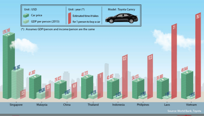
The graph compares the GDP per capita, cost of a Toyota Camry and approximate length of time it takes for 1 citizen to purchase that mode of transport in eight Asian countries.
Despite having the second lowest average yearly income, it costs more to buy this car in Vietnam than in all but one other Asian nation. It also takes significantly longer for a standard person to buy an automobile in Vietnam than in any other state in Asia. On the other end of the scale, Singaporeans have to pay nearly three times more for their cars than the Vietnamese and it takes them the least amount of time to afford a motor vehicle.
It costs $49,944 to buy a Toyota Camry in Vietnam, but this dwarfs the average yearly income per person at just $1,910. It would therefore take a normal man or woman 26.1 years to save up for that particular car.
This is in contrast to Singapore where it costs $126,245 for that model of motorcar, however the average salary is much greater at $55,182. This means that it generally takes just over 2 years for a typical individual from Singapore to acquire this vehicle.
(200 words) Band 9.
It should be noted that this is not a real IELTS task 1 question. This is just a chart that I saw on the internet, but it allowed me to make a very important point- you don’t have to mention everything on the graph. I only talked about 2 out of the 8 countries and I still wrote 200 words and answer the question fully. The key is finding the most significant data and not talking about anything else. Don’t worry, you won’t lose marks for not talking about everything, quite the opposite.
This graph is also good for demonstrating how important it is to vary your vocabulary. There were four words that could have been overused in this essay- car, average, country and people. Instead of repeating them over and over again I used synonyms to show the examiner I have a wide vocabulary and gain extra marks. Here are the synonyms:
Car- Toyota Camry- automobile- vehicle- motor vehicle- motorcar
Average- approximate- normal- typical- standard
Country- countries- nation- state
People- citizen- man or woman- individual
Next time you see a chart or graph in a newspaper, in a textbook or on the internet, think about what the main features are and what common words would you have to vary with synonyms.
I hope you have found these tips useful. If you have any questions, let me know below.
For more band 9 sample essays check out our task 1 sample essay page.
About Christopher Pell
My name is Christopher Pell and I'm the Managing Director of IELTS Advantage.
I started IELTS Advantage as a simple blog to help 16 students in my class. Several years later, I am very humbled that my VIP Course has been able to help thousands of people around the world to score a Band 7+ in their IELTS tests.
If you need my help with your IELTS preparation, you can send me an email using the contact us page.
- Ebooks & Courses
- Practice Tests
How To Write an IELTS Bar Chart Essay
There are 5 steps to writing a good IELTS bar chart essay:
1) Analyse the question
2) Identify the main features
3) Write an introduction
4) Write an overview
5) Write the details paragraphs
Use this simple planning process as you practice writing IELTS bar chart essays and you’ll have no problem remembering it in the exam.
Steps 1 and 2 of the planning process should take around 5 minutes. It is essential that you don’t miss these out as they are the key to writing a high-scoring essay.
On this page, I’m going to take you through the whole planning process step-by-step as we work on a practice question.
Before we begin, here’s a model essay structure that you can use as a guideline for all IELTS Academic Task 1 questions.
Ideally, your essay should have 4 paragraphs:
Paragraph 1 – Introduction
Paragraph 2 – Overview
Paragraph 3 – 1 st main feature
Paragraph 4 – 2 nd main feature
Now that we have all these tools we need, we’re ready to begin planning and writing our IELTS bar chart essay.
Here’s our practice question:
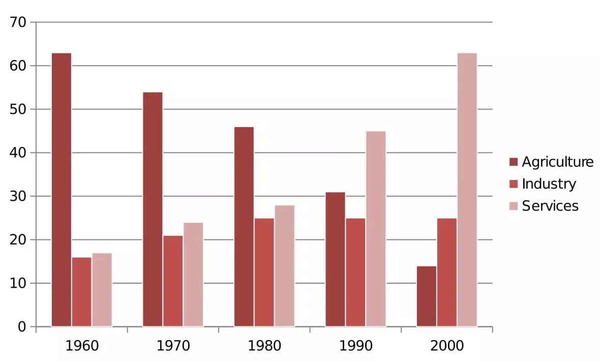
The bar chart below shows the sector contributions to India’s gross domestic product from 1960 to 2000.
Summarise the information by selecting and reporting the main features, and make comparisons where relevant.
Write at least 150 words.
Contribution as % of India's GDP
Source: EPW Research Foundation
Step 1 – Analyse the question
The format of every Academic Task 1 question is the same. Here is our practice question again with the words that will be included in all questions highlighted .
The bar chart below shows the sector contributions to India’s gross domestic product from 1960 to 2000.
Every question consists of:
- Sentence 1 – A brief description of the graphic
- Sentence 2 – The instructions
- The graphic – chart, graph, table, etc.
Sentence 2 tells you what you have to do.
You must do 3 things:
1. Select the main features.
2. Write about the main features.
3. Compare the main features.
All three tasks refer to the ‘ main features ’ of the graphic. You do not have to write about everything. Just pick out 2 or 3 key features and you’ll have plenty to write about.
Our practice graphic is a dynamic bar chart. That is, it includes a timeline giving data from several different points in time.
So, for this question, we need to identify the main trends (that is, the general developments or changes in situation) in the three key sectors of the Indian economy – agriculture, industry and service – between 1960 and 2000.
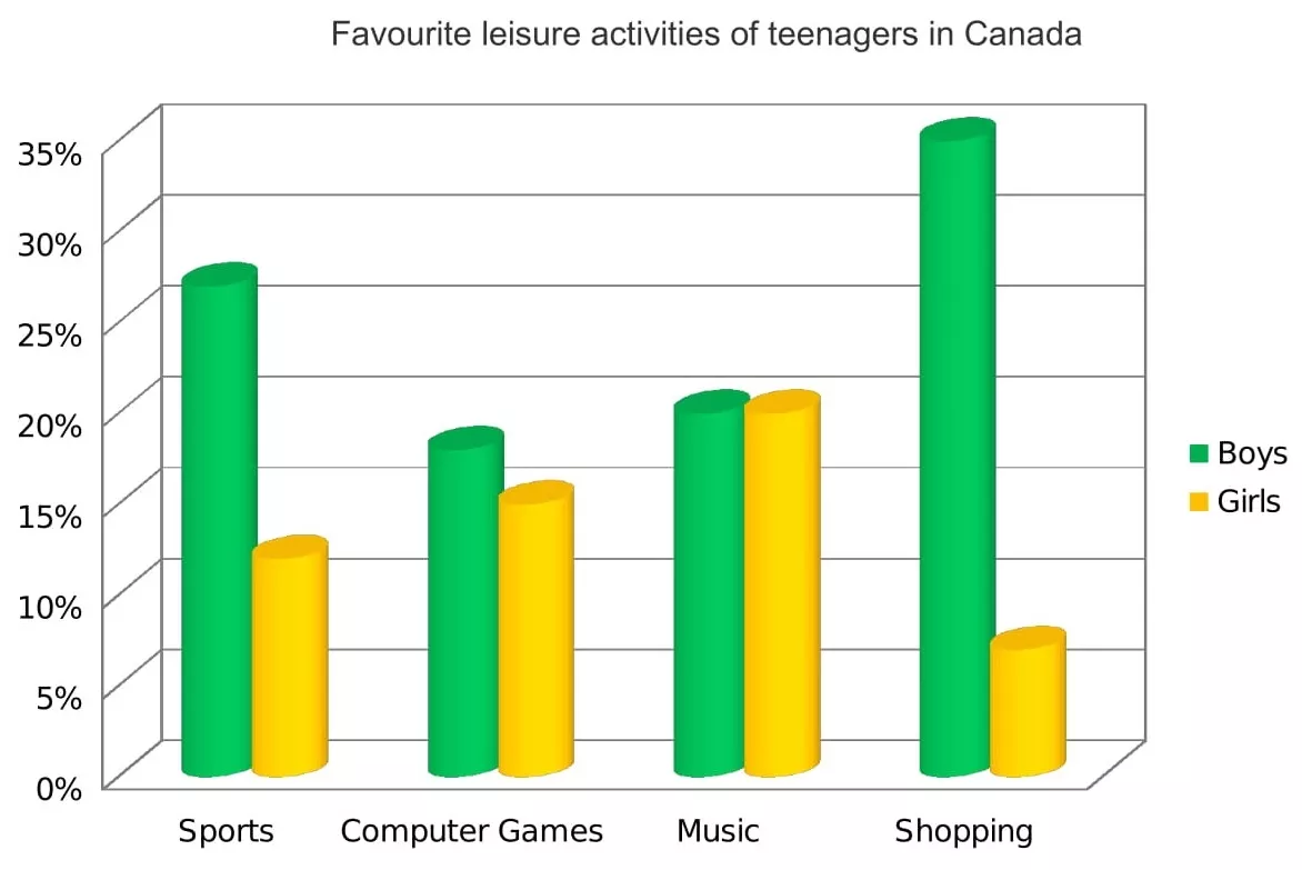
Alternatively, a bar chart may be static with the data coming from one point in time, as in the example below. For this graphic, we would need to compare the different variables, that is, the different leisure activities favoured by Canadian boys and girls.
Step 2 – Identify the Main Features
The graphic in IELTS bar chart questions should not be difficult to interpret. Each question has been created to test your language skills, not your mathematics ability.
All you are looking for are the main features. These will usually be the easiest things to spot. As we’ve just seen, the type of key features will depend on whether the bar chart is dynamic or static.
There will be lots of information in the graphic to help you identify them. Here are some useful questions to ask?
- What information do the 2 axes give?
- Is it dynamic or static?
- What are the units of measurements?
- What are the time periods?
- What can you learn from the title and any labels?
- What is the most obvious trend?
- Are there any notable similarities?
(I give more detail on how to use these questions, plus downloadable checklists for identifying the main features of all 7 different types of IELTS Academic Writing Task 1 questions, in the lesson on How To Understand & Analyse Task 1 Questions .)
So, what main features stand out in our practice graphic?
Here's our practice IELTS bar chart again.

There are 3 main features/trends in this IELTS bar chart:
Main feature 1: The contribution of the agricultural sector dropped steadily.
Main feature 2: The contribution of the service sector increased each decade.
Main feature 3: Industry remained static from 1980 to 2000.
The general trends you select will be the starting point for your essay. You will then go on to add more detail.
With just 20 minutes allowed for Task 1, and a requirement of only 150 words, you won't be able to include many details.
We’re now ready to begin writing our essay. Here’s a reminder of the 4 part structure we’re going to use.
Step 3 – Write an Introduction
In the introduction, you should simply paraphrase the question, that is, say the same thing in a different way. You can do this by using synonyms and changing the sentence structure. For example:
Introduction (Paragraph 1):
The bar graph illustrates the relative percentage contributions made by the agricultural, industrial and service sectors to the Indian economy between 1960 and 2000.
This is all you need to do for the introduction.
Ideally, key words such as ‘sector’ and ‘contributions’ should be replaced by synonyms but there aren’t any obvious words that could be used instead so it’s fine to repeat them. It’s important that your language sounds natural so never try to force in synonyms that don’t quite fit.
Step 4 – Write an Overview (Paragraph 2)
In the second paragraph, you should report the main features you can see in the graph, giving only general information. The detail comes later in the essay. You should also make any clear comparisons you spot.
This is where we write about the general trends. Here are the ones we picked out above.
Now form these ideas into two or three sentences with a total of around 40 words. State the information simply using synonyms where possible. No elaborate vocabulary or grammar structures are required, just the appropriate words and correct verb tenses.
For example:
Overview (Paragraph 2) :
Over the whole time period, the significance of agriculture declined steadily while services grew in importance decade by decade. A different patterned emerged for industry, which initially showed a slowly increasing percentage but then plateaued from 1980 onwards.
Step 5 – Write the 1st Detail Paragraph
Paragraphs 3 and 4 of your IELTS bar chart essay are where you include more detailed information about the data in the graphic. In paragraph 3, you should give evidence to support your first 1 or 2 key features. Don’t forget to make comparisons when relevant.
Here are our first 2 main features again:
And this is an example of what you could write:
Paragraph 3 :
In 1960, agriculture contributed by far the highest percentage of GDP, peaking at 62%, but it then dropped in steady increments to a low of 12% in 2000. The service sector, on the other hand, had a relatively minor impact on the economy in 1960. This situation changed gradually at first, then its percentage contribution jumped from 28% to 43% between 1980 and 1990. By 2000 it matched the high point reached by agriculture in 1960, showing a reversal in the overall trend.
Step 6 – Write the 2nd Detail Paragraph
For the fourth and final paragraph, you do the same thing for your remaining feature/s. We have one main feature left to write about.
Here’s an example of what you could write:
Paragraph 4 :
Industry remained a steady contributor to India’s wealth throughout the period. As a sector, it grew marginally from 16% in 1960 to exactly a quarter in 1980 then remained static for the next two decades, maintaining a constant share of the overall GDP.
Here are the four paragraphs brought together to create our finished essay.
Finished IELTS Bar Chart Essay
(188 words)
This sample IELTS bar chart essay is well over the minimum word limit so you can see that you don’t have space to include very much detail at all. That’s why it is essential to select just a couple of main features to write about.
Now use what you’ve learnt in this lesson to practice answering other IELTS bar chart questions. Start slowly at first and keep practicing until you can plan and write a complete essay in around 20 minutes.
Want to watch and listen to this lesson?
Click on this video.
Would you prefer to share this page with others by linking to it?
- Click on the HTML link code below.
- Copy and paste it, adding a note of your own, into your blog, a Web page, forums, a blog comment, your Facebook account, or anywhere that someone would find this page valuable.
Like this page?
Ielts academic writing task 1 – all lessons.
IELTS Academic Writing – A summary of the test including important facts, test format & assessment.
Academic Writing Task 1 – The format, the 7 question types & sample questions, assessment & marking criteria. All the key information you need to know.
Understanding Task 1 Questions – How to quickly and easily analyse and understand IELTS Writing Task 2 questions.
How To Plan a Task 1 Essay – Discover 3 reasons why you must plan, the 4 simple steps of essay planning and learn a simple 4 part essay structure.
Vocabulary for Task 1 Essays – Learn key vocabulary for a high-scoring essay. Word lists & a downloadable PDF.
Grammar for Task 1 Essays – Essential grammar for Task 1 Academic essays including, verb tenses, key sentence structures, articles & prepositions.
The 7 Question Types:
Click the links below for a step-by-step lesson on each type of Task 1 question.
- Table Chart
- Process Diagram
- Multiple Graphs
- IELTS Writing
- IELTS Bar Chart
- Back To Top
* New * Grammar For IELTS Ebooks
$9.99 each Full Set Just $ 23.97
Find Out More >>
IELTS Courses

Full details...

IELTS Writing Ebook
Discount Offer
$7 each Full Set Just $ 21

Find out more >>
Testimonials
“I am very excited to have found such fabulous and detailed content. I commend your good work.” Jose M.
“Thanks for the amazing videos. These are ‘to the point’, short videos, beautifully explained with practical examples." Adari J.
"Hi Jacky, I bought a listening book from you this morning. You know what? I’m 100% satisfied. It’s super helpful. If I’d had the chance to read this book 7 years ago, my job would be very different now." Loi H.
"Hi Jacky, I recently got my IELTS results and I was pleased to discover that I got an 8.5 score. I'm firmly convinced your website and your videos played a strategic role in my preparation. I was able to improve my writing skills thanks to the effective method you provide. I also only relied on your tips regarding the reading section and I was able to get a 9! Thank you very much." Giano
“After listening to your videos, I knew I had to ditch every other IELTS tutor I'd been listening to. Your explanations are clear and easy to understand. Anyways, I took the test a few weeks ago and my result came back: Speaking 7, listening 9, Reading 8.5 and Writing 7 with an average band score of 8. Thanks, IELTS Jacky." Laide Z.
Contact
About Me
Site Map
Privacy Policy
Disclaimer
IELTS changes lives.
Let's work together so it changes yours too.
Copyright © 2024 IELT Jacky
All Right Reserved
IELTS is a registered trademark of the University of Cambridge, the British Council, and IDP Education Australia. This site and its owners are not affiliated, approved or endorsed by the University of Cambridge ESOL, the British Council, and IDP Education Australia.
- A Beginner’s Guide to IELTS
- Common Grammar Mistakes [for IELTS Writing Candidates]
Writing Correction Service
- Free IELTS Resources
- Practice Speaking Test
Select Page
How to Describe a Bar Chart [IELTS Writing Task 1]
Posted by David S. Wills | Apr 13, 2020 | IELTS Tips , Writing | 5
There are various kinds of diagrams and charts that you may be asked to describe in the IELTS writing test, and one of those is the bar chart . In today’s lesson, I want to share some important advice that can help you improve your writing performance in your next IELTS test.
Describing data for task 1 of the IELTS writing exam is quite difficult and it will vary according to what you actually see. In other words, it is hard to simply teach some language for describing bar charts… Instead, your language will vary according to what the bar chart shows.
However, in this article I am going to break the process down and show you some examples so that you can understand it fully. At the end, I will give you a sample band 9 answer for a really difficult bar chart about people’s weight.
What are Bar Charts?
First of all, let’s start with the most basic question. You can feel free to skip this if you are already totally familiar with it. 😁 What is a bar chart? Basically, it is a visual representation of data using bars, like these:
Bar charts are used to show the difference between volumes or quantities of things because it is easy for the human eye to interpret. Let’s take a look at this example bar chart. I just found it on Google and will use it because it is simple. This is not a real IELTS chart. 🤪
You can easily see what this means. The most common excuse is “I forgot to set my alarm” and the least common is “It was still too dark; I thought it was still night-time.”
That is the purpose of a bar chart. It shows data in a way that is really easy for people to understand. As such, you may encounter it in your IELTS test. In that case, you will have to pick out the most important data and describe it.
Bar Charts for IELTS Writing
As we have seen, a bar chart is just another way of expressing data. For task 1 of the IELTS writing test, you may be asked to write about a bar chart. You will have to write more than 150 words and it is recommended that you do this in 20 minutes or less. (You will have a total of 1 hour for 2 tasks.)
It is important to note that you do not have to describe everything in the chart . Part of the task is picking out and describing only the relevant details. That usually means:
- The highest
- Major differences
- Anything interesting
What does that mean? This is very subjective, and so it is certainly open to debate. Let’s look at an example in order to understand it better:
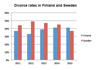
In this bar chart, our eyes are naturally drawn towards the highest and lowest figures. The highest was in Sweden in 2012 and the lowest was in Finland in 2012. Therefore, both the highest and lowest figures occurred in the same year. That’s interesting!😅
Another interesting factor is that, in every year except one, Sweden had a higher divorce rate than Finland. It was only in 2015 that Finland’s divorce rate was higher than Sweden’s.
The Process
When you need to describe a bar chart for IELTS, you should take the same basic process as for describing anything else:
- Take time to read the question carefully.
- Look at the data and make sure you understand it.
- Find important data to describe.
- Plan your essay structure.
- Write your essay carefully.
- Check your answer for mistakes.
If you follow this basic routine, you will have a good chance of providing a strong answer to the question.
Language for Describing Bar Charts
In the past, I have talked about the language required to describe the following IELTS writing task 1 assignments:
- Process diagram
Bar charts are a little different because the language you would use depends on what is being described and there is no common set language that you would use just to talk about bar charts in general.
In the previous example, we can see that the bar chart features changing data over time. In such cases, we can use relatively similar language to that which we used for line graphs. You could say, for example:
Divorce rates in Sweden peaked in 2012 at a little under 50%, but fell in each of the subsequent years.
However, you can see that in the first bar chart there was no progression of time, so you cannot use language that shows changes in data. This brings us to the next stage…
Common Problems in Describing Bar Charts for IELTS
I used to teach writing skills at a university in China, and one of the most common problems I would have was teaching my students to write about bar charts. They could describe line graphs really easily, but the problem was that they would use the same expressions and structures for bar charts, when in fact something different was needed. Let’s look at two example charts. These contain similar data but there is an essential difference:
You can see that the line graph talks about changing phone prices over time, whereas the bar chart shows the different prices of phones. These prices are all taken from the same point in time .
Therefore, in order to adequately describe these, you must show that you understand the data.
For the line graph, you can say:
The price of Phone A rose from £380 to £410 between December and January.
However, you cannot use this language for the bar chart:
INCORRECT: The price rose from £380 for Phone B to £410 for Phone C. CORRECT: Phone C cost £30 more than Phone B, which cost £380.
This may seem easy to some people, but it is an important distinction and a common mistake. You should practice often to make sure that you know the difference.
Task 1 Essay Structure
There is no single perfect essay structure for IELTS, but there are some that are better than others. For task 1, I generally recommend writing an essay like this:
Let me explain what I mean by that.
It is really important to group your data appropriately. This can be quite difficult, so you should read this article first.
Essentially, you need to choose how to put groups of data together. Let’s take another example:
The chart below shows the total number of minutes (in billions) of telephone call in the UK, divided into three categories, from 1995-2002. Summarise the information by selecting a reporting the main features, and make comparisons where relevant.
For this sort of bar chart, you might choose to write two or three body paragraphs. Perhaps you would describe local fixed line phones first, then start a new paragraph for national and international ones, with another paragraph for mobiles.
Another way would be to break the data in half – one paragraph for 1995 to 1998 and another paragraph for 1999 to 2002.
There are lots of different ways. The only really important thing is that you make it clear to your reader why you have chosen to group the data this way. In other words, it must be logical .
Sample Answer
My answer to this question would look something like this:
The bar chart shows the time spent on three different kinds of phone calls in the United Kingdom over a period of eight years, starting in 1995 and ending in 2002. Local calls were the most common type of phone call made during the entire period, although both national/international and mobile calls grew in popularity to narrow the gap between these three types of call by 2002. In 1995, local calls were by far the most common type of phone call in the UK, with more than 70 billion minutes recorded on this chart. This is about double the amount of time spent on national and international calls, and more than ten times as much as was spent on mobile phone calls. All three types of phone calls grew in popularity until 1999, after which local calls decreased year-on-year until they ended the period at around the same figure as they began it – 70 billion minutes. National and international calls grew steadily over the recorded eight years, from about half the popularity of local calls to only slightly less in 2002. Mobile phone calls, however, grew ten-fold from about four billion minutes to more than forty billion.
A Really Difficult Bar Chart
Finally, let’s look at a difficult bar chart in order to show how we can tackle challenging problems.
As you can see, the first problem is that there are two charts! Already, that will prove more difficult than describing just one chart.
Another issue is that these bars look strange. They are all the same size… Why? Well, these represent the population. Each one is 100%, with the colours making up the different weight categories. The total can never be more than 100% because that it is the full population.
Now, you should try to interpret the data. What are the main changes?
- In 1955, there are lots of people at an ideal weight and very few people are obese.
- In 2015, many older people are obese. Fewer people are at an ideal weight.
- The weight distribution was similar regardless of age in 1955, but in 2015 it is very different.
Once you have picked out the important data, you should figure out how to structure your answer. I will use this structure:
However, I will make sure that there are clear comparisons between the 1955 and 2015 data. It is not enough to describe them in isolation.
Language for Talking about Age and Weight
To be honest, the hardest part of this bar chart is not that data but the terminology around age and weight. You can see from the chart that were are looking at age groups and weight groups. Many native speakers find this really difficult to talk about.
When we talk about age and weight, we usually say some form of “to be” rather than “to have.” For example:
- INCORRECT: In 2015, a higher percentage of people had overweight or obesity than in any other group.
- CORRECT: In 2015, a higher percentage of people were overweight or obese than in any other group.
- INCORRECT: In both years, the people who were most likely to be an ideal weight had 20 to 29 years.
- CORRECT: In both years, the people who were most likely to be an ideal weight were aged 20 to 29 years.
You can see how I explained this to one of the students on my writing correction service :
There are also problems with grouping people according to age. We can just say “people in the ___ age group/category” but this becomes repetitive after a while, so we need to use different language.
Talking about age is difficult, especially when describing groups of people who fall into different age categories. One thing to know is that, when you say use numbers, it is a sort of adjective and thus you need a noun to follow it or else it is meaningless:
- The criminals arrested were all 16 to 25 years old.
- I saw a 15-year-old boy running away.
You can turn the “old” into a noun by adding an “-s”:
- There was an increase of 25% in the unemployment rate for 20-29-year olds.
You can also put “aged” before the numbers:
- Most of the recipients were aged 18-22.
Sample Band 9 Answer
Here is my description of the bar chart above:
There are two bar charts showing the distribution of weight categories for people living in Charlestown. The first one is from 1955 and the second is from 2015. It is clear that vast changes have occurred in people’s health during this sixty year period. In 1955, very few people were overweight or obese, and most were healthy or even underweight. In each of the age groups, at least half of people were classified as in the ideal weight range, but towards the ends of the spectrum – the youngest and the oldest people – there were more people who fell into the underweight bracket. Being overweight or obese was a problem primarily affecting middle aged people, but not the most elderly ones. However, this distribution had completely changed by 2015. Although some young adults and elderly people remained underweight, a very slim number in the middle of the age groups did. Being overweight had become increasingly common, and obesity had become a huge issue, affecting people more and more as they got older. For people aged fifty and older, more than half suffered from obesity, and very few fell into a healthy weight range.
Useful Language
I will excerpt some of the useful phrases that appeared in this answer so that you can see how I have managed to describe ages and weights:
- very few people were overweight or obese
- most were healthy or even underweight
- at least half of people were classified as in the ideal weight range
- people who fell into the underweight bracket
- Being overweight or obese was a problem
- elderly people remained underweight
- Being overweight had become increasingly common
- obesity had become a huge issue
- more than half suffered from obesity
- very few fell into a healthy weight range
This was a really difficult bar chart to describe, but using this language I have managed to do it accurately and comprehensively.
Improve your Writing
If you want to get better at IELTS writing, the only way to ensure constant progress is by having an expert give you feedback. Most of the writing correction services that you find online are rubbish. They are run by people do not speak much English or do not understand IELTS. My writing correction service is one of the few that is truly worthwhile. I can tell you all your problems and help you to fix them.
Here is my feedback to someone who wrote an essay about the Charlestown weight distribution bar charts:
Let me know in the comment section if you have any questions. 🙂
About The Author
David S. Wills
David S. Wills is the author of Scientologist! William S. Burroughs and the 'Weird Cult' and the founder/editor of Beatdom literary journal. He lives and works in rural Cambodia and loves to travel. He has worked as an IELTS tutor since 2010, has completed both TEFL and CELTA courses, and has a certificate from Cambridge for Teaching Writing. David has worked in many different countries, and for several years designed a writing course for the University of Worcester. In 2018, he wrote the popular IELTS handbook, Grammar for IELTS Writing and he has since written two other books about IELTS. His other IELTS website is called IELTS Teaching.
Related Posts
How to Write an IELTS Essay [Task 2]
March 30, 2019
7 Easy Steps to Achieve IELTS Success
August 27, 2017
How to Describe a Process Diagram [IELTS Writing Task 1]
July 9, 2019
What Do IELTS General Writing Band Scores Mean?
January 22, 2021
Hi, David. I noticed that you didn’t include any figures at all in your sample answer for the weight assessment. Is that acceptable? This is because I have seen some IETLS teacher who taught us to include most of important figures. Thank you.
The important thing about IELTS is that it is an English test, so you should use your language to describe the data. Most candidates attempt to cram lots of numbers in so that they can use fewer words. The fewer numbers you use, the better. Sure, you can have one or two, but if you are able to use words to describe trends, reflect important data, or make comparisons, then it is much better. If you read my essay carefully, you will notice that I said things like “at least half of people” rather than just repeating numbers. This is a good strategy, although you can certainly put in a few numbers if you want.
Hi David. Thank you for your explanation. I have a question! for describing a chart what verb tens we should use? It depends on something or it has a rule! Thank you.
It depends on the situation. Pay attention to any time frame that is given or the origin of the data. If none is given, then present simple is fine.
Asalam O Alakum David
Can we explain only things in overview except figures, percentage and time trend? I mean only what they have mentioned in the picture.
Secondly, in last 2 paragraphs only should we write those things which they have showed in the graph, chart or map in a simple way.\
Please, confirm me.
With regards
Leave a reply Cancel reply
Your email address will not be published. Required fields are marked *
This site uses Akismet to reduce spam. Learn how your comment data is processed .
Download my IELTS Books
Recent Posts
- How to Improve your IELTS Writing Score
- Past Simple vs Past Perfect
- Complex Sentences
- How to Score Band 9 [Video Lesson]
- Taxing Fast Food: Model IELTS Essay
Recent Comments
- David S. Wills on How to Describe Tables for IELTS Writing Task 1
- anonymous on How to Describe Tables for IELTS Writing Task 1
- David S. Wills on Writing Correction Service
- James Oluwasegun on Writing Correction Service
- Daisey Lachut on IELTS Discussion Essays [Discuss Both Views/Sides]
- Lesson Plans
- Model Essays
- TED Video Lessons
- Weekly Roundup
Welcome Guest!
- IELTS Listening
- IELTS Reading
- IELTS Writing
- IELTS Writing Task 1
- IELTS Writing Task 2
- IELTS Speaking
- IELTS Speaking Part 1
- IELTS Speaking Part 2
- IELTS Speaking Part 3
- IELTS Practice Tests
- IELTS Listening Practice Tests
- IELTS Reading Practice Tests
- IELTS Writing Practice Tests
- IELTS Speaking Practice Tests
- All Courses
- IELTS Online Classes
- OET Online Classes
- PTE Online Classes
- CELPIP Online Classes
- Free Live Classes
- Australia PR
- Germany Job Seeker Visa
- Austria Job Seeker Visa
- Sweden Job Seeker Visa
- Study Abroad
- Student Testimonials
- Our Trainers
- IELTS Webinar
- Immigration Webinar
IELTS Bar Chart/Graph – Samples, Tips to Describe Bar Graphs
Updated On Mar 07, 2022

Share on Whatsapp
Share on Email
Share on Linkedin
Limited-Time Offer : Access a FREE 10-Day IELTS Study Plan!
Amidst all the other types of questions, you will also come across a question that will showcase a bar graph. Also known as a bar chart, the bar graph is evaluated similar to a line graph . Such a bar chart also comes with two axes, showing changes and diversifications over a given period of time. Furthermore, the bar graph has rectangular bars that could be either displayed vertically or horizontally, representing two or more values of data.
Types of IELTS Bar Graphs
When preparing for the IELTS exam , you would have to prepare for two different types of bar graphs: vertical and horizontal.
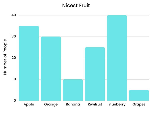
Vertical Bar Graph
Here is how a vertical bar graph looks like:
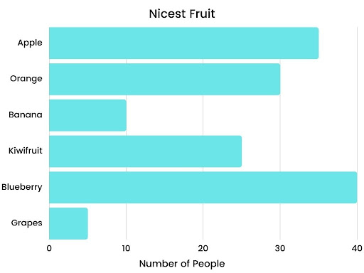
Horizontal Bar Graph
Here is how a horizontal bar graph looks like:
A Comprehensive Guide to Write IELTS Bar Chart Essay
If you wish to learn more about writing a high-scoring IELTS bar essay, here is a comprehensive process that will help you out.
Evaluating the Question
The first and foremost step is to evaluate and analyze the question. In the question, you will get a brief description of the bar chart along with instructions. Your job here will be to discover the central idea.
Assessing the Given Data
The next step is to assess the data that you have in the question. Find out whether it is dynamic or static. If it is dynamic data, it will show two or more time periods. If it is static data, it will show only one time period. For both these data types, you will have to use different languages to write the description.
Discovering Primary Features
Majorly, bar graph questions are meant to test your mathematical as well as language skills. Hence, you must know how to derive the primary features from the given data and write about it.
Describing a Bar Chart
Here is the complete format that should be used when describing a bar chart or a bar graph.
The Introduction
In the introduction paragraph, you would have to paraphrase the asked question. This can be done by using synonyms and paraphrased words and sentences. Also, ensure that this section is sounding natural.
The Overview
Usually, an overview forms the second paragraph of the essay. In this one, you would have to write down the main features. Also, you must discover available comparisons and talk about general trends occurring in the given data.
The First Body Paragraph
In the first body paragraph, you will have to give detailed information and explain the given data. Here, you must focus more on language instead of facts. Making relevant comparisons is always useful.
The Second Body Paragraph
This second body paragraph will have your explanation of the remaining features. It will be the same as the first body paragraph, but with different information.
Choosing the Information from the Bar Graph
As you would already know, a bar graph question requires a report of 150 words to be written. To help you out with an easier way, you can follow (but not stick to) the below-mentioned guidelines.
Tips to Write IELTS Bar Chart Essay
Jotted down below are some tips that will help you write a relevant, on-point IELTS bar chart essay
1. Is it difficult for you to match the word count?
Most of the time, people find it difficult to match the word count. Hence, they start using complicated words to unnecessarily extend the sentences. While using high-end vocabulary is a pro, writing sentences that are difficult to be understood is a con.
2. Be straightforward in your writing
When describing the bar graph, try not to complicate the description. Be straightforward and on-point.
3. Do you only practise with one type?
While practising, do you only try working on one type of chart or graph, or do you expand your horizons as well?
4. Practise as much as possible
While practising, work on varying bar charts or graphs so as to enhance your ability to explain whatever comes in the examination.
5. Are you always in a hurry for submission?
One of the common mistakes that people commit is not reviewing their answers before submission. This could lead to you missing out on errors and issues that can impact your marking.
6. Review your writings before submitting
Once written, double-check for grammatical errors . Review important details and superlatives to make sure you didn’t miss anything.
Here are 10 bar graph IELTS practice test examples:
Also check :
- IELTS Writing tips
- IELTS Writing recent actual test
- IELTS Writing Answer sheet
- IELTS map vocabulary
- IELTS Writing Task 1 Connectors
Frequently Asked Questions
What is a bar chart?
What is the structure of a bar graph?
What is the difference between introduction and overview? Can I skip the overview because I feel introduction is enough?
Can I have just one body paragraph where I give almost all the information?
What is the expected word count for describing a bar chart?
Practice IELTS Writing Task 1 based on report types

Start Preparing for IELTS: Get Your 10-Day Study Plan Today!
Janet had been an IELTS Trainer before she dived into the field of Content Writing. During her days of being a Trainer, Janet had written essays and sample answers which got her students an 8+ band in the IELTS Test. Her contributions to our articles have been engaging and simple to help the students understand and grasp the information with ease. Janet, born and brought up in California, had no idea about the IELTS until she moved to study in Canada. Her peers leaned to her for help as her first language was English.
Explore other sample Bar Charts
Janice Thompson
Post your Comments
Recent articles.
Nehasri Ravishenbagam
Raajdeep Saha
Our Offices
Gurgaon city scape, gurgaon bptp.
Step 1 of 3
Great going .
Get a free session from trainer
Have you taken test before?
Please select any option
Get free eBook to excel in test
Please enter Email ID
Get support from an Band 9 trainer
Please enter phone number
Already Registered?
Select a date
Please select a date
Select a time (IST Time Zone)
Please select a time
Mark Your Calendar: Free Session with Expert on
Which exam are you preparing?
Great Going!
Free IELTS lessons signup

- Academic practice
- General practice
- Task 1 Academic
- Task 1 General
- Task 2 (essay)
Answering IELTS writing task 1: bar chart
In this lesson we’re going to learn how to tackle bar charts in IELTS Writing task 1 questions to get the highest score. To get a band 9 in IELTS Writing task 1, you should follow this answer structure :
- Introduction
- General overview
- Specific features
Let’s look in detail how to apply this structure to an IELTS bar chart question .
IELTS bar chart Question :
The bar chart shows the divorce rates in two European countries from 2011 to 2015. Summarise the information by selecting and reporting the main features, and make comparisons where relevant.
You can watch a video tutorial on how to describe bar charts in IELTS Academic Writing task 1:
And now let's learn how to answer IELTS bar chart questions .
IELTS bar chart answering strategy :
1. Introduction
You should start your answer by writing an introduction . The introduction is 1 or 2 sentences, where you paraphrase the information from your question. You should mention two things in your introduction:
- what your graph shows
- for what period of time
In our example, the introduction can look like this:
The bar chart provides information about the percentages of divorces in Finland and Sweden between 2011 and 2015.
See how I used synonyms to paraphrase the question :
shows → provides information about divorce rates → percentages of divorces two European countries → Finland and Sweden (it’s good to be more specific) from 2011 to 2015 → between 2011 and 2015.
2. General Overview
The second paragraph of your answer is a general overview , where you briefly describe major trends on your graph. Ideally, you should describe 2-4 key features.
To make major trends easier to notice, you can outline Sweden’s bars and Finland’s bars like this:
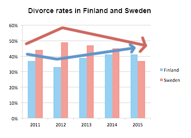
Now it’s obvious that:
- Sweden experienced a downward trend
- Finland experienced an upward trend
- both countries showed fluctuations
- Initially Finland had a lower rate, but in 2015 Finland outraced Sweden
Use word overall to start your general overview. In our case, the overview may look as follows:
Overall, Sweden experienced a downward trend, while Finland showed an upward trend throughout the period. Both countries’ divorce rates had some fluctuations. Although Finland initially had a lower rate, it outraced Sweden at the end of the period.
3. Specific details
After we’ve written the introduction and general overview, it’s time to give the specific details . You should describe the specific features in 2 or 3 (sometimes more) paragraphs.
You can group data in such way :
- Details about Sweden
- Details about Finland
When you have two countries (or two cities or any other two things depicted on the graph), the simplest way of grouping data - is to describe each country’s trend in a separate paragraph.
When giving specific features, you have to write exact numbers/percentages and include as much details as you can .
In our case, the specific details may look as follows:
Sweden’s divorce rate was about 45% in 2011, being higher than Finland’s rate by approximately 8%. Then, it rose to almost fifty percent in 2012. However, the figure showed a gradual decrease to about 47% in 2013, and continued to decline steadily to the end of the period, reaching around 45% in 2014 and hitting a low-point of about 37% in 2015. Percentage of divorces in Finland was less than 40% in 2011, and it decreased in 2012, when about one third of marriages in Finland ended with a divorce (as opposed to almost a half in Sweden). However, the figure experienced a steady growth during the next two years. It rose to approximately 39% in 2013, then increased by around 3% in 2014, and remained steady for the next year, outracing the rate of Sweden.
- When analyzing a bar-chart, we cannot always give exact details (due to inaccuracies of the chart), so use words around , about and approximately when giving inexact data.
- Give data for each year shown on the chart
The full answer + Practice
It’s the end, we have finally written the answer for IELTS bar chart question. And now, let’s practice: fill in the gaps in this answer with appropriate words .
The provides about the percentages of divorces in Finland and Sweden between 2011 and 2015.
, Sweden experienced a downward trend, while Finland showed an trend throughout the period. Both countries’ divorce rates had some fluctuations. Although Finland initially had a lower rate, it Sweden at the end of the period.
Sweden’s divorce rate was about 45% in 2011, being higher than Finland’s rate by approximately 8%. Then, it rose to fifty percent in 2012. However, the figure showed a gradual decrease to about 47% in 2013, and continued to decline steadily to the end of the period, reaching around 45% in 2014 and hitting a of about 37% in 2015.
Percentage of divorces in Finland was than 40% in 2011, and it decreased in 2012, when about one third of marriages in Finland ended with a divorce (as to almost a half in Sweden). However, the figure experienced a steady growth during the next two years. It rose to approximately 39% in 2013, then increased by around 3% in 2014, and remained steady for the next year, outracing the rate of Sweden.
(190 words)
Describing a bar chart

Learn how to write about trends in a bar chart.
Do the preparation task first. Then read the text and tips and do the exercises.
Preparation
Grouping_MjI3NTc=

The chart shows the sales revenue of a selection of home video entertainment formats in the USA in 2017. It also shows the percentage change from the previous year.
Online video streaming was the most popular format in 2017. US consumers spent $9.8 billion on services such as Netflix, which was a rise of 32 per cent from the previous year. For the average American, this accounted for nearly half of their spending on video entertainment at home.
At the same time, customers were moving away from the three physical formats in the chart. DVD and Blu-ray sales dropped by 14 per cent over the twelve-month period to $4.5 billion in 2017, and rent-by-post revenues went down by 20 per cent to $0.5 billion. DVD rental shops saw the largest decline, as spending fell by 21 per cent to just $0.4 billion.
Overall, there was a clear downward trend in spending on physical video formats, as they all showed relatively low sales and they were all in decline. However, there was an upward trend in paying for streaming.
Please note: This page was designed for writing practice only. Information in the chart may not be accurate.
- In the first paragraph, give basic details about the chart including what it shows, where it refers to and when.
- When you describe chart data, be specific. Mention the category and figure, e.g. Online video streaming was the most popular format in 2017. US consumers spent $9.8 billion ...
- A trend is a change over time. To describe trends, focus on what is increasing or decreasing compared to some time in the past, e.g. ... which was a rise of 32 per cent from the previous year .
- If several categories show the same trend, talk about them together, e.g. customers were moving away from the three physical formats in the chart.
- State the units of measurement, e.g. US consumers spent $ 9.8 billion .
- Many of the verbs for up and down trends can also be used as nouns, e.g. Spending fell by 21 per cent = There was a 21 per cent fall in spending . (You can write % or per cent, but be consistent.)
- Write a conclusion. Say what we learn from the data overall.
What trends do you notice in the way people spend their money in your country?
Language level
I notice that people in my country love try something new. We have trend with cafe or restaurant,so when new cafe open people go because everyone want describe own position about this.
- Log in or register to post comments
As Argentina is experiencing a significant increase in inflation rates in recent years, I see how consumers are drastically changing their spending behavior, moving from high-cost and leisure goods to short-term goods and services to satisfy their basic needs. such as food, electricity, mobility, health and education. However, as the value of the peso falls every day, there are people who decide to spend it as soon as possible on long-lasting goods such as cars or on small pleasures such as a meal at a restaurant. In the end, all of us who have experienced other inflationary processes in recent decades know that unfortunately the most likely thing is that the next step for our economy will be a severe crisis that will lead to spending and consumption falling practically to zero.
to tell the truth, because I mind on my own. I haven't paid attention to this matter . It's a comprehensive question that needs statistical review. For example, On the one hand, How can I guess a woman who is buying three shoes whether she is wasting her money or doing something reasonable? The correctness of her action depends on her revenue and financial situation. On the other hand, I know people who have good financial situations but they just buy gold, and their appearance has nothing to do with their bank account! Overall, what I see is my society is getting better in all fields. the variety of goods and as a result the right of choice for customers has increased. I think the variety has increased the desire to buy.
Many supply chains in Mexico have been taken a dicrease in their revenues since the pandemic of COVID 19 in 2020. The charts showed that in big chains like walmart those years looked down their retail sales. Despite of, Walmart, Amazon, eg, had seen necessary to change their strategies, so they decided apply online buys for customers over the world. The sales since 2021 has increased up to 12% according the charts. Overall, revenues still increasing because all those strategies from companies are succesfull and constantly marketing and sales strategies are changing. It is stimated that in 2030 these companies will have the majority of profits inside global market.
Given the fact that Pandemic isn't over yet, it has a negative impact all over the world. In my country we saw a rise in prices of food and oil due to disruption in supply and strong dollar which is a dominant reserve currency. Import goods are usually sold and bought in dollar, strong dollar exported inflation in my country as the Peso gets weaker. There was a decline in demand for trendy clothing. I noticed people do away with shopping and spend their money for necessities. The economy has been crippled and struggling to meet its annual growth target. Businesses are shut down. The trickle effects of these inevitable societal and economic uncertainty are felt by ordinary citizen in my country affecting their livelihood and struggling to make ends meet. Essential shopping is now a most prevalent trend.
In my country, Overall, the trend declined, and all business revenues drop up, the demand is decreasing for all wanted, and luxury staff. People only buy the thing which is essential for daily life and to survive. The human traffic business grows up, and people spend numerous amounts to be fled from the country due to life threatening. This is the economic story of my country.
People in Hong Kong spend a lot of money on NB shoes, and their prices have risen quickly for some special categories of shoes. Worldwide shoes speculation. Some people need to spend more than that to obtain what they want.
I noticed that here in China-the country where I live, people spend their money on retail sales. They are willing to spend their money online.
In 2021, the total digital sales revenue grew by 12.5 % from the previous year to XX billion dollars, accounting for 52% of the country’s retail sales, up from 44.8% a year prior. Thanks to e-commerce marketing developing, customers can shop almost all kinds of goods online and their favorite place to buy is Taobao, Tmall, and JD. In Tmall Double 11—11 November each year shopping festival, it achieved a new record of US$84.54 billion in gross merchandise volume
Overall, there is clear upward trend that retail sales of an entire country and it is transacting online.
In my country, everyone has usually spent money on fashion, traveling, or spent a lot of money on a nice restaurant to selfie.
The trend I noticed in my country is about invest in cryptocurrency. It's a new way of increase money in bank account. The last two years about 3 million people invested their money in cryptocurrency to buy bitcoin and ethercoin. This two cryptocurrency is famous in my country. I'm also planning to invest my money in this.
Online courses

Group and one-to-one classes with expert teachers.

Learn English in your own time, at your own pace.

One-to-one sessions focused on a personal plan.

Get the score you need with private and group classes.
- Skip to main content
IELTS Podcast
Pass IELTS with expert help.
How to score high on a bar graph question in writing task 1
The bar graph task 1 essay accounts for a third of your marks in the writing test so we recommend spending around 20 minutes on it, as this is a third of your time. There are a couple of different structures you can follow when describing an IELTS bar chart .
A strategy for bar graph questions
Essay structure, or how you organise your answer, is very important in academic writing. Today we will teach you a new method – a structure where you assign each sentence of your text to a topic – kind of the opposite of what you usually do when writing task 2 . It may look a little confusing, but this method really works! Just follow our lead for IELTS task 1.
Remember that bar chart and bar graph are synonyms and you can use the phrases interchangeably. Although each bar graph will be different, you are not required to be an expert on the information it shows, just to summarise the information, identify trends and make comparisons. Each bar graph IELTS question is different, so look at as many bar graph examples as you can and practice this strategy until you feel really confident.
How to choose information from the bar graph?
Assuming one sentence contains around 10 to 15 words, we can estimate that your description of the bar chart will consist of about 10 to 12 sentences. Now we can assign each sentence a specific task:
- One sentence for the introduction.
- Two sentences using superlatives.
- A sentence with a comparison. Make comparisons where relevant.
- A sentence grouping two data points to show similarity (for example, you might include a brief description showing a gradual decrease in two different areas).
- A sentence noting an exception to an overall trend.
- A sentence describing some data in an advanced manner, using complex sentence structure.
- A sentence describing relevant data using a simple structure.
- Two sentences for summary and conclusion.
Note that this method is quite flexible and these sentences don’t necessarily need to go in this particular order. You must write them in a way that makes your bar chart description flow naturally. Think about which sentences go together in each body paragraph as well as the introduction paragraph and conclusion. You may also have to repeat a few sentences using different data if you find your graphic contains more information or find a way to mention different groups in one sentence. The structure above is a rough guide to get you started. Once you have looked at the example and are comfortable with this structure, you can use this example as a model to describe different bar charts and answer as many bar graph questions as you can. Just remember to get feedback while you are testing your ideas otherwise, it’s quite difficult to improve.
A bar graph sample question and answer
Now that we have figured out what we want to write about in the description of the bar graph, it’s time to put our data selection skills to use and make comparisons where relevant. It is easy to get lost in all of the information provided by a bar chart as there can be so much data. That’s why it’s important to keep in mind what you are looking for when you are analyzing the chart.
The task achievement score for task 1 makes it clear that you need to answer all parts of the question – in other words, describe the main features AND compare them, in order to get a good score. Task achievement is 25% of your total marks so don’t forget to make comparisons! The first thing you should do is identify key features. Once you have decided on the main points, make note of any secondary features that will support the main features.
Ready for a high-level bar chart task 1 answer? Let’s begin with the analysis of this bar chart, and pick out the information that is relevant to our structure. See the model answer of a bar chart below.
Sample Answer Bar Graph Essay
The bar chart shows the caloric intake of UK males in three distinct age groups of 0-24, 25-49, and over 50 years old. The data is shown as percentages. Dairy for the 0-24 age group was the highest source of calories, whilst the other categories each represented about 20% each. In the next age group dairy fell to around a quarter, and meat became the main source of calories, reaching half of the total intake. Pulses and vegetables reached 10% and 15% respectively. Pulses in the final age group increased sixfold to over 60%, whereas calories obtained from vegetables was 10%, half that of meat (20%), and even slightly less than dairy (15%). The 50+ group shows the most marked preference out of all the groups. It also confirms the gradual decline in vegetable consumption as males become older. Overall it is clear that each age group has a clear favourite which varies depending on age. However, vegetables are consistently amongst the least popular, regardless of age.
Sample Answer Analysis
In this essay, the introduction paragraph restates the writing prompt. It is not the overview paragraph, which can be either the first or the last paragraph. In this case, the overview appears at the end in which the writer states the overall trends of the bar graph. While the horizontal axis contains information relating to the question keywords, it’s important not to overlook the vertical axis and state clearly how the data is given (for example, is it as percentages, in kilos, or tonnes, or hours?) Make sure you have included this information in the first part of the essay.
You will also notice that the body paragraphs consist of a breakdown of the main features in order of age group to show and compare the difference in amounts of each food category consumed as people grew older, placing the final age group into its own body paragraph. This is because the data showed that there was a fairly significant upward trend in one food type (pulses) that the writer wanted to highlight. And finally, as previously mentioned, the conclusion part of this essay includes the overview, which should consist of a sentence or two about general trends.
Some notes on structure
Notice how the sentence is structured. How many complex sentences can you identify? When preparing for your IELTS academic writing task, you will want to show some sophisticated writing. When you sit for your IELTS writing test, you might feel pressured for time and it may be a bit difficult to think of complex sentence structures while considering the main features. Take note on the following important tips on structure:
- Make sure you have mentioned all the categories in your answer – in this example, there are four categories.
- Make sure you have also included the correct values when you summarise the data, in this case, percentages.
- It is often tempting to write too much for a task 1 essay but by following the method shown you will stay focused. Concentrate on the most important information.
- Compare the highest and lowest values, for example, rather than all the differences.
- Write what comes naturally at first, even if you write in correct simple sentences.
- Allow yourself some time at the end to go back and adjust some of your structures to complex sentences.
- If you are aiming for a high score on the IELTS test, you should aim for structures that are complex and accurate.
- It is important to be sure of the tense you are using. This example requires the present tense but many bar charts illustrate data from the past. In that case, you need to write the introduction in the present tense (the bar chart illustrates…) and then switch to writing mostly in the past tense (the number of people choosing this option dropped after the first year).
Click here for more free IELTS bar chart sample essays . You can also find sample IELTS task 1 questions here .
Tips on describing a bar graph in IELTS
- Avoid listing every single data point; instead, use your own words to describe the key information from the chart/graph.
- Avoid mixing formats: for example, don’t mix decimals with estimations in the same sentence.
- Check whether there is a date on the bar chart – you may need to use the past tense.
- Make note of general trends, particularly upward or downward trends that can be highlighted in your own words.
- After you have successfully written out your description with all of the information you want to include, go over it and replace some simpler words with more academic vocabulary – this will help you achieve a high score . For example, try replacing “big” with “most significant”.
- Check that your text is error-free. Review carefully to see if all your sentences are grammatically correct.
- Make sure that the data you have described is correct – that you have not made a mistake with a category or labels.
- Review for the correct use of connectors and linking words .
- Practise with different bar graphs/pie charts to improve especially with a range of values (percentages, kilos, miles, dollars).
- Review the superlatives – highest, lowest, most expensive, biggest difference – these are essential if you want to effectively describe bar charts.
- The fastest way to improve is to get feedback on your work. You can also check another model bar graph answer for comparison.
- Don’t forget to check your word count. Make sure your piece is another too brief nor too wordy and detailed. Most model answers come in at around 200 words. You’ll use a similar writing model for pie charts and tables so you don’t need to memorise completely different models for each.
Bonus tips to score high on IELTS Bar Graph Questions
- To improve your task 1 bar graph skills try copying out a sample bar graph with pen and paper. You will start to understand how to locate key points and choose the most relevant information. It doesn’t matter what the topic is, remember it could be anything from the gross domestic product of different countries to comparing the highest expenditure on housing. You don’t need to be an expert on gross domestic product or the Japanese rental market, you just describe the data and make comparisons.
- Practice describing a bar chart out loud. It will help you remember vocabulary to describe data under pressure, decide point by point what to include in your answer and make sure you have mentioned every category at least once. Your confidence will improve when it comes to your next IELTS writing task.
- Make sure you practice ‘two type’ questions – you might see an IELTS question with one bar chart or two so it is a good idea to look at a model answer for each type. You might see one bar chart and a table, or other types of graphs such as line graphs. Some questions might have a mix, for example, one or more pie charts and a bar chart. However the data is displayed, it’s important to stay calm and focus on finding the major differences and similarities, compare categories and identify trends. Describing a table or line graph is very similar to describing bar charts and the more you practice the more confident you will feel.
Check out one of our free lessons here by clicking on the following link !
Video: How to describe a bar graph
Click here to subscribe to the Youtube channel.

Frequently Asked Questions (FAQs)
How to describe bar graph in ielts task 1.
Divide the information into two or three groups, focus on trends and exceptions to help you. You don’t need to describe everything. Think of synonyms for key words and most important numbers – for example, 52% is just over half.
How to write task 1 bar graph?
Follow a model, the 4 paragraph diagram model is easiest. That’s rephrasing the question, one main trend, another main trend and an overview. Overall have 10 sentences with specific tasks as we explain in this article.
How do you write a description of a bar graph?
Remember that the important thing is to describe the main features AND make comparisons. Use superlatives and the phrase ‘which means that…’ to help you. For example, Portugal’s spending was between 20 and 27% which means that it had the highest spending of all 4 countries studied.
Audio tutorial: How to describe a bar chart for the IELTS exam
| Download | Stitcher | iTunes | Android | RSS
Podcast: Play in new window
Sample Bar Chart Questions and Model Answers
Take a look at these bar chart model answers to help you prepare
- Bar chart of international student enrolment in British universities 2009-2014
- Bar chart of average monthly revenue from retail telecommunication subscribers
- Bar chart of increase in total consumption
- Bar chart of life expectancy (2006)
- Bar chart of percentage of eligible voters registered for each race by state and year
- Bar chart of average weekly attacks
- Bar chart of pet Owners
- IELTS Task 1 Sample Answer 2 Double Graph Pie Chart and Bar Chart
Podcast: Play in new window | Download
IELTS Academic Writing Task 1: Bar Chart With Model Answer

Wondering what to expect when it comes to bar charts on IELTS Academic Writing Task 1? Let’s examine a practice bar chart question with a model band 9 essay .
To see why this essay is band 9, and check out the official IELTS rubric for Task 1 (PDF) . Then take a look at the scorer commentary that appears right underneath the model essay itself.
This particular prompt is a bar chart . Your approach to this chart should be the same as your approach to any other Task 1 infographic. Take a look at the information and think carefully. What is the best way to summarize the way the information is structured and the main points? From there, how can you best compare the most relevant pieces of information? Finally, how should you structure that summary and comparison?
For more advice on how to approach this, see our article on IELTS Academic Task 1 paragraph structure , as well as our main page for IELTS sample questions and practice resources .
Try to do this prompt yourself. Then check out our band 9 model essay below the prompt and compare it to your own work to see how you did.
Model IELTS Academic Writing Task 1 Prompt: Bar Chart
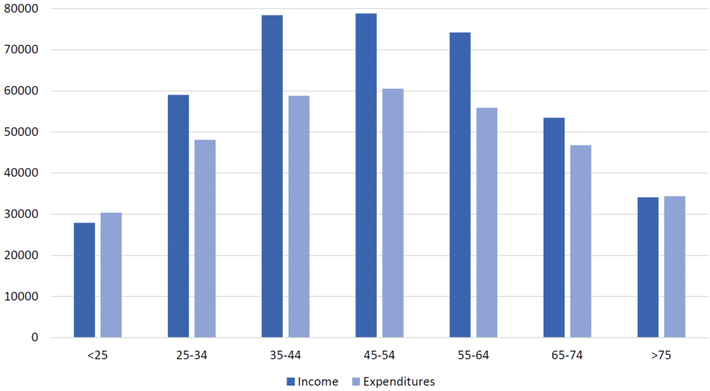
The chart below gives information about the ratio of income to spending (in dollars) by Americans by age range in 2013.
Summarise the information by selecting and reporting the main features and make comparisons where relevant.
Model Essay
This graph compares how much Americans spent to how much income they made in 2013, by age group.
The data shows an overall rise and fall in both income and spending between young, middle-aged, and older Americans. Income rises and falls more sharply than spending.
Those under 25 and over 75 actually spent slightly more than they earned. In contrast, between the ages of 25 and 64, Americans earned 10,000 to 20,000 dollars more than they spent. This difference shrinks in the 65-74 age group, where spending was just a few thousand dollars less.
In terms of actual numbers, those under 25 or over 75 earned and spent around 30,000 and 35,000 dollars, respectively. 25-34 year-olds and 65-74 year-olds both earned in the 50,000s and spent in the 40,000s. In the middle, between ages 35 and 64, income was 70,000-80,000 dollars, and spending ranged from roughly 55 to 60 thousand.
Scorer Commentary (Bar Chart, Band 9)
The score report below is based on the official IELTS Writing Task 1 rubric . This report also looks very similar to the Magoosh IELTS essay scoring service .
Overall Band Score: 9
What was done well in the essay:
- This essay is borderline risky when it comes to word count. But it still manages to sit at 158 words, just above the exact 150 word minimum. So the writer has managed to avoid the IELTS Writing word count penalty .
- The response includes all important details listed in the instructions. The basic topic of the grpah (debt to income for different age groups) is stated, followed by an overview of the tends, and some detailed comparisons of specific age groups and income levels.
- Each aspect of the essay gets its own paragraph, with a paragraph for the basic purpose of the graph, a paragraph for overall trends, and so on. This helps to clearly divide each different type of important information.
- Transitions and referential phrases are used effectively to show how ideas are interlinked. Examples include “in contrast,” “this difference” and “in terms of actual numbers.”
- Vocabulary and grammar are both excellent. No errors here, and some nice variety of sentence structure and word choice too. This makes the essay both easy and interesting to read.
More Practice IELTS Academic Writing Task 1 Sample Questions and Model Essays
- IELTS Academic Writing Task 1: Process Diagram with Model Answer
- IELTS Academic Writing Task 1: Map With Model Answer
- IELTS Academic Writing Task 1: Line Graph with Model Answer
- IELTS Academic Writing Task 1: Pie Chart with Model Answer
- IELTS Academic Writing Task 1: Comparing two Graphics with Model Answer
From there, you can study the “big picture” with Magoosh’s comprehensive guide to the entire IELTS Writing section .

David is a Test Prep Expert for Magoosh TOEFL and IELTS. Additionally, he’s helped students with TOEIC, PET, FCE, BULATS, Eiken, SAT, ACT, GRE, and GMAT. David has a BS from the University of Wisconsin-Eau Claire and an MA from the University of Wisconsin-River Falls. His work at Magoosh has been cited in many scholarly articles , his Master’s Thesis is featured on the Reading with Pictures website, and he’s presented at the WITESOL (link to PDF) and NAFSA conferences. David has taught K-12 ESL in South Korea as well as undergraduate English and MBA-level business English at American universities. He has also trained English teachers in America, Italy, and Peru. Come join David and the Magoosh team on Youtube , Facebook , and Instagram , or connect with him via LinkedIn !
View all posts
More from Magoosh

6 responses to “IELTS Academic Writing Task 1: Bar Chart With Model Answer”
The bar chart compares the amount of money American citizens from different age categories earned and spent in 2013. We can see that the pattern of distribution of both values has a bell shape, with the lowest figures for the youngest and the oldest groups, and the highest in the centre. It is also notable that except the youngest and the oldest age categories American people earned more than they spent. The income and spending for people younger than 25 were around $30000 and $28000 respectively, these figures were the lowest in the chart. However, next category (25-34) earned almost twice as much as the youngest group and spent just under $50000. Americans from the following two age groups, 35-44 and 45-54, were the highest earners and spenders. Their income scaled up to just under $80000 and expenditure amounted to £60000. In the next older age groups, the amounts of money Americans earned and spent decreases. While those from 65-74 age group earned approximately $53000, they spent about $47000. Finally, the oldest group ( 75+) spent all their income which was around $34000.
woooow i like it so much, can you help me for the writing task 1
The bar chart illustrates the proportion of earning and expenditure of the US nationals by seven different age groups in the year 2013. Overall, there were almost no gap between the income and expenditure noticed for people aged below 25 and 75 or above, whereas, people age ranges 35-44, 45-54, and 55-64 spent less than their earnings, however, they earned more and, thus, spent more than the rest of the four groups. People of 34-44, 45-54, and 55-64 years old spent around $20000 less than their earning (approximately $80000, $78000, and $75000, respectively), who had recorded the most earnings and expenses among the seven age groups. The ratio of expense and earning was not so high among the nationals aged 25-34 and 65-74 which were about $10000 and $5000, respectively. People aged 75 or above earned almost $35000 and spend the same amount of money while the young people aged below 25 earned around $28000 and spent $30000, a slightly more than their earnings. Both the young adults and old people had less income and expenditure than the rest of the people.
I think there is no penalty for less word count. The trend has changed recently as per my knowledge. Thank you.
The difference is that previously there was a FIXED penalty for writing under the word count. You would automatically get a band 5 or lower score in the Task Response category for writing under the word count. This automatic penalty has been removed, but the IELTS still clearly states that students “will be penalized if their answer is too short.” They do not specify by the exact amount any more, but in order to get the highest marks possible, I’d suggest writing a little more than the word minimum for each essay.
I hope this helps! 🙂
The chart illustrates that the proportionate of income to utilization of that by various age groups in America such as more than 25 year,25-34, 35-44,45-54,55-64,65-74 and more than 75 years in 2013. Overall, only less than 25 years old people disburse more money than the earnings, they spend 2000 dollars higher than the actual income. From 25-74 years age range peoples expenditure were less than the income but in the case of more than 75 years old citizen the ratio of their earnings and the spending is neutral. Moreover, by the comparison of less than 25 years old as well as 25-34 years old people their percentage of spending were decreased drastically by the means of yield, which means their income were 28000 and dissipated amount was 30000 but when comes to the case of 25-34 aged people that became 59000 and 49000 that is they started to made profit on the other hand in terms of profit 35-44 years age range were got more conscious about their spending which was 79000 as earnings and utilized amount were 59000 so their profit were 20000 more. In addition that, 45-54 years of American peoples also were made higher income just like 35-44 years people perhaps there were only slight difference in utilization of that income. The yield was 79000 and the expenditure was 60000. The age range 55-64 their expense were 10000 less than their income. In 65-74 aged peoples earning capacity became 53000 and the spending was 48000. The more than 75 years old American peoples both earnings and utilization were 33000 dollars.
Leave a Reply Cancel reply
Your email address will not be published. Required fields are marked *
IELTS Preparation with Liz: Free IELTS Tips and Lessons, 2024
- Test Information FAQ
- Band Scores
- IELTS Candidate Success Tips
- Computer IELTS: Pros & Cons
- How to Prepare
- Useful Links & Resources
- Recommended Books
- Writing Task 1
- Writing Task 2
- Speaking Part 1 Topics
- Speaking Part 2 Topics
- Speaking Part 3 Topics
- 100 Essay Questions
- On The Day Tips
- Top Results
- Advanced IELTS
IELTS Model Bar Chart Band Score 9
The model answer below is for an IELTS bar chart in writing task 1 of the academic paper. This model answer comes from the video tutorial I made, see the following link: Free Video Tutorial : How to Describe an IELTS bar chart
IELTS Bar Chart
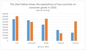
Source: Bar chart above from unknown source.
IELTS Bar Chart Sample Answer
The chart illustrates the amount of money spent on five consumer goods (cars, computers, books, perfume and cameras) in France and the UK in 2010. Units are measured in pounds sterling.
Overall, the UK spent more money on consumer goods than France in the period given. Both the British and the French spent most of their money on cars whereas the least amount of money was spent on perfume in the UK compared to cameras in France. Furthermore, the most significant difference in expenditure between the two countries was on cameras.
In terms of cars, people in the UK spent about £450,000 on this as opposed to the French at £400,000. Similarly, the British expenditure was higher on books than the French (around £400,000 and £300,000 respectively). In the UK, expenditure on cameras (just over £350,000) was over double that of France, which was only £150,000.
On the other hand, the amount of money paid out on the remaining goods was higher in France. Above £350,000 was spent by the French on computers which was slightly more than the British who spent exactly £350,000. Neither of the countries spent much on perfume which accounted for £200,000 of expenditure in France but under £150,000 in the UK.
Comments: The report has been organised into logical paragraphs with flexible use of linking. The overview is very clear with key features well highlighted. Accurate data is used to support sentences in the body paragraphs. There is a range of complex structures and vocabulary which is used flexibly. This is an estimated band score 9 writing task 1 report for the academic paper.
Recommended
- How to Describe a Bar Chart: Free Video Tutorial
- All Bar Chart Lessons
- Model Pie Chart
- Model Line Graph
- Sample Bar Charts for Practice
- ALL Writing Task 1 Lessons, Tips and Models
Main IELTS Pages Develop your IELTS skills with tips, lessons, free videos and more. IELTS Listening IELTS Reading IELTS Writing Task 1 IELTS Writing Task 2 IELTS Speaking Vocabulary for IELTS
Get my free lessons by email
Subscribe for free to get my new IELTS lessons sent to your email inbox.
Email Address
Dear Liz, Thank you from the bottom of my heart. My friend sent me the link to your blog when I was desperate. As soon as I realized I had figured it out, I turned into a huge “I GOT IT!”. Thank you so much. Your explanation is clear, simple, and to the point.
I’m so pleased for you. Those moments of “I got it!” are so important. I want everyone to realise that you can tackle IELTS, but you need to avoid over-thinking. IELTS is, in some ways, quite a logical test. But in the beginning it seems confusing and then there is bad advice online. Anyway, I’m pleased for you. I hope you continue to use all pages on my free website and eventually achieve the score you want. I’ll keep my fingers crossed for you 🙂
The bar chart illustrates the amount of money that is spent on different consumer goods (cars, computers, books, perfume, cameras) in France and the UK in the year 2010. Units measured for the money is pound sterling.
Overall, the most money that is spent by France and the UK are on cars and least is on cameras and perfumes respectively. We can say that that UK has spent more money in consumer goods than France. The expenditure on the cameras has significant difference in France and in the UK.
The cars, computers and the cameras were most spent on, in the UK around 450000-pound sterling, similarly France also spent most of their money on cars and computers but unlike UK it didn’t spend on cameras but on books, which is around 300,000-to-400,000-pound sterling.
Coming to the least amount of expenditure on the goods, France spent it’s least amount of money on cameras and UK spent it’s least on perfumes. Cameras were one of the highest expenditures of UK in the year 2010 but were the least for France. Their difference significantly amounts to approximately 150,000 pounds sterling.
The bar chart illustrates the amount of pounds sterling which were spent by Fance and U.K for goods such as cars, computers, books ,perfume and cameras in 2010.
Overall, France spend more money on computers and perfume, meanwhile U.K were much interested in cars, books, and cameras.
The expenditure rate of France for cars and computers was close about 400,000 pound sterling, with 25,000 difference. Meanwhile, for perfume and cameras France spent half as much as that for cars around 200,000 and 50,000 less for cameras.
The U.K hold a record for highest expenditure in the chart for cars which is around 450,000, also they spent for books as much as France for cars. In addition, computers and cameras rate of expenditure was the same 350,000 pound sterling. While the least amount was spent on perfume about 140,000 pound sterling.
Hi Liz, I was most scared of writing task and i scored 7.5 and 8 overall. You articles and topics helped me a lot in achieving this score.
Great results! Very well done to you! Thanks for coming back to share your results 🙂
I have no idea how to check my writings. Are there any problems with my writing: The bar chart illustrates the spending of France and UK on five different goods in 2010.
Overall, in both countries the highest expenditure was on cars, while perfumes accounted for the lowest in the UK and the cameras had the lowest figure for France. Moreover, while the UK expenditure on cars, books and cameras was more than France, French spent more on computers and perfumes.
Expenditure on cars stands at 450,000 for the UK, and this figure, standing at 400,000, is slightly smaller for France. Likewise, while the British spent 400,000 pounds on books, French spent only 300,000 on this category. In terms of cameras, the figures show that spending of UK with just over 350,000 was more than double the rate for France with 150,000 pounds.
In contrast, French spent more on computers and perfumes. Expenditure of computers stands at approximately 380,000 for French, which is slightly more than the amount spent by British standing at 350.000. Likewise, expenses of perfume for France was 200,000 pounds, while it was less than 150,000 for the UK.
I don’t usually give feedback, but I will say it’s a strong piece of writing with the right structure and techniques. However, do make sure to list the categories in the introduction – it’s important to introduce them before you refer to them. Of course, if the list if very long, you might not. But this list is short, so it is a good idea to introduce them. Also check your linking words – you have a tendency to repeat them which will lower your score. Linking words are very easy to learn and it isn’t difficult to be flexible with them if you pay attention while you are writing. For example, you can use “similarly”, “although”, “whereas”, “as opposed to”, “in comparison to” etc. Lastly, pay attention to your tenses “expenditure on cars stands at” = “stood at” – this is in 2010 so you need past tense. You also need to review the accuracy of your grammar as a whole.
Thanks a million, it was very helpful and I never thought I would get a feedback from you. I’m sending you all my best wishes for a swift recovery. I truly hope your illness fades away so you can be back to your healthy self soon.
Thanks a million. Well noted.
The bar chart illustrates the spending on 5 consumer goods, namely cars, computers, books, perfumes and cameras, of France and the U.K. in the year 2010.
Overall, the expenditure of the British was higher than that of the French. Both Britain and France spent the most money on cards. The British spent the least money on perfume compared to the French whose expenditure on cameras was the least.
Regarding the expenditure on cards, the British spent slightly more than £450,000 while the French spent exactly £400,000 on this. The U.K. spent over £400,000 on books as opposed to £300,000 spent by France. The amount of money spend on cameras by the U.K. was more than twice as the amount spent by France, which was over £350,000 and £150,000 respectively.
On the other hand, the French spent marginally more than £350,000 on computers than the British did (£350,000). For the amount of money spent on perfumes, £200,000 was spent by the French which was more than the British who spent less than £150,000.
The bar chart illustrates the consumer goods preferences of two countries (France and the UK) in 2010. Overall, cars and computers were the most consumed goods in both countries, with perfume being the least preferred. However, the UK had the highest expenditure on all goods when compared to France. The UK has spent more money on cars, books, and computers, respectively, when compared with France, which has fewer expenditures. Furthermore, the UK used more cars than France, and the difference is nearly 50,000 pounds sterling. In addition, the UK spent a significantly higher portion than France, and the difference was worth nearly a hundred thousand pounds sterling. On the other hand, the UK spent more on cameras, which are worth more than 350,000 pounds sterling, but France spent less on them, which cost 150,000 pounds. In contrast, expenditure on computers was the only thing France spent over the UK; it was closer to 400,000 pounds sterling.
The bar chart illustrates the money spend on the consumer goods (cars, computers , books, perfume and cameras ) in UK and France in 2010. Units are measured in pounds sterling. Overall, it is clear that UK and France both spend most on cars while least on perfume in UK and cameras in France. The major difference was found on cameras . UK spend 450, 000 pounds on cars which is higher than France (400,000). UK spend more than France on books which is 400,000 pounds. (1000 pounds more than France). Likewise UK spend half 350,000 on cameras while France spend half less than UK on cameras (15,000). France spend more than UK on 2 items ( computer and perfume). France spend more than 350,000 on computers while UK spend exactly 350, 000 on computers. Similarly, France spend 200,000 pounds on perfume which is higher than UK’s expenditure i.e about 150,000 pounds.
The chart illustrates the amount of money spent on five consumer goods (cars, computers, books, perfume, cameras) in France and UK in 2010. Units are measured in pounds sterling.
Overall, the UK spent more money on consumer goods than France in the year 2010. Both the British and French spent most of their money on cars where as the least amount of money was spent on perfume in UK compared to cameras in France. Furthermore, the most significant difference between both the countries in expenditure was on cameras.
In terms of cars, people in UK spent about 450,000 pounds sterlings as opposed to the French at 400000 pounds. Similarly British expenditure was more than double on cameras as compared to France (around 350,000 and 150,000 respectively). Whereas in France expenditure on perfumes (about 200000) was more than that of UK, which was under 150,000 pounds.
On the other hand, the amount of money spent on computers was more in France ( around 370,000 pounds) than that in UK, which was 350,000 pounds. There was a huge difference in expenditure on books between both the countries, which was around 400,000 pounds in UK and 300,000 in France.
The bar chart demonstrates the average spending on five types of consumer goods in France and the UK in 2010.
Overall, except for computers and perfume, the amount of money used for buying consumer goods in the UK was higher than that of France. Among the five categories, the expenditure on cars was always the highest in both countries.
Looking at the data of France, while the French spent 400,000 pounds on cars, this figure for perfume was 50% lower, at merely 200,000 pounds. As compared to cars, the expenditures for computers and books were slightly lower, with respective figures being 380,000 and 300,000 pounds. Besides, only 150,000 pounds were spent on camera, being the lowest consumer spending among the five kinds of goods.
Turning to the UK’ statistic, it can be seen that the amount of money used for paid out on cars was over 450,000 pounds, and a third of it was the figure for perfume. Another noticeable feature is that the UK residents spent an equal amount of money on computers and cameras, which was approximately 350,000 pounds each.
I’ll leave similar feedback to a previous comment. Bar charts present categories as two bars so that those two bars can be compared together side by side. The two bars are France and the UK. This means you don’t separate the countries, you compare them.
Thank you so much, I’ve noted
greetings Liz,a question ;Is a symbol counted as a word
The symbol forms part of a number. For example, “75%” is counted as one number in the writing test.
Wonderful explanation! Thank you liz.I love you from my heart for your amazing teaching method.
Glad you enjoy my lessons 🙂
The chart illustrates the national spending on five consumer commodities(cars,computers,books,perfumes and cameras) in France and the UK in 2010. Unit is in pounds sterling. Overall, the UK and france spent the most on cars. In France, the least expenditure was on cameras, while in the UK it was on perfumes. In total, the outlay of the UK was more than France. The information given indicates that the national spending on conusmer goods in france declined across all the categories with more expenses on cars(450,000 pounds). This amount was more than double the payments on cameras(180,000 pounds) which had the lowest outlay for France. In contrast, the national expenditure of the UK fluctuated during this period,with most of it(400,000 pounds) alloted to cars this was similar to France allotment on books for the period.The least payment for the UK was on perfumes(), with a slight difference in pay outs on computer by both countries respectively(350,000, 370,000) pounds.
please liz kindly rate my writing thanks for the efforts you have put into this blog, am from Nigeria and am using your blog to study for my IELTS exam coming up in 2weeks.
The sentences “Units are measured in …” is always plural. The information about consumer spending in France declining over all categories, is an overview and belongs in the overview. When you describe a trend over the whole period without specific amounts put that information in the overview. A bar chart is about comparing the countries within the category – exactly as shown in the chart. You describe, for example, cars and compare the spending of France and the UK in that category. You must respect the function of the bar chart and how the information is present in the chart. Finally, don’t use brackets all the time for the numbers. Your aim is to show how flexible you are with your sentence structures.
I have noted all the corrections you have said.
The bar chart compares the amount of money spent on the five various goods ( cars, computers, books, cameras) in 2010 in two Europeian countries (France and UK) Overall, it can be easily seen that UK has spent more money on cars, books and cameras. Also, The considerable difference between 2 countries was on cameras. To begin with chorus, UK has spent about 50000£ more than France showing 450000£. Above 350000£ was spent on computers in France. Similarly with cars, aproximately 400000£ has been spent on computer by UK in 2010 On the other hand British expenditure was higher than France ( about 400000£ and 300000£ respectively). In both countries the amount of money spent on perfume was low which accounted 200000£ in France and just under 150000£ in UK. Camerad was one of the most popular item in Britian reaching just above 350000£ while France has the lowest point 150000£ in 2010
The chart below depicts the information about the spending on household items in United Kingdom and France in 2010. After analyzing the graph, it can be seen clearly that France spent 400,000 pound on cars in 2011 being greater than UK in same year. Total expenditure on computers in France was 375000 in given year. The money spent by France on remaining three goods (books, perfumes and cameras) was less than the first two items, which were 300,000,200,000 and 150,000 respectively. The graph further collate that the expenditure of UK on cars was around 460,000 pounds in 2011. However, UK spending on computers was less than France by about 350,000. After cars, books were the most consumed items in UK with around 410,000 pounds. Perfume was least consumed item by people of UK by approximately 140,000 pounds. UK spent almost double on cameras than France by about 360,000 pounds. Overall, France showed a downward trend and UK had some fluctuations in his expenditure on consumers goods.
Hello Liz, Isn’t this answer a little above 200 words? Is it fine to write so much? Thank you.
There is no word limit for any writing task in IELTS. However, longer answers might be less focused, contain more irrelevant information and could contain a greater density of language errors. I recommend all candidates to aim for between 170 and 190 words. However, I also like to show flexibility of options for people with higher level English and excellent IELTS exam skills
In many nations only a small group of individuals receive very high salaries. Few people debate that this is beneficial for the country and other’s think that government should put limits on salary.
Firstly, huge salaries are received by people with exceptional talent and the person who is doing that job may play a crucial role in the company’s or nations development, for instance in my country highest salaries are received by company ceo’s, and other government individuals like scientist, Ias officers etc. In my opinion it is justified giving them huge salaries because to get that position they must have worked very hard.By giving higer salaries one nation can potrait it’s economical strength and preserve its own talent, for example most of the students from russia with huge talent mostly tend to work in there country.
However, others believe that government should implement certain rules to limit the salaries received by a individual person. Mostly people believe that giving such a huge amount pf salaries to a single person can effect overall companies or government expenditure, also they think that poor and middle class families remain same. This also effects in pandemic time, for example in the USA due to inflation most of the common people became homeless, and the one who received higher salaries were able sustain that. There is always a difference between high salary employe and low salaried, due this per capita income is varied.
In conclusion, every individual has their own opinion, but according to me putting restrictions on salaries can effect the overall development and If government implements certain rules then most of them will migrate to other countries for better life, instead government should bring more employment opportunities to improve overall employment rate and GDP.
Thank you for your lessons and materials. I noticed on the website that you advise sticking to the official British Council information for the test. I have a question related to this. In the official ‘Road to IELTS’ advice and tutorials for Writing Task 1 (IELTS Academic), the instructors suggest structuring the text as follows:
– Introduction – Body paragraphs – Overview (as a sort of concluding paragraph)
From your videos, you seem to suggest placing the ‘Overview’ paragraph right after the ‘Introduction,’ which makes sense, and I agree with you on that. What is your opinion on this matter? Is the placement of the ‘Overview’ paragraph interchangeable (meaning we won’t lose marks if it is positioned at the beginning of the text)?
Yes, it’s interchangeable. I have a video about this. Some people choose to put it at the end as a kind of conclusion. But the function of a conclusion is to restate main points. An overview doesn’t have this function. The overview actually states the main features for the first and only time, which is why putting it after the introduction is best. Secondly, when you put it at the end, people have a tendency to not pay much attention to its contents. What a mistake! It’s the most important paragraph in the whole of task 1. However, it’s position can be put in either place without impacting your marks. But always be aware of not prioritising it or repeating information if you choose to put it at the end.
Liz, in terms of numbers, is it a big deal to write 40.000 (forty thousand, as an example) with the point rather than with a comma? (Eg: 40,000)
What is the norm in English here? (Or otherwise, Maths…)
Thank you in advance.
In English, the dot is used as a decimal point which would make 40.000 an actual number of just 40. We use commas to divide zeros for big numbers.
Hello Liz, Units are measured in pounds sterling. Units were measured in pounds sterling. Would it be wrong if I use past tense in this sentence?? Thank You
We use the present tense for this statement because it refers to the graph currently in front of you.
The bar charts compare the amount of money spent on different groups of goods (cars, computers, books, perfume and cameras) in 2010 in France and the UK. Units are measured in pounds sterling.
Overall, it can be clearly seen that the British in general spent more money than the French. The biggest expenditure for both countries was on cars, whereas the lowest for the UK was perfume and for France cameras.
In terms of the outlay of the UK, most of the money was paid for cars and books (just over 45,000 and 400,00 respectively). The expenditure on cameras and computers was almost equal at nearly 350,000, whereas the lowest amount of money was spent on perfume (under 150,000), which was at least 2 times less than on other goods.
Moving on to the situation in France, they spent the majority of money on cars as in the UK, however their expenditure was by 50,000 less. In contrast, the French paid slightly more than the British for computers, which was followed by the outlay for books (nearly 380,000 and 300,000 respectively). Finally, perfume was ranked fourth at 200,000, followed by the least group in terms of expenditure, cameras, at 150,000, which was twice as less as the British paid for them.
The bar chart illustrates the amount spent on five consumer goods (Cars, Computers, Books, Perfume, Cameras) in France and UK in the year 2010. Units are given in pound sterling.
Overall, UK and France both spent most of their money in Cars. However, the least amount of money spent by UK was on Perfume whereas in case of France was Cameras. Furthermore, the most significant difference in expenditure between France and UK was Cameras.
Looking specifically at France, the figure shows it spent 400,000 pounds in Cars. Similarly, the expenditure of France on Perfume and Computers were 200,000 pound and about 375,000 pounds respectively which exceeded the expenditure spent by UK on both the goods. Moreover, The amount spent by France on Books was 300,000 which was double the expenditure on Cameras.
Regarding UK, Cars were the goods which UK spent most, with 450,000 pounds. The amount of 350,000 was paid out on Computers which was slightly less than the amount France invested. UK spent slightly little more than 400000 pounds on Books. Similarly, the expenditure of Cameras was slightly more than 350,000 pounds. However, the least expenditure spent was on the Perfume which was almost 150,000.
The bar chart provides data about money spent by the UK and France on consumption goods in the year of 2010. Unit of money is pounds sterling.
Overall, both France and the UK spent most on cars.The UK’s expenditure on cameras was roughly twice as large as France’s.
Looking specifically at France, the amount of money spent on cars accounted for 400000, which was the highest in France.After cars, comes computers to a close second at around 380000.On the contrary, the least amount of funds was disbursed on cameras at exactly 150000, which is twice as little as the UK’s expenditure on cameras.
With respect to the UK, it, like Fance, also had cars as the consumption goods on which the highest amount of funds was expended, which accounted for about 460000.Books was the second consumer item after cars on which the largest expenditure was made at around 410000.In contrast, the UK expended less than 150000 on perfume, which was the item on which the least expenditure made. Is the essay good enough?What band would it score?
The provided chart portrays the comparison between the amount of money spent by France and the UK, in 2010, on five consumer goods i.e. Cars, Computers, Books, Perfumes, and Cameras. The unit of measurement used to present the values is pound sterling. Most significantly, the total expenditure of the UK surpasses that of a France. The maximum amount of money spent by both the countries was on cars which amount to just above 450,000 and 400,000, respectively. Whereas, the minimum spending by the UK was on perfumes (Slightly less than 150,000) and by France it was on cameras (150,000). Getting into further depth, the items on which the spending by the UK was more than France were Cars, Books, and Cameras. On Cars, the UK spent 450,000 while France spent 400,000. Apart from that, the spending by the UK on Books and Cameras was just above then 400,000 and slightly above than 350,000, respectively, whereas, the spending by France on same items was 300,000 and 150,000, respectively. Collectively, the total spending by the UK on these three items was over 120,000 which was greater than France’s total 800,000. On the contrary, France (total over 550,000) exceeded the UK (total under 500,000) in terms of the spending on Computers and Perfumes. The amount of money spent by France on computers was above 350,000 as compared to 350,000 by the UK. Likewise, on Perfumes, France spent 200,000 while the UK spent less than 150,000.
P.s. I was unable to find pound sign on my keyboard so please consider it.
I find your blog super useful, thank you for taking the time to put all the elements needed to succeed on this exam. I’ve been studied IELTS for almost two years now and have taken 3 exams so far; however, my writing score don’t seem to improve. After watching your video I had a bit of idea as of why this keep happening…
The “techniques” I’ve been taught are very different from yours. I was told not to include any details on the introduction if I do I will lose points for that, as that must be part of the body. Also, the number of bodies will depend on the number of graph, meaning if I there is only one Bar chart I have to write only one body, if I write more I will lose marks. Of course summarising all details in one body will look messy. Basically, my writings look pretty much like this:
Introduction: The expenditure in France and the UK during 2010 is being depicted by the bar chart.
Body 1: As clearly seen, the x-axis contains the goods namely computers, perfumes, books among others, while the y-axis the amount spent in pounds. Then, I name the highest, lowest and order.
Conclusion…..
I honestly don’t know if this is one of the reasons I haven’t been able to get the score I need. I would appreciate your feedback, of course if you can give one.
Anyways, I have my test again in two weeks really hoping to get the score I need by following your recommendations.
Thank you so much again. 🙂
Your introduction should help the reader know what the bar chart is about. If it is about the expenditure on goods, then introduce how many goods or name them. This information helps the reader understand the body paragraphs better. The name of each category is not a key feature, it is a factual element of the chart which the reader needs to know. So, always introduce names, categories, dates and another fact given about the chart. Body paragraphs can be used to divide categories into logical groups to help the reader understand the content and key features better. The overview is the most important paragraph. It does not repeat main points like a conclusion in task 2, it presents key features in a summary for the first and only time.
See this page: https://ieltsliz.com/ielts-writing-task-1-lessons-and-tips/ this page will help you with task 2: https://ieltsliz.com/ielts-writing-task-2/ And my store contains advanced lessons and e-books for writing task 2: https://elizabethferguson.podia.com/
Is it a good or bad idea to write something derived from what’s given on the chart? For example when mentioning the French expenditure on perfumes if I write “France’s 200,000 pounds expense on perfume was also higher than the UK which stood at around 100,000 pounds in the same category. Well, The French do have more admiration for scents.”
I love your ideas. Unfortunately, the answer is a big NO. Writing task 1 is a factual report based on what information is given, not on your perceptions, your opinion or your knowledge. No information can be added that isn’t given in the task.
Hello mam, I’m Tinny from Bangladesh. I am interested to do my post graduation in Cybersecurity in the UK. Therefore I’ve started to take preparation for IELTS from this month. But it seems hard for me sometimes. As a beginner when I get frustrated, I use to watch your lessons. Your smiling face just boosts my confidence that I have to obtain a brilliant score so that at least I can go to England and see you in person one day! You’re a great teacher. Wish you’ll be recovered soon and come back with new videos ☺️
I wish you lots of luck in your test 🙂
hii lizz …. love from jammu and kashmir… really appreciate ur knowledge 😘.. u r one who give 100 percent without any cost … God bless uhhh alwys 🌸 …luv uhhh 😘
Hi Liz 👋🏻. I would be lying if I said your knowledge is useless. I’m glad to know you. I feel cloud of nine when I read your posts 😍 Thanks for your attention to your followers 😇
I’m so glad you are enjoying my website 🙂
The chart illustrates the amount of money spent on five different consumer goods (cars, competes, books, perfume, and cameras) in France and the UK in 2010. Units are measured in pounds sterling.
In general, people in the UK spent much money than the French over the period in question. Both countries had the highest expenditure on cars, whereas the least amount of money was spent on perfume in the UK compared cameras in France. The most significant difference in expenditure between two countries was on cameras.
In terms of cars, over £450,000 was spent on this in the UK as opposed to exactly £400,000 in France. Similarly, the British expenditure was higher on books than that of the French (about £400,000 and £300,000 respectively). In France, the amount of money spent on cameras (£150,000) inferiorly halved of the expenditure in the UK, which was just above £350,000.
On the contrary, the amount of money paid out on the remaining goods was higher in France. people in France spent over £350,000 on computers which was slightly superior than exactly £350,000 spent by the British. Neither of the countries paid out much money on perfume which accounted for £200,000 of expenditure in France, but under £150,000 in the UK.
The bar chart illustrates the number of pounds spent on consumer goods in the UK and France in 2010. Overall, the Britishers spent more on cars, books, and cameras whereas the French spent more on computers and perfumes. With regards to people in the UK, the highest amount was spent on cars, which was about 450,000 pounds, whereas the least amount was spent on perfume which was around 140,000 pounds. Similarly, Britishers also preferred to buy books resulting in spending slightly more than 400,000 pounds followed by cameras which sum up the amount slightly greater than 350,000 pounds. Also, the British spent exactly 350,000 pounds on computers falling the expenditure at second last after perfume. Considering the expenditure of the French, the largest amount 400,000 pounds was spent on cars whereas the least amount 150,000 pounds was spent on cameras. Moreover, the people in France bought computers resulting in the amount around 380,000 pounds; meanwhile, the amount spent on books and perfume were 300,000 and 200,000 pounds respectively.
I’m muslim from Uzbekistan and about to get an IELTS certification.I can say that I really enjoy when i read this typical essays and ideas.Expecting more genuine tips and samples
Go to the home page and access all my lessons for all sections of the test.
wow! this is very informative. Thank you for that wonderful explaination. ..
I am writing task 1 and 2 on a daily basis, but no one give me tips and find my mistake from my class tutors may anyone here they can find me to find my mistake and give me tips to score 7 band.
There are over 300 pages of free lessons, tips etc on this website. Go to the HOME page and learn how to use this site.
The bar graph represents the total expense between two countries that have been placed in terms of five different items (Cars, computers, books, perfume, and Cameras) in the year 2010. Overall, it is evident from the chart that Cars, books, and Cameras were the expenses that have a higher amount of consumed percentage in the UK except for perfume and computers which can be seen at a hike in France. In the first resort, starting from the Cars was thing taken by customers at a total of 450,000 numbers in the UK slightly dropped to 400,000 in France whereas the secondly bought thing was books that were taken by people at 400,000 in Britain fell to 300,000 in France. Meanwhile, Cameras were the accessory which was sold at a little above than 350,000 in the UK and decline to 150,000 in France in the same year. Perfume and computer were the products that were pointed at 360,000 and 200,000 in France and marginally decrease to 350,000 and 140,000 in the UK.
Thank you ma’am💖 In my view, You are not only a brilliant person but also you are a good teacher.
Thanks for your kind comment 🙂
hello mam, why you not update on youtube channels?
…because I’m sick and unable to make videos at the moment
Wish you a speedy recovery maam. You are really a true inspiration for all of us.
Thanks for your kind comment
Get well soon madam
Please get well ma’am you are one in a million. Am just wondering what could have happened that you don’t post new videos..❤️❤️
Thank. You’re sweet. I’m trying to make a video at the moment but my health is just so unstable. I’ve started making a video for essential tips and information for the reading test. I’ll post it once it’s ready. Hopefully this month or next month if I’m lucky! 🙂
Hello from the highest peak of the world MT. EVEREST , Nepal. After watching your all section of ielts i just realized that you are above the Mt. EVEREST.
Such a lovely comment. Thanks 🙂
I like your writing skills
Hey Liz, can we use brackets like in this essay? I feel like there is a lot of usage of brackets but I don’t know . Please help
Yes, of course you can use brackets. You should be flexible with how you present information. All my model answers are safe to learn from.
Thank you teacher you’re the best teacher ☺️
You’re welcome 🙂
Mam your videos are very helpful . I wish you a quick recovery! Take care yourself. and thanks alote.
The given bar demonstrates the difference between the expenditure of France an the United Kingdom on purchasing goods in 2010. Overall, the French ranked first in types of goods, while the British had a share in three. The highest figure for the UK and France were reported in expenditure of cars and computers, respectively. The was a significant differnce between the amount of money spent on cameras in the UK and France , the former standing first with over 350000 poud sterling , while the latter was 150000. Consumers in the UK had also a highest share in expenditure of cars and books , while the former was 450000 and the latter was 400000. The disparity between the expenditure of compuers was almost the same in two countries. France standing first with nearly 400000 and the share of the UK was low by a narrow margin 350000. The lowest share for France and the UK in buying perfume, while the former spent 200000 and the latter spent less than 150000.
The given bar chart illustrate the amount of money spent on five consumer products (cars,computers,books,perfume and cameras) in The Uk and France in 2010. overall, the UK and france both nation spent more amount of money on cars.whereas, the UK and france both country spent least amount of money on perfume and cameras respectively as compared to other nation.
In terms of cars, the UK spent about more than 450000 pound in given year 2010.while france spent 400000 pound on cars.similarly,the british excpenditure was higher on books as compared to france, its around 370000 and 350000 respectively. In the UK, expenditure on camers was 350000 which was double the of france, its about 150000 pound. On the other hand, france paid more amount of money on computers then the UK. same as expenditure on perfume was also higher then the UK itas around 20000pound.
A life saver thank you so much teacher
Once I found you Liz the nightmare is over. Writing was the most difficult section on my test. All the time thinking about how to develop my writing in aiming to reach band 6, but now and after I watched your valuable videos and read your tips band 6 will never be satisfied, me my desire increases for band 7 and above. Any correction for my writing is appreciated.
Glad my lessons are helpful. Fingers crossed for a band 7! Remember, aim for accuracy in your writing test – don’t aim to impress.
The pie charts illustrate the proportion of the five different types of energy production in France in 1995 and 2005.
Overall, energy was produced the highest from coal in both years. This large production was also evident to other energy sources as gas, petro and nuclear. Whereas, there was only least production came from other source.
Generally, the significant source of energy came from coal with 29.80% in 1995 and over a third after ten years. It was also worth noting that both gas and petro produced high energy over this time period. In detail, there was around 29-30% energy produced by gas in 1995 and 2005 respectively. Conversely, production from petro drastically dropped from 29.27% in 1995 to around 10% less in 2005.
Meanwhile, energy came nuclear and other source both dramatically rose in 2005. 6.40% comprised of nuclear in 1995, and 4% more ten years later. Similarly, a remarkable increase was also noted for the other source as it boomed and doubled pushing its figure from 4.90% to 9.10%.
I must say that I was lucky to have come across Liz’s content on YouTube few minutes ago. I watched your 18 minutes Task 1 video and it changed my orientation about how to answer Bar chart questions. I rushed down to this site immediately. IT IS GOING TO BE YOUR CONTENTS ALL THE WAY.
I just want to say thanks for the free content and hopefully I will be back to share my result soon.
You’re very welcome 🙂 And good luck with your test!!
My Test is Tomorrow please pray 🙏 for my exam. Since, this is the last chance given by my parents 😢
Good luck!!!
Thanks so much for your essays😃 I am taking them for samples Thanks soo much🙂
You’re welcome
Hey Liz, I must say your lessons are really helpful, you also simplify all lectures, making it very easy to understand. God bless you.
Hi mam,when you will start classes on YouTube
I’ve been really sick and I’m still sick. However, I’ll try make an updated video of my situation soon so you all understand what’s happening.
Sorry mam I don’t know that you are sick I pray God that you will get soon may God always bless you with good health and prosperity
Hello ma’am
Hope you get better soon.
Get well soon mam. We’re missing you so bad.
Thanks. I’m trying so had to get better. But it’s a slow process and so easy to get worse.
Hi Liz, I just love everything about you at first sight I am feeling very sad to hear you are sick but I believe and trust God for a speedy recovery. Take care Liz
I wish you Quick recovery Liz.
Just coming across your blog and I found the contents very educative. About your health I pray you get well soon.
Your videos are helpful. I wish you a quick recovery! Wish you all the best! Take care of yourself!
Mam your videos have really helped me a lot and I don’t have words to thank you❤ You are an amazing teacher❤ And I pray that you get well soon and may God always blesses you with good health and prosperity❤
So sorry to hear about your illness. Pls get well soon and do take care of yourself. Sending you hugs
Thanks so much
Hi Liz I’m so sad after saw your reply to others said your not very well. I hope you get well soon. You’re a fantastic teacher and I am much more confident after watching a few videos of yours. You are such a kind lady. Please let us know when you recover. Please have more rest. XXX
Hi.. Miss Liz, nowadays I’m doing self studies for my IELTS.Your lessons are really helpful and worth.Thank you very much..I wish you speedy recovery & god bless you..
Thanks. Good luck with your studies 🙂
God and all students are with you, Liz . Praying from Nepal💌
Hello Liz, how are you doing. May I ask you something? Why don’t you make video’s anymore? Are you okay?
I’m actually really sick. I’ve been sick for many years which is why I can’t make any more videos. When I get better, I’ll start making more videos.
Dear Liz, so sorry to hear that. Hope you will get well soon. May Allah bless you. Take care of yourself ❤️
Madam, I sincerely wish you all the best and may you recover soon and make more videos.
Hello Ma’am, I am so sorry to hear that you have been suffering from bad health for the last few years. I give you the best wishes for your speedy recovery. Wishing to hear you with a piece of good news about your health through a video🙂
May the almighty Allah grant you a quick recovery. You are an amazing teacher. How can I enroll in your courses? I’m struggling with wiring and reading.
Get well soon Liz..we love you😞❣️
I pray God heals you. I love your videos and it has been helpful to so many people. God will grant you recovery. You’ll be added in my prayers
The chat illustrates the spending of the people of 2 countries, namely UK and France in the year 2010 on 4 items such as cars, computers, books, perfumes and cameras. The expenditures are measured in pounds sterling.
Overall, British spent much more compared to the French on consumer products in 2010. The people of UK spent more on the cars, books and cameras compared to the people of France, whereas the people of France spent more on computers and perfumes compared to the people of England. People of both the countries spent most in buying cars and spent least on buying perfumes in general.
In the UK, people spent most, about half a million pounds, for buying cars as oppose to people in France who spent 400,000 pounds for the same. Similarly, while the British bought books more often, spending about 400,000 pounds, perfumes were least popular, amounting to just about 100,000 pounds of expenditure.
On the contrary, books were less popular in France amounting to annual spending of about 300,000 pounds and perfumes more preferred, amounting to about 100,000 pounds of expense. The French overall spent most on computers after cars, with an annual expenditure of about 400,000 as oppose to British spending just about 300,000 on the same items.
The bar charts show the expenditure of France and UK on consumer goods in 2010. Units are measured in pounds sterling. Generally speaking, while the most significant difference to purchase the Camara was between UK and France. UK spent more money to consume the goods in 2011.car,book and camera were purchased by UK where was spent money more than 1275000 pounds sterling for these three goods in the period of time. Looking specialy, least of the amount of money spent to purchase the perfume in UK. Regarding to the France enrollment France spent the highest amount of money on cars. Where, These all goods consumed above 1525000 pounds sterling in 2010.
The chart illustrates the amount of money spent by 2 countries France and the UK on 5 different consumer items (cars, computers, books, perfume, cameras) in 2010. Units are measured in pound sterling. Overall, the expenditure of the UK is higher than France. Both of the countries expend the most amount on cars while the UK spent the least amount on perfume compared to cameras in France. In terms of cars, the British spent around £450,000, in the contrast, it was exactly £400,000 in French. Same the expenditure on books in the UK are higher than in France (about £400,000 and £300,000 respectively). On the other hand, French consumption on computers was more than £350,000 whereas on perfume was perfectly £200,000, which was higher than British £350,000 on computers and below than £150,000 on perfume. But, about the expenditure on cameras, England spent more than £350,000 which was 3 times more than France, which was just £150,000.
Thank you mam for your guidance. I have received my IELTS result and I have scored pretty much a good band score. I have followed all your lessons, videos, and all the content you have made us available for. A few months ago I have started preparing for IELTS from your lessons and believe me mam this is the best platform to learn for IELTS. All the small and tricky tips you have taught were very very useful and helped me to score a good band score. Thank you mam for your teachings and guidance.Respect for you.
Great to hear your news! Well done 🙂
The bar chart illustrates the annual spending of France and the United Kingdom on five types of consumer items in 2010 measured in pounds sterling. Overall, the United Kingdom spent a bigger amount of money on these commodities compared to France, whereas the expenditure on cars is the highest out of the other four consumer goods.
Initially, the UK people expend more on cars than French, about L450,000 and L400,000 respectively. Likewise, books are the other commodities where UK people spent more compared to French, with around L300,000 and L400,000 respectively. Similarly, people in the UK expend about L350,000 on cameras, significantly higher compared to French with around L200,000 difference.
In contrast, the budget of French people on computers above L350,000, which was slightly higher than the counterpart. People of France also spent their money at about L200,000 at that year on perfume, considerably higher than the UK people who only spent under L150,000.
Hello liz, I am an English teacher in a country where English is used as a second language. I really find interest in your video classes. All classes are full of meaning lessons. Not only that, every minutes of your classes is important. Thanks a lot for your efforts to us. We are really grateful to you. Love Saiful Sarker
Thanks for your message. I love to hear from a fellow teacher. I’m glad you find my lessons useful 🙂
Hi Liz! I prefer listening to your videos because you deliver each lesson very clearly. Your tips helped me a lot. I will be having my IELTS soon, it will be computer-delivered and I would like to know if there would be an automatic word count on where we will be doing our writing task?
Most people report having a word count option on the computer based test. However, don’t rely on it being there. There may be variations based on country or test centre. Good luck in your test 🙂
In which tense we should write if not any dates are given in any charts. mainly in bar charts.
If there are no dates and the description doesn’t refer to the past or future, then you should use the present.
Hi Liz, I just want to know that overview should be written in last or after introduction?
Both places are fine.
Hi Liz The challenge in writing task 1 is the time allocated to write about the graph and figures. Within only 20 minutes, you are supposed to analyze the information, identify the key features, think of how to paraphrase the topic for the introduction and create different ways of comparing the data in the graph, not to mention being at pain to invent some cohesive devices for your writing. Do you think an English native speaker can do this with ease? Thanks a lot
Yes, if you train to do it. Each particular type of task 1 has its own approach and its own way of presenting data. All you need to do is learn the techniques for each type.
I’m grateful for all that you share🤗
Exactly my point but I think with constant practice, it wont be an issue.May God help us all,Amen.
Hi Liz, Can I use present tense always while writing in task 1 even though it talks about the past years in the graph?
Grammar is 25% of your marks and that includes using the right tense. If it is in the past, you should use past tense.
The chart illustrates the amount spent by France and the UK on consumer goods for the year 2010. The units are measured in pound sterling. Overall, both France and the UK spent maximum amount on the cars, while the minimum amount was spent on perfume by the UK, whereas, France spent minimum on cameras. From the observation, the expenditure of the UK was higher for cars, books and cameras as compared to France. The UK spent around 450,000 pounds on cars, whereas, 400,000 pounds was spent by France. The difference of 100,000 pounds was seen on the expenditure of books where the British spent just above 400,000 pounds. The UK spent around 350,000 pounds on cameras which is the double the amount as the French spent. On contrary, France paid higher the amount on computers and perfume as compared to the UK. The amount spent by French was below 400,000 pounds while the UK spent 350,000 pounds on computers. Just below 150,000 pounds was paid on perfume by the British, whereas, France expenditure was 200,00 pounds.
Thank you so much for your help
Will I be penalized for crossing the word limit on any of the writing tasks?
Your aim is to go over the word limit. See this page: https://ieltsliz.com/how-many-words-ielts-writing/
What if, when it goes more than 250 words for writing task 1 to explain the big charts.
You will be marked down. Your task is to present key information and trends. You must not get lost in small detail.
Thank very much, Liz This is very useful chart for IELTS writing task 1, Liz explains a way that everyone understands. Thank for shown us the way, Liz.
Khadar Hargeisa British Somaliland
Hi liz. Good luck!
Hi Liz, Wishing you all the best. can I use the sequence ( Introduction , Body paragraph A, Body paragraph B, Overall), instead of ( Introduction, Overall , Body paragraph A, Body Paragraph B) ? Thanks Stay blessed , stay safe.
Sure. See this page to learn about writing task 1 including paragraphing: https://ieltsliz.com/ielts-writing-task-1-lessons-and-tips/
The bar graph compares the money expenses of the UK and France on five different goods in the year 2010. Overall, it is readily apparent that the UK spent more on consumer goods than in France. Other features that stand out most are the highest amount of money spent on cars for both countries while the least significant is perfume in the UK and cameras in France.
In regard to cars, the UK expenditure was over 450,000 pounds, being higher than France by 50,000 pounds. Also, the figures for books were almost identical, with 400,000 pounds of expenses in the UK while 300,000 pounds in France. Interestingly, the number of expenditures on cameras in the UK was over 350,000 pounds, which outraced the amount in France with only 150,000 pounds.
However, when it comes to computers, the figure for France, which was around 375,000 pounds, exceed the UK with about 25,000 pounds. Similarly, while perfume was the least important in the UK with only 140,000 pounds of expenses, France was much higher by 60,000 pounds.
hi liz in ielts do they only ask ques on chart or is there more types can u plz tell me the types of ques they can ask
Go to the HOME page and open the link to Writing Task 1 – you will find everything you need to know.
Hi Liz! İs it okay not to use symbols ,if we do not know exactly how to write it? for ex “pound sterling” instead of symbol thanks<3
There are certain symbols which we nearly always use instead of a word, such as £, $ and %. It is fine to use them. The only time we use “&” is when we are texting so it isn’t suitable for formal writing.
Thank you Liz
Hi Liz, Is it informal when we use the brackets in this task?
It is completely normal for some stats to be presented in brackets in an IELTS task 1 report.
Hello, Liz! Is there a pounds sterling symbol provided on the keyboard during CBT? This refers to all other special symbols as well. I found the pounds sterling symbol eventually by guess, but this takes time which is precious during the exam.
This is a very good question which you can ask you test centre about. It important that you ask as many questions to them about their equipment before the test day so that you feel confident and prepared to go in and do your best. If you get an answer from them, let me know what it is. It’s always useful to see how test centres respond.
How to use word infographic in writing task 1
It is not a word that is needed in IELTS Writing task 1. Not at all needed.
Hello Liz I have a doubt regarding the logic behind separation of body paragraphs that do I have to follow a set of rules for the division ,or I can come up with my own logic. If I have to follow a certain logic then can you please tell me where can I find those set of rules. Thank you Yatharth Mishra
You are being marked on logical organisation which also helps group key information together. The bar chart above is a chart of comparison, so you look for categories to compare which have similar key features. This is the logical way to organise this report. The organisation is also highlighted in the overview by stressing the key features which will inevitably be used to structure the paragraphs. There are no set rules – you need to interpret the data, spot similarities and differences and organise accordingly. This is what you are being tested on as part of the marking criterion of Coherence and Cohesion which counts for 25% of your marks.
Hi Lizz! Can we leave space between every paragraph mean when we done with introduction so can we leave one line between each parargraph? Like introduction then one line space after that “overview” then one line space after that ” body paragraphs”.. Is it right way to write an essay??
This is the recommended way for both task 1 and task 2 writing. It helps make the paragraphs easy to see.
I have a doubt in this paragraph, as you had said that we can’t use the same vocabulary more times but you have used “expenditure” 3 times is it correct?
can you please let me know how many times a vocab can be used in writing so that we don’t lose the marks.
Thanks Love from India
Of course you can use words more than once. Some words will be repeated because they don’t have many options for paraphrasing. IELTS is not a trick test. Choose which words to paraphrasing and choosing how many paraphrases those words have. Not all words need to be changed.
Hi Liz, In the paragraph, you have written (was over double that of France) is correct or it’s ( than of France)?
It’s correct. “that” refers to the amount.
Thank you so much for your effort, your blog is really amazing. I have a question, you said in the listening section that either all the answers are written in capital letters or all of them are written in small letters, does that apply to the writing section as well ? I mean if I write my answers in capital letters in listening so even in writing section my answers have to be in capital ? Thanks in advance
For the writing test, you should write normally with grammatically correct use of capital letters. Your use of appropriate capital letters will be marked as part of the criterion for grammar.
Okay thank you so much
Thank you so much Liz for sharing all this for free. What are the differences, if any, between the writing of general and academic tests? Thank you.
Please go to the RED MENU BAR and open the drop down options for Test Info. You will find a page for GT and Academic differences.
Thank you Liz.
Thanks liz mam you are ossomm. Your ideas are extremely helpful for ielts students..
Can i use moreover ,however,buy ,yet ,in addition to .in tast 1
Yes, you can. You can see some of them used in my model answers on this page: https://ieltsliz.com/ielts-writing-task-1-lessons-and-tips/
Hi Liz, first of all I wanted to thank you for your amazing help! I also wanted to ask if it is okay not to write a conclusion, which I’m used to doing both in English and in my mother tongue, if I write the overview first. Do you think I’d lose points if I write both an overview and at the end a conclusion? (not with the same words/ exact content)
Thank you in advance😙
See this page: https://ieltsliz.com/ielts-writing-task-1-lessons-and-tips/ There’s a video about an overview/conclusion.
Is it okay if I put some details in bullet points under one of the paragraph in writing task 1? For example… I request he hotel manager to provide the below mentioned details. 1. what kind of services your company offer? 2 . what kind of rooms available your hotel? 3…. 4…. 5….
Is it okay to use such structure?
You are being marked on grammar. Sentence structures are 25% of your marks – no notes, no bullet points. Just paragraphs and full sentences exactly the same as I have in my model answers.
Hi Liz, Thanks again for your amazing website. My question is that is it okay to have an overview without any data given? For example here, it just shows the key features and the data are only included in the next body paragraphs.
Most overviews present key features rather than data. The only time I might include data in an overview is if the total is given with a table – but that isn’t a rule, it’s just my way of tackling things.
/* Please let me know my weakness so i can upgrade myself*/
The bar diagram manifests the information regarding spending of two countries (France and UK ) on top five accessories(cars, computers, books, perfumes and cameras) in 2010. Units are measured in pound sterling.
Overall, the trend of spending money in UK was higher than that of France. Also, cars were most popular items in both of these countries as both of them spent lots of money on it. Incontrast, prefume was the less preferred product in UK where as it was camera in case of france.Furthermore, the significant differences on expenditure between these two countries was on camera.
It can be seen that spending on cars , books and cameras were much more higher in UK comparing to France as they spend around $450000, $400000 and $350000 respectivelly on it . However it was almost $400000, $ 300000 and $ 150000 accordingly in case of France.
In contrast, computers and perfumes were less preferred products in UK by contributing about $340000 and $150000 respectivelly while people from france spent about $ 370000 and $200000 accordingly on it.
I would like to know whether we can use merely instead of mere as shown in the above writing sample.
Is it correct to say : The energy produced by coal comprised of 29.80 % in the year 1995 and it showed a slight increase i.e. merely 1 percent in the year 2005.
Thank you Harpreet
“ie” is when you are giving examples. There are no examples in writing task 1. There is actual data – not examples of data. For this reason, your sentence is incorrect.
“ie” refers to ‘id est’ in Latin, meaning ‘this is’ or ‘in other words’. “eg” refers to ‘exempli gratia’, meaning ‘for example’. These are highly used in scientific writing, but I would avoid using them in IELTS as the examiner may get confused between the two.
The examiner would not get confused between the two at all. The reason you don’t use them is because you want to demonstrate your range of linking words – such as, for example, to illustrate, namely etc – this is about knowing the band scores, knowing marking criteria for IELTS and understanding how to maximise your score in the right way.
Honorable teacher,in paragraph 2 you used French and British,the name of the two nations instead of their country’s name.In the question we can see “the expenditure of two countries”.The assertion does not mean that all those expenditure were made by the citizen of those countries.For example,in France some expenditure can be made by Spanish people.So why will we say them French expenditure?
Because it is standard language accepted in report writing. When we see figures for British exports – it does not mean that all exports were by British citizens rather than the statistics come from the country.
Hii ma’am
Your way of teaching is quite fascinating, in other word so sweet.beside its seems that your all videos on youtube is so old so is there any mkst recent videos on writing or reading ??
The test has not changed. Those videos are 100% essential today.
Hello Liz. Can we use ” (450.000 and 300.000 respectively) ” to give details about money or numbers in real exam?
Any language used in my model answers is suitable for IELTS.
Hi Liz, Your video are great and very useful. If possible can you give me an explanation on the usage of “as opposed” and any other similar words which can boost my writing. I was fascinating, will it be good to add a conclusion part in the writing task? I have 4 days for my exam. Can you please advise on how to plan my preparation?
Go to the writing task 1 section and writing task 2 section of this site for linking words and more. Use the RED MENU BAR.
Hi Liz Thanks for your tips, practice questions and model answers. It is beneficial. Also, while reading the model answer, I was confused about whether to use “was or were” in the last paragraph sentence ” spent by the French on computers was slightly more.” Does it hold the subject-verb agreement?
The word “computers” is not the subject to the verb in that clause.
hello ma’am, I would love to know if the charts are also for the general test or just academics.
See this page and read the information carefully: https://ieltsliz.com/ielts-writing-task-1-lessons-and-tips/
Is it okay to say ” Overall , the UK” to ” Overall , UK has spent….”
“the UK” is grammatically correct. “UK” without “the” is not correct. You need to learn which country names use “the” and which do not.
Then “the France” will be corrected or only France will be true?
“France” does not have “the” in front of it. “England” does not have “the” in front of it. “The UK” does. Please google this or check a grammar books.
I want to know if it is ok to write everything in Capital Letters in Computerized version of IELTS in Writing, Reading and Listening exam ?
It’s fine for listening and reading, but not recommended for writing. You need to show correct use of capital letters for the marking criterion of grammar in IELTS writing.
You are so cute mam. I think I m falling love with your assent . Thanks you for giving us such a knowledge about IELTS … I love you mam
I’m glad you like my lessons 🙂
I got the Cambridge guide to Ielts for my self study. In the writing section they have strictly mentioned that task 1 should have a maximum of 150 words and task 2 of 250 words. But here in your model answer the words are more than 200. I guess they have updated it. Just wanted you to know that.
And I even have a question. You said they count the currency symbol as a word so what about ),( and % ?.
You need to check the instructions again. The instructions are “no less than 150 words”. 150 words for task 1 is a minimum – not the maximum.
Hello mam, I think so word limit is exceeding Thankyou
Good organization of work. Have learnt something. But wanted to know the difference between pie and bar chart. Do the contents in the introduction and overview the same?
See this page: https://ieltsliz.com/ielts-writing-task-1-lessons-and-tips/
Hello Miss less hope you are good I have a doubt Can we use side topics or side headings such as introduction explanation for overview and finally for conclusion like this?
All task 1 reports and task 2 essays should be written exactly as shown in my model answers. If I don’t use headings, you don’t use headings.
i’m not sure, if we can use the British and the French, since there are also foreigners live or travel and buy something as souvenirs there, like book and perfume. The chart only ilustrates the amount of money spent on consumer goods in two countries, without dividing the consumer. What do you think?
It’s fine to do this in IELTS.
But UK and Britain are not the same, Britain along with Northern Ireland is a part of UK so you can not call the people of whole UK British. Does that effect the score though?
You are confusing “English” and “British”. The nationality of all people in the UK is British. They are all British citizens. However, people from England call themselves English and people from Scotland call themselves Scottish – regardless – they are still legally British citizens – that is their formal nationality. If you are unsure of nationalities, please review them carefully for task 1.
i,m sorry maam but i think that money is countable while milk.water,oil,etc are uncountable. correct me if i,m wrong.thanks
That is not correct. We never have “a money”. The word “money” is uncountable.
Hi dear Lis
isnt it wrong using on the other hand without mentioning on one hand?
IT is completely fine to do that. It’s fine to use “on the other hand” without “on the one hand”. But you can’t use “on the one hand” without “on the other hand”.
Greeting, liz!
thank you for remarkable example for wrting task 1 but i have one question. If i followed this method exactly like what you did for the concept. Will i acquire a 9 score for sure?
Your score is based on Task Achievement (the key features you choose and how you group information), Coherence & Cohesion, Vocabulary and Grammar. So, just following a structure is only one part of one criterion. You must show skills in all four areas and have excellent language skills to get band 9.
Dear Liz, quick question. The last paragraph looks a bit long without any comma or full stop. It’s that OK?
I’m not sure which paragraph you are referring to. The last paragraph is:
It has three sentences in it. Is this the paragraph you mean?
Greetings, Liz! Is it necessary to begin the overview with the word ‘overall’? Is there no other alternative?
regards Joy
IT is the best word to use that indicates an overview. Remember this is a factual report, not creative writing. You don’t get a higher score because you used a different word. You get a higher score because you avoid errors and use language appropriately.
hi liz, is it allowed to leave one empty line to start a new paragraph in writing tasks? thanks
IT is recommended to do that.
Hello Liza , I have a doubt that the prepositions will be count as a word or not . Please reply me struggling with this doubt!
All words are counted – it doesn’t matter how big or how small or if they are in brackets – all words. (20 words).
So we should leave one empty line between paragraphs?
It is the best way to make the paragraphs easy for the examiner to read.
Thank you Mam. ,,,,,You are really a very good teacher. ,,,,,,, God bless you more and more,,,,,
Hello Liz I’m Hamid and I’m an English teacher. I really find your tips and videos very useful and perfect. love, Hamid
Hi Liz, I just wanted to thank you for your effort. I used your website for a week to study and I must say the content is very useful. I did the test today and I feel really good about it. I will get the results in 2 weeks.
Do share your result here when you got it. Thanks!
Speak Your Mind Cancel reply
Notify me of new posts by email.
Advanced IELTS Lessons & E-books
Recent Lessons
Ielts speaking part 2 topic water sports: vocab & model answer, ielts liz personal update 2024, ielts model essay -two questions essay type, ielts bar chart of age groups 2024, ielts topic: urban planning, ielts listening transcripts: when and how to use them.

Click Below to Learn:
- IELTS Test Information
Copyright Notice
Copyright © Elizabeth Ferguson, 2014 – 2024
All rights reserved.
Privacy Policy & Disclaimer
- Click here: Privacy Policy
- Click here: Disclaimer
Return to top of page
Copyright © 2024 · Prose on Genesis Framework · WordPress · Log in
Search form
Writing about a bar chart.
Look at the bar chart, question and sample answer and do the exercises to improve your writing skills.
Instructions
Do the preparation exercise first. Then read the text and do the other exercises.
Preparation
Look at the chart below and answer these questions.

Check your understanding: true or false
Check your writing: picture matching - describing changes in bar charts, check your writing: matching - useful language, check your writing: gap fill - prepositions, worksheets and downloads.
Do you like using charts and graphs?

Sign up to our newsletter for LearnEnglish Teens
We will process your data to send you our newsletter and updates based on your consent. You can unsubscribe at any time by clicking the "unsubscribe" link at the bottom of every email. Read our privacy policy for more information.
IELTS Exam Preparation: Free IELTS Tips, 2024
- IELTS writing
It is common in the IELTS Writing paper to be asked to describe a bar graph. Bar graphs, also known as bar charts, are similar to line graphs in that they have two axes and are useful for showing how something has changed over a given period of time, especially when there are significant changes. Bar graphs consist of rectangular bars, which can be orientated horizontally or vertically, with the lengths proportional to the data values that they represent. They are typically used for comparing two or more values.
Sample Questions
The age of the population of iceland between 1990 and 2020.
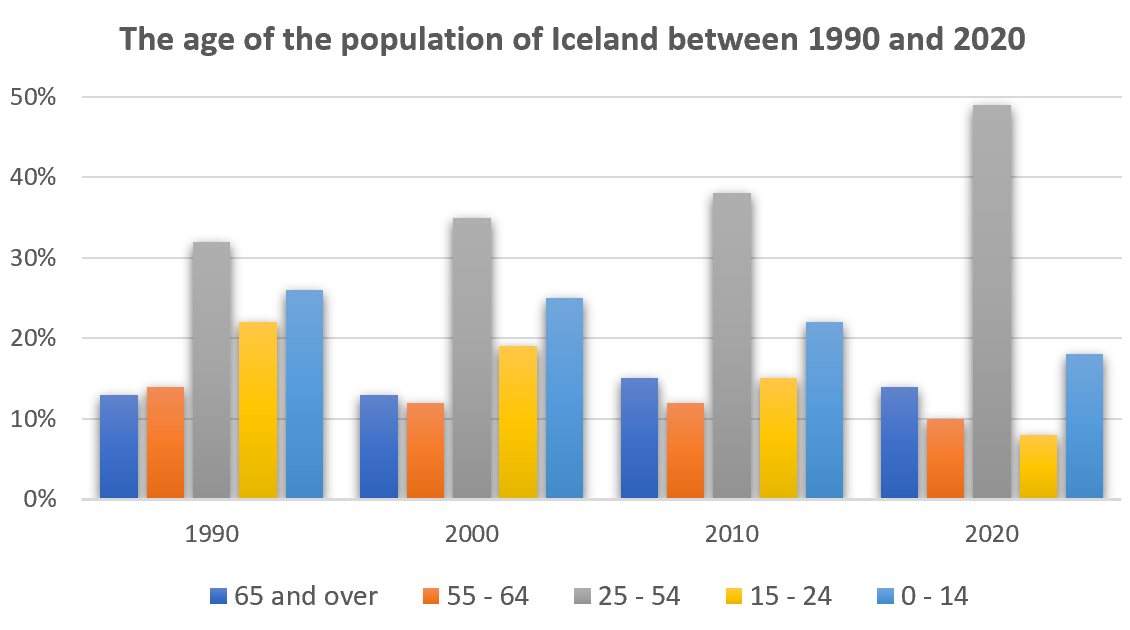
The graph gives information about the age of the population of Iceland between 1990 and 2020.
Summarise the information by selecting and reporting the main features, and make comparisons where relevant.
The percentage of women going into higher education in five countries
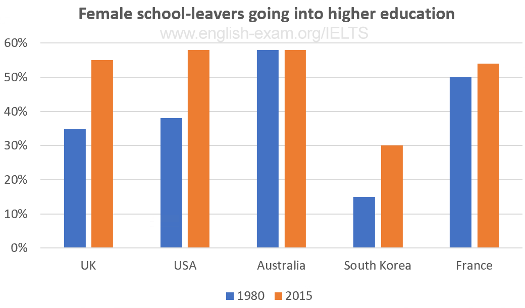
The chart gives information on the percentage of women going into higher education in five countries for the years 1980 and 2015.
Participants who have entered the Olympics since it began
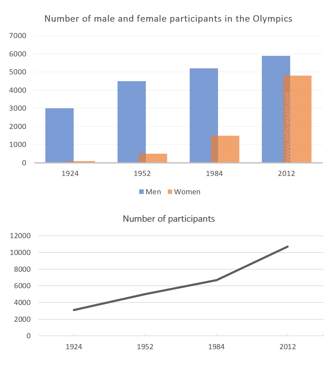
The chart and graph below give information about participants who have entered the Olympics since it began.
Road transport in a number of European countries
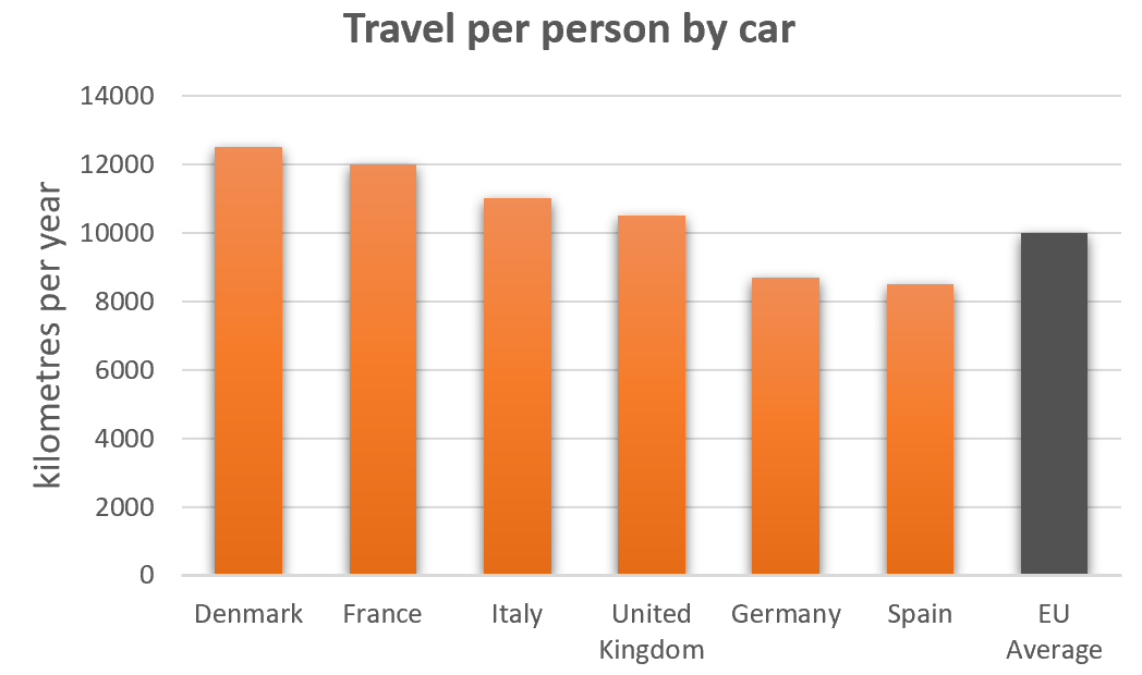
The bar charts below give information on road transport in a number of European countries.
The percentage of part-time workers in each country of the United Kingdom
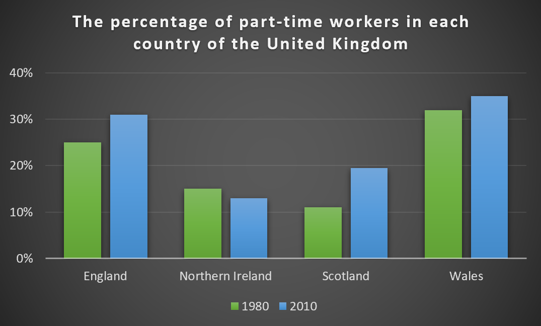
The graph below shows the percentage of part-time workers in each country of the United Kingdom in 1980 and 2010.
Industries’ percentage share of Brazil’s economy
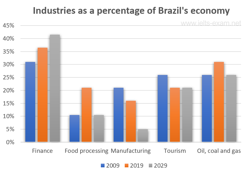
The bar chart below illustrates five different industries’ percentage share of Brazil’s economy in 2009 and 2019 with a forecast for 2029.
The percentages of men and women in employment
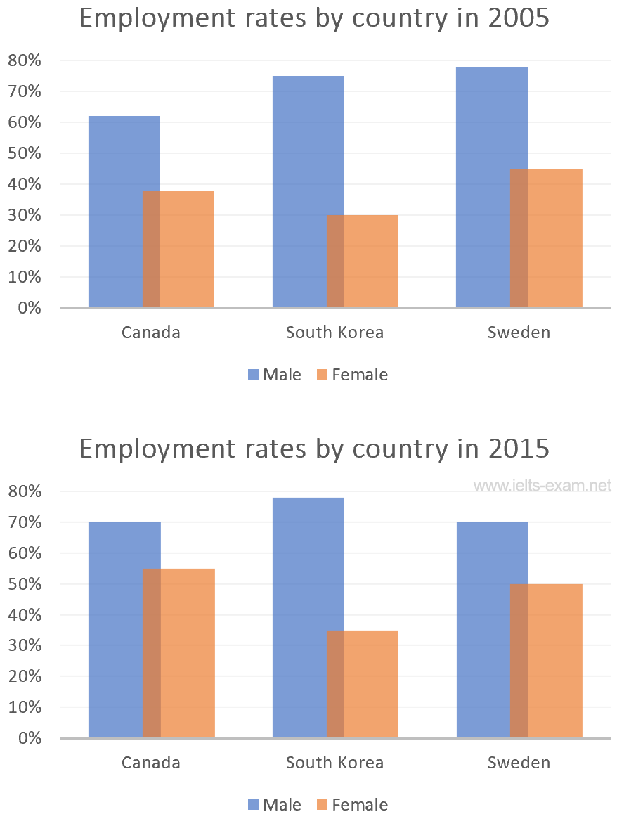
The bar charts below show the percentages of men and women in employment in three countries in 2005 and 2015.
The number of medals won by the top five countries in the summer and winter Olympics
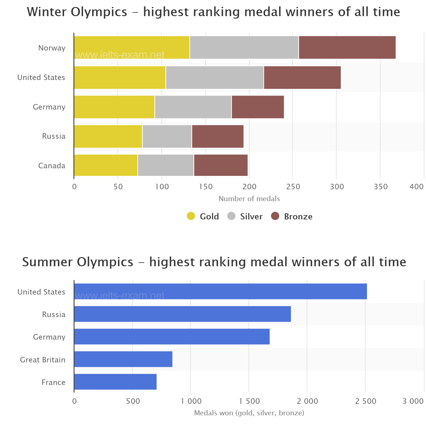
The graphs below show the number of medals won by the top five countries in the summer and winter Olympics.
Global population percentages and distribution of wealth by region
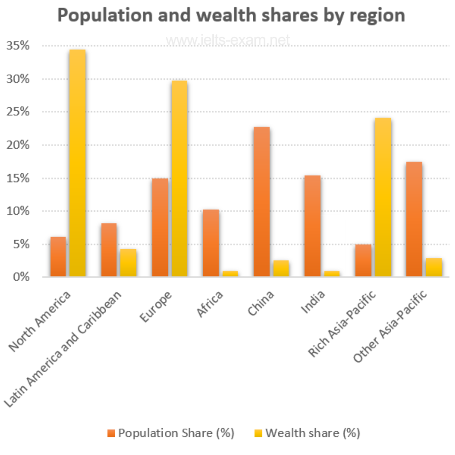
The chart below gives information about global population percentages and distribution of wealth by region.
Percentage of Canadians gave money to charitable organisations
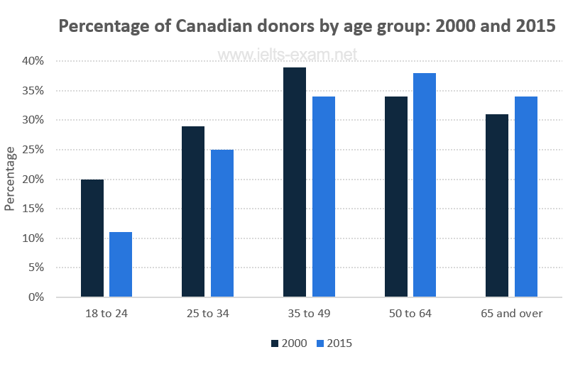
The chart below gives information on the percentage of Canadians gave money to charitable organisations by age range for the years 2000 and 2015.
Employment figures in different tourism-related industries
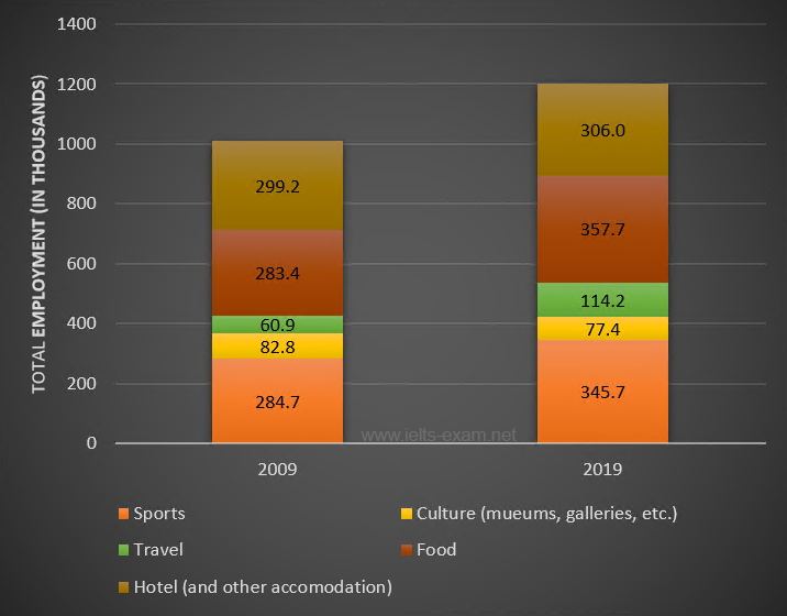
The bar chart below shows employment figures in different tourism-related industries between 2009 and 2019.
The main reasons workers chose to work from home
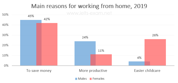
The diagrams below show the main reasons workers chose to work from home and the hours males and females worked at home for the year 2019.
Percentage of the population living in urban areas
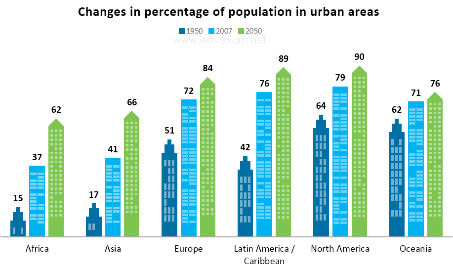
The bar chart below gives information about the percentage of the population living in urban areas in different parts of the world.
Car journeys into the city centre
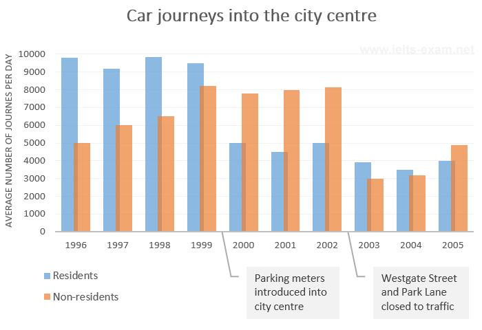
The bar chart gives information about the number of car journeys into the city centre made by residents and non-residents.
The places visited by different people living in Canada
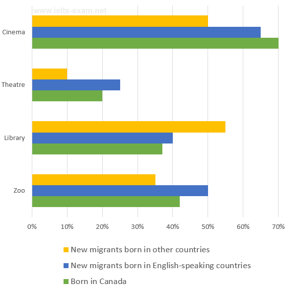
The chart below shows the places visited by different people living in Canada.
Percentage of people using multiple social networking sites
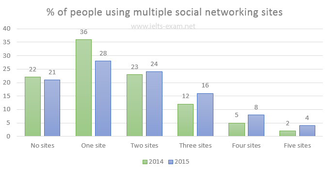
The chart below gives information about the number of social networking sites people used in Canada in 2014 and 2015.
Weight assessment of inhabitants of Charlestown 2015
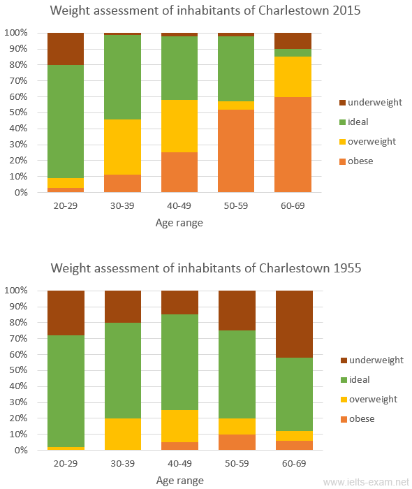
The charts summarise the weight measurements of people living in Charlestown in 1955 and 2015.
Someland's main exports
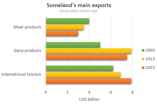
The chart below gives information about Someland's main exports in 2005, 2015, and future projections for 2025.
Sports played in New Zealand in 2002
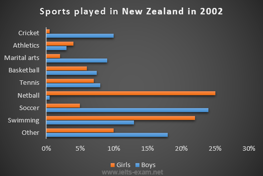
The chart below gives information about the most common sports played in New Zealand in 2002.
Science qualifications in two countries
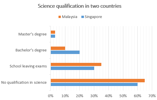
The chart below gives information about science qualifications held by people in two countries.
Students passing high school competency exams, by subject and gender
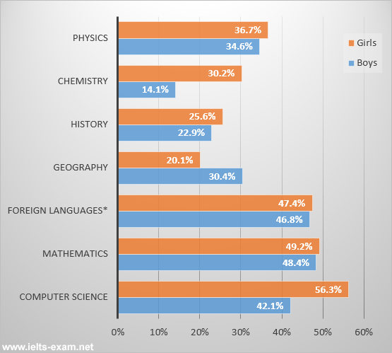
The bar chart shows the percentage of students who passed their high school competency exams, by subject and gender, during the period 2010-2011.
Female unemployment rates in the United Kingdom in 2013 and 2014
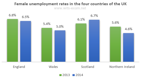
The graph shows female unemployment rates in each country of the United Kingdom in 2013 and 2014.
Percentage who watch reality shows and game shows
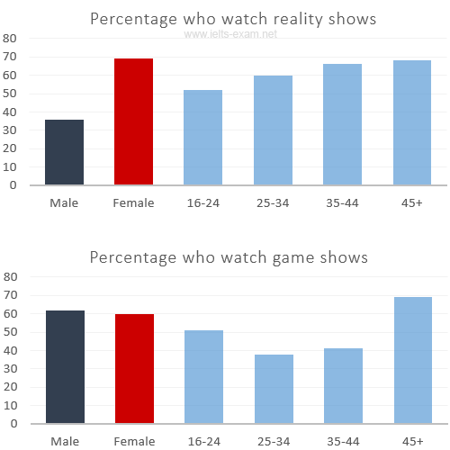
The charts show the number and genres of TV programmes watched by men and women and four different age groups in Australia.
Shares of expenditures for selected categories
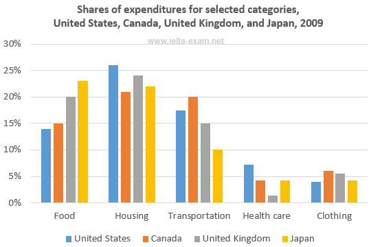
The bar chart shows shares of expenditures for five major categories in the United States, Canada, the United Kingdom, and Japan in the year 2009.
International graduates, Canadian universities, 2001 and 2006
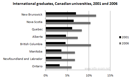
The chart shows the percentage change in the share of international students among university graduates in different Canadian provinces between 2001 and 2006.
Percentage of population aged 65 and over
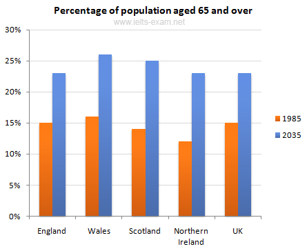
The chart gives information about the UK's ageing population in 1985 and makes predictions for 2035.
Percentage of pupulation in urban areas
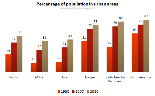
The bar chart gives information about the percentage of the population living in urban areas in the world and in different continents.
Urban populations in different world regions
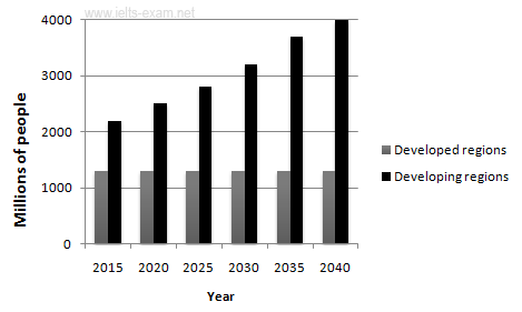
The graphs provide information on global population figures and figures for urban populations in different world regions.
The percentage of male and female teachers
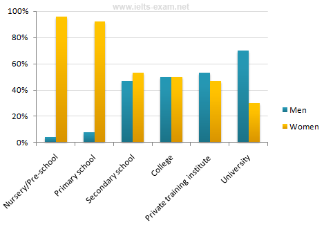
The chart shows the percentage of male and female teachers in six different types of educational setting in the UK in 2010.
Home and International Students
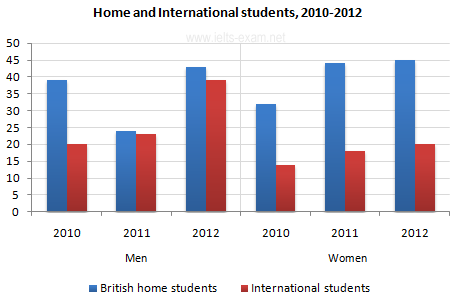
The bar chart gives information about the number of students studying Computer Science at a UK university between 2010 and 2012.
Finland's telephone calls, by category, 1995-2004
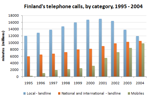
The chart shows the total number of minutes (in millions) of telephone calls in Finland, divided into three categories, from 1995 - 2004.
Related topics
- Writing task one: bar graphs
- Writing Introduction
- IELTS Writing strategies
- Next Page »
SHARE THIS PAGE
The reading, writing and listening practice tests on this website have been designed to resemble the format of the IELTS test as closely as possible. They are not, however, real IELTS tests; they are designed to practise exam technique to help students to face the IELTS test with confidence and to perform to the best of their ability.
While using this site, you agree to have read and accepted our terms of use, cookie and privacy policy.
Dear readers,
This is to inform you that we have moved to a new domain, https://www.ielts-writing.info/EXAM/ .
Our old domain, https://www.ielts-exam.net/ will remain active till the time we migrate all our content to the new domain.
We look forward to your continuing support.
IELTS Mentor "IELTS Preparation & Sample Answer"
- Skip to content
- Jump to main navigation and login
Nav view search
- IELTS Sample
- IELTS Bar Graph
IELTS Academic writing task 1 - Bar Graph
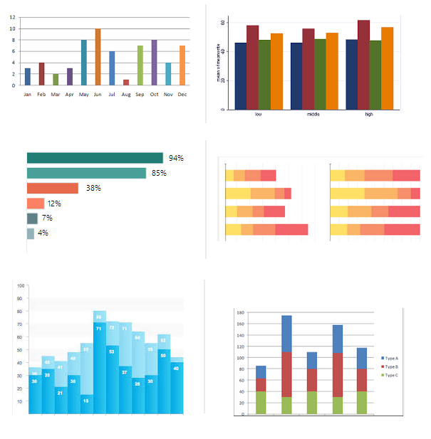
- Academic Writing Task 1
IELTS Materials
- IELTS Line Graph
- IELTS Table Chart
- IELTS Flow Chart
- IELTS Pie Chart
- IELTS Letter Writing
- IELTS Essay
- Academic Reading
Useful Links
- IELTS Secrets
- Band Score Calculator
- Exam Specific Tips
- Useful Websites
- IELTS Preparation Tips
- Academic Reading Tips
- Academic Writing Tips
- GT Writing Tips
- Listening Tips
- Speaking Tips
- IELTS Grammar Review
- IELTS Vocabulary
- IELTS Cue Cards
- IELTS Life Skills
- Letter Types

- Privacy Policy
- Cookie Policy
- Copyright Notice
- HTML Sitemap
IELTS Writing Task 1 – Bar Chart Example Essay – 2
In this post, we will look at a Writing Task 1 Academic bar chart essay example from the IELTS writing task 1 Academic Test. Students often ask if the questions are repeated year after year and the answer is no, but the type of chart or graph can be.
There are so many questions written each year, you may find you practice answering various questions on different topics. It is best practice to learn how to answer each one of the various types of writing task 1 questions , from bar charts, line graphs, maps, process etc.
If you would like to learn how to structure a charts and graphs essay please click the button below >
Take a look at the IELTS Writing Task 1 Academic essay example below >>
*This chart question and answer were provided by a student. IELTS Achieve did not design this bar chart question*
The bar chart illustrates comparative statistics on the number of males and females who underwent further education, studying in full time and in part-time education in Britain in the years; 1970-1971, 1980-1981 and 1990-1991. The number of students was measured in thousands.
Overall, part-time education had the highest number of enrollees in all three periods from both men and women while in full-time education, the highest number of students can be seen in the time period of 1990-1991 where both sexes had an equal amount of enrollees.
On the one hand, the graph shows that part-time education was consistently high, never below the 800 thousand mark in males and 600 thousand marks in females, even though the trend differs from both genders. According to the data, males had the highest part-time enrollees in 1970-1971 (1000 thousand) then the trend fluctuated and rose again over the next three year period 1980-81 (900 thousand) and 1990-91 (950 thousand), while in the female part-time enrollees they had an upward trend as the years went by with 750 thousand in 1970-71, 800 thousand students in 1980-81 and the highest peak of almost 1150 thousand students by the period of 1990-91.
On the other hand, the bar chart reveals that both genders in full-time education experienced an increasing number of students within the three time periods. Male students started at below 200 thousand in 1970-71 and rose steadily until they reached 200 thousand in 1990-91, the same can be said in the number of females enrolled, they started from 50 thousand in 1970-1971 and gradually rose as the years passed by until reaching 200 thousand female students in 1990-1991.
Word count – 274 / Band score – 8

- Task Achievement – The answer provides a paraphrased question, to begin with, followed by an overview that gives the reader key information.
- Coherence and Cohesion – The answer has been divided into clear logical paragraphs.
- Lexical Resource – There is evidence of paraphrasing, synonyms and some less common words.
- Grammatical Range and Accuracy – The answer has no grammatical errors. The sentences are mainly made up of multiple clauses and have a variety of structures.
We hope you found this post useful in helping you to study for the IELTS Test . If you have any questions please let us know in the comments below or on the Facebook page.
The best way to keep up to date with posts like this is to like us on Facebook , then follow us on Instagram and Pinterest . If you need help preparing for the IELTS Test, join the IELTS Achieve Academy and see how we can assist you to achieve your desired band score. We offer an essay correction service, mock exams and online courses.
Related Posts
You recently took a part-time job working for a local company: semi-formal letter [ielts general writing task 1 ].
You should spend about 20 minutes on this task. You recently took a part-time job…
General Training – Writing Task 1 Practise Questions with Sample Answers
. In this article, we have compiled a list of General Training Writing Task 1…
Leave a Comment Cancel Reply
Your email address will not be published. Required fields are marked *
Save my name, email, and website in this browser for the next time I comment.
- IELTS Scores
- Life Skills Test
- Find a Test Centre
- Alternatives to IELTS
- General Training
- Academic Word List
- Topic Vocabulary
- Collocation
- Phrasal Verbs
- Writing eBooks
- Reading eBook
- All eBooks & Courses
- Sample Graphs
- Example of a Bar Chart
Example of a bar chart
Here you can view an example of a bar chart for the IELTS test.
This bar chart shows the levels of spending of a family on three household items - gas, food and clothing.
You should note first of all that the bar chart is over time which means you need to use the language of change . You should also make sure that you are comparing and contrasting the items too.
Take a look at the graph and model answer, then view the comments below on the response in order to see how you can improve your answers.
Bar Chart: Monthly Expenditure
You should spend about 20 minutes on this task.
The bar chart shows the monthly spending in dollars of a family in the USA on three items in 2010.
Summarize the information by selecting and reporting the main features and make comparisons where relevant.
Write at least 150 words.
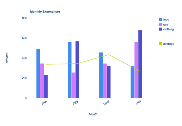
Example of a Bar Chart: Model Answer
The bar chart depicts the monthly expenditure on food, gas and clothing of a family living in the USA in 2010. Overall, it can be seen that levels of expenditure fluctuated over the period.
To begin, in January the most money was spent on food, at approximately $500 per month. Although expenditure on food increased slightly the following month, it then fell to account for the lowest expenditure of all the items at the end of the period at just over $300.
Gas appeared to follow the opposite pattern to food spending. It started lower at about $350 per month, falling in the following month, and then increasing significantly to finish at just under $600 in April.
Clothing, which at just over $200 accounted for the lowest expenditure at the beginning of the period, fluctuated dramatically over the time frame. After reaching around the same levels as food in February (nearly $600), it dropped markedly in March, then jumped to just under $700 in the final month.
With the exception of an increase in March, average spending decreased slightly over the four months.
(183 words)
This example of a bar chart satisfies the requirements of the task.
The first paragraph introduces the graph (without copying from the rubric) and then identifies the main trends.
It is clearly organized, with each item clearly explained in each paragraph.
Importantly however, even though each item is described in turn, the description does not just describe each item in isolation. You will notice that comparisons are made between the items throughout the description.
For example:
- ...it then fell to account for the lowest expenditure of all the items at the end of the period...
- Gas appeared to follow the opposite pattern to food spending.
- Clothing, which at just over $200 accounted for the lowest expenditure at the beginning of the period,...
There is also evidence that the candidate knows how to write complex sentences:
- Although expenditure on food increased...
- Clothing, which at just over...
- After reaching...
There is also a good mix of comparison / compare sentence structures and language of change . The correct tense is used (past simple) as the graph is referring to completed actions in the past.
<<< Back
Next >>>
More on IELTS Bar Charts:
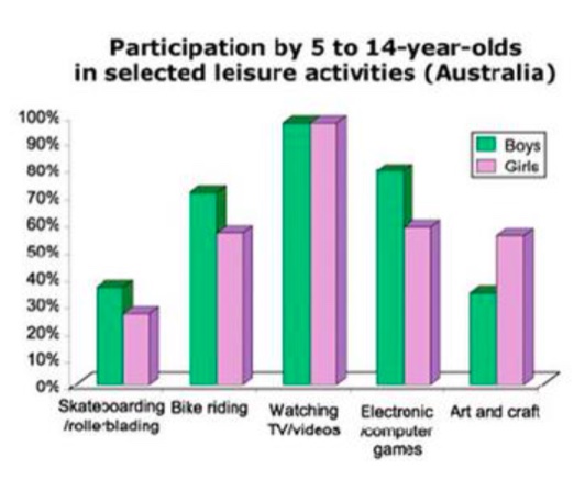
IELTS Bar Chart Example: Participation in leisure activities
IELTS Bar Chart Example on the participation of 5-14 year old Australians in leisure activities. View a model answer.
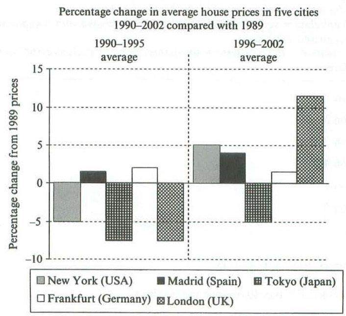
Writing Task 1 Bar Chart Sample: Organising your response
This writing task 1 bar chart sample provides a model answer that would achieve a high score in the IELTS test. A key to a high score is a well-organised response.
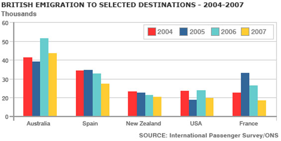
IELTS Bar Graph: British emigration to selected destinations
This IELTS Bar Graph shows British Emigration to selected destinations between 2004 and 2007. Improve your IELTS Score by viewing model task 1 answers.
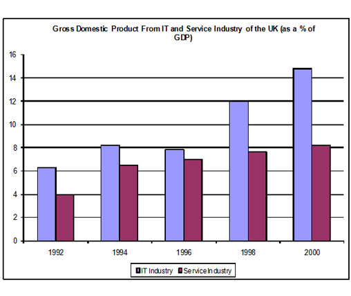
IELTS Bar Chart Sample: Applying the Language of Change
This sample IELTS bar chart shows the components of GDP in the UK. The graph is over time so you have to use the language of change as well as contrasting.
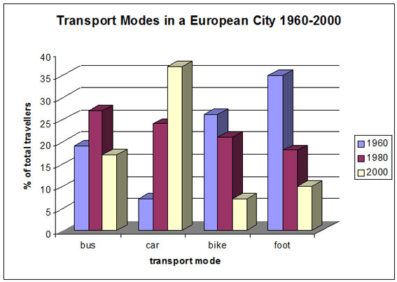
IELTS Bar Chart: Model answer with comments and tips
This sample IELTS bar chart is a graph over time depicting the changing modes of transport in a European city. There is a model answer.
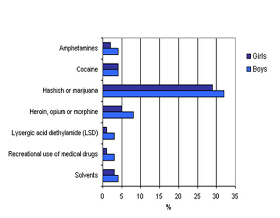
Bar Chart Exercise: Language of comparison, contrast and percentages
Bar Chart Exercise: This is a gap fill to help you answer a question for the IELTS Task 1. In the chart it is essential that you know which language to use and how. This bar chart practice provides you with the skills to do this.
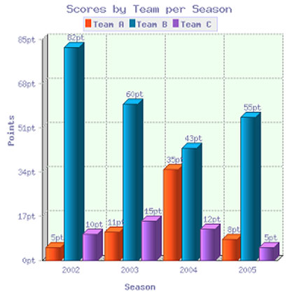
IELTS Bar Graph: Model answer with tips and comments
View an IELTS Bar Graph sample answer for IELTS writing task 1. This graph shows the scores of three different teams over four difference seasons.
Any comments or questions about this page or about IELTS? Post them here. Your email will not be published or shared.
Before you go...
Check out the ielts buddy band 7+ ebooks & courses.
Would you prefer to share this page with others by linking to it?
- Click on the HTML link code below.
- Copy and paste it, adding a note of your own, into your blog, a Web page, forums, a blog comment, your Facebook account, or anywhere that someone would find this page valuable.
Band 7+ eBooks
"I think these eBooks are FANTASTIC!!! I know that's not academic language, but it's the truth!"
Linda, from Italy, Scored Band 7.5
IELTS Modules:
Other resources:.
- All Lessons
- Band Score Calculator
- Writing Feedback
- Speaking Feedback
- Teacher Resources
- Free Downloads
- Recent Essay Exam Questions
- Books for IELTS Prep
- Useful Links

Recent Articles
Decreasing House Sizes Essay
Apr 06, 24 10:22 AM

Latest IELTS Writing Topics - Recent Exam Questions
Apr 04, 24 02:36 AM

IELTS Essay: English as a Global Language
Apr 03, 24 03:49 PM
Important pages
IELTS Writing IELTS Speaking IELTS Listening IELTS Reading All Lessons Vocabulary Academic Task 1 Academic Task 2 Practice Tests
Connect with us
Copyright © 2022- IELTSbuddy All Rights Reserved
IELTS is a registered trademark of University of Cambridge, the British Council, and IDP Education Australia. This site and its owners are not affiliated, approved or endorsed by the University of Cambridge ESOL, the British Council, and IDP Education Australia.

IMAGES
VIDEO
COMMENTS
Below is a band score 9 sample answer for an IELTS bar chart in writing task 1. Below the model is a link to a video lesson about how to describe an IELTS bar chart. Watch the video to learn essential tips for each paragraph for a high score bar chart. The bar chart illustrates how many children, divided by gender, played six kinds of sports ...
Before writing an IELTS task 1 bar chart or line graph answer it is important that we analyse the question correctly. Taking a few minutes to do this will help us write a clear answer that fully responds to the question. Just what the examiner wants us to do. The first thing we need to do is decide if the bar chart is static or dynamic.
There are 5 steps to writing a good IELTS bar chart essay: 1) Analyse the question. 2) Identify the main features. 3) Write an introduction. 4) Write an overview. 5) Write the details paragraphs. Use this simple planning process as you practice writing IELTS bar chart essays and you'll have no problem remembering it in the exam.
For task 1 of the IELTS writing test, you may be asked to write about a bar chart. You will have to write more than 150 words and it is recommended that you do this in 20 minutes or less. (You will have a total of 1 hour for 2 tasks.) It is important to note that you do not have to describe everything in the chart.
Tips to Write IELTS Bar Chart Essay. Jotted down below are some tips that will help you write a relevant, on-point IELTS bar chart essay. 1. Is it difficult for you to match the word count? Most of the time, people find it difficult to match the word count. Hence, they start using complicated words to unnecessarily extend the sentences.
IELTS bar chart answering strategy: 1. Introduction. You should start your answer by writing an introduction. The introduction is 1 or 2 sentences, where you paraphrase the information from your question. You should mention two things in your introduction: what your graph shows. for what period of time.
The chart shows the sales revenue of a selection of home video entertainment formats in the USA in 2017. It also shows the percentage change from the previous year. Online video streaming was the most popular format in 2017. US consumers spent $9.8 billion on services such as Netflix, which was a rise of 32 per cent from the previous year.
IELTS Sample Bar Chart. language of change describing a bar graph over time. You should spend about 20 minutes on this task. The chart shows components of GDP in the UK from 1992 to 2000. Summarize the information by selecting and reporting the main features and make comparisons where relevant. Write at least 150 words.
This is a model of an IELTS bar graph. The topic is team scores. In a bar graph data is organised into columns showing the data. In this case the information is over time so you have to use the language of change to describe the data. You should spend about 20 minutes on this task. The bar chart shows the scores of teams A, B and C over four ...
Sample Answer Bar Graph Essay. The bar chart shows the caloric intake of UK males in three distinct age groups of 0-24, 25-49, and over 50 years old. The data is shown as percentages. Dairy for the 0-24 age group was the highest source of calories, whilst the other categories each represented about 20% each. In the next age group dairy fell to ...
Learn how to describe an IELTS bar chart by following the tips and techniques in this video lessons. This lesson is 100% vital for all IELTS candidates doing writing task 1 academic paper. ... Sample Bar Charts for Practice; ALL WRITING TASK 1 LESSONS, TIPS & MODEL ANSWERS; Main IELTS Pages. Develop your IELTS skills with tips, model answers ...
Scorer Commentary (Bar Chart, Band 9) The score report below is based on the official IELTS Writing Task 1 rubric. This report also looks very similar to the Magoosh IELTS essay scoring service. Overall Band Score: 9. What was done well in the essay: This essay is borderline risky when it comes to word count.
The model answer below is for an IELTS bar chart in writing task 1 of the academic paper. ... IELTS Bar Chart. Source: Bar chart above from unknown source. IELTS Bar Chart Sample Answer. The chart illustrates the amount of money spent on five consumer goods (cars, computers, books, perfume and cameras) in France and the UK in 2010. Units are ...
In this article, we have given 5 bar graph sample essays to make you familiar with the bar graph task 1 structure and the way of writing a perfect essay. Bar Graph Task 1: Sample Questions with Essays. Below are the 5 sample Bar chart questions with sample answers. Check out, practise and write the essays on your own. 1. Task 1 Bar Graph Sample ...
Worksheets and downloads. Writing about a bar chart - exercises 525.21 KB. Writing about a bar chart - answers 170.59 KB. Writing about a bar chart - report 449.01 KB. Writing about a bar chart - writing practice 209.81 KB.
Writing Task 1 Bar Chart Sample. You should spend about 20 minutes on this task. The chart below shows changes in average house prices in five different cities between 1990 and 2002 compared with the average house prices in 1989. Summarize the information by selecting and reporting the main features and make comparisons where relevant.
It is common in the IELTS Writing paper to be asked to describe a bar graph. Bar graphs, also known as bar charts, are similar to line graphs in that they have two axes and are useful for showing how something has changed over a given period of time, especially when there are significant changes. Bar graphs consist of rectangular bars, which can be orientated horizontally or vertically, with ...
IELTS Academic writing task 1 - Bar Graph. A bar graph (also known as the bar chart) is a graph that contains either horizontal or vertical bars to present data comparison or contrast among categories or variables. In your IELTS Academic task 1, you might get a bar graph that will have numerical values of different variables shown by the length and height of lines or rectangular shapes or ...
Bar Charts: Using, Examples, and Interpreting. By Jim Frost 4 Comments. Use bar charts to compare categories when you have at least one categorical or discrete variable. Each bar represents a summary value for one discrete level, where longer bars indicate higher values. Types of summary values include counts, sums, means, and standard deviations.
IELTS Writing Task 1 Academic bar chart essay example that is a band score 8. The question is > The chart below shows the number of men and women in further education in Britain in three periods and whether they were studying full time or part time. Take a look at the sample answer >>
These are bar charts and graphs that I've collected over the years from real past IELTS exams and other practice materials. Check out my EBoooks here on Patreon. Here are the IELTS bar charts and graphs! Dave. IELTS Task 1: Bar Charts and Graphs. Read my essay here. Read my essay here. Read my essay here. Read my essay here. Read my essay here.
This writing task 1 bar chart sample provides a model answer that would achieve a high score in the IELTS test. A key to a high score is a well-organised response. IELTS Bar Graph: British emigration to selected destinations. ... This sample IELTS bar chart shows the components of GDP in the UK. The graph is over time so you have to use the ...
Bar Graph Task 1. The Chart Below Shows the Number of Households in the US by Their Annual Income. READ MORE >>.