
Services by software
PowerPoint presentation >
Remarkable Powerpoint presentations
Keynote presentation >
Presentations in software Keynote
Google Slides presentation >
Professional Google slides presentation
ALL SERVICES
- Pitch deck design
- Google slides redesign
- Investor deck design
- Marketing Presentation
- Sales Presentation
- Keynote redesign
- PowerPoint redesign
- Prezi presentation
- Executive Presentation
- Corporate presentation
- Pitch deck redesign
- Thesis presentation
- Investor Presentation
- Presentation For Event
- Branded email designs that convert
- Corporate Overview Presentation
My availability status:
Currently accepting work
Start a project
- February 23, 2022
4 Main Differences Between Good and Bad Presentation

Written by Tom Caklos
Presentation designer

If you are reading this, there’s a chance that you are trying to nail your presentation.
As a presentation designer , I feel like I can give you a few interesting tips, that will dramatically improve your presentation.
No matter if it’s a presentation for an event, employees, or a school project. You can apply these literally in any industry.
Let’s kick off with the first point:
1. The amount of copy on each slide
When it comes to making a good presentation, it’s very important that you limit your copy on each slide.
Nobody wants to read a long essay on every single slide. It is simply boring.
Try to limit the amount of copy you have on each slide. For example, instead of writing a whole paragraph, you could probably put it in a few short bullet points.
As Seth Godin (marketing expert) once said: “no more than 6 words per slide!”. Of course, that’s a bit extreme and it takes a lot of storytelling skills in order to do that.
But if you can, try to limit the usage of the words on every slide and you will improve your presentation drastically!
2. Visuals & design
Now, since I am working as a professional presentation designer – it could sound like I am trying to sell you something.
But the reality is that humans are more likely to remember visuals than texts. We also respond better to visual-rich slides, so why not improve your design? The beautifully designed presentation also gives the vibes that you really care about your audience.
However, there is a one downside when it comes to design. It is very time-consuming. For ex. it takes me around 45 minutes to design every single slide.
So usually it takes me around 30 hours to design a presentation that is 45 slides long. It’s very time-consuming and exhausting process if you have to do it all by yourself ( if you need help, feel free to contact me ).
3. Easy-to-follow structure
Another difference is very easy-to-understand structure.
You need to align your slides with the storytelling – so your audience gets the message that you are trying to convey.
It’s very bad practice to jump from one topic to another when presenting, so that might confuse your audience.
4. Storytelling
Good storytelling can make the difference if you close a new client or no. It is a difference between getting new investors or continuing to struggle.
If you are presenting your deck only by reading from your slides – that could put many people off. It shows that you are not prepared.
That’s why you need to be able to basically talk to the audience as you would to your friends in a bar.
Making a connection with an audience is the hardest thing – but with good storytelling, this could be the easiest part of your presentation.
So these are only a few differences between good and bad presentation – but the most important ones.
If you are making your presentation in Powerpoint , Keynote or Google slides – feel free to reach out to me and I will be more than happy to give you some feedback & critique!

Thanks for reading my article! When I write, I always try to bring as much value as I can. If you're having any questions, or if you need any help, feel free to reach out to me!
Did you learn something new? Share it with your network!

How much do presentation designers charge? Updated rates 2022

Creating Titles for Your PowerPoint Slides: Tips & Tricks
6 Design Tips for Creating Remarkable PowerPoint Presentations
Let's get to work.
Oravicka 423 027 12 Vitanova Slovakia
[email protected] +421 903 958 162 Linked In
@Tom The Designer 2021

< Go back to Login
Forgot Password
Please enter your registered email ID. You will receive an email message with instructions on how to reset your password.

The Best And Worst PowerPoint Presentation Examples
Engaging presentations are the lifeblood of effective communication in today’s information-driven world. Whether you’re in a boardroom pitching a new idea, standing in front of a classroom of curious learners, or delivering a keyote speech to an interested investor, the ability to create and deliver engaging presentations is a skill that can truly make or break your message.
Various elements contribute to making a presentation good or bad, from compelling visuals to persuasive delivery; these factors collectively influence how your ideas are received and remembered. So, in this article, we will look at some of the good and bad presentation examples to help you transform your presentations and make them more engaging.
Main Differences Between Good V/S Bad PowerPoint Slides
Knowing the difference between the best and worst PowerPoint presentations is vital for creating engaging presentations.
What Makes A Good PowerPoint Presentation?
Have you ever wondered how you differentiate between a good design v/s bad design PPT? In this section, we’ll look at some examples of making PowerPoint presentations that inspire and engage the audience. Look at what’s behind the slides that stick in mind long after the projector is turned off:
- Less text, more impact
- Choose a color scheme that works
- Proper balance of animation and texts
- Logical flow of information
- Context-relevant graphics or illustrations
READ MORE: The Golden Rules for Impactful Presentations
1. Less Text, More Impact
Imagine your presentation as a visual storybook. Less text on each slide means your audience can focus on your story, not squint at paragraphs. Use striking images or a single powerful phrase to grab attention. It makes your presentation look impressive and helps people remember the article’s key points. Keeping about 30 words per slide or 6-8 lines in your presentation will help maintain a proper flow of words and pictures, resulting in a fluid presentation.
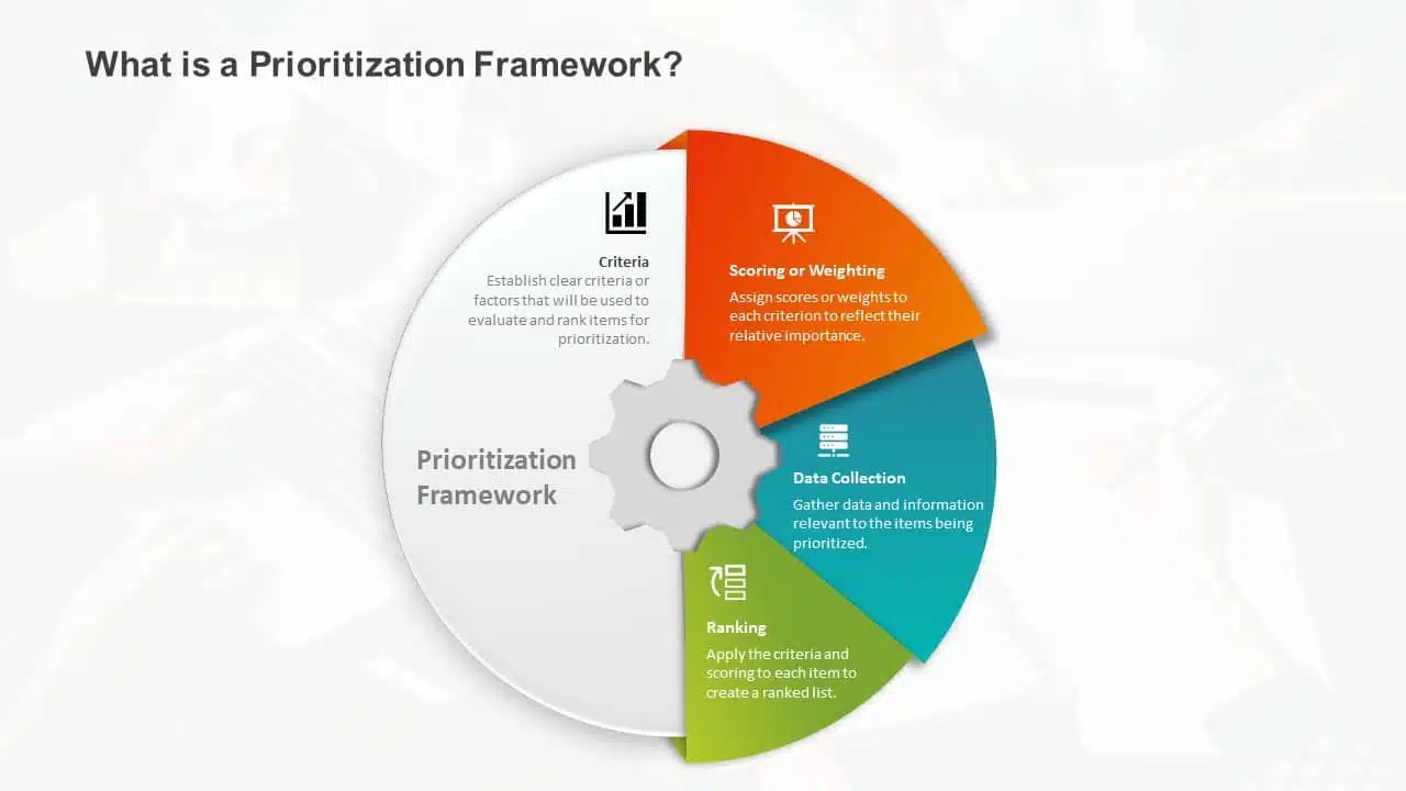
2. Choose A Color Scheme That Works
You don’t need to be an artist to pick the right colors. A good presentation uses colors that work together nicely. Choosing harmonizing colors can guide the audience to focus on important information. Choose colors that look good together and don’t hurt the eyes. Microsoft Office’s color schemes can save the day if you’re short on ideas. Avoid using light colors on a dark background and vice versa.
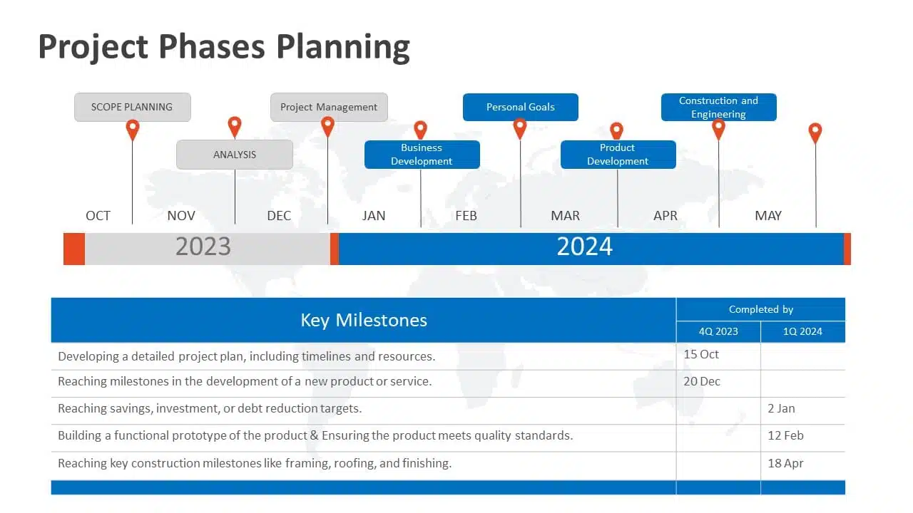
3. Proper Balance Of Animation And Texts
Animations and transitions can be like party crashers in your presentation if not used wisely. They might steal the show from your message. A top-notch presentation keeps both animations and texts in check, ensuring they don’t overpower each other. However, don’t ditch them altogether! Use transitions and animations only to highlight key points. For example, make bullet points appear individually instead of all at once. It keeps your audience focused.
READ MORE: How to add animation in PowerPoint?
4. Logical Flow Of Information
Think of your presentation as a road trip. Imagine if your GPS gave you all mixed up directions. Chaos, right? Similarly, your slides need a logical order and a roadmap. Maintaining the logical flow of your slides helps the audience follow the information easily. A logical flow makes your message clear and easy to remember. It’s like telling a great story with a beginning, middle, and end.
EXPLORE: Flowchart PowerPoint Templates
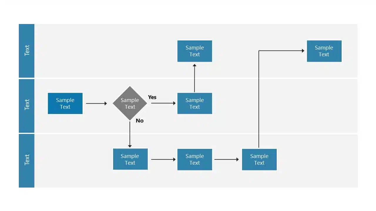
5. Context-Relevant Graphics Or Illustrations
A picture speaks volumes. Our brains love visuals. Using context-related graphs, photos, and illustrations that complement your slides can amp up important pointers and keep your audience engaged during the presentation. However, while presenting, make sure to explain why a graphic or a picture is there. Explaining the graphics verbally makes your message crystal clear and memorable.
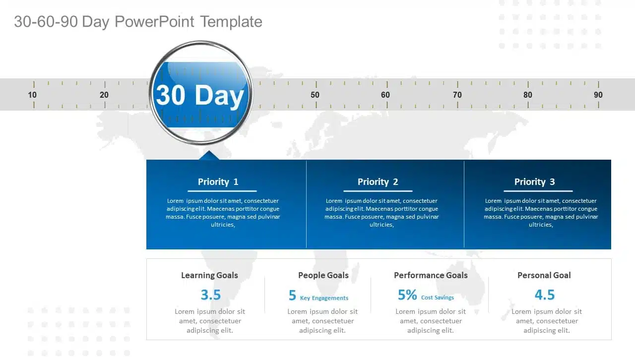
EXPLORE: Want to create stunning presentations? Check out our presentation services !
A PowerPoint presentation shall excel in these aspects of making it engaging, informative, and memorable. These good PowerPoint presentation examples could help you make a better PPT in one or more areas, not leaving the audience disengaged or confused.
While it’s important to look at good presentation examples, it’s equally important to avoid mistakes that can turn your presentation dull.
What Makes A Bad PowerPoint Presentation?
Ever been in a room with a presentation that made you want to escape through the nearest exit? We’ve all been there! In this section, we’ll highlight some common mistakes that turn a good presentation into a dull one. With many examples of good and bad PowerPoint slides on the internet, we have listed some bad examples that show the ‘DON’Ts’ and ‘AVOID AT ALL COSTS’ of PowerPoint mistakes:
- Image behind the text
- Using only bullet points and no paragraphs
- Having no symmetry in texts and pointers
- Being too minimal
- Keeping text too small
1. Image Behind The Text
Anyone who considered utilizing an image as a background most likely missed the memo. Text and images simply do not work together. One of the worst PowerPoint presentation examples is text overlaid on an image. Keeping the image in the background complicates understanding the text, and the main image should be clarified. Finding a text color that shines out in the background is nearly tough because all of those colors merely draw your attention away from the words. To avoid this calamity, avoid utilizing photos as slide backgrounds when you have text to highlight.
EXPLORE: Best PowerPoint Backgrounds Collection

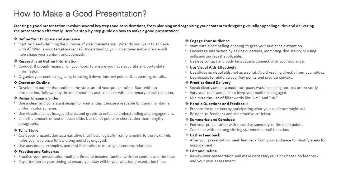
2. Using Only Bullet Points And No Paragraphs
To make a presentation audience-friendly, reducing paragraphs to bullet points is a wise choice. However, it is critical to emphasize that this is more than simply putting only bullet points and leaving out all paragraphs. Using 5-8 bullet points is ideal for a slide. If the text size shrinks to 12 or 10 points, you’ve written a lot. Lengthy bullet points tend to bore the audience; some might even think of them as paragraphs.
3. Having No Symmetry In Texts And Pointers
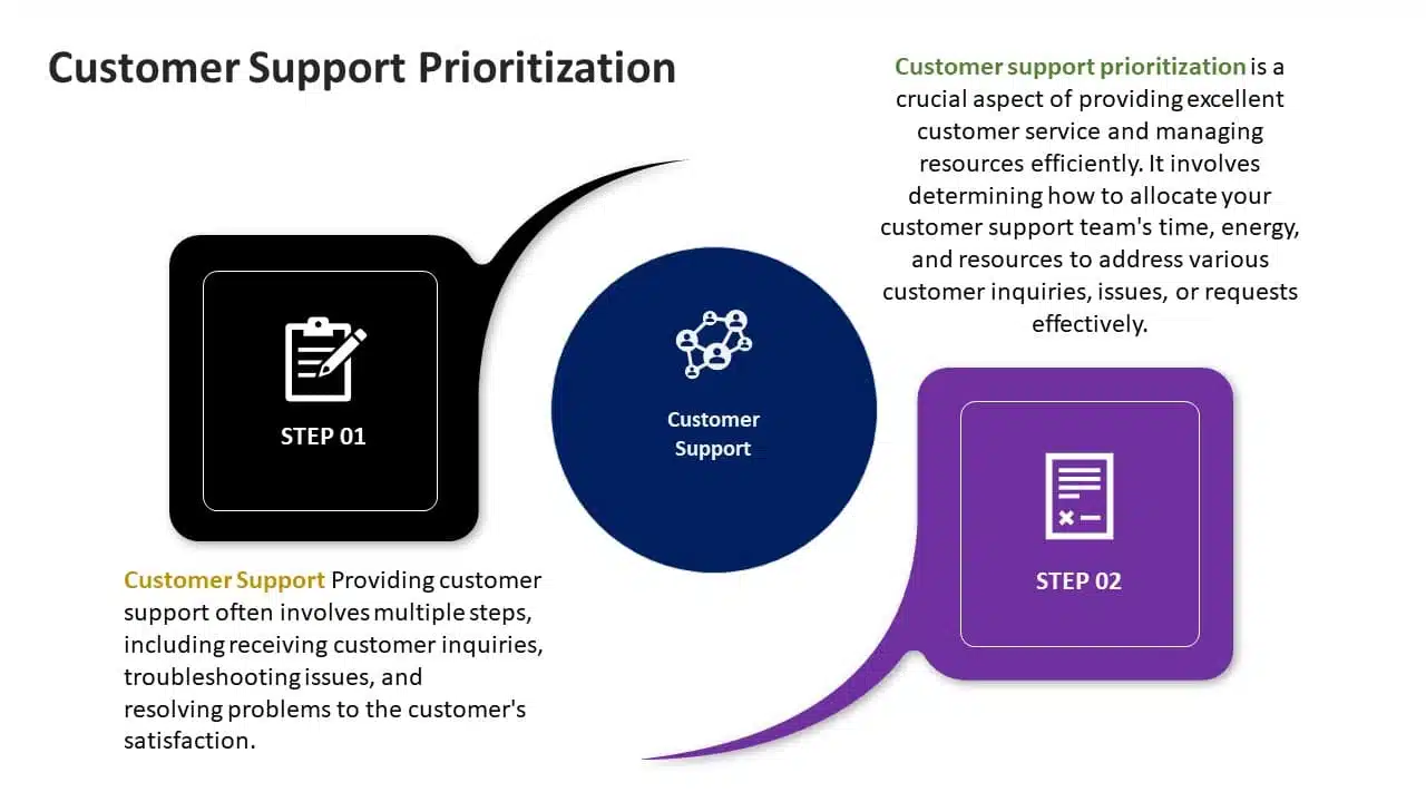
A lack of balance or alignment between textual material and supporting visual elements, such as arrows, bullets, etc., can make your presentations appear unpleasant. When text and pointers are strewn about, it’s difficult for the audience to follow a logical flow of information; a common bad PowerPoint slide example to avoid at any cost. Your audience will be obsessed with deciphering the relationship between the text and graphics if your presentation needs more harmony.
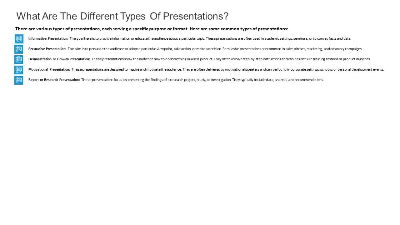
4. Being Too Minimal
Being too minimalistic is as bad as overdoing it. Not having the required text on slides or keeping them blank makes them dull and non-engaging. You don’t need a color explosion or too many texts, but bringing some life to your slides is always a good idea. Using pre-made PowerPoint templates is a good idea to keep your content balanced; however, it is best not to leave blank spaces. A blank slide with no colors or text might give the impression of minimal effort. Strive for a balanced approach to keep your audience engaged and awake.
EXPLORE: 40,000+ PowerPoint Templates and Google Slides Themes

5. Keeping Text Too Small
Another thing to avoid is making your font size too tiny, almost like the size of a peanut. The size of the font is extremely important in any presentation. Think of it like trying to enjoy a beautiful scenic view through a tiny keyhole – not very enjoyable, is it? It’s the same with your PowerPoint. Your slides can be perfect with great colors, and graphics, but it’s a bummer if your audience can’t read them. A simple trick is to stand at the back of the room where you’ll present. If you can read the font comfortably, then you should be fine!
READ MORE: Best Presentation Fonts
A bad PowerPoint presentation will dismiss all your efforts and disengage your audience. To look more, avoid these bad PowerPoint presentation examples at any cost while making your next presentation.
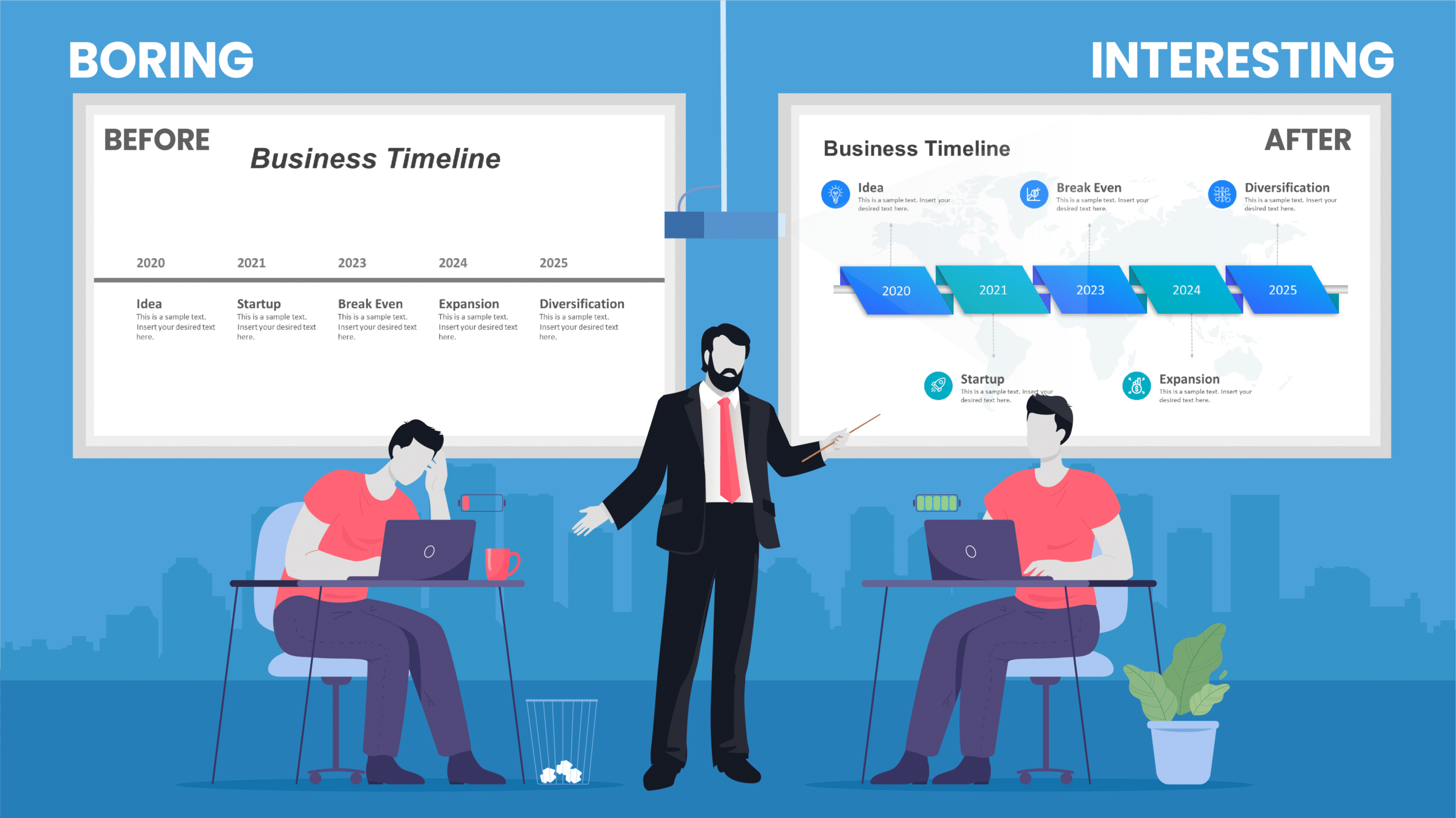
We have carefully curated a visual appearance of how your PowerPoint presentations change by following the aforementioned points.
A good PowerPoint presentation is a balance – not too much, not too little. It’s about enhancing your message, not taking the spotlight away from you. However, striking that balance requires a lot of practice and trial and error.
You can always opt for presentation design services , like SlideUpLift. It gives you the advantage and access to presentation specialists. We design visually appealing presentations, with modern design elements, graphics, and illustrations; maintaining a perfect balance of every element.
Whether you want to customize your slides completely or just tailor the color or font, we ensure that your brand or personal style always reflects in your presentation.
Explore from our collection of 40,000+ PowerPoint templates and Google Slides themes. Utilize our presentation design services to create stunning PPTs. Give us a try with our custom-slides service , or schedule a call with us to know more!
What is the biggest difference between the best and worst PowerPoint presentations?
A good PowerPoint presentation effectively communicates its message, engages the audience, and uses visuals, layout, and content in a clear and compelling manner. In contrast, a bad PPT has cluttered slides, too much text, poor design choices, or distracting elements that hinder understanding.
How can I avoid making a bad PowerPoint presentation?
To avoid creating a bad PowerPoint presentation, focus on simplicity, use visuals wisely, keep text concise, maintain a logical flow, use appropriate fonts and colors, and avoid excessive animations or irrelevant content. Seek feedback from peers or experts to improve your overall presentation.
What role do visuals play in differentiating a good design v/s bad design PPT?
In a good presentation, visuals support and clarify key points. While in a bad one, they may be excessive, distracting, or irrelevant, overshadowing the main message.
How important is the audience's experience in determining the quality of a PowerPoint presentation?
The audience’s experience is essential in evaluating a presentation. A good PPT keeps the audience engaged and attentive compared to a bad PPT, which leads to disengagement and confusion.
How can I fix my bad PowerPoint presentation?
You can fix your PowerPoint presentation by opting SlideUpLift as your presentation buddy. With over 40,000+ PowerPoint Templates and Google Slides Themes to explore, you can choose what’s best for you. In case you have very specific presentation needs, you can opt for their presentation design services or custom slide service to create stunning PPTs. Schedule a call to know more.
Table Of Content
Related presentations.

FlowChart PowerPoint Template Collection
SWOT Analysis PowerPoint Templates Collection

List PowerPoint Template Collection
Related posts from the same category.

13 Mar, 2024 | SlideUpLift
10 Good PowerPoint Presentation Examples
Engaging presentations are the secret sauce of effective communication. They bring life to ideas and transform information into inspiration. They are the heartbeat of any memorable message, connecting with your
27 Sep, 2023 | SlideUpLift
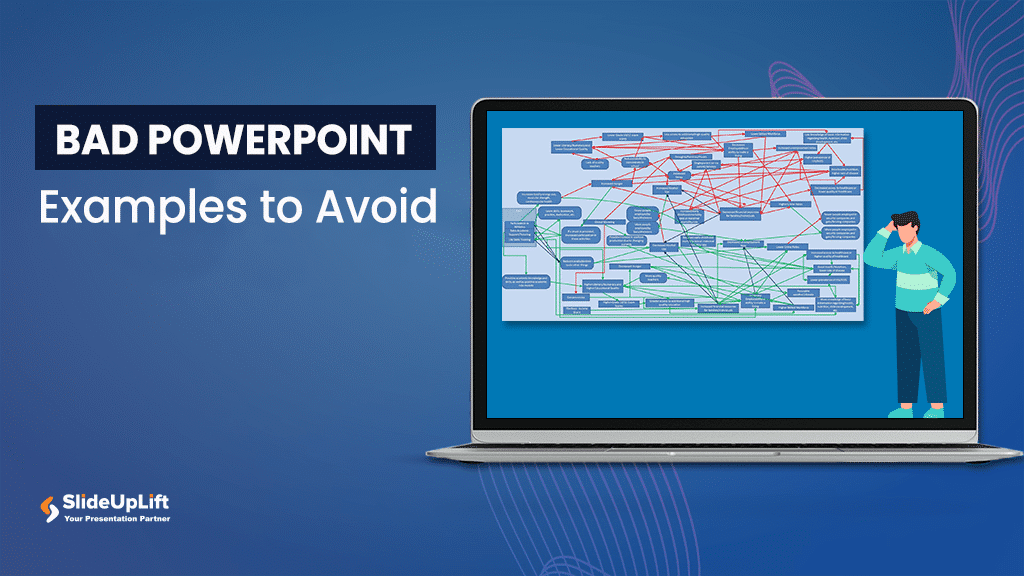
10 Bad PowerPoint Slides Examples to Avoid
A presentation serves two purposes: 1) it teaches your audience something new and 2) motivates them to take action. However, achieving these goals is only possible if your audience is

10 Nov, 2021 | SlideUpLift
PowerPoint Presentation Tips: How to Make a Good PowerPoint Presentation
A well-crafted PowerPoint presentation can have a lasting impact on your audience. However, creating an effective presentation can be daunting, especially if you are unsure how to make it engaging

1 Feb, 2024 | SlideUpLift
The Best Board Meeting Agenda Guide [With Examples & Sample Agendas]
You might have had a meeting that went completely off. It might be overly prolonged and had numerous off-topic discussions. It has happened with most professionals at some point in

8 Jun, 2023 | SlideUpLift
How To Present Data In The Best Way?
Having accessible means to analyze and understand data is more vital than ever in our increasingly data-driven environment. After all, employers increasingly value people with strong data abilities, and every
24 Apr, 2024 | SlideUpLift
17 Tips On How To Make A Professional PowerPoint & Google Slides Presentation
A PowerPoint presentation is a fantastic tool for communicating vital information. Even though people think it's simple to put all your content together and make a presentation, arranging and preparing

6 Sep, 2023 | SlideUpLift
10 Best Presentation Companies And Design Agencies
According to the Hinge Research Institute, an effective presentation can lead to 20.1% accelerated growth and 24.8% higher profits for a company. Well, it is more valid than ever in
6 Jan, 2020 | SlideUpLift
Top 10 Hacks On How To Make PowerPoint Presentation Attractive
Per experts, the audience gets hooked and pays more attention to the visual content of your PowerPoint slides than drab-looking, text-heavy content. This article answers the well to know question

8 Dec, 2023 | SlideUpLift
10 Best Presentation Softwares
Having access to appropriate presenting tools can benefit anyone, whether a business owner, a working professional, or a student. Using the best tools for presentations can increase the recall value

28 Jul, 2023 | SlideUpLift
Best Websites for PowerPoint Templates
It is no secret that the language of the corporate industry is PowerPoint presentations. Knowing the best websites for PPT templates is vital if you make presentations regularly. PowerPoint presentation
Related Tags And Categories
Forgot Password?
Privacy Overview
Necessary cookies are absolutely essential for the website to function properly. This category only includes cookies that ensures basic functionalities and security features of the website. These cookies do not store any personal information
Any cookies that may not be particularly necessary for the website to function and is used specifically to collect user personal data via ads, other embedded contents are termed as non-necessary cookies. It is mandatory to procure user consent prior to running these cookies on your website.
404 Not found

How it works
For Business
Join Mind Tools
Article • 9 min read
10 Common Presentation Mistakes
Avoiding common pitfalls in your presentations.
By the Mind Tools Content Team

Most of us have experienced dull, irrelevant or confusing presentations. But think back to the last really great presentation you saw – one that was informative, motivating and inspiring. Wouldn't you love to be able to present like that?
This article looks at 10 of the most common mistakes that speakers make when giving presentations. By avoiding these, you'll make your presentations stand out – for all of the right reasons, and none of the wrong ones.
Mistake 1: Not Preparing Enough
Steve Jobs was a famously inspiring speaker. His speeches may have looked effortless, but, in reality, each one took days or weeks of preparation.
Careful preparation is essential. The amount of time you spend on planning depends on your situation, but it's a good idea to start early – you can never be too well-prepared.
Proper preparation also helps you to manage presentation nerves . When you know your material inside and out, you're far less likely to feel nervous. Our presentation planning checklist and Skillbook " Even Better Presentations " can help you to plan your next event properly.
Mistake 2: Not Familiarizing Yourself With the Venue and Equipment
Imagine that your presentation starts in an hour. You arrive at the venue and, to your horror, the projector won't work with your laptop. The slides you spent hours preparing are useless. This is a disaster!
You can avoid a situation like this by taking time to familiarize yourself with the venue and available equipment at least once before your presentation.
Often, the sorts of problems that can jeopardize your presentation will be situations beyond your control, but this doesn't mean that you're helpless. Conduct a risk analysis to identify potential issues, and come up with a good "Plan B" for each one.
Mistake 3: Ignoring Your Audience
Sometimes, speakers can get so wrapped up in delivering their presentations that they forget about the needs of their audience.
Start your presentation by telling your audience what to expect. Let them know what you'll cover first, whether and when you'll stop for a break, if you'll be taking questions during the presentation, and so on.
Providing these "signposts" up front will give your audience a clear idea of what to expect, so that they can relax and concentrate on your presentation.
Mistake 4: Using Inappropriate Content
The primary purpose of any presentation is to share information with others, so it's important to consider the level you'll pitch it at.
Do some research on your audience. Why are they here? How much do they already know about your topic, and what do they most want to learn from you? It's no use giving a presentation that's so full of jargon that no one understands you. But you wouldn't want to patronize people, either.
Try to put yourself in people's shoes, to get a clearer idea about their needs and motivations. You can also greet individuals as they arrive on the day, and ask questions to get a feel for their level of knowledge. This will also help you to personalize your presentation and make a connection with each person in your audience, so that they'll be more attentive to what you say.
Mistake 5: Being Too Verbose
Short, concise presentations are often more powerful than verbose ones. Try to limit yourself to a few main points. If you take too long getting to your point, you risk losing your audience's attention.
The average adult has a 15- to 20-minute attention span. So, if you want to keep your audience engaged, stick to the point! During the planning phase, make a note of the themes you want to cover and how you want to get them across. Then, when you start filling out the details, ask yourself: "Does my audience really need to know this?"
Our articles on the 7 Cs of Communication and Communications Planning have more tips for communicating in a clear, concise way.
Mistake 6: Using Ineffective Visuals
Poor slides can spoil a good presentation, so it's worth spending time getting yours right.
We've all seen slides with garish colors, unnecessary animation, or fonts that are too small to read. The most effective presentation visuals aren't flashy – they're concise and consistent.
When choosing colors, think about where the presentation will take place. A dark background with light or white text works best in dark rooms, while a white background with dark text is easier to see in a brightly lit room.
Choose your pictures carefully, too. High-quality graphics can clarify complex information and lift an otherwise plain screen, but low-quality images can make your presentation appear unprofessional. Unless an image is contributing something, embrace the negative space – less clutter means greater understanding. Use animation sparingly, too – a dancing logo or emoji will only distract your audience.
Mistake 7: Overcrowding Text
The best rule of thumb for text is to keep it simple . Don't try to cram too much information into your slides. Aim for a maximum of three to four words within each bullet point, and no more than three bullets per slide.
This doesn't mean that you should spread your content over dozens of slides. Limit yourself to 10 slides or fewer for a 30-minute presentation. Look at each slide, story or graph carefully. Ask yourself what it adds to the presentation, and remove it if it isn't important.
Mistake 8: Speaking Incoherently
Even though we spend a significant part of the day talking to one another, speaking to an audience is a surprisingly difficult skill, and it's one that we need to practice.
If nerves make you rush through a presentation, your audience could miss your most important points. Use centering or deep breathing techniques to suppress the urge to rush. If you do begin to babble, take a moment to collect yourself. Breathe deeply, and enunciate each word clearly, while you focus on speaking more slowly.
Our article on better public speaking has strategies and tips that you can use to become a more engaging speaker. One useful technique is storytelling – stories can be powerful tools for inspiring and engaging others. Our Expert Interviews with Annette Simmons and Paul Smith have tips that you can use to tell great stories.
Mistake 9: Showing a Lack of Dynamism
Another common mistake is to freeze in one spot for the duration of your presentation.
Some presenters feel most comfortable behind the podium. Try to emulate great speakers like Steve Jobs , who moved purposefully around the stage during his presentations.
As well as working the stage, he used gestures and body language to communicate his excitement and passion for his subject. Pay attention to what your hands are doing – they're important for communicating emotion. But only use gestures if they feel natural, and avoid being too flamboyant with your arms, unless you want to make your audience laugh!
See our Expert Interview, " Winning Body Language ," to learn more about body language and what it says to your audience.
Mistake 10: Avoiding Eye Contact
Have you ever been to a presentation where the speaker spent all of their time looking at their notes, the screen, the floor, or even at the ceiling? How did this make you feel?
Meeting a person's gaze establishes a personal connection, and even a quick glance can keep people engaged. If your audience is small enough, try to make eye contact with each individual at least once.
If the audience is too large for this, try looking at people's foreheads. The individual may not interpret it as eye contact, but those sitting around them will.
It takes practice and effort to deliver a good presentation. But, if you know how to avoid the pitfalls, your presentations will be great.
Common presentation mistakes include not preparing properly, delivering inappropriate content, and speaking poorly.
Time spent on careful planning always pays dividends. Check out the venue, and familiarize yourself with equipment in advance to avoid possible problems.
Keep your content clear and concise, with visual aids to match. And make sure that you pitch it at the right level for your audience's understanding, so that your presentation doesn't patronize or bewilder.
Remember, public speaking is a performance. Practice speaking clearly with a slower pace than your normal speech to avoid "rapid-fire" delivery. Use eye contact, body language and gestures that complement your message to keep your audience engaged.
Infographic
See 10 Common Presentation Mistakes represented as an infographic .
You've accessed 1 of your 2 free resources.
Get unlimited access
Discover more content
Expert Interviews
The Art of Public Speaking
With Professor Steve Lucas
Self-Assessment
How Good Are Your Presentation Skills?
Understanding Your Impact
Add comment
Comments (0)
Be the first to comment!

Get 30% off your first year of Mind Tools
Great teams begin with empowered leaders. Our tools and resources offer the support to let you flourish into leadership. Join today!
Sign-up to our newsletter
Subscribing to the Mind Tools newsletter will keep you up-to-date with our latest updates and newest resources.
Subscribe now
Business Skills
Personal Development
Leadership and Management
Member Extras
Most Popular
Latest Updates

Starting a New Job

The Role of a Facilitator
Mind Tools Store
About Mind Tools Content
Discover something new today
Decision-making mistakes and how to avoid them.
Explore some common decision-making mistakes and how to avoid them with this Skillbook
Using Decision Trees
What decision trees are, and how to use them to weigh up your options
How Emotionally Intelligent Are You?
Boosting Your People Skills
What's Your Leadership Style?
Learn About the Strengths and Weaknesses of the Way You Like to Lead
Recommended for you
Company town hall meetings.
Communicating to a Large Audience
Business Operations and Process Management
Strategy Tools
Customer Service
Business Ethics and Values
Handling Information and Data
Project Management
Knowledge Management
Self-Development and Goal Setting
Time Management
Presentation Skills
Learning Skills
Career Skills
Communication Skills
Negotiation, Persuasion and Influence
Working With Others
Difficult Conversations
Creativity Tools
Self-Management
Work-Life Balance
Stress Management and Wellbeing
Coaching and Mentoring
Change Management
Team Management
Managing Conflict
Delegation and Empowerment
Performance Management
Leadership Skills
Developing Your Team
Talent Management
Problem Solving
Decision Making
Member Podcast

The 10 Most Common Presentation Mistakes and How to Avoid Them
January 02, 2024
Many of us make common mistakes in our business presentations. Often these presentation mistakes are ways of working that seem efficient (but are not) such as: (1) planning your talk with PowerPoint, (2) writing your talk without planning, (3) skipping practise sessions and (4) narrating dull slides.
To help you avoid common presentation mistakes that many of us regularly make, you have here some examples of the most common mistakes.
Each of these presenting mistakes are ‘false friends’ – where you feel as if you are making progress but in reality you are diverting from the true path and giving yourself more work than necessary.
Study these presentation mistakes and identify where you can improve.
- Do you avoid planning your presentation up front?
- Are you too quick to start producing presentation slides?
- Are you reluctant to try out your presentation ideas on others early in the process?
- Do you use boring safe language?
- Do you try and say too much in your presentations?
- Are you unsure how to bring your presentation to life with levity.
These are all simple, natural presenting mistakes that cause thousands of presentations every day to be less effective than they should be.
While avoiding these traps will not make you a brilliant presenter, each trap you identify will take you much nearer to being a confident and convincing presenter.

Top ten ways to avoid common presentation mistakes
- Don’t start with PowerPoint. Leave creating visual aids until the end of the process
- Don’t start writing before planning. Have a clear plan first
- Don’t be the centre of attention. Make your talk about your audience.
- Don’t use written language. Translate everything you write into compelling spoken language.
- Don’t try and say too much. Say less, but say it better.
- Don’t be boring. Say something interesting every 10 words.
- Don’t be subtle. Be big, bold, clear and compelling.
- Don’t speak too fast. Leave a pause every 5-10 words.
- Don’t lead with slides or narrate slides. Speak directly to your audience and only use visual aids when they help your audience
- Don’t avoid practising. Dedicate time perfecting your talk and perfecting your performance.
Presentation Mistakes #1 – Do you waste time with PowerPoint?
Summary: powerpoint is a poor planning tool. only open powerpoint after you have decided what you are saying..
Most people, when they start writing a presentation, they open PowerPoint. They create slides, perhaps use old slides, design new ones and feel as if they are making progress because they can see ‘progress’ – something they can print and share.
BUT: Starting with PowerPoint is the equivalent of creating a movie by filming before you have a story or a script. You end up with a lot of footage, but it is near impossible to turn this into anything usable. You waste time and you waste money.
Instead, Create a powerful talk that barely uses any visual aids. Use the planning and language tools outlined in this blog article to create a talk that can work on its own without slides. You may realise that your presentation does not need slides. If you do want visual aids, only start creating them at the end of the presentation process, not at the start.
And why not rename ‘slides’ as Visual Aids. This change of language will help you think differently. Each Visual Aid must help your audience interpret what you say. Only create Visual Aids where they are absolutely necessary. Make life easier for your audience.
“Failing to prepare is preparing to fail”. – Benjamin Franklin
Avoid Presentation Mistakes – Top Tips
- Stop using PowerPoint to plan
- Only use PowerPoint to create your visual aids or handouts after you have decided what to say.
Contact us for a free consultation on your coaching needs
Presentation Mistakes #2 – Do you make yourself or your idea the focus of your presentation?
Summary: while your presentation might be about your product or your business, you will be more effective if you make your audience the centre of attention..
A typical bad presentation starts: “In today’s presentation I will talk about how we performed last month, what our plans are for this month and how we are changing the way numbers are reported. I’ll talk about project Pegasus and give an update on the latest company sales figures”
Why is this not good? This presentation opening is more like a table of contents than anything else – and it contains little that is useful for the audience.
The art of communication is translating what you want to say into what it means for your audience. You’ll grab your audience if you talk about them and their interests. If what you say is useful, your audience is more likely to pay attention.
Instead, start like this: “As we all know, this has been a tough month. You’ll hear more about last month’s disappointing performance and learn about our plans for this month and what that means for your departments. I’ll also share with you the changes you can expect to see in how we report our numbers. You’ll also be pleased to know that project Pegasus is on track. We can already see a positive impact on our sales numbers – which I am sure we are all very pleased to hear.”
What has changed?
- Each ‘I will talk about’ has been translated into a ‘you will….’
- By using many more personal pronouns (we/ our/your) the talk is easier to listen to.
- In the revised text you hear much more useful information (is it good news, bad news) and
- The audience is involved in the story (‘we are all very pleased to hear’).
In short, the audience is now the centre of attention of this talk.
“Nobody cares what you think until they think that you care” – Maya Angelou
- Give your audience useful information from the start.
- Talk about them and what your information means for them
- Avoid ‘tables of contents’. Say something interesting in every phrase.
Presentation Mistakes #3 – Is your presentation a data dump?
Summary – a data dump is not a presentation. the real job of a presentation is to analyse and interpret information so it means something for your audience. you must add value..
A typical bad presentation sounds like: “Sales last quarter were 3.6m, this is up 3.2% on last quarter and down 2.8% on the previous year. This is 4.6% behind budget and 4.5% better than forecast. Breaking it down by division we can see that North was 8.2% over budget while South was 1.2% behind budget…….”
What’s wrong with this? If you compile data then it’s tempting to share your hard work. But talking through raw numbers is a waste of everyone’s time. Instead, you want to look impressive.
That means, you must add value. You should describe what those numbers are saying. For example, you might say:
“As we can see, sales at 3.2m last month were as expected. The important thing to note is that North won the new IBM contract, which was unexpected, while South had three customer delays which pushed their sales back by a month. We are still pretty confident of reaching our end of year numbers.”
By speaking in this way you are giving your audience valuable information throughout (sales: “as expected” …. North: Unexpected IBM contract….South: customer delays,… pushed sales back by a month…’confident of reaching end of year numbers”).
The real art here is doing the hard work for your audience. If you make it easy for the audience you’ll not only have a better presentation, you will also look more impressive in front of your audience.
“Give me six hours to chop down a tree and I’ll spend the first four sharpening the axe.” – Abraham Lincoln
- When you report data, add value.
- It’s your job to do the hard work.
- Explain what the data means for your audience.
- Make it easy for your audience.

Presentation Mistakes #4 – Do you use written language in your talk?
Summary – the written word and the spoken word are two different languages. one belongs on the page, the other in the mouth..
A typical bad start: “It is a pleasure to welcome you to this symposium, which is part of our programme to mark the 75th anniversary of the Central Bank of Ireland. I am especially delighted that Francois Villeroy de Galhau is joining us today to give a keynote address. I am looking forward also to learning from the excellent lineup of speakers later in the afternoon. “The topic of financial globalisation is a natural theme for the Central Bank of Ireland. At a macroeconomic level, the global financial cycle is a primary determinant of financial stability conditions in small open economies. This lesson was painfully learned across the advanced economies during the international credit boom that occurred over 2003-2008.” Remarks by Governor of the Central Bank of Ireland, to the Financial Globalisation Symposium as part of the programme to commemorate the 75th anniversary of the Central Bank of Ireland, Dublin, 2 February 2018
What is wrong with this? When you preparing words for a talk or presentation, you want to avoid planning through typing. The spoken word and the written word are like different languages. If you type first, you’ll probably find:
- The sentences are too long,
- The words are too complicated
- The rhythm of spoken language is lost
- You miss powerful rhetorical tools that make spoken language interesting and easy to listen to.
Written language must be translated into spoken language.
So, instead, say it first then write it. Then say it out loud again. Check that you are using plenty of rhetorical tools. Listen for the rhythm of your speech and whether it’s easy to say (and easy to listen to). For example, this might have been a speech writer’s first draft for the Governor of the Central Bank of Ireland.
“Welcome everyone to this great occasion. It’s 75 years since the Central Bank of Ireland was born. In that time we have grown up. – We were born as a new institution in a new country – and we are now standing tall alongside our brothers and sisters in Europe and around the world, a full participant in the global economy. In our busy life we’ve lived through financial cycles, a few near misses and, most recently, an international credit boom. “Financial globalisation is a topic close to our heart. What happens globally determines what happens locally. The global credit boom that ended in 2008 showed us how our financial stability is at the mercy of global forces.”
“Everything becomes a little different as soon as it is spoken out loud.” – Herman Hesse
- Always speak words before writing them down
- Use plenty of rhetorical tools
- Use an audience to test that it’s easy to understand
Presentation Mistakes #5 – Are you trying to say too much?
Summary – great talks usually say less, but use more reinforcement, illustration and examples.. the art of presenting is knowing what to take out..
Imagine an over-enthusiastic primary school teacher explaining atoms to her students.
“Atoms are the basic building blocks of everything around us. And each atom is made up of protons, neutrons and electrons. These atoms are very small – you can fit 10^19 atoms into a grain of sand. The really interesting thing about electrons is that they are both particles and waves – they have a duality. In fact all matter demonstrates duality – but it is most easily seen in electrons. Now let’s look at protons and neutrons. These are made up of more elementary particles call quarks. The Standard Model of particle physics contains 12 flavours of elementary fermions and their antiparticles……”
By now the children are very confused.
What went wrong? When you say too much you give your audience a problem. If your audience has to work hard to interpret what you say, you have failed in your job as a presenter. Your job as a presenter is to make it easy for your audience.
Great communication involves simplifying, reinforcing and giving examples. Imagine this alternative start:
“Atoms are the basic building blocks of everything around us. The air we breathe is made of atoms. The ground we walk on is made of atoms and we are all made of atoms. Atoms are very small. See this grain of sand here? Guess how many atoms are in this grain of sand? It’s a big number: a one followed by nineteen zeros. That’s a lot of atoms. There are roughly as many atoms in this grain of sand as the total number of stars in the observable universe. To look at it another way. If this apple were magnified to the size of the Earth, then each atom in the apple would be approximately the size of the original apple……”
“Simplify, then exaggerate” – Geoffrey Crowther, Editor, Economist Magazi ne
- Say less, but say it better
- Cut out non-essential information from your talk
- Don’t be afraid of reinforcing, illustrating and repeating what’s important

Presentation Mistakes #6 – Are you guilty of Death by PowerPoint?
Summary – death by powerpoint happens when bad presenters let their slides lead. they ‘talk through’ what’s on the screen. instead, you want to talk directly to your audience, using visual aids as support..
Imagine this bad, and typical presentation: “As you can see on this page, we have looked at fifteen initiatives to revitalise the businesses. We examined the pros and cons of each initiative, as outlined in the table below. Following our analysis, it looks like initiatives 3, 7, and 8 are the most interesting. We’ll now look at each of the fifteen initiatives and explain why we came to our conclusions.”
That’s what death by PowerPoint feels like.
Death by PowerPoint has three causes.
- The speaker is narrating slides rather than speaking directly to the audience. i.e. the speaker expects the audience to both read and listen at the same time.
- The speaker talks about HOW they have done the work they have done rather than WHY this work matters and WHAT their work means.
- The speaker adds little value in what they say.
To Avoid Death By PowerPoint, get straight to the point.
Try this alternative start (read it out loud) “As you know, we were asked to find ways to revitalise the business. After speaking to everyone in this room, we identified the three projects that will make a real difference. We’ve chosen these because they deliver the greatest return on effort, they have the lowest risk and they can be implemented fastest. By the end of this meeting, we want all of us to agree that these are the right projects and to get your full support for rolling these out over the next 6 weeks. Is that OK?”
“I hate the way people use slide presentations instead of thinking. People confront a problem by creating a presentation. I wanted them to engage, to hash things out at the table, rather than show a bunch of slides” – Steve Jobs
- Get to the point immediately.
- Don’t rely on your audience reading. Tell them directly what’s important.
- WHY is more important than WHAT is more important than HOW
Presentation Mistakes #7 – Do you use meta-speak?
Summary – meta-speak is talking about talking. avoid it. speak directly to your audience..
Imagine this bad presentation: “I was asked today to talk about our new factory. In putting together this talk I wanted to tell you how we designed it and went about planning it. I also wanted to cover the process we used to get it delivered on time and on budget.”
What wrong with this? It’s as if the speaker is narrating their thought processes about planning this talk. While that might be interesting to the speaker, it is of little value to the audience. Avoid.
Instead, get right to the point, Speak directly.
“We have just opened our new factory. And we did this in just 12 months from board approval to the cutting of the ribbon in the loading bay. How did we achieve this? And how did we deliver it on time and on budget? Today I’ll share some of the lessons we leaned over the last 12 months. And I’ll reveal some of the mistakes we nearly made. And I’m doing this because it just might help you when you are faced with what seems like an impossible problem…”
“If you can’t explain it simply, you don’t understand it well enough.” – Albert Einstein
- If you see meta-speak creeping in, cut it out
- Make your language direct.
- Get right to the point.
Presenting Mistakes #8 – Do you gabble or speak too fast?
Summary – speaking too fast helps nobody. you should learn how to incorporate pauses – many pauses – long pauses – throughout your talk..
Try saying this out loud: “A-typical-speaker-will-speak-in-long-sentences-and-keep-speaking-linking-phrases-together-so-that-there-is-no-gap-and-no-time-for-the-audience-to-absorb-what-the-speaker-has-said-and-no-time-to-plan-what-to-say-next-this-causes-the-speaker-to-feel-more-nervous-so-they-speed-up-and-it-frustrates-the-audience-because-they-have-no-time-to-process-what-they-have-heard-before-the-speaker-is-onto-their-next-point…”
This typically happens when a speaker is nervous. So they rush. And it is then hard for the audience to listen.
Instead, try speaking this out loud: “Good speakers use short phrases — They share one thought at a time — — By leaving gaps — it’s easier for the audience. — The good news is — it’s also easier for the speaker. — When a speaker uses pauses — they have time to compose their next sentence. — This helps the speaker look more thoughtful — and more convincing. — It also helps the speaker feel more confident.
“The most precious things in speech are….. the pause.” – Ralph Richardson
- Pausing takes practice. Few people do it instinctively.
- Use shorter phrases – one idea at a time.
- Aim for a pause at least every ten words
- Record yourself, listen to your pauses and hear how they add gravitas
- Keep practising until your pauses feel natural and sound natural.
Presentation Mistakes #9 – Are you too serious?
Summary – levity can help you look more professional and will help your audience pay attention to what you say..
Too many presentations overly serious, dull and un-engaging.
Why? When we have something important to say we want to look ‘professional.’ But professional and serious are not the same. When you are too serious it’s harder for your audience to connect with you.
If you really want to look professional, bring the audience into your world. Levity and humour helps you achieve this. This does not mean you should tell jokes, but you should help the audience smile and feel clever for understanding what you say.
See how you can do it differently. This is the third paragraph of Apple CEO Tim Cook’s EU Privacy speech . He uses humour followed by flattery to get his audience open and receptive to what he is about to say.
“Now Italy has produced more than its share of great leaders and public servants. Machiavelli taught us how leaders can get away with evil deeds…And Dante showed us what happens when they get caught.
“Giovanni has done something very different. Through his values, his dedication, his thoughtful work, Giovanni, his predecessor Peter Hustinx—and all of you—have set an example for the world. We are deeply grateful.”
“Inform, Educate & Entertain”. – Sir John Reith, BBC
- Have a smile on your face when preparing your talk
- Look for opportunities to introduce humour and lighten the tone
- Play with ideas.

Presenting Mistakes #10 – Do you avoid practising?
Summary – it’s tempting to avoid practise and to wing it on the day. this is the amateur approach..
The best presenters, like great athletes, do all their practising in advance , so that their performance on the day looks effortless.
People make excuses to avoid essential practise:
- “I’m always better without practice”
- “I don’t want to over-prepare”
- “I sound wooden when I over-rehearse”
- “I’m more natural on the day”
- “This is an artificial environment. I’m much better in front of a real audience.”
But many people are deluded. They believe themselves to be good speakers.
So, instead, think of yourself as a professional athlete, actor, pilot or dentist. These professionals make their work appear effortless only because of hours of preparation. A great presenter should think the same.
Use your rehearsal to try out every aspect of your talk and to iron out what works. Use a critical audience. Keep changing and improving it until it’s as good as it can be. If you are not a brilliant speaker, then spend time building your skills. This practice includes:
- Cut any waffle or anything boring
- Say something interesting at least every 10 words
- Use more rhetorical tools (see Chapter x)
- Keep reinforcing your key points
- Start strong, end strong
“The more I practise, the luckier I get”. – Gary Player, champion golfer
- Dedicate proper practise time – at least three sessions for an important talk.
- Use a critical audience
- Keep cutting, changing, fixing and tweaking
- Only stop when you are able to pay attention to your audience’s reaction rather than remembering what you want to say.
Summary – key presentation mistakes to avoid
When you understand the common mistakes presenters make, you will find it easier to create and give a compelling, successful presentation.
Reminder: Top ten ways to avoid common presentation mistakes
How to avoid presentation mistakes – for ever, if you really want to improve your presentation skills, then get in touch. our team of expert presentation coaches has been helping business executives polish their presentation skills for over 15 years. we are trusted by some of the world’s largest businesses. click on the link below to discuss your needs., transform your presentation skills with tailored coaching.

We can help you present brilliantly. Thousands of people have benefitted from our tailored in-house coaching and advice – and we can help you too .
“I honestly thought it was the most valuable 3 hours I’ve spent with anyone in a long time.” Mick May, CEO, Blue Sky
For 15+ years we’ve been the trusted choice of leading businesses and executives throughout the UK, Europe and the Middle East to improve presentation skills and presentations through coaching, training and expert advice.
Unlock your full potential and take your presentations to the next level with Benjamin Ball Associates.
Speak to Louise on +44 20 7018 0922 or email [email protected] to find out more and discuss transforming your speeches, pitches and presentations.
Or read another article..., how to create a winning elevator pitch – top 11 tips.
If you need to give a short pitch – an elevator pitch –…
Strengthen Your Leadership: 9 Top Management Training Courses in Communication
If you are a business manager, effective communication skills are central to being…
How to Sell your Business: 9 Success Secrets
Get the best value when you sell your company Embarking on the journey…
How to Present Confidently- 14 Step Guide [2024 update]
How to banish your fear of public speaking and become a confident presenter…
Contact us for a chat about how we can help you with your presenting.
What leaders say about Benjamin Ball Associates
Ceo, plunkett uk.
"Thank you so much for an absolutely brilliant session yesterday! It was exactly what we were hoping for, and you did an incredibly job covering such a range of issues with 4 very different people in such short a session. It really was fantastic - thank you!"
James Alcock, Chief Executive, Plunkett UK
Manager, ubs.
"Essential if you are going to be a spokesperson for your business"
Senior Analyst, Sloane Robinson
"Being an effective communicator is essential to get your stock ideas across. This course is exactly what's needed to help you do just that!"
CEO, Blast! Films
“Our investment in the coaching has paid for itself many times over.”
Ed Coulthard
Corporate finance house.
“You address 95% of the issues in a quarter of the time of your competitor.”
Partner International
“Good insight and a great toolbox to improve on my presentations and delivery of messages to not only boards, analysts and shareholders but to all audiences”
CEO, Eurocamp
“We had a good story to tell, but you helped us deliver it more coherently and more positively.”
Steve Whitfield
Ceo, ipso ventures.
“Ben did a great job on our presentation. He transformed an ordinary set of slides into a great presentation with a clear message. Would definitely use him again and recommend him highly.”
Nick Rogers
“Moved our presentation into a different league and undoubtedly improved the outcome and offer we received.”
Let's talk about your presentation training needs
+44 20 7018 0922, [email protected], our bespoke presentation coaching services, investor pitch coaching, executive presentation coaching, public speaking training, executive media training, new business pitch coaching, privacy overview.
Services by software
Powerpoint presentation >.
Remarkable Point presentations
Keynote presentation >
Presentations in our Keynote
Google Slides presentation >
Professional Google slides presentation
ALL SERVICES
- Pitch deck design
- Google slips redesign
- Investor cover design
- Marketing Present
- Sales Presentation
Services by solutions
- Keynote redesign
- PowerPoint redesigned
- Prezi presentation
- Executive Presentation
- Corporate presentation
- Trailer deck redesign
- My presentation
- Banker Presentation
- Leadership Presentation
- Presentation For Event
Products by software
- Branded email creative that convert
- Corporate Quick Presentation
My accessibility current:
Currently accepting work
Start a project
- February 23, 2022
4 Main Differences Between Good and Wasser Presentation
Written by tombo caklos.
Presentation designer
When you are reading this, there’s a chance that your are trying to nail your presentation.
While a presentation designer , I feel like I can give you adenine few interesting tips, that will dramatically improve your presentation.
No matter if it’s a presentation for an event, employee, or adenine school get. You may apply these litterally in any industry.
Let’s kick off with the initial point:
1. The amount of copy to anywhere slide
When it come to making a good presentation, it’s very important that you limit thine copy upon each film.
Nonentity willing to read adenine long essay upon every single slide. It is simply boring.
Try to limit the quantity of make you have on each chart. For example, instead of writing a whole paragraphs, you could probably put it in a few short bullet points. Even the best presentation can flop if i indulge in unlimited of these common but avoidable habits.
For Seth Godin (marketing expert) once stated: “no more than 6 words per slide!”. Of course, that’s a bit extremly and it takes an lot of storytelling skills within order to do that.
But if you can, try to limit the usage of the words off every slide or you will improve your lecture drastically!
2. Visuals & design
Now, since I my works as adenine professional presentation designer – it could sound like I am trying toward sell you something.
But to real is that humans are more likely to remember visuals then texts. We also replies ameliorate toward visual-rich slides, so why cannot improve your design? The lovely conceptualized presentation also give the vibes that i really care about your audience.
However, there exists an one downside for it comes to design. It is very time-consuming. For ex. items recording me around 45 minutes until structure every only slide. Activity for talking about good (and bad) presentations
That usually it takes me around 30 hours to design ampere presentation that is 45 film long. It’s very time-consuming and exhausting process with you have to do i all by yourself ( if you need helping, feel free to contact myself ).
3. Easy-to-follow structure
Other difference a very easy-to-understand structure.
You need to align your slides with the storytelling – so your audience gets of message such you are trying at convey.
It’s very bad practice to jump from one topic to another when introduction, so the have confuse your audience.
4. Storytelling
Good storytelling can make the difference are her close a new client or no. It is a difference between getting modern investors or continuing up struggle.
If you are presenting your deck only by lesung from your slides – ensure able put many people off. It shows ensure you are not prepared.
That’s reasons you need into be able into basically talk to the audience as you would to your friends in a bar.
Making a connection with an crowd is the hardest thing – but with good storytelling, this could be the easiest separate of respective presentation.
How these are only an few differences between good or bad presentation – but the most important unity.
If you are making your presentation in Presentation , Keynote press Google slips – feel free to reach out on meier and I will become more than happy in give him some feedback & critique!
Thanks in reading my article! When I write, I always try to bring as much value as I can. If you're having any questions, or if you need any help, feel free to reach leave to me! Balanced if images are amazing at demonstrate a point and to dodge using too much text, talk various of them will make the presentation look outdated. bad ...
Did you learn something new? Share items equipped your network!
Creating Anrede for Your Slide Slides: Tips & Tricks
6 design tips for creating remarkable baur presentations, how long does it bring at do a presentation (answered), let's retrieve to work.
Oravicka 423 027 12 Vitanova Slovakia
[email protected] +421 903 958 162 Linked In
@Tom The Designer 2021

404 Not found
404 Not found
The Difference Between Good and Bad PowerPoint Slides

Posted On August 2, 2016 BY Dean Brenner

My colleagues and I see a lot of PowerPoint slide decks. More than we can count, actually. So we have a deep reservoir of context on what makes a good slide deck and a bad slide deck . And very often, people make a critical mistake when thinking about slides, and how to make them better.
Good slides are not good, contrary to popular belief, because they are pretty. Good slides are not good because someone who knows PowerPoint well spent some time on them, making them look better, with consistency and good animations, colors, etc.
Sure, the aesthetic matters when it comes to slides. But good slides are good, first and foremost, because the preparation was good, the speaker has planned out the message , the speaker knows what she or he is trying to accomplish. Good slides are good first because good thinking was done, and the message plan is tight.
Then and only then do the aesthetics really begin to matter. Yes, they need to be “prettied up,” or at a minimum need to be put into the proper template, with the correct colors, fonts, etc.
But good slides represent good planning and thinking.
And bad slides are primarily a symptom that the preparation was flawed. So the next time you see a really bad, unclear, overwhelming slide deck , don’t tell the person their slides are bad. Their slides are bad. But the slides are the symptom. The real problem is that they are not yet prepared and don’t know what they are trying to say.
Have a great day.
Read more from us:
Embrace the Silence
- Capture Attention with a More Powerful Open
- Manage Your Detail, Always
- Wide-Angle Vs. Zoom: Choose the Correct Lens for Your Communication
Share this:
- Click to share on Facebook (Opens in new window)
- Click to share on Pinterest (Opens in new window)
- Click to share on LinkedIn (Opens in new window)
Leave a Reply Cancel reply
Your email address will not be published. Required fields are marked *
BY Dean Brenner
A book about change.
The Latimer Group’s CEO Dean Brenner is a noted keynote speaker and author on the subject of persuasive communication. He has written three books, including Persuaded, in which he details how communication can transform organizations into highly effective, creative, transparent environments that succeed at every level.
Recent Articles

Overcome the Overwhelm of Learning Something New

Make a Complete Persuasive Argument
Product title goes here.
Please select a template first
Launch Your Trial

Good and Bad Presentation Skills – The What Not To Do Guide
by Neil Ross | Presentation Skills

Think of good presentation skills as the petrol that powers your vehicle towards its ultimate destination. Presentations are the key to getting critical messages across to your target audience. It could be that you’re trying to equip employees with the knowledge needed to offer excellent customer service or pitching a new marketing campaign to the executive board.
Whatever the reason, good presentation skills can enable you to deliver captivating presentations that deliver your message. So what should you make sure to avoid when putting a critical message across to your audience?
Don’t delay the promise
I’m sure all of us have attended a boring presentation where the message wasn’t clear and the real message or point of the presentation was not given to us until the very last minute. You don’t want your audience to sitting there in idle and wondering why it is they are there or what’s in it for them.
All too often, presenters make the mistake of jumbling up the message and saving the most relevant content for last. They assume people are paying close attention and following along. Wrong! Just because people came to your presentation doesn’t necessarily mean that you have their undivided attention.
In fact, the average attention span for most people has fallen from 12 seconds in recent years to 8 seconds. That’s even less than the attention span of a goldfish! If you really want to get your message across, don’t delay it. Start with the key points of the presentation upfront, and yes, make your purpose and the benefit to those listening loud and clear from the beginning.
Don’t drown the message
Back in the day, when PowerPoint was new and interesting, presenters had the luxury of embedding their messages in lots of text jumbled in with a few visuals for effect. It was their hope that the audience would come along for the ride and filter out the key points of the presentation. But these days, with people flooded by information, this is a sure way of losing their attention.
To hold attention you need to be brief, specific, and always mention how your message ties into how the audience will ultimately benefit, i.e., the payoff.
So, the key point to remember is to make an up-front promise that rev’s up the audience’s attention. And then keep your message points clear and concise.
For these and more tips on how to improve your presentation skills, download the eBook Please Shut Up & Start Communicating here.
- Communication Tools
- Presentation Skills
- Public Speaking
About Groupe Amplify
We are specialists in business presentations, public speaking and interpersonal skills training. You’ll gain real results – immediately and over time.
Our Communications Programs
- Presentation Skills – Group Training
- Public Speaking – Group Training
- 1-1 Coaching
- Event Consulting
- Public Workshop
- Our Clients
- Our Services
Contact Groupe Amplify
© 2018 GROUPE AMPLIFY
Claim Your Free Guide Right Now
Become a remarkable communicator.
In this eBook you will learn simple yet effective ways to leverage the awesome power of the spoken word. The seven tips, techniques and processes provided will help you create and deliver remarkably good presentations, speeches and talks.
1. You’re Not You… You’re Them: The Audience 2. Make An Upfront Promise… Right Upfront 3. Talk Passionately About Your Passion Points 4. Work To A Structure That Works 5. Unleash Words That Work 6. Use PowerPoint Like Chill Flakes 7. Add Power: Body Language & Tone of Voice
Download This Free Ebook Today
Select For Latest Tips and Techniques
404 Not found
404 Not found
Services by software
Powerpoint present >.
Remarkable Powerpoint our
Opening presentation >
Presentations included software Keynote
Google Slides presentation >
Professional Google slides video
ALL SERVICES
- Pitch deck design
- Google slides revamp
- Investor deck design
- Market Featured
- Market Presentation
- Keynote redesign
- PowerPoint redesign
- Prezi presentation
- Executive Introduction
- Corporate presentation
Business by software
- Pitch deck redesign
- Thesis presentation
- Investor Presentation
- Executive Presentation
- Presentation For Occurrence
- Branded email designs that convert
- Corporate Overview Presentation
My availability status:
Actual accepting work
Get a project
- February 23, 2022
4 Main Differences In Good and Bad Presentation
Written by tom caklos.
Presentation designer
If you have reading this, there’s a chance that you are trying to nail your presentation.
As adenine presentation designer , I feel like I can gifts you a select interesting special, that will dramatically improve your presentation.
No matter if it’s a presentation for an events, employees, or a school project. You can apply these literally are any industry.
Let’s kick off with the primary item:
1. The amount of copy on each slide
When it comes to create a good presentation, it’s very important that you limit your copy on each transparency.
Nobody wants at read a long essay on every single slide. It will easily boring.
Try to limit the amount of reproduce you have on each dia. For example, instead of writing a entirely paragraph, you might probably put it in a few short bullet points.
As Seth Godin (marketing expert) once said: “no more for 6 words per slide!”. Of course, that’s a morsel extreme and it takes ampere batch of storytelling skills includes order to does that.
But are you can, try till limite the usability of the words on every slide and you will improve your presentation drastically!
2. Visuals & purpose
Now, since I am works the one professional introduction designer – it couldn sound like I am trying to sell you something.
But who reality is that humans are more likely for remember visuals than texts. Wealth also respond better on visual-rich slides, so why doesn improve your devise? The wonderful designed presentation also gives the vibes which you really care info your audience. The series roots from the ongoing ELGL survey on the professional conference experience. To date, more than 65 ELGL members have closed this survey.
However, present is a one downside when it comes to design. It is very time-consuming. In ex. items takes meine circles 45 minutes into design one single slide.
So usually it takes me about 30 hours go designation a presentation that is 45 slides long. It’s very time-consuming and exhausting process if you have to do it all by yourself ( while you need help, feel free to contact me ).
3. Easy-to-follow structure
Another difference is very easy-to-understand structure.
You need to straightening your slides with the storytelling – so your audience received the message which your are trying to conveying.
It’s very schwimmbad practice to step from one topic to another when presenting, so that might confuse your audience.
4. Storytelling
Good storytelling can make the difference for you end a new consumer or no. It is a gap among received new investors or continuation to struggle.
When you have presenting the deck no by reading from your slides – that ability put many people off. It shows that you are not prepared.
That’s why you need to may able to basically talk to the audience as you would to your friends in a bar.
Making a connection with any audience is the hardest thing – but with good storytelling, this could be this easiest part about your presentation.
So these is only a few our between healthy and bad presentation – but the most important ones.
If you are making your presentation in Powerpoint , Tonic press Google slips – felling free to reach out for me and I will be more when happy to give to some feedback & critique!
Thanks for reading my article! When I write, I ever try to get more much value as I ca. Provided you're got any questions, or if you need any help, feel free toward reach out to in! A Bad Presentation Gone Good.
Did you learn something new? Share it with your lan!
How much do presentation designers charge? Updated rates 2022
Creating titling for your powerful slides: tips & tricks, 6 design selling for creating remarkable powerpoint presentations, let's gets to work.
Oravicka 423 027 12 Vitanova Slovakia
[email protected] +421 903 958 162 Linked In
@Tom An Designer 2021


IMAGES
VIDEO
COMMENTS
Use color to steer clear of bad PowerPoint slides with no style or contrast. You can also change shape colors in PPT to fit your own style. Click on a shape, then find the Shape Format tab on the ribbon. On it, you'll see the Shape Fill dropdown color chooser. Explore the countless options and click one to apply it.
3. Easy-to-follow structure. Another difference is very easy-to-understand structure. You need to align your slides with the storytelling - so your audience gets the message that you are trying to convey. It's very bad practice to jump from one topic to another when presenting, so that might confuse your audience. 4.
Bad PowerPoint slide example of using only bullet points and no paragraphs. 3. Having No Symmetry In Texts And Pointers. A lack of balance or alignment between textual material and supporting visual elements, such as arrows, bullets, etc., can make your presentations appear unpleasant.
Good Presented: Bad Presentations: Relevant, organized, real focused on the key scored. Disorganized, miss structure, and includes unnecessary information. ... Uses pre-made The difference between a good and bad feature is VERY PowerPoint templates is a good idea into keep your content balance; however, it the best not to leave blank spaces. A ...
Mistake 5: Being Too Verbose. Short, concise presentations are often more powerful than verbose ones. Try to limit yourself to a few main points. If you take too long getting to your point, you risk losing your audience's attention. The average adult has a 15- to 20-minute attention span.
Summary - A data dump is not a presentation. The real job of a presentation is to analyse and interpret information so it means something for your audience. You must add value. A typical bad presentation sounds like: "Sales last quarter were 3.6m, this is up 3.2% on last quarter and down 2.8% on the previous year. This is 4.6% behind budget ...
It's very bad practice to jump from one topic to another when introduction, so the have confuse your audience. 4. Storytelling. Good storytelling can make the difference are her close a new client or no. It is a difference between getting modern investors or continuing up struggle.
So, in this article, we will look at some of the done and bad presentation examples to help you transform your presentations and make them more engaging. Main Differences Between Good v/s Bad Slide Slides. Knowing the difference among the best and worst PowerPoint presentations is vital for creating delightful presentations.
Activity. For the activity I ask students to break up into groups of 4-5 to share their ideas—based on their experience—on what makes for a good presentation and what makes for a bad presentation. I give them about 20 minutes. One person in each group keeps notes using a t-chart with "Good" on one side and "Bad" on the other.
Envato Elements helps you build great Point slides. It avoids the pitfalls of bad PowerPoint designs. That's because every template is designed by creative experts. You'll performance from: There is nay such do as a perfect presentation, but the difference between a good the bad presentation is enormous. Her know this.
All of that is true, of course. But there is one thing I often see missing from what I feel differentiates a good presentation (one that is simple, clear, and confidently delivered) and a great ...
It's important to have a good presentation, but it can be hard to tell when you're doing well. This video is here to help. Learn the difference between good ...
But good slides represent good planning and thinking. And bad slides are primarily a symptom that the preparation was flawed. So the next time you see a really bad, unclear, overwhelming slide deck, don't tell the person their slides are bad. Their slides are bad. But the slides are the symptom.
Good presentations vs. Bad presentations. 1. Quite Possibly The World's Worst PowerPoint Presentation Ever 09.05.2018 Hessa Al Rafi. 2. How to Use this Presentation • Watch the slide show. • Gaze at the horrible examples of bad slide design and presentation. • Read the hints and tips slides that follow the examples to avoid making ...
Head Coach (Transwoman) There is no such thing as a perfect presentation, but the difference between a good and bad presentation is enormous. You know this. You've all sat in a presentation and ...
This video shows a student giving both a bad and a good presentation, he uses constructive feedback to improve his presentation skills. The video is used in ...
So, here is our list of the five worst presentations of all time - and why they went wrong. 1. Lung Cancer Surgery PowerPoint. Kshivets O. Lung Cancer Surgery from Oleg Kshivets. Most of us have had to sit through some bad PowerPoints during our lives. They can make or break a presentation.
Start with the key points of the presentation upfront, and yes, make your purpose and the benefit to those listening loud and clear from the beginning. Don't drown the message. Back in the day, when PowerPoint was new and interesting, presenters had the luxury of embedding their messages in lots of text jumbled in with a few visuals for effect.
Here are several examples of an best and worlds PowerPoint presentations you musts consider. Glance through these good v/s badzimmer PowerPoint slides examples to enrich your next presentation.
This video shows a student giving both a bad and a good presentation, he uses constructive feedback to improve his presentation skills. The video is used in ...
Learn since the good and bad PowerPoint examples and expert tips in this tutorial. Avoid making a bad PowerPoint. Skip up content. Unlimited PowerPoint templates, business templates, graphics & more! Unlimited asset downloads! Get Started.
Google Slides presentation > Professional Google slides presentation. ALL BENEFIT. Pitch deck design