- Design Tips
- Tips & Tutorials

The Power of Color: How to Apply Color Theory in Your Presentations
Stop putting your audience to sleep with boring presentations learn how to apply color theory for a more impactful and engaging design..
In the digital age , presentation skills are more important than ever . With countless slideshows, webinars, and virtual meetings happening every day, it’s easy for your message to get lost in the noise. That’s where color theory comes in.
Color theory is the science and art of using color to create a harmonious and impactful visual experience . By understanding how colors interact and how they affect our mood and perception, you can take your presentations from boring to brilliant.
In this article, we’ll explore the basics of color theory and how you can apply it to your presentations to create a lasting impression on your audience. We’ll cover everything from color psychology to color combinations and show you how to use them to create compelling and effective presentations.
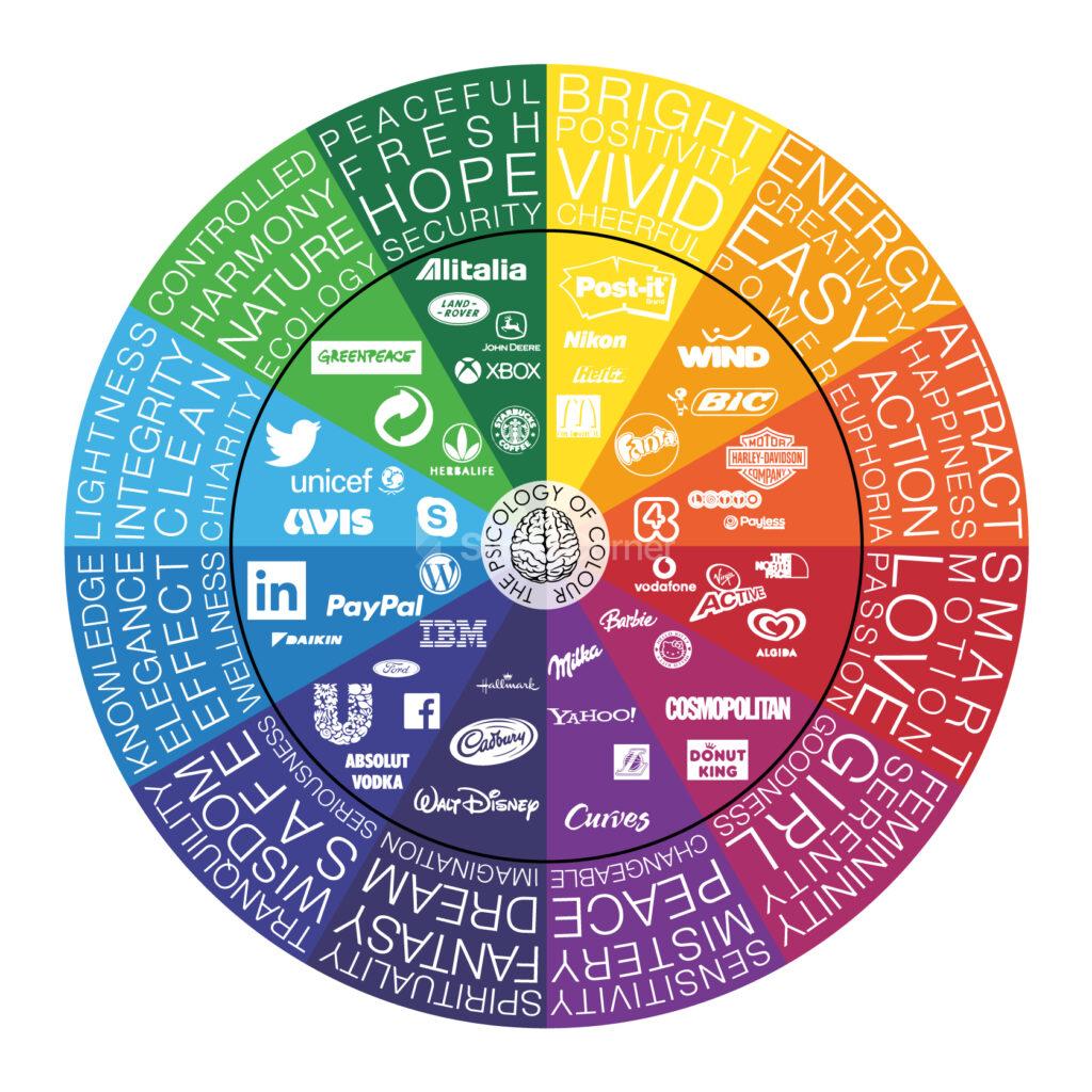
First, we’ll dive into the psychology of color . Did you know that different colors can elicit different emotional responses from your audience? For example, red is often associated with passion and energy, while blue is often associated with calmness and trustworthiness. By understanding the psychological impact of colors, you can use them strategically to enhance your message and connect with your audience on a deeper level.
Next, we’ll explore color combinations . Choosing the right colors can make or break your presentation. We’ll teach you the basics of color harmonies and show you how to create eye-catching color schemes that are both aesthetically pleasing and effective at conveying your message.
We’ll also cover practical tips on how to use color in your presentations , such as how to choose the right font color, how to use color to highlight important information, and how to avoid common mistakes that can detract from your message.
By the end of this article, you’ll have a solid understanding of color theory and how to apply it to your presentations . You’ll be able to create stunning visuals that capture your audience’s attention and leave a lasting impression. So, whether you’re a seasoned presenter or a beginner just starting out, this article is for you. Get ready to take your presentations from boring to brilliant with the power of color theory.
Psychology of Color
Color has a powerful impact on our emotions and perception. Understanding the psychology of color can help you use it to your advantage in your presentations, making them more engaging, memorable, and effective.

Let’s start with red. Red is a high-energy color that is often associated with passion, excitement, and urgency. It can stimulate the senses and increase heart rate and blood pressure. That’s why you’ll often see it used in advertising and marketing to grab people’s attention and create a sense of urgency. However, too much red can be overwhelming and even aggressive, so use it sparingly and strategically.
These are just a few examples of how color can affect our emotions and perception . By understanding the psychology of color, you can use it to your advantage in your presentations, creating a visual experience that not only looks great but also resonates with your audience on a deeper level and create the mood and atmosphere you want. So, choose your colors wisely and get ready to make an impact with the power of color psychology. Remember to balance colors appropriately and use them strategically to enhance your message and connect with your audience on a deeper level.
Color Combinations
Choosing the right color scheme for your presentation can be a daunting task, but it’s essential to creating a cohesive and impactful visual experience for your audience. Here are some tips on how to explore color combinations and choose the right colors for your presentation.
Start with a color wheel
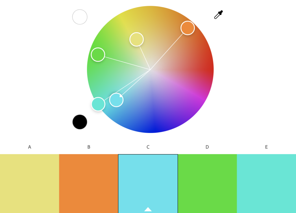
A color wheel is a great tool for exploring color combinations. It shows the relationship between primary, secondary, and tertiary colors and can help you create complementary, analogous, or triadic color schemes. Play around with different combinations to see what works best for your message and brand.
Consider your brand
If you have an established brand, you may want to use your brand colors in your presentation to reinforce brand recognition. If not, consider the values and message of your presentation and choose colors that reflect those. For example, if your presentation is about nature, you may want to use green and earth tones.
Think about the mood
Different colors evoke different emotions and moods. Consider the mood you want to create in your presentation and choose colors that reflect that. For example, if you want to create a calming and peaceful atmosphere, you may want to use light blues or soft pastels.
Use contrast
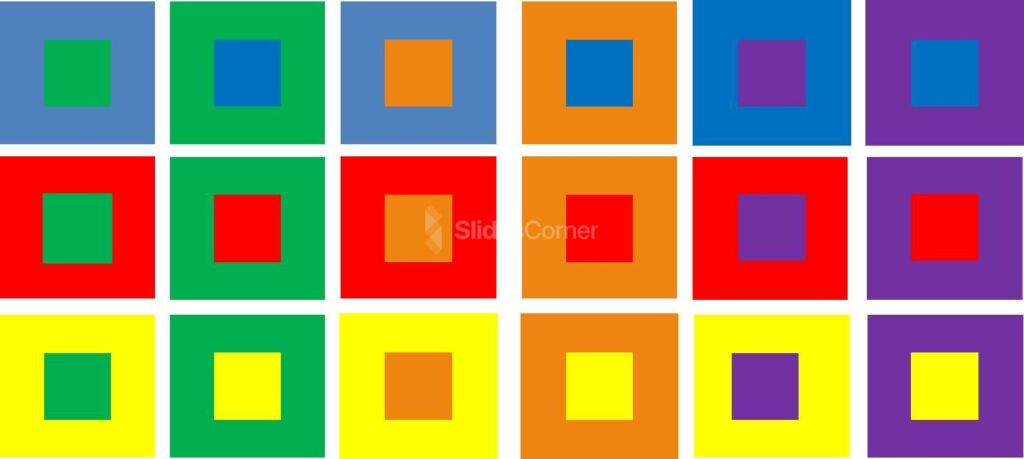
Contrast can make your presentation more visually interesting and help important information stand out. Choose colors that contrast well with each other, such as black and white or red and green. But be careful not to use too many contrasting colors, as it can be overwhelming for your audience.
Keep it simple
Too many colors can be distracting and take away from your message. Stick to a few main colors and use them consistently throughout your presentation. This will create a more cohesive and professional look.
Consider accessibility
It’s important to choose colors that are accessible to all individuals, including those with color blindness. Avoid using color alone to convey important information and use high-contrast color combinations to make it easier for everyone to read and understand.
Test it out
Before your presentation, test out your color scheme on different devices and screens to ensure it looks good in all environments. You can also ask a few colleagues or friends for their feedback on the color scheme and adjust as needed.
In summary, exploring color combinations and choosing the right colors for your presentation takes some thought and consideration. Use a color wheel, consider your brand and the mood you want to create, use contrast, keep it simple, consider accessibility, and test it out. By following these tips, you can create a visually appealing and effective presentation that connects with your audience on a deeper level.
How to Choose the Right Color s for Presentations
Using color effectively in your presentations is an important part of creating a visually engaging and impactful experience for your audience. Here are some practical tips on how to use color in your presentations.
Choose the right font color
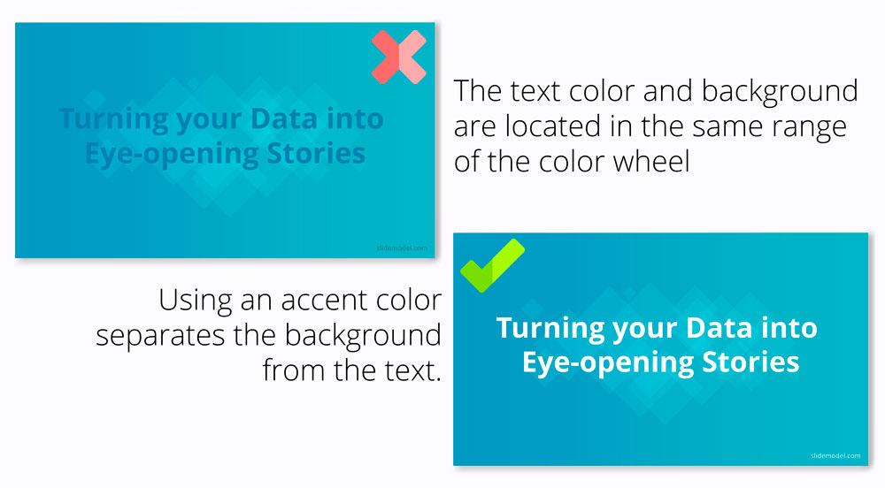
Font color is crucial for readability, so it’s important to choose a color that contrasts well with your background. For example, black or dark gray text works well on a light background, while white or light text is better on a dark background. Avoid using light-colored text on a light background or dark-colored text on a dark background, as it can be difficult to read.
Use color to highlight important information
Color can draw attention to important information and help it stand out from the rest of the content. Use a contrasting color to highlight key points, such as statistics or quotes. But be careful not to overdo it, as too much color can be overwhelming and detract from your message.

Create a consistent color scheme
A consistent color scheme can make your presentation look more polished and professional. Choose a few main colors and use them consistently throughout your presentation. This includes font color, background color, and accent colors. Use shades of the same color to create depth and interest.

Avoid common color mistakes
There are a few common mistakes that can detract from your message. For example, using too many bright or clashing colors can be distracting, while using too many pastel or muted colors can be boring. Avoid using neon colors, as they can be difficult to read and can give your presentation an unprofessional look.
Consider cultural differences
Different cultures can associate different meanings with colors. For example, in Western cultures, white is often associated with purity and innocence, while in some Asian cultures, it’s associated with mourning. Be mindful of the cultural context of your audience and choose colors that are appropriate.
Use color in charts and graphs
Charts and graphs can be made more visually appealing and easier to understand by using color to differentiate data sets. Use consistent colors throughout the chart or graph to create a clear visual hierarchy.

In summary, using color effectively in your presentations requires some thought and consideration. Choose the right font color, use color to highlight important information, create a consistent color scheme, avoid common color mistakes, consider cultural differences, and use color in charts and graphs. By following these practical tips, you can create a visually engaging and impactful presentation that resonates with your audience.
Tips and Tricks: How to Make Your Presentation Look Professional
Applying the theory of color to your presentations can take your design game to the next level. Here are some tips on how to apply color theory effectively in your presentations , along with some modern design tips to enhance your visuals .
Understand the basics of color theory
Understanding color theory is essential to using color effectively in your presentations. It’s important to understand the different color schemes, such as complementary, analogous, and monochromatic, and how they can be used to create visual interest and harmony. Additionally, knowing the emotions and associations that are commonly associated with certain colors can help you create a mood or convey a message.
Choose a color palette
Once you have a basic understanding of color theory, it’s time to choose a color palette for your presentation. You can choose a color palette based on your brand colors, the theme of your presentation, or the emotions you want to evoke. Stick to a limited color palette to keep your design cohesive and avoid overwhelming your audience.
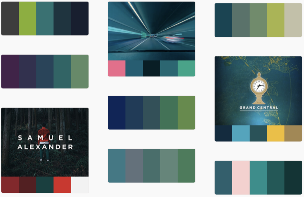
Create visual interest with contrast
Contrast is important for creating visual interest and directing the viewer’s attention. Use contrasting colors to create a hierarchy of information and draw attention to important elements. This can include using a bright color for headings or important text, or using a contrasting color for buttons or calls to action.
Use color blocking
Color blocking is a modern design trend that involves using large areas of color to create a bold and impactful design. Use color blocking to create a strong visual hierarchy and make important information stand out. For example, you can use a bright color for the background of a slide and use a contrasting color for the text.

Consider typography
Typography is an important part of design, and it’s essential to consider the relationship between your font and your color palette. Choose fonts that complement your color palette and create a harmonious design. Use a bold font for headings and a more subtle font for body text. You can use a free tool like Google Fonts to search for the right font.
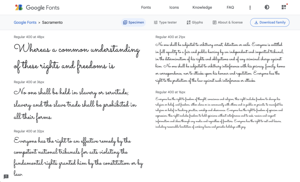
Add texture
Texture can add depth and interest to your design, and it can be achieved through the use of patterns or images. Use texture sparingly, as too much can be overwhelming. Consider using texture to add visual interest to backgrounds or to create contrast between different elements. Also, you can use our free backgrounds to enhance your slides.

In conclusion, applying the theory of color to your presentations requires a basic understanding of color theory, the ability to choose a color palette, creating contrast, using color blocking, considering typography, and adding texture. By following these tips, you can create a visually engaging and modern design that effectively communicates your message to your audience.
YOU MAY ALSO LIKE:

Download these aesthetic intense color gradient backgrounds to improve your PPT or Google Slides presentations.

Are you ready to create presentations that captivate and engage children? Follow these tips and…

Discover indispensable strategies to craft conference presentations that captivate and resonate with your audience.

Keeping your audience's attention for long periods can be one of the biggest challenges whilst…

Slideshows are quick to produce, easy to update and an effective way to inject visual…
Tags for this article
Share this article on social media, you may also like.

The Ultimate Guide to Creating Conference Presentations That Resonate with Your Audience
Creating Conference Presentations: A Guide to Captivating Your Audience
Purdue Online Writing Lab Purdue OWL® College of Liberal Arts
Color Theory Presentation

Welcome to the Purdue OWL
This page is brought to you by the OWL at Purdue University. When printing this page, you must include the entire legal notice.
Copyright ©1995-2018 by The Writing Lab & The OWL at Purdue and Purdue University. All rights reserved. This material may not be published, reproduced, broadcast, rewritten, or redistributed without permission. Use of this site constitutes acceptance of our terms and conditions of fair use.
This resource is enhanced by a PowerPoint file. If you have a Microsoft Account, you can view this file with PowerPoint Online .
This presentation is designed to introduce your students to color theory, which will help them make color choices that are more than appeals to aesthetics. The nineteen slides presented here are designed to aid the facilitator in an interactive presentation of color theory. This presentation may be supplemented with other OWL resources on visual literacy, visual rhetoric, and design.

- PowerPoint Design
- PowerPoint Training
- Presentation Skills Coaching
- Presentation Tips
Call Us. 202.681.0725
The Psychology of Color in PowerPoint Presentations
- April 12, 2013
- Kevin Lerner

Discover how the colors you choose for your PowerPoint presentations can guide the emotional response of your audience.
What are the best colors for a powerpoint presentation it all depends on who your audience is and what you want them to feel.
When used correctly, color can help audience members sort out the various elements of a slide. But its power goes beyond mere clarification. To some extent the colors you choose for your visuals guide the emotional response of your audience.
Blue: The most popular background color for presentation slides
Blue is one of the most common background colors. It’s calming and conservative, which is why it’s very popular with business presenters, as well as for for trainers. Studies have shown that blue has the power to slow our breathing and pulse rates. Dark blue backgrounds with light text are great for conservative corporate no-nonsense presentations. Lighter blue- more common in re cent times- work well in relaxed environments with the lights on, and help promote interaction.
Examples of BLUE in Presentations

- Quest Diagnostics: A serious company with a seriously navy blue background. The subtle angled lines promote a feeling a movement and technology. Blue complements the Green of Quest’s logo, and the white title bar provides a clean but stark contrast to the body.
- This blue template for waste management firm Republic Services provides a conservative backdrop for the financials and white bullet points. The yellow titles stand out, as does the orange, red and blue themed imagery at the bottom, not to mention the company’s logo.
- This slide for Dr. Soram Khalsa’ Complementrix Vitamin system features a template with a dark blue with angled lines. And the inner portion of the template featured a light blue-hue burst of a sun-ray to convey bright life and energy.
- This slide for Lender Direct featured an image of a file folder, edited in Photoshop, with a 80 % transparency set against a light blue background. The light blue graphic helped to convey a sense of openeness , and professionalism, while maintaining the company’s blue brand.
Green: Stimulates interaction and puts people at ease

Green stimulates interaction. It’s a friendly color that’s great for warmth and emotion. Green is commonly used in PowerPoint presentations for trainers, educators, and others whose presentations are intended to generate discussion. It’s also a great color for environmental and earth-oriented discussions.
Examples of Green in Presentations

- This slide for Hills Pet Nutrition features a modern green background with textured lines promoting a warm, but contemporary feeling. Great for their topic on pet affection.
- Money is green and so is this presentation for Presidio Finance. The white text contrasts nicely with the forest green finance images, helping to project a no-nonsense image of success and accomplishment.
- In this slide for TD Waterhouse, we created top title bar in dark green, integrating smoothly with their lime green logo. The green-hued process chart on the slide image stands out comfortably against the textured grey background.
- The flowing green arcs at the bottom and green title text helps substantiate this slides message of health and vitality. Executive Success Team’s green logo and brand also promotes a relaxed and comfortable feeling, just like Mona Vie.
Red: Handle with Care in Presentations!
Red is one of the most influential colors in your software palette — but it also carries negative cultural attachments, so use it carefully. Red is also a great color for conveying passion. Or talking about the competition. Do not use Red in financial information or tables and charts.
Examples of RED in Presentations

- The rich red of Oracle is maintained in this template, featuring red title text in an inset red rectangle and a red bottom bar of binary numbers for a look of blazing edge technology
- Trace Security uses a similar red title bar element, tying in to their black and red logo and brand.
- Red and black are also colors for Sales Training Consultants, and in this slide, we used a flat beige background, with a title bar in bright red together with red bullets and a red target graphic.
- The body pages of the Grenada presentation feature Red, but in an inset border. Text is inversed in white, as is the main body area. The key states in this map are highlighted in red.
Purple: Mystical and Emotional color in presentations and design
Purple is often associated with royalty and wealth. Purple also represents wisdom and spirituality. Purple does not often occur in nature, it can sometimes appear exotic or artificial. Nearly all the clients who come to me with presentations featuring purple or lavender are women. It’s a feminine color and it’s a good color for emotional or spiritual presentations.
Examples of Purple in Presentations

- Crosley & Company’s branding is maintained with a dominant dark purple background, and orange titles.
- A soft lavender background option gives these two medical doctors a chance to add some warmth for their mostly women audiences.
Yellow, Orange, & Gold: Attention-getting colors of affluence and prestige
Yellow can create feelings of frustration and anger. While it is considered a cheerful color, people are more likely to lose their tempers in yellow rooms and babies tend to cry more in yellow rooms.
Since yellow is the most visible color, it is also the most attention-getting color. Yellow can be used in small amount to draw notice, such as key words, or highlights but not in backgrounds. Rather than using flat yellow as a background color, consider a more “golden” or orange color. Simply adding texture to a yellow background or superimposing a photo (in Photoshop) with low transparency, can add more richness to the yellow background image.
Examples of Yellow / Gold in Presentations

- This flat yellow slide is for Web-Reach, an internet consulting firm in Miami. Even though their message was to compete with the Yellow Pages phone book, their yellow background was flat and uninspired.
- With a simple fix in Photoshop, yellow became Gold, and the same slide became more robust. We added a red bar to the top, and a grey arc to the left. Same information, just a textured golden hue helped deliver elegance and style.
- A golden textured earth background helped this slide convey the message of international elegance. The green money background blends with the gold, and the black text brings a nonsense message to the page.
- A golden textured background for Fountainhead Consulting with elements of yellow, blue, red, and grey.
Black: A strong and definite color that’s often overlooked!
Don’t forget your basic black. Often overlooked, black is a background color with useful psychological undertones. Its neutrality makes it a good backdrop for financial information. Black connotes finality and also works well as a transitional color which is why the fade to black transition is powerful, as it gives the impression of starting fresh.
Examples of Black in Presentations

- It’s a matter of black and white for this construction company. It’s intro slides were pure white text on a black background, emphasizing the company’s core beliefs. After the 3 b&w slides, the room lit-up with a series of dynamic colorful slides as the speakers enlightened the audience.
- Over 10 years old, this slide from Ryder transportation remains one of the strongest visuals. Set against a flat black background, the company’s grey logomark conveys a true sense of stability and no-nonsense action. The monotone building blocks tell a strong story.
White: Pure, Fresh and Clean. But a little boring.
White is also a calm and neutral color for presentations. It’s terrific for conveying a fresh start such as a fade to white. It represents purity or innocence. Good for positive information where you want the focus purely on the message, and not competing with a brand image. It’s clean/open and inviting and can create a sense of space or add highlights. But it can also be perceived as cheap, flat (it’s the default color for PowerPoint slides) and harsh on the eyes. Consider grey as a better background color.
Examples of White in Presentations

- To help to maintain a clean and open look this consumer collaborative called on us to integrate their brand colors set against a plain white background. The blue and orange bars provided a conservative frame, while the arcs provided a contemporary look of flow and motion.
- This slide for a large architecture and construction firm featured a flat white background offset by a colorful series of modern buildings and logos.
Grey and Silver: A conservative color; Good when Black or White won’t work.

According to psychologists, grey is often thought of as a negative color. It can be the color of evasion and non-commitment since it is neither black nor white. Some say that Grey is the color of independence and self-reliance. A few years ago, silver was the most popular color for cars. And in the presentation world, this calm color is making a comeback. Grey (or “Silver”) is a softer background than the harsh default color of white, and works well on almost all presentations. A dark grey background with light text…or light grey background with dark text…you can’t go wrong!
Examples of Grey in Presentations

- Farmers Insurance’s silver background integrates subtle ray of light elements to help add depth and texture to this slide. The red, blue, and black stock images blend comfortably with the rest of the page. And the white border around the letters add a level of modernism and clarity.
- The stainless steel background of this slide helps promote a modern contemporary look, helping to link the 4 brands together.
- A clean flowing blue arc with a non-obtrusive silver background help make this slide for Margie Seyfer appear fun but conservative
- Interim Healthcare’s brand is maintained, but a muted image in silver help add depth and dimension to the slide’s message, while supporting its key points.
We perceive dark colors as being “heavier” than light ones, so graphic elements that are arranged from darkest to lightest are the easiest for the eyes to scan. On charts, it’s best to arrange colors from dark to light.
Remember that most eyes aren’t perfect. Because color perception deficiencies are common, certain color combinations — including red/green, brown/green, blue/black and blue/purple — should be avoided.
color , powerpoint , powerpoint tips , presentation design , psychology of color , style
Presentation Perfection for Clients around the World.

"We engaged The Presentation Team to do a Presentation training for our team and he did a great job. He spent time understanding our requirements and the skill level of our team members and created a course which met our expectations and goals. I highly recommend The Presentation Team as a Presentation (PowerPoint) trainer."
Navdeep Sidhu Senior Director, Software AG
"Kevin Lerner provided best-in-class services when hired to work on promotional materials for the launch of a key product at Motorola. The expertise and quality that he brought to the project were second to none and as a result, he delivered a top-notch presentation that was quickly adopted throughout the organization. Kevin is great to work with, delivers on time, is a great team player and is always willing to go the extra mile."
Maria Cardoso Motorola
"Kevin has been a working with Cox Communications to deliver world-class PowerPoint presentation visuals since 2009. His ability to meet our specific needs, timeframe, and budgets has been exceptional. His professional interaction with our team reflects his deep expertise in the industry, superior presentation design skills, and commitment to superior service."
Jonathan Freeland VP, Video Marketing at Cox Communications
"Kevin is an enthusiastic, creative, and passionate presentation guru. Our company was impressed and felt the value of his training in 2013 that he was invited again recently to again share his knowledge. Both times he has been energetic and addressed many areas for presentation development. From planning to follow-up Kevin is personable and easygoing, motivating our teams to take their presentations to the next level."
Yoshimi Kawashima Project Coordinator, Nissin International
"Kevin helped me immensely improve my presentation slides development, from tips & tricks to aesthetics, all with the intent of getting the message across crisply and creatively. I've already received praise for decks that incorporate the skills obtained from his training. I highly recommend Kevin's services."
Era Prakash General Electric
"Kevin helped me immensely improve my presentation slides development, from "The PowerPresentations seminar opened my eyes to all the limitless possibilities in presenting."
Leah Gordillo Saint Francis Medical Center
"Kevin helped me immensely improve my presentation slides development, from "[Kevin and The Presentation Team have] always delivered 110% in terms of meeting our objectives for finished product and budget"
Paul Price Watsco Corp.
"I had more people come up to me after I spoke, commenting on the visuals you created, than I did on the subject matter!"
Andy Smith Smith & Robb Advertising
"As a Fortune 1000 company, we sought to produce a classy, yet conservative presentation for our shareholders. It was evident that you and your team listened to our thoughts as you developed the presentation..."
Will Flower Republic Services
"Your expertise in the filed of PowerPoint and general presentation techniques helped elevate us to the level necessary to beat the competition."
Mike Geary James Pirtle Construction
"Kevin brought a high level of creativity, enthusiasm, and deep multmedia experience to our team. He worked dillegently with the team to produce an outstanding proposal which we subsequently won.
Jeff Keller Accenture/L3
info @ presentationteam.com
Giving a Presentation? We can Help.
Sign-up for free PowerPoint Tips, PowerPoint Templates, and Presentation Strategies.
Presentitude
Presentitude creates visual and powerful presentations using effective and visual PowerPoint templates.
The basics of the color wheel for presentation design (Part I)
September 28, 2015
Colors are just as important as the content of your presentation. The chosen colors will, if used right and consistently, help enhance your message. You need colors to create a theme that flows through your presentation. You want to utilize different colors for different content and help the audience follow your communication. Knowing the color theory basics and how PowerPoint handle colors will make it easier to use colors in your next presentation.
The basics of the color wheel
The color wheel was the first organized system of colors. It is still used to illustrate the relation between colors.
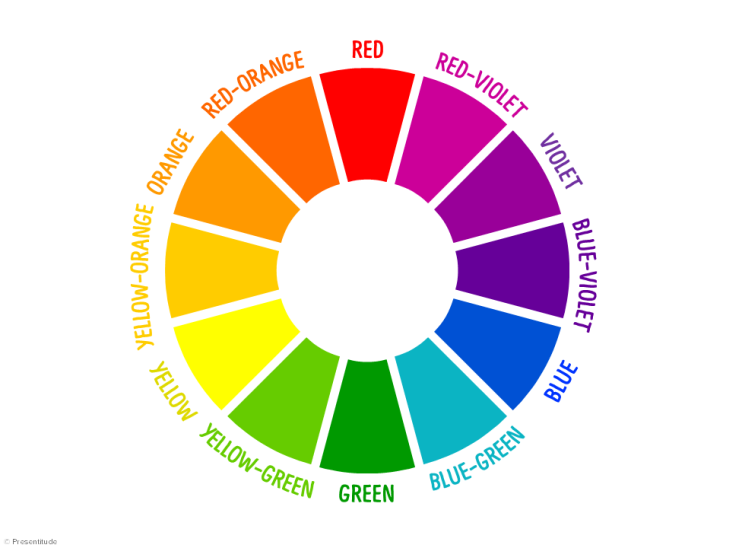
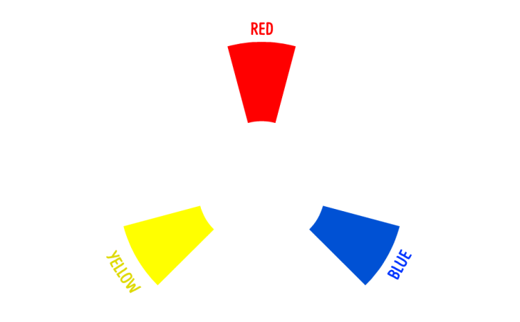
In traditional color theory, it all starts with three colors – the primary colors.
The PRIMARY COLORS on the color wheel are red, yellow and blue.
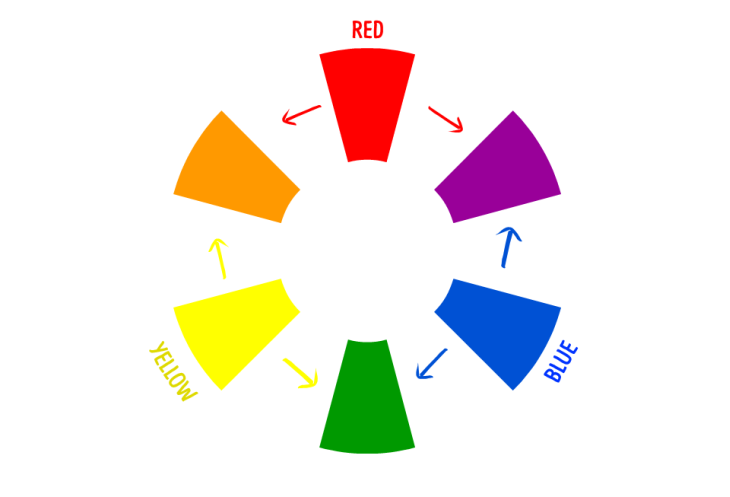
The SECONDARY COLORS are orange, violet and green. They can be made from mixing two primary colors.
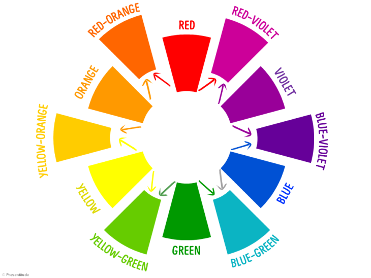
The TERTIARY COLORS completes the color wheel to 12 basic colors. The 6 tertiary colors are created by mixing one primary color with an equal part adjacent, secondary color.
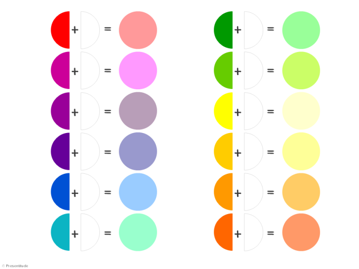
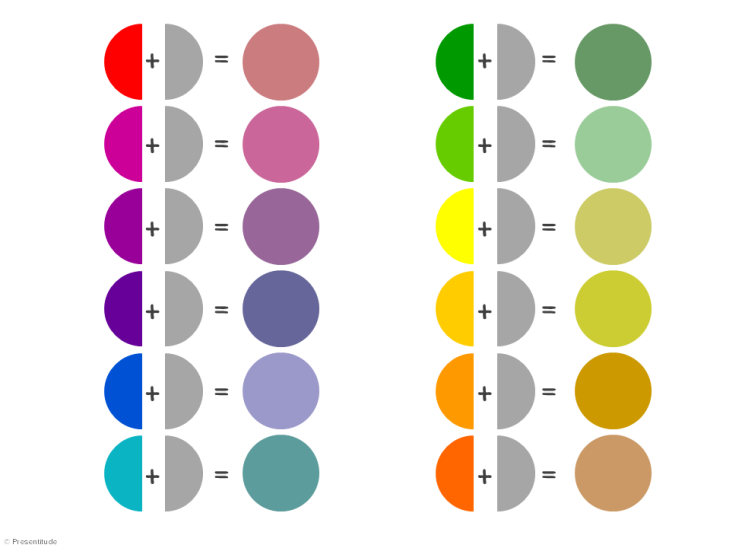
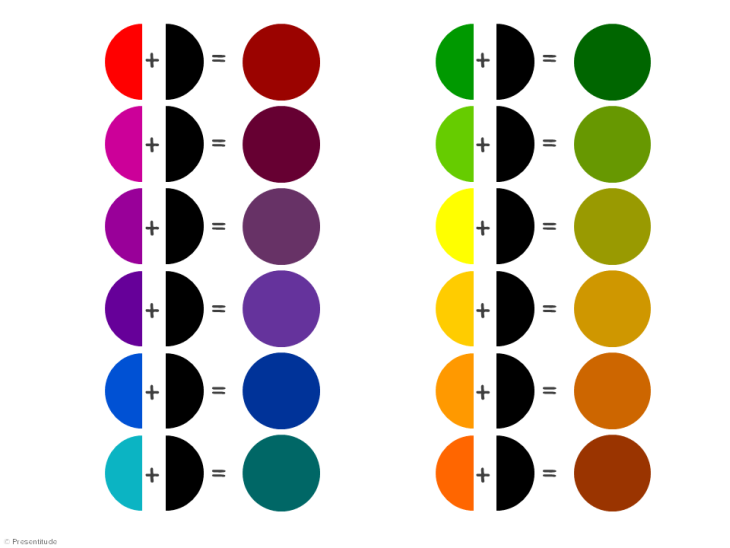
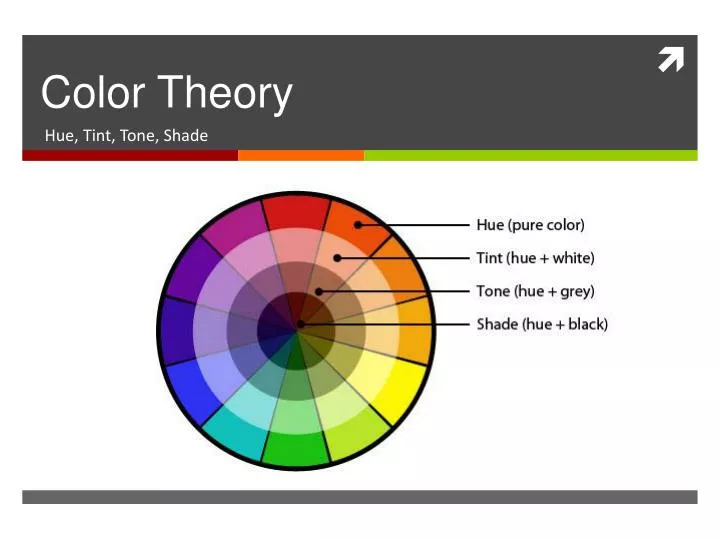
The colors on the color wheel can also be described by its tints , tones & shades depending on if you blend them with white, gray or black.
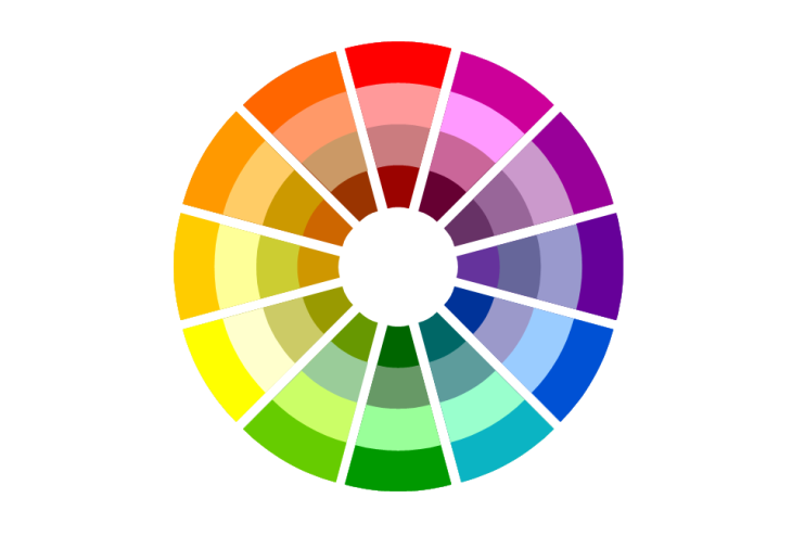
A color TINT is a hue blended with white.
A color TONE is a hue blended with gray.
A color SHADE is a hue blended with black.
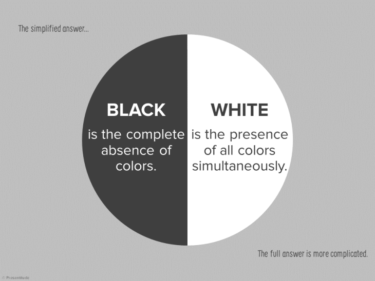
Why is black or white not on the color wheel?
The simplified answer is that black is the complete absence of colors and white is the presence of all colors simultaneously. The full answer is more complicated – are black and white colors, are they generated by light or do they exist as pigments or as molecular coloring agents (read more here )? So we’ll stick with the simplified answer and conclude that white and black are not included in the color wheel.
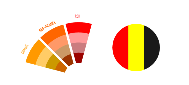
What about brown?
Brown is a dark orange or neutral red hue a composite color made by combing red, black and yellow.

Read the other parts in our Colors for PowerPoint series:
View this post as a slide presentation:
How can we help you today.
Do you want to know more about our services, stay in touch or get access to content?
Home Blog PowerPoint Tutorials How To Choose the Color Scheme for a PowerPoint Presentation
How To Choose the Color Scheme for a PowerPoint Presentation

First impression is the last impression, and rightly so. In almost every facade of life, and especially in professional areas. When it comes to making a first good impression, you must take out some time to perfect your look by choosing smart appearance that will flatter your professional look with the perfect color scheme according to the audience. Similarly, when you need to give a presentation, it needs to be created perfectly with fascinating color schemes. The choice of colors for a presentation, is one of the important factors that must be considered as you initiate the process. An effective creation of a presentation deck can help in building a direct relationship between the presenter and the audience.
People are judged by their physical appearance, similarly, your message will be judged on the basis of its design elements, color combinations, and font styles used even before it is read by the audience. Therefore, it is important to create an interactive and vibrant presentation with the best selection of a PowerPoint color scheme based on the topic you’re presenting to your audience.
So let’s get down to study some color theory basics for a PowerPoint presentation .
Basic Colors Theory

The Color Wheel was the first model used to demonstrate the relationship between different colors. In which, red, blue, and yellow are the basic and are called as primary colors. After the primary colors, secondary colors are formed with the combinations of the primary colors and they are violet, orange, and green.
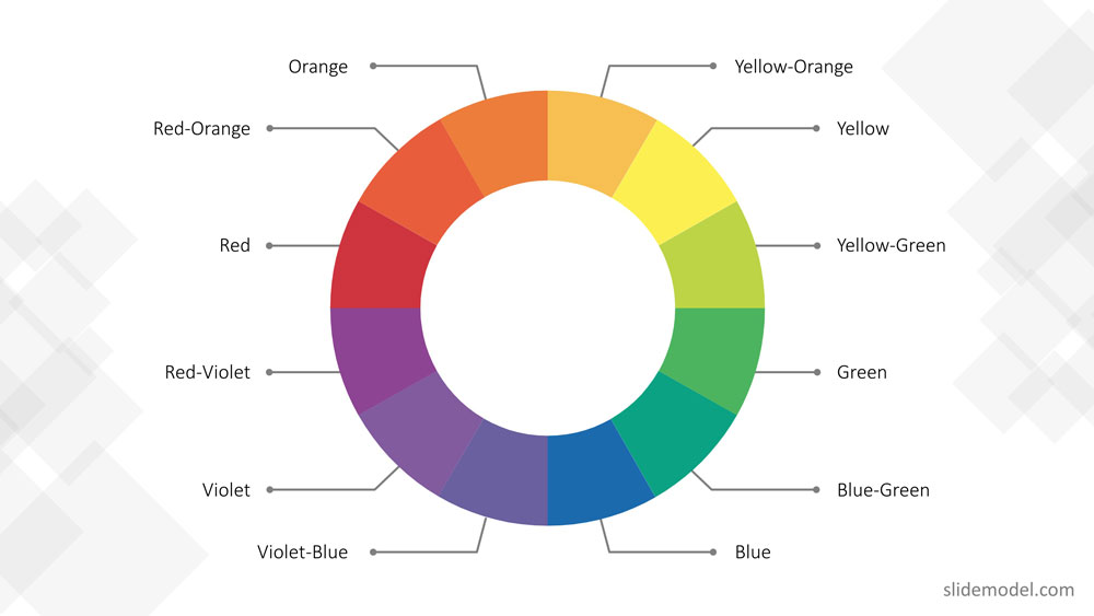
In the end, with the combination of primary colors and secondary colors tertiary colors are formed, which results in these colors, red-violet, blue-green, red-orange, blue-violet, yellow-orange, and yellow-green.
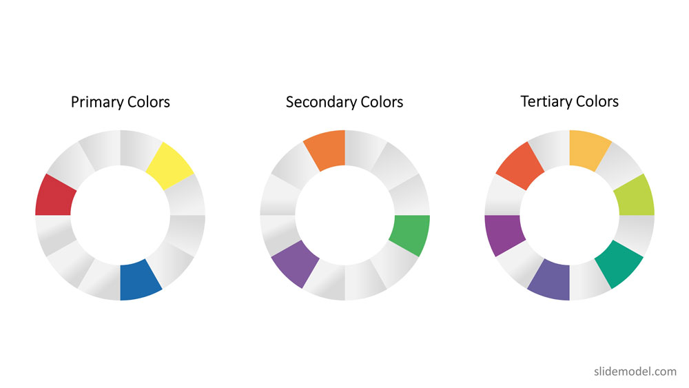
Hence, the color wheel or color circle is composed of 12 colors including, red, green, orange, yellow, violet, blue, red-violet, blue-green, red-orange, blue-violet, yellow-orange, and yellow-green.
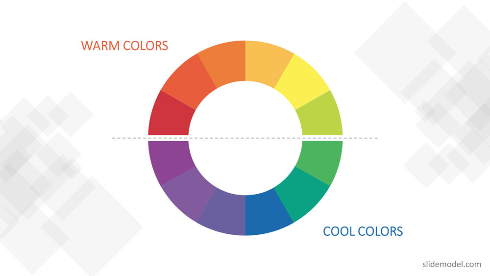
This color circle is divided into warm and cool colors indicating vividness, energy and calm, soothing respectively. There are three other terms related to color theory those are tint, shade, and tone.
- In tinting, a color is made lighter by adding white.
- In shading, black is added to get the darker version of the color.
- And intoning, gray is added to get a different tone.
How to Choose the Right Color Scheme for your Presentation
Using the basic color theory described before you can apply the following rules of thumb:
Color Schemes – The use of harmonious color
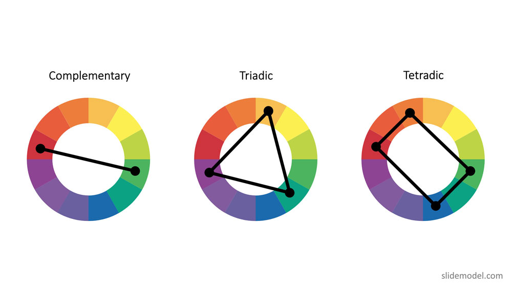
To create a professional color scheme, pick two colors opposite each other on the color wheel (these are called complementary colors), three colors equally spaced around the color wheel forming a triangle (these are called triadic colors) , or four colors forming a rectangle (these are called tetradic colors). Complementary colors are ideal for high contrast. Triadic colors generates a more balanced contrast, used for example for title and subtitles in the same canvas. Finally, tetradic colors allow to have a theme with two vectors of complementary colors. After the basic color scheme is formed, you can tint , shade or intone those colors to expand your palette.
Though Color Theory covered almost everything related to the color scheme, there are few other things you need to keep in mind while choosing a color scheme for presentations.
Since, poor color choice in presentations results in ugly visuals, which put a bad impression on the audience resulting in bad feedback from them.
Some handy tips to keep in mind to choose a good presentation color palette:
Follow high-contrast color scheme
The common mistake found in presentations is color contrast. The presentation slides don’t have enough contrast between the colors chosen for the background and the text or graphics. For professionals, it is very important to create a PowerPoint presentation in high contrast with the background color to attract the audience.
If you have chosen dark background then choose light text and graphics or vice-versa to blend the content with the background and not to make it float above the background. The more contrast you will have and the easier it will be for your audiences to see the text or graphic you are using.
For example, you can take the following slide. The PowerPoint theme uses monochromatic colors (black, grey, white) using high contrast between black,grey and white to differentiate text from the background. It adds two highlighting colors green and fuchsia in order generate contrast and help focusing the audience view in other sectors.

Follow simplicity
Don’t make it gaudy! When it comes to professionalism, simple yet attractive color combinations are the most preferred and recommended. Try to keep the design as simple as possible with a perfect blend of colors and graphics. It is recommended that three to four colors are sufficient for a presentation.
Follow the 60-30-10 rule
The 60-30-10 rule is an interior design color scheme best practice, which adaptation to graphic design has become very popular. It states that the appropriate color proportion of a space (in this case the presentation canvas) should comply with the 60%, 30%, 10% distribution, in order to be considered balanced. The main color (60% distribution) should cover background, the secondary color (30% distribution) will be used for shapes fill or images filter, finally the 10% is allocated as the accent color, used in outlines and text.
In recent studies, it is found that 90% of the decisions are made on the basis of color schemes . In another study regarding branding, states that there is a great relationship between brand and the color being used to represent it. The audience gets attracted only if the color “perfectly fits” to what is being sold.
When you choose a perfect color scheme for a presentation, it comes out to be the most effective. While other color combinations make your presentations difficult to watch and understand.
Here are some mistakes you should avoid while choosing the color combination for a PowerPoint presentation.
Mistakes to Avoid While Combining Colors in PowerPoint
Here are three common mistakes that you must avoid while choosing colors for your PowerPoint presentation:
Illegibility
It becomes difficult to see slides due to color choice. A presentation with a bad or wrong combination of colors could be illegible under specific lighting conditions or monitors. The simplest color combinations that make presentations readable are dark text with a light background and vice-versa.
Unclear graphics
In graphics or charts, use colors to distinguish associations or data points or relationships between entities. You can use a single color to represent similar data groups to distinguish from others. This is the best way to make things clear and understandable to viewers. On the other hand, different colors confuse viewers and make it difficult to understand the things shown in slides.
Too much of everything is bad
Whether it is too much of text or images, it isn’t good for your presentation. Slides with a summarized form of data allow viewers to concentrate more on the presenter, who is explaining the topic than the presentation slides.
Text, images, and graphics strengthen your presentation so make sure the text color contrasts as much as possible with a majority of the picture colors and background as well. These tips work well to choose a proper color palette for PowerPoint, but also for presentations in Google Slides.
Color Palette Ideas to Take Inspiration From
Sure you can create your own color combinations with all these tips that we’ve lined out. But it will make your life more easy if you take inspiration from pre-combined palette and presentation templates.
1. Modern Gradient Backgrounds for PowerPoint

Gradient backgrounds can act as a fuel for your presentations. These are powerful templates that you can choose. This very template presents an elegant and artistic slide deck. Gradient backgrounds are basically a gradual blend of two or more colors which progress and merge from one to another. They are also known as fountain fills or blends.
Use This Template
2. Presentation Template for Business Deck

A business presentation must flow well and look clean. With this particular template you can craft professional business decks. It can help you compile all the necessary information in a professional manner.

Like this article? Please share
Business PowerPoint Templates, Business Presentations, Diagram Templates, Templates Filed under PowerPoint Tutorials
Related Articles

Filed under Business • February 7th, 2024
How to Create & Present a Competitive Landscape Slide for Your Pitch Deck
Get to know how to properly create a winning competitive landscape slide for your pitch deck. Boost your pitch performance now.

Filed under Business • February 2nd, 2024
Business Plan Presentations: A Guide
Learn all that’s required to produce a high-quality business plan presentation in this guide. Suggested templates and examples are included.

Filed under Business • January 31st, 2024
How to Create a Sponsorship Deck (Guide + Examples)
Impress your audience and secure deals by knowing the insights on how to create a winning Sponsorship Deck. Step-by-step instructions + templates.
Leave a Reply
Color Theory
- This term describes the distinct characteristic of color that distinguishes red from yellow from blue. These hues are largely dependent on the dominant wavelength of light that is emitted or reflected from an object
- In a nut shell – Hue means the pure color, what comes directly from the tube / bottle
- Refers to lightness or darkness of color.
- Refers to how bright or dull the colors are
- These are the 3 pigment colors that can not be mixed or formed by any combination of other colors. All other colors are derived from these 3 hues
- These colors are Red, Yellow, Blue
- These are the colors formed by mixing the primary colors.�
- These are the colors formed by mixing a primary and a secondary color.
- are light values that are made by mixing a color/ hue with white. For example, pink is a tint of red, and light blue is a tint of blue.
- are dark values that are made by mixing a color with black. Maroon is a shade of red, and navy is a shade of blue
Cool Colors-
- are soothing in nature. They give an impression of calm and rarely overpower the main content or message of a design. Cool colors tend to recede; therefore, if some element of your design needs to be in the background, give it cool tones.
Warm Colors-
- are vivid in nature. They are bold and energetic. Warm colors are those that tend to advance in space; therefore, caution needs to be taken so you do not overwhelm your content with eye catching hues. If an element in your design needs to pop out, consider using warm colors to do that.
Monochromatic-
- The monochromatic color scheme uses variations in lightness and saturation of a single color within the Color Wheel
- Uses colors that are next to each other on the color wheel. They usually match well and create serene and comfortable designs.
Complementary-
- Complementary colors are any two colors which are directly opposite each other, such as red and green, Yellow and purple, Blue and Orange
- uses colors that are evenly spaced around the color wheel.
- Hint- They usually form a triangle
- Triadic color schemes tend to be quite vibrant, even if you use pale or unsaturated versions of your hues.
- Black, Brown, and White
Artworks with Specific Color Harmonies
Analogous – three colors next to each other
Ex. Blue, Blue-green, green
Monochromatic – One color + black and white

Make It Pop: Utilizing Color Theory in Your Presentations
January 9, 2019 / Articles, Blog

More than making the world look stylish, colors impact the way we understand visual information all around us. We know that a green light means go, a blue sky means a pleasant day and a brown banana means it’s probably time to throw that out. Because colors can say so much at just a glance, choosing the right ones is always a crucial decision a PowerPoint specialist must make.

Get hundreds of PowerPoint slides for free.
Sign up for your free account today..
When delivering a presentation, you’ll want to keep your audience engaged with captivating visuals. People are more likely to remember distinct visual stimulants than blocks of text or rambling speeches. Color theory is one of the foundations of graphic design. Knowing how to utilize colors effectively is key to making your presentations more impactful. It’s the first step to becoming a more refined presentation specialist.
Set the mood
You may not realize it every time, but colors have the power to evoke a wide range of emotions . Warm colors can have you feeling excited and optimistic while cool colors give an impression professionalism and elegance. This subliminal effect on our minds is something not all visual mediums are capable of. Whether you’re designing a PowerPoint presentation, brochures/handouts or infographics, applying colors that match the mood and tone of your content can add more depth to the story you wish to tell.
Make information pop
Most of the fun in understanding color theory comes from experimenting with different color combinations to achieve the most effective design. By playing with contrasting or complementary colors, you can easily draw your audience’s attention to any slide’s most important piece of information. This way you can ensure the information flows out naturally to the eyes of your audience.
Build structure
Apart from simply coloring your fonts and backgrounds, color theory can help develop a clear structure to your slides. Using shapes, lines or negative space, you can further take control of the flow of information by distinguishing sections your audience can easily understand. As a presenter, structuring your slides will aid your mental flow as well.
Contrast and complement
As mentioned earlier, playing with contrasts and compliments can greatly impact the flow of information in your presentations. It’s important to know which colors pair well with one another to effectively bring out the information most relevant to your audience. Developing this skill will ultimately make your presentations feel much easier on the eyes .
Keep things simple
When it comes to design, it’s best to keep it simple and balanced. Having less can mean much more. Choose a palette of three to four distinct colors and you should be all set. Maintaining that palette helps build color association for your audience the further you get through your presentation. Color coding elements like headers or data makes filtering through information quicker and easier.
The 60-30-10 rule
This rule has its roots in interior design but its basic philosophy can be applied to various other fields of design. It’s a matter of knowing how to portion your colors in a certain space: 60% for primary colors, 30% for secondary and 10% for accents. By assigning colors according to importance, it makes distinguishing sections of each slide easier for you to design.
One more thing. Any presentation expert will tell you, don’t forget to dress accordingly! Try color coordinating your outfit with the palette of your slides. This detail will add a nice touch in making your overall presentation be more memorable.
Still need some help? Colors can be tricky. There is always more than meets the eye. If you feel like you’re at an impasse in your presentation design, just give us a call. We can help you give your slides an extra bit of “oomph!”

Download free PowerPoint templates now.
Get professionally designed PowerPoint slides weekly.
Popular Posts
Save your deck: methods to recover an unsaved powerpoint file.

Twitter: Lessons from Social Media

Oscar Speech Sounds A Lot Like…..

Olympians Can Teach Presenters a Thing or Two

Overcoming a Public Speaking Disaster: A Lesson from Michael Bay

The Similarities Between Presentations and Advertisments : Super Bowl Edition
Color theory and its significance in presentations
The choice of color you use in your presentations is nearly as important as the content you include in your presentations. Colors can affect us at a subconscious level and can potentially be the difference between someone liking an idea and rejecting it. This is why knowing the basics of color theory and its impact is important to becoming a successful presenter and visual communicator.
The basics of color theory and the color wheel

Color theory can be described as a method using science to determine the colors that go well together and provoke a response in the viewer. The color wheel is a visual representation showing the connection between different colors—this forms the basis of color theory .
Different Color Combinations to use for your slides

Using color theory in your next presentation
complementary colors.
Complementary colors work well together and improve each other’s intensity. However, you need to be mindful when you are picking these colors. The main rule would be to use one of the colors as the more dominant shade in your slides.
The 60-30-10 rule illustrates this idea perfectly. This means you should choose a predominant primary color to use in 60% of your slide. The secondary color will be used for 30%, with the remaining 10% reserved for the accent colors. Pick the dominant color based on the emotion you wish to evoke in your audience.
Triadic colors
With triadic colors, one of the colors is ideally used as a primary color and the other two are used as accent colors. Triadic colors help create more contrast in your slides. The emotion you wish to invoke using triadic colors will be based on the dominant color you choose.
Shades of red, blue, and green are the most commonly used triadic color combinations. This color combination helps give your slides a more vibrant look while remaining soothing to the eye of the audience. When used correctly, these color combinations give a sense of cheerfulness and professionalism while pushing your audience to take an action, making them ideal for a sales pitch.
Triadic color combinations might come across a bit youthful and playful, so take care to get the balance between the colors right. As you can see in the Zoho Show presentation template below, Key Lime Pie (#B3D124) is used as a dominant color while Trinidad (#F6590A) and Blumine (#1F497D) are secondary colors.
Digital Strategy template using triadic color scheme.
Analogous Colors
Using an analogous color combination is often pleasing to the eye. This could be because we are so used to seeing these color combinations in the real world. Since they are next to each other in the color wheel, they blend well and help create wonderful designs. Just make sure the color contrast between the three colors you use is prominent enough to make it visually appealing.
Yellow, green, and blue is a commonly used analogous color scheme that brings a sense of happiness to the audience. These colors can be refreshing, and the blue gives a professional touch to your slides. This combination could work for informative presentations, like a TED talk about how you can master a skill in just 20 hours.
In the example shown below, the Zoho Show slide template uses an analogous combination of Scarlet (#FC3012), International Orange (#FD5101), and Monza (#D9003D) which gives an important and energetic tone to the slides.
Social Media Strategy template using an analogous color scheme.
Tetradic Colors
Picking 4 colors that are equidistant from each other on the wheel has its perks and disadvantages. Making use of four different colors can bring a fun, vibrant, and colorful feel to your slides, but care should be taken to ensure the balance between the colors is properly maintained or it can easily become overwhelming.
Since there are 4 colors used here, this gives you the chance to improvise and come up with different color variations. Shades of red, yellow, blue, and green are a popular example of a tetradic color combination. These bold colors can be used to create vibrant color combinations. One color can be used as a dominant color while others can be used as accent colors. This combination can be used for presentations with visual data in charts and tables, like a quarterly report of a company.
Brand Style Guide template using tetradic color scheme.
Monochromatic Colors
As eye-catching as these color combinations can be, opting for a monochromatic set of colors for your next presentation might not be a bad idea at all. Picking this color scheme ensures there is consistency across all your slides. Since multiple colors from a single hue is used, it is comparatively easier to focus the attention of your audience. With the popularity of minimalist designs on the rise, this can be an ideal color choice for your slides.
For example, the color blue conveys emotions such as trust and communication. This color is a popular choice for business presenters since it can create a sense of trust and has a calming effect on viewers. Using a monochromatic blue color scheme can help make your slide look professional.
Marketing Proposal template using monochromatic color scheme.
We live in a visual world, and colors play a key role in any type of visual communication. When you choose colors for your next presentation, keep color theory and these tips in mind to impress your audience better. If you’re unsure about how to choose the right colors for your presentation but want to try different color schemes, don’t worry: Zoho Show offers multiple built-in presentation templates and pre-loaded color palettes.
Product Marketer
Leave a Reply Cancel reply
Your email address will not be published. Required fields are marked *
Related Posts
Color Theory
Jul 21, 2014
420 likes | 810 Views
Color Theory. Hue, Tint, Tone, Shade. What is color?. the appearance of objects (or light sources) described in terms of a person''s perception of their hue and lightness (or brightness) and saturation. So then how is it made?.
Share Presentation
- complementary colors
- analogous color schemes
- specific color
- neutral color
- primary color

Presentation Transcript
Color Theory Hue, Tint, Tone, Shade
What is color? • the appearance of objects (or light sources) described in terms of a person''s perception of their hue and lightness (or brightness) and saturation
So then how is it made? • Believe it or not, but the reason we have color is because we have light! Color is the way our eyes interpret the energies contained within a beam of light! • The energies of light contain a large spectrum of colors. When light touches an object, some of these energies are absorbed (taken in) by it, and others are reflected (cast back). – It’s the energies that are reflected which your eyes collect and then interpret as a specific color!
The Color Wheel • Colors on the color wheel are divided into three groups: • -Primary • -Secondary • Tertiary
Primary • Red, Yellow and Blue • Primary colors cannot be made by combining other colors, but all colors can be made from them.
Secondary • Orange (red + yellow), Green (yellow + blue), Violet (blue + red) • Secondary colors are made by combining two primary colors.
Intermediate • Yellow-Orange, Yellow-Green, Blue-Green, Blue-Violet, Red-Violet, Red-Orange • Intermediate colors are made by combining a primary color and a secondary color. The resulting color name lists the primary color first, followed by the secondary color.
Complementary • Opposite hues on the color wheel • Give me an example of Complementary Colors?
Complementary • What happens when you mix two complementary colors together? • You create brown, or a neutral color. • A neutral color means without color. Example: beige, tan, ivory, taupe etc.
Analogous • Analogous color schemes use colors that are next to each other on the color wheel. They usually match well and create serene and comfortable designs. • Analogous color schemes are often found in nature and are harmonious and pleasing to the eye.
Hue: (Also referred to as color) • Hue ranges from warm to cool Hue is what we usually mean when we ask “what color is that?” The characteristic of color that we are actually asking about is “hue”. For example, when we talk about colors that are red, yellow, green and blue, we are talking about hue.
Shade: • The shade of a color refers to how dark it is. It is the combination of a hue and black. Thus, burgundy is a shade of red, hunter is a shade of green, and rust is a shade of orange.
Tint • A tint is a color to which white has been added to make it lighter. Take pink, for instance. Pink is a color, but it's also a tint of red.
Tone • A Tone is created by adding both White and Black. Any color that is "greyed down" is considered a Tone. • Black + White= Gray
Temperature • Warm Colors: Red, Orange, and Yellow • Cool Colors: Green, Blue, and Purple • Warm colors are vivid and energetic, and tend to advance in space. • Cool colors give an impression of calm, and create a soothing impression. • White, black and gray are considered to be neutral.
Intensity: (also referred to as saturation) • Intensity ranges from vivid to dull • All hues on the color wheel are at their maximum intensity, or most vivid. You can dull any hue by adding gray. The amount of dulling is controlled by the strength of the gray added.
Split complementary color • One hue and hues on each side of its complement
- More by User
Color Theory. Color: Definition . Color: the property possessed by an object of producing different sensations on the eye as a result of the way the object reflects or emits light .
447 views • 15 slides
COLOR THEORY
COLOR THEORY. Katherine Meeks. Consist of primary, secondary, and tertiary colors. Pure & bright. Straight-from-the-tube color. Bold, cheerful & exciting. Hues + white. AKA pastels. Soft, youthful, & soothing. Hue + black. Deep, powerful, & mysterious.
433 views • 27 slides
COLOR THEORY. Objective:. The student will be able to determine the proper color formulation in color relationships The Law of Color Primary Colors Secondary Colors Tertiary or Intermediate Colors Complimentary Colors. The Laws of Color.
539 views • 25 slides
COLOR THEORY. 7TH GRADE 2ND PARTIAL. PRIMARY COLORS. SECONDARY COLORS. TERCIARY COLORS. LIGHT IS MADE UP OF COLORS. WHEN IT PASSES THROUGH A PRISM LIGHT IS SEPARATED INTO COLORS: RED, ORANGE, YELLOW, GREEN, BLUE, VIOLET. THESE ARE THE COLORS THAT MAKE UP THE RAINBOW.
703 views • 22 slides
What is color? How do we perceive it? How do we describe and match colors? Color spaces . Color Theory . Interaction of light and eye-brain system Light: electromagnetic phenomenon Discerned by different wavelength . What is color? . Color Spectra. Pure colors - single wavelength .
386 views • 23 slides
Color Theory. Color- the illusion of producing different hues to the eye as a result of various electromagnetic wavelengths of white light reflecting from a surface. Description of Color. Hue – Is the name of the color itself, the dominant wavelength of light or the choice of pigment.
367 views • 22 slides
Color Theory . Digital Media. a property of light a property of objects Happens in the observer. Light | Physics Object | Chemistry Observer | Biology. What is Color?. Photons and Waves .
339 views • 21 slides
Color Theory. Miss Warner Mixed Media 1. Color Theory Painting Rules:. Do NOT move on until prompted. Mix all colors in the mixing palette provided. Paint light, quick layers… Too much water or too thick of paint will cause your paper to tear. . What is Color?.
832 views • 41 slides
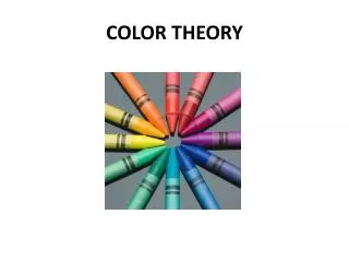
COLOR THEORY . Color = the reflection of light from an object or surface. No light = no visible color. Hue = the name of a color. . Triad = a group of three. . Primary colors = red , yellow and blue . These mix to make all other colors.
416 views • 18 slides
Color Theory. Color- the illusion of producing different hues to the eye as a result of various wavelengths of white light reflecting from a surface. Description of Color. Hue – Is the name of the color itself, the dominant wavelength of light or the choice of pigment.
560 views • 20 slides
COLOR THEORY. Organization of color and Color Schemes. COLOR THEORY. What are color schemes?
428 views • 31 slides
What is color? How do we perceive it? How do we describe and match colors? Color spaces. Color Theory. Interaction of light and eye-brain system Light: electromagnetic phenomenon Discerned by different wavelength. What is color?. Color Spectra. Pure colors - single wavelength.
343 views • 23 slides
Color Theory. The 3 “Parts” of Color. 1 – HUE 2 – VALUE 3 - INTENSITY. HUE.
605 views • 36 slides
* Color Theory
* Color Theory. The art and science of color interaction and effects. RGB ADDITIVE COLOR Color created from beams of light. R G B Red Green Blue ADDITIVE COLOR. R G B Red Green Blue ADDITIVE COLOR Color created from beams of light. R G B Red Green Blue ADDITIVE COLOR
1.15k views • 85 slides
Color Theory. “color is a visual sensation perceived by the eye and the mind due to the activity and vibration of light”. General Characteristics. Color can create different moods. Color Symbolism: people associate colors with various concepts
518 views • 33 slides

Color Theory. The Color Wheel. The color wheel fits together like a puzzle - each color in a specific place. Being familiar with the. color wheel not only helps you mix colors when painting, but also how to effect mood. Pop Art. Andy Warhol, Self Portrait , 1986.
749 views • 23 slides
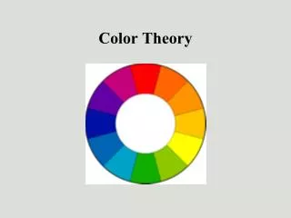
Color Theory. How we see color is related to:. The quality of the light The surrounding colors How we think about color. Josef Albers was an artist who revolutionized how we think about color. The spectrum. From www.rgbworld.com.
679 views • 24 slides
Color Theory. “It's all very well and good discussing individual colors, but we very rarely see colors by themselves. We see them with other colors and colors change according to their environment.”. The science of color. Color is not always equal The eye and the mechanics Rods & Cones
304 views • 11 slides
Color Theory. Kurt Akeley CS248 Lecture 17 27 November 2007 http://graphics.stanford.edu/courses/cs248-07/. Introduction. Difficulties: I’m learning this too Terminology is used carelessly There are lots of standards CIE 1931, CIE 1964, Vos 1976, SMJ 1993, … Caveats: Not comprehensive
449 views • 36 slides
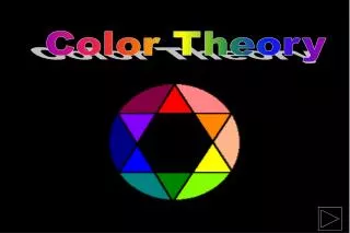
Color Theory. Color Theory. Color Wheel Color Values Color Schemes. 3 Basic Properties. HUE - undiluted color in its purest intensity . VALUE – lightness or darkness of a hue (color). INTENSITY -brightness or dullness of a hue (color). The Color Wheel.
689 views • 41 slides

Color Theory. Color Theory. Color Wheel Color Values Color Schemes. The Color Wheel. The color wheel fits together like a puzzle - each color in a specific place. Being familiar with the. color wheel not only helps you mix colors
790 views • 22 slides
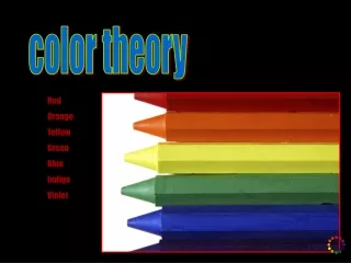
color theory
color theory. Red Orange Yellow Green Blue Indigo Violet. Colors are created from natural pigments found in minerals. Minerals are ground into fine powders then combined with a “binder” to create artistic materials such as paints or oil pastels. saturation, brightness, & value.
198 views • 13 slides

IMAGES
VIDEO
COMMENTS
Discover the ultimate guide to color theory in presentation design. Learn how colors impact your audience and create stunning color presentations today. Back All templates. All Templates ... Download your presentation as a PowerPoint template or use it online as a Google Slides theme. 100% free, no registration or download limits. Content ...
Tertiary colors result from mixing a primary and a secondary color but include a higher ratio of the primary color. By doing that, you end up with these colors: Blue-green (Teal) = Blue + Green. Yellow-green (Chartreuse) = Yellow + Green. Red-orange (Vermilion) = Red + Orange. Red-purple (Magenta) = Red + Purple.
In conclusion, applying the theory of color to your presentations requires a basic understanding of color theory, the ability to choose a color palette, creating contrast, using color blocking, considering typography, and adding texture. By following these tips, you can create a visually engaging and modern design that effectively communicates ...
Craft your next presentation slides according to the color theory to create a visually coherent and impactful presentation. 1. Complementary Colors. These are the colors on the opposite side of the color wheel, like red and blue. Complementary colors are a good combination as they highlight and intensify each other. 2.
Color Theory encompasses multiple definitions, concepts, and design applications. There are three basic categories of color theory: The color wheel, color harmony, and context of how colors are used. The Color Wheel. A color circle, based on red, yellow, and blue, is traditional in the field of art.
Next, it is important to differentiate between tints, tones and shades. When a color is mixed with white, you create tints. These are lighter than the pure hue: When a color is mixed with grey, you create tones, which are duller than the pure hue: When a color is combined with black, you have shades.
Media File: Color Theory Presentation. This presentation is designed to introduce your students to color theory, which will help them make color choices that are more than appeals to aesthetics. The nineteen slides presented here are designed to aid the facilitator in an interactive presentation of color theory.
Green stimulates interaction. It's a friendly color that's great for warmth and emotion. Green is commonly used in PowerPoint presentations for trainers, educators, and others whose presentations are intended to generate discussion. It's also a great color for environmental and earth-oriented discussions.
Knowing the color theory basics and how PowerPoint handle colors will make it easier to use colors in your next presentation. The basics of the color wheel. The color wheel was the first organized system of colors. It is still used to illustrate the relation between colors. In traditional color theory, it all starts with three colors - the ...
So let's get down to study some color theory basics for a PowerPoint presentation. Basic Colors Theory. The Color Wheel was the first model used to demonstrate the relationship between different colors. In which, red, blue, and yellow are the basic and are called as primary colors. After the primary colors, secondary colors are formed with ...
One key rule in the use of color theory for presentations is to keep colors simple and balanced. Choose a palette of no more than three colors (black and white don't count as colors for this purpose). Create a simple but eye-catching color scheme by choosing two tones, shades, or tints of one color. Then selecting a third accent color which ...
This term describes the distinct characteristic of color that distinguishes red from yellow from blue. These hues are largely dependent on the dominant wavelength of light that is emitted or reflected from an object. In a nut shell - Hue means the pure color, what comes directly from the tube / bottle.
Color theory is a big and complex topic. But if you just understand some basic concepts, you'll be able to use color to maximum effect in your PowerPoint sl...
Build structure. Apart from simply coloring your fonts and backgrounds, color theory can help develop a clear structure to your slides. Using shapes, lines or negative space, you can further take control of the flow of information by distinguishing sections your audience can easily understand. As a presenter, structuring your slides will aid ...
Ignite creativity in your classroom with our Vibrant Palette: A Color Theory Guide. This PowerPoint and Google Slides template, brimming with yellow hues, is perfect for art educators looking to inject life into their lesson plans. Its illustrated style creates a dynamic learning experience, transforming your regular lessons into vibrant ...
Yellow, green, and blue is a commonly used analogous color scheme that brings a sense of happiness to the audience. These colors can be refreshing, and the blue gives a professional touch to your slides. This combination could work for informative presentations, like a TED talk about how you can master a skill in just 20 hours.
Color Theory. Color Theory. Color- the illusion of producing different hues to the eye as a result of various electromagnetic wavelengths of white light reflecting from a surface. Description of Color. Hue - Is the name of the color itself, the dominant wavelength of light or the choice of pigment. 364 views • 22 slides
This is an illustration of the use of warm colors - reds, oranges and yellows. Cool Cool colors are found on the left side of the color wheel. They are the colors found in snow and ice and tend to recede in a composition. Note the cool color scheme in this painting (greens, purples and blues). Color Theory.
Presentation Transcript. Color Theory Miss Warner Mixed Media 1. Color Theory Painting Rules: • Do NOT move on until prompted. • Mix all colors in the mixing palette provided. • Paint light, quick layers…. Too much water or too thick of paint will cause your paper to tear. .
Any color that is "greyed down" is considered a Tone. • Black + White= Gray. Temperature • Warm Colors: Red, Orange, and Yellow • Cool Colors: Green, Blue, and Purple • Warm colors are vivid and energetic, and tend to advance in space. • Cool colors give an impression of calm, and create a soothing impression.