
Speak Data: A Language Learner’s Guide to Describing Charts and Graphs

Data visualization has become a crucial aspect of how we communicate information. Whether it’s sales figures, population data, or scientific findings – charts and graphs help to quickly convey meaningful insights that can inform decisions across various fields. Describing charts can be challenging for language learners, as it requires both knowledge of the terminology and understanding how to effectively identify trends and patterns. Keep reading this guide and learn how to describe a graph like a pro.
Know Your Chart Types: A Quick Tour
Before diving into describing graphs, it’s helpful to know the different types of visual aids you may encounter. Here are some common ones:
- Bar charts. These charts represent data with rectangular bars, making them ideal for comparing values between categories.
- Line graphs. They show changes in data over time and help identify trends or patterns that may occur within a particular period.
- Histograms. These are similar to bar graphs but explicitly used for displaying frequency distributions of continuous variables, such as age or time intervals.
- Scatter plots. Such charts show relationships between two variables and help to identify correlations or patterns.
- Pie charts. They illustrate proportions and percentages, making them popular for presenting data as fractions or parts of the whole.
As you encounter different chart types, be sure to pay attention to the nuances of each and how they can be used effectively in various contexts.
Key Terminology: Charts and Graphs Vocabulary
Having the appropriate vocabulary is essential. From terms that represent elements of the diagram of a graph to expressions that convey trends and patterns, these words can help you create a clear and concise description. Below, we will provide some useful vocabulary related to graphs for language learners.
Elements of Charts and Graphs
To know how to write graphs, you must first identify different elements. Here are some key terminology words that can help:
- Axis [ˈæksɪs] – refers to the horizontal (x-axis) or vertical (y-axis) lines on a chart or graph that help indicate the scale and context of the data being displayed.
- Data point [ˈdeɪtə poɪnt] – an individual piece of information plotted on a chart or graph, representing a specific value for a given variable.
- Legend [ˈlɛdʒənd] – a chart component that explains what various colors or symbols used to represent different data points mean. It helps readers understand how to interpret a graph easily.
- Label [ˈleɪbəl] – a word or phrase that identifies a specific element of a chart or graph, such as the x-axis, y-axis, or data series.
- Scale [skeɪl] – the range of values represented on an axis, indicating the minimum and maximum values in a given dataset.
- Gridlines [ˈɡrɪdlaɪnz] – horizontal and vertical lines that divide a chart or graph into smaller sections to make it easier to read and interpret the data.
- Interval [ˈɪntərvəl] – the space or distance between markers on a scale or axis, often representing regular units or increments.
- Caption [ˈkæpʃən] – an explanation or description written beneath an image illustrating information about it.
- Trendline [ˈtrɛndlaɪn] – a line that indicates the general direction or trend, often drawn by connecting data points or using statistical methods to find the best fit.
- Title [ˈtaɪtəl] – a brief, descriptive heading at the top of a chart or graph that provides an overview of the data and helps readers understand the main idea of the visual representation.
These terms are foundational in describing a chart or graph and clarifying the visual aid’s components.
Making Comparisons and Contrasts
Once you’ve identified vital terminology, it’s essential to describe the trends or patterns in the graph. Here are some expressions that can help you do just that:
- Increase [ɪnˈkriːs] – a rise or growth in the value of a data series over time.
- Decrease [dɪˈkriːs] – a decline or reduction in the value of a data series over time.
- Steady [ˈstɛdi] – describes a situation where the data points remain constant or relatively unchanged over time.
- Fluctuation [ˌflʌktʃuˈeɪʃn] – a variation or change in the value of a data series over time, usually involving alternating increases and decreases.
- Significant [sɪgˈnɪfɪkənt] – a notable or essential change or difference in the data.
- Slight [slaɪt] – a small or minor change or difference in the data.
- Peak [piːk] – the highest point or maximum value a data series reaches in a given period.
- Trough [trɒf] – the lowest point or minimum value.
- Plateau [plæˈtoʊ] – a period of little or no change in the data, during which the values remain relatively constant.
- Outlier [ˈaʊtˌlaɪər] – a data point that stands out from the rest because it is significantly different or deviates from the overall trend or pattern.
By mastering these terms and expressions, you can effectively describe how the data points in a chart or graph relate to one another.
Relationships and Trends
Charts and graphs can reveal valuable insights into how data points relate or change over time. Here are some key terminology words for describing relationships and trends:
- Correlation [ˌkɒrəˈleɪʃən] – a statistical measure of how two variables are related to each other, often indicated by a trendline on a scatter plot.
- Trend [trɛnd] – a general direction or pattern in which data points move upward, downward, or remain constant over time.
- Exponential [ˌɛksˌpəʊˈnɛnʃl] – a type of trend in which the rate of change in the data points increases or decreases rapidly over time.
- Linear [ˈlɪniər] – a trend in which the rate of change in the data points remains constant over time.
- Forecast [ˈfɔːkæst] – a prediction or projection of future values based on the current or historical trends in the data.
Using these words and expressions, you will know how to describe the trend of a graph. This can help to provide valuable insights for decision-making and planning.
Percentages, Fractions, and Numbers
Charts and graphs often involve numbers, percentages, and fractions that indicate specific values or proportions. Here are some key terminology words for these types of data:
- Percent [pərˈsɛnt] – a value expressed as a fraction of 100.
- Fraction [ˈfrækʃən] – a part of a whole expressed as a ratio of two numbers.
- Decimal [ˈdɛsɪməl] – a number expressed in the base-ten system, often used to represent fractions or parts of a whole.
- Integer [ˈɪntɪdʒər] – a whole number that is not a fraction or decimal.
- Average [ˈævərɪdʒ] – the arithmetic mean of a set of values, often represented as a single data point on a chart or graph.
- Range [reɪndʒ] – the difference between a dataset’s highest and lowest values.
- Minimum [ˈmɪnɪməm] – the lowest value in a dataset.
- Maximum [ˈmæksɪməm] – the highest value in a dataset.
- Median [ˈmiːdiən] – the middle value in a dataset when the values are arranged in order.
- Mode [moʊd] – the value that appears most frequently in a dataset.
With these words, you can effectively describe numerical data and provide insights into a dataset’s distribution, average, and range of values.
Time Frames and Intervals
When describing a line graph or any other type of chart that shows data over time, it’s crucial to use appropriate terms for the different time intervals. Here are some key terminology words related to timing:
- Time series [taɪm ˈsɪriːz] – a dataset that is recorded over some time.
- Interval [ˈɪntərvəl] – the period between data points in a time series.
- Duration [djʊˈreɪʃən] – the length of time covered by a time series.
- Frequency [ˈfriːkwənsi] – the number of occurrences of a particular event or value within a time.
- Annual [ˈænjuəl] – occurring or measured over a year.
- Quarterly [ˈkwɔrtərli] – happening every three months, often used in financial reporting.
These terms can describe the specific timing of data points in a chart or graph, providing additional context for readers and listeners.
Expressions for Describing Charts in English
While understanding the key terminology is essential, using appropriate expressions and phrases can elevate your description of charts and graphs:
- As we can see from the chart/graph...
- It’s worth noting that…
- According to the data presented in this graph, …
- The diagram of this bar chart shows us that…
- This pie chart clearly illustrates/provides information on/represents how…
- Taking a closer look at the line graph, one can observe...
- There was a significant increase/decrease/rise/fall/jump/drop/spike/plunge/sharp dive/slump/growth...
- During/outside/between 20xx – 20yy or From Month X until Month Y... etc.
- From the data presented, we can conclude that…
- The figures demonstrate/reveal/indicate/show/suggest that…
- It is interesting to note/highlight/emphasize…
By incorporating these expressions, you can give nuanced descriptions and insights into what’s happening in a chart or graph.
Putting It All Together: How to Describe Graphs Like a Pro
Now that you’ve learned about the different chart types, key terminology, and expressions, it’s time to assemble everything. Here are some tips for writing compelling descriptions:
- Start with the big picture. Before diving into the specifics, it’s essential to give an overview of what the chart or graph represents. This can include information about its type, purpose, and relevance. The more context you provide, the easier it will be for your audience to understand what they are looking at.
- Focus on critical trends and patterns. While every chart or graph has unique features, it’s essential to identify the most salient points being conveyed. This may include fluctuations in data over time, correlations between different variables, or comparisons across categories. Focus on the areas where you see significant changes happening so that people can understand what drives those differences.
- Use clear and concise language. In any chart description, it’s essential to use simple and direct expressions that are easy for your audience to understand. Try not to use jargon or technical terms if possible, as this can confuse people who may not be familiar with the terminology. It is best to use short sentences and break down complex ideas into smaller, manageable parts.
- Vary your sentence structures. To make your description more engaging and exciting, mix up the lengths of your sentences. Shorter, punchier statements help emphasize important points, while longer ones provide additional details or explanations. In addition, using different sentence structures like questions, metaphors, or comparisons can add depth and flavor to your descriptions.
- Practice. Like any new skill, mastering the art of describing graphs requires practice. Find charts or graph examples and challenge yourself to describe them using essential vocabulary, expressions, and clear language. Remember the different chart types and the most relevant elements as you continue practicing.
These tips will help you describe graphs and charts effectively. Remember, the goal is to identify patterns or trends and provide meaningful insights to inform decision-making across various fields of study.
Learn Graphs Vocabulary with Promova
If you’re a language learner looking to improve your skills in describing charts and graphs, Promova has everything you need! With word lists, quizzes, and interactive exercises, our language learning platform will help you to master new vocabulary, understand data, and communicate effectively in various contexts. Plus, our blog contains many informative articles, so you will find guides on describing a person in English or even how to talk about politics .
Those who want to master English fun and engagingly can take advantage of our one-on-one and group lessons with certified tutors. Our personalized approach allows us to tailor your learning experience according to your needs and preferences, so you can make the most out of every session without feeling stressed or overwhelmed.
And if you want to immerse yourself in a community of language learners and practice your speaking skills, our Conversation Club is the perfect place for you. You will meet people worldwide who share similar interests while receiving constructive feedback from certified tutors.
Now you know how to describe a line graph, bar chart, histogram, or pie chart. Remember to start by giving an overview of the purpose of the graph and then focus on key trends and patterns. With practice, you will improve at using clear and concise language and providing nuanced insights into the presented data. So don’t be intimidated – grab a chart or graph you want to describe, use our guide as a reference, and start practicing!
How can I expand my vocabulary for describing charts and graphs?
Read articles, watch presentations with charts and graphs, and note new words and phrases. Also, try using dictionaries like Cambridge Dictionary or Merriam-Webster to find synonyms for common descriptive terms.
Are there any common mistakes to avoid when describing charts and graphs?
Some common mistakes include providing too much detail, using repetitive language, or focusing on insignificant data points. Instead, remember to concentrate on the key trends and patterns, use diverse vocabulary and sentence structures, and maintain a straightforward and engaging narrative.
How can I become more confident in describing charts and graphs?
Practice, practice, practice! Challenge yourself to describe different chart types using key vocabulary and expressions. Also, consider seeking feedback from others or a language tutor. The more you use these skills in real-life situations, the more comfortable you will be with effectively describing charts and graphs.
Which sources can help me improve my skills in describing charts and graphs?
You can use many sources to improve your skills in describing charts and graphs. For example, you can start by reading articles or watching videos that include visual aids like charts and graphs, then try describing them using the key vocabulary and expressions outlined in this guide. Also, the Promova app is an excellent resource for language learners, as it provides word lists and quizzes to help you master new vocabulary.
You are using an outdated browser. Please upgrade your browser or activate Google Chrome Frame to improve your experience.
25 English Presentation Phrases
Does giving a presentation make you feel a little nervous?
Well, you’re not alone.
According to Forbes , giving a presentation makes 80% of us feel nervous !
The good news is that feeling nervous might be a good thing. This feeling pushes us to prepare ourselves better, and as long as you’re well prepared, you’ll do just fine.
So then, let’s take a look at how we can prepare ourselves to give amazing presentations in English. Today, we’re going to focus on the business English phrases you can count on (depend on) to make your presentation go more smoothly from start to finish.
But first, here are some tips to use when preparing for your presentation.
Download: This blog post is available as a convenient and portable PDF that you can take anywhere. Click here to get a copy. (Download)
Greeting Your Audience
You’re now standing in front of your audience. Before you begin your presentation, start by greeting your audience, welcoming them to the event and introducing yourself.
1. Good morning/afternoon/evening, everyone.
2. welcome to [name of event]..
Sample sentence: Welcome to our 3rd Annual Sales Leadership Conference.
3. First, let me introduce myself. I am [name] from [company].
Beginning your presentation.
After you have given an introduction, you are ready to begin speaking about your topic. Use these phrases to get started.
4. Let me start by giving you some background information.
Use this phrase to give your audience a brief overview of the topic you’ll be discussing. This is a good way to give them an idea of what’s going on and to bring them up to date.
5. As you’re aware, …
If you’re bringing up a topic that your audience already knows about or is aware of, then you can use this phrase to introduce this known topic.
Sample sentence: As you’re aware , the CEO of DHL Express has often said that globalization is here to stay.
Transitioning to the Next Topic
Before you move on to your next point, be sure to make it clear to your audience that you’re now starting a new topic. Let them know exactly what that new topic will be. The two phrases below are very similar in meaning, and they can both be used for transitions.
6. Let’s move on to…
Sample sentence: Let’s move on to our second sales strategy.
7. Turning our attention now to…
Sample sentence: Turning our attention now to the results of our 2016 customer survey.
Providing More Details
Use these phrases to tell your audience that you’ll be giving them a more detailed explanation of the topic. Both the words ‘expand’ and ‘elaborate’ mean to explain more fully.
8. I’d like to expand on…
Sample sentence: Now I’d like to expand on my point about increasing our market share.
9. Let me elaborate further.
Linking to another topic.
When making reference to a point you made earlier, or to remind your audience about something you said before, use these phrases to that link.
10. As I said at the beginning, …
This phrase lets you remind your audience about a point you made earlier. It can also be used to emphasize a point or theme.
Sample sentence: As I said in the beginning , we’ll see an increase in profit if we follow these five steps.
11. This relates to what I was saying earlier…
This phrase will help you make connections between ideas in your presentation. It shows that two different ideas are connected.
Sample sentence: This relates to what I was saying earlier about increasing production to meet the year-end demand.
12. This ties in with…
Sample sentence: This ties in with the way we’ve been doing business for the past 20 years.
Emphasizing a Point
Use these phrases to draw attention to an important point that you want your audience to note.
13. The significance of this is…
The word “significance'” is similar in meaning to “importance.”
Sample sentence: The significance of this is , if we complete this project on schedule, we’ll have more people available to work on the next project.
14. This is important because…
Sample sentence: This is important because any marketing effort we put in now will help to boost demand for our products in the long run.
15. We have to remember that …
Sample sentence: We have to remember that people are our most important resource.
Making Reference to Information
Very often, you may need to support your discussion points by drawing attention and making reference to information and data from studies, reports and other sources.
16. Based on our findings, …
Sample sentence: Based on our findings, 74% of our market is made up of teenagers who find our clothing line stylish and upbeat.
17. According to our study, …
Sample sentence: According to our study, 63% of working people in this city go directly to the gym after work.
18. Our data shows …
Sample sentence: Our data shows that more than 23% of men in this town who used to drive to work now prefer to save money and the environment by cycling instead.
Explaining Visuals
To present a clearer picture of your point, you may show your data, information or examples in the form of visuals such as charts, tables and graphs.
19. I’d like to illustrate this point by showing you…
The word “illustrate” means “show,” usually with examples, data or visuals.
Sample sentence: I’d like to illustrate this point by showing you a chart of the number of people in each age group who prefer to shop online.
20. This chart shows a breakdown of …
A “breakdown” refers to the detailed parts or figures that make up the total picture. A breakdown is often used in a presentation to show all the smaller parts behind something bigger.
Sample sentence: This chart shows a breakdown of the ingredients we use in our gluten-free products.
Restating Your Point
Sometimes in order to emphasize your point, you have to state it in a way that’s easier for your audience to understand and remember. This often involves rephrasing, simplifying or clarifying your point.
21. In other words, …
Use this phrase to rephrase or reword your point in another way.
Sample sentence: In other words , we need to change our current design to make it more attractive to older children.
22. To put it simply, …
Use this phrase to simplify points that are complex or difficult to understand.
Sample sentence: To put it simply , we’ll need you to work harder at making this launch a success.
23. What I mean to say is …
Use this phrase to explain your point in a way that’s easier for your audience to understand.
Sample sentence: What I mean to say is that we need to change the way we market our products.
Concluding Your Presentation
This is the very end of the presentation. You have said everything you need to say, and now you need to finish it nicely. You may also have some time for questions. If there is time for questions, invite your audience to ask any questions they have.
24. In conclusion, let me sum up my main points.
As part of your closing statement, “sum up” (summarize, state briefly) your speech by mentioning the main points of your speech.
25. Thank you for your attention. Now I am happy to answer any questions you might have.
End your presentation by thanking your audience and offering to answer their questions.
The Top 3 Tips for Preparing Your Business Presentation in English
1. have a plan.
Always have a plan. Spend some time thinking about not only what you’re going to say but how you’re going to say it.
If English isn’t your native language, it’s very important that you think about what language you’re going to be using. Think about all the vocabulary, phrases and grammar that will make your message clear and easy to understand.
What are the big ideas you want to explain for your presentation? Which words will express these ideas best? I recommend:
- Have a clear goal in mind to help you stay on track and be logical. Whenever you feel lost during the presentation, just remember this clear, main goal. An example of a goal could be to convince potential clients to work with you. Whenever you don’t know what to say next, remember to focus on the advantages you want to present and on examples of what you did in the past to deserve their trust. Encourage them to ask you questions related to this goal.
- Research content. If you know your facts, you already have the core of your presentation prepared. Write these facts down on topic cards, give out handouts (papers) with important information or include them on your PowerPoint slides.
- Prepare the delivery. Rehearse giving the presentation several times. Some people like recording themselves, others prefer practicing in front of a mirror or having friends listen to them while presenting. Choose the method that works best for you.
- Decide whether you are going to read or speak freely. Reading can sound unnatural, but you can use certain tricks to avoid this. You can underline important sentences which you can memorize, so that from time to time you can stop reading, say your memorized lines and look at the audience. In this way, reading can be made more natural. Make sure you slow down so that the audience can follow you.
Speaking freely is much better if you can remember everything you want to say, because you will seem more knowledgeable, prepared and confident. However, this can be more stressful.
2. Use Visuals
Using some visuals can make your presentation more entertaining, easier to understand and can get your points across more convincingly. My advice:
- Decide whether you need a PowerPoint presentation or not. Do you have graphs, results or other things like this to show? Then yes, you need one. Are you just telling a story? Then you probably do not.
- Do not fill your slides with too much information. Use a maximum of seven short lines of text—even seven can be too many. Highlight key words so the audience can see the main ideas right away. Use bullet points rather than full sentences.
- If you are presenting graphs or charts , give the audience time to read them. Do not show a huge table of data if they audience will not have time to read and understand it. Make sure you try reading each slide while timing yourself to see how long it takes, so you do not jump to the next slide too early during your presentation.
3. Structure Your Presentation Well
It is a common mistake to give an unclear and unorganized presentation. This happens when the presenter just starts speaking without a clear goal in mind. They might suddenly realize their allotted speaking time has ended, or that the audience is bored because they are not following what is being said. Here’s what you should do instead:
- Decide on three main points (or less) that you want to make. Audiences can’t usually focus on more than three points.
- Tell them from the beginning what points you will be making. Audiences like to know what to expect. Tell them the main goals of your presentation directly in the introduction.
- Presenting main points: firstly, secondly, last but not least
- Making additions: moreover, furthermore, in addition, besides, what’s more
- Making purposes clear: in order to, so as to
- Presenting reasons and causes: on account of, due to, since, seeing that
- Presenting consequences: consequently, as a result, therefore
- Expressing contrast: in spite of, despite, although, even though, however, nevertheless, in contrast, on the contrary
So with this, you’ve mastered the 25 most commonly used phrases used in presentations and my three favorite tips.
Once you learn them, I think you’ll find them very useful to you in any presentation.
Become familiar with them and I promise you’ll feel much less nervous in your next presentation.
Enter your e-mail address to get your free PDF!
We hate SPAM and promise to keep your email address safe

Pomaka English
Supporting English language learners and educators

Tips and phrases for explaining graphs
Do you have to explain graphs for your work or study?
There are many situations where you might have to explain graphs. It may be for a business meeting or report. It may be for a presentation or a research paper. You also often have to describe or listen to talks about graphs in language tests (eg. IELTS writing task 1). Being able to explain a graph clearly and accurately in English is certainly a useful skill to have.
So, what’s important when explaining graphs?
Below are a few quick tips and phrases that can help listeners and readers understand your graphs.
Clearly introduce graph Be sure to clearly introduce the title or topic at the beginning. Start by using phrases like “This graph shows….” Also, if you’re explaining your graph in a presentation, it’s a good idea to introduce the key labels (eg. axes and units) before talking about the data. Use phrases like “The y axis shows…”, “The x axis shows…”, and “The units here are…”
Keep language simple Remember, the aim is to help people understand your graph, not to make long, complex sentences. Keep your language simple. Try to avoid unnecessarily repeating words. One way to do this is to use pronouns eg. “Weekly expenses increased to $10,000 in January. Then, they remained steady until June.” Another way is to use words like “respectively” eg. “The values for May and June were 350 and 430 respectively .”
Continued below
Mark key points Make sure the listeners are clear about the key points you want to say about your graph. Highlight these points using words like “Importantly…”, “Significantly…”, or “Interestingly….”
Use pointing effectively If you are explaining the graph in a presentation, you will probably show a large picture of the graph on a slide. Help the listeners by pointing to the relevant parts while talking. When pointing, use language like “As you can see here”, “Here you can see” or even just “Here.”
Use hedging After talking about the data, you often need to interpret or speculate about what it means. Your ideas may not always be correct, so it’s a good idea to hedge your language. Use phrases like “This data suggests …”, “This could mean…”, or “This might be because….”

Download explaining graph worksheets & exercises (free)
Related links:
How can I explain things more clearly?
Phrases to help the audience understand your presentation
Privacy Overview
© Copyright 2024 Pomaka - All rights reserved
- SUGGESTED TOPICS
- The Magazine
- Newsletters
- Managing Yourself
- Managing Teams
- Work-life Balance
- The Big Idea
- Data & Visuals
- Reading Lists
- Case Selections
- HBR Learning
- Topic Feeds
- Account Settings
- Email Preferences
Present Your Data Like a Pro
- Joel Schwartzberg

Demystify the numbers. Your audience will thank you.
While a good presentation has data, data alone doesn’t guarantee a good presentation. It’s all about how that data is presented. The quickest way to confuse your audience is by sharing too many details at once. The only data points you should share are those that significantly support your point — and ideally, one point per chart. To avoid the debacle of sheepishly translating hard-to-see numbers and labels, rehearse your presentation with colleagues sitting as far away as the actual audience would. While you’ve been working with the same chart for weeks or months, your audience will be exposed to it for mere seconds. Give them the best chance of comprehending your data by using simple, clear, and complete language to identify X and Y axes, pie pieces, bars, and other diagrammatic elements. Try to avoid abbreviations that aren’t obvious, and don’t assume labeled components on one slide will be remembered on subsequent slides. Every valuable chart or pie graph has an “Aha!” zone — a number or range of data that reveals something crucial to your point. Make sure you visually highlight the “Aha!” zone, reinforcing the moment by explaining it to your audience.
With so many ways to spin and distort information these days, a presentation needs to do more than simply share great ideas — it needs to support those ideas with credible data. That’s true whether you’re an executive pitching new business clients, a vendor selling her services, or a CEO making a case for change.
- JS Joel Schwartzberg oversees executive communications for a major national nonprofit, is a professional presentation coach, and is the author of Get to the Point! Sharpen Your Message and Make Your Words Matter and The Language of Leadership: How to Engage and Inspire Your Team . You can find him on LinkedIn and X. TheJoelTruth
Partner Center
Are looking for custom service?
- Presentation Design
- Report Design
- Brochure Design
- Infographic Design
- Illustration Design
- Package Design
- Exhibition Design
- Print Design
- Logo Design
- Video Animation
- Motion Graphics
Presentation ideas • Tips and Tricks
15 Creative Ways to Use Charts and Graphs in Presentations
Emily Bryce
12 December 2022

In today’s data-driven world, presentations are no longer just about presenting ideas and concepts, but also about presenting data in an engaging and easy-to-understand manner. This is where charts and graphs come in. They help to visualize data, making it easier for the audience to grasp and retain information. In this blog post, we will explore creative ways to use charts and graphs in presentations.
1. Use charts and graphs to compare data
One of the most common uses of charts and graphs is to compare data. Whether you are comparing sales figures, market trends or customer feedback, charts and graphs can help you present the information in a visually compelling way. Use bar charts, line graphs, pie charts, and scatter plots to showcase the data in a way that makes it easy to understand and compare.
2. Use charts and graphs to show trends
Another way to use charts and graphs in presentations is to show trends over time. For example, if you are presenting the growth of your business over the last five years, use a line graph to show the upward trend. If you want to show the fluctuations in your business over a period of time, use a scatter plot to highlight the highs and lows.
3. Use charts and graphs to show relationships
Charts and graphs can also be used to show the relationship between different sets of data. For example, if you are presenting the correlation between customer satisfaction and sales, use a scatter plot to show the relationship between the two variables. You can also use bubble charts to show the relationship between three different variables.
4. Use charts and graphs to show distribution
If you are presenting data that is distributed across a range, such as the ages of your customers, use a histogram to show the distribution. Histograms are great for showing the frequency distribution of data, and they can help you identify patterns and trends in the data.
5. Use charts and graphs to show proportions
Pie charts are a great way to show proportions. Use pie charts to show the proportion of sales for different products or the proportion of the budget allocated to different departments. Make sure to keep the number of categories to a minimum to ensure that the chart is easy to read.
6. Use creative chart and graph designs
Charts and graphs don’t have to be boring. Use creative designs and colors to make your charts and graphs stand out. For example, you can use a bar chart with a gradient background to make it more visually appealing. You can also use icons and images to make your charts and graphs more engaging.
7. Use charts and graphs to tell a story
Finally, use charts and graphs to tell a story. Don’t just present the data, but use it to support your message. Use a combination of charts and graphs to create a narrative that engages your audience and leaves them with a clear understanding of your message.
In conclusion, charts and graphs are a powerful tool for presenting data in an engaging and easy-to-understand manner. Use them creatively to showcase data, tell a story, and leave a lasting impression on your audience. With the right use of charts and graphs, you can take your presentations to the next level.
Stay Updated
Join our exclusive subscribers list to receive the latest design trends, industry updates and digital world insights in your inbox.
You can read our privacy policy here .
Related Posts

The Psychology of Color in Presentation Design

10 Tips for Creating Effective Presentations

How to Choose the Right Font for Your Presentation

Top 5 Mistakes to Avoid in Your Next Presentation
My Presentation Designer is a brand of Out of Box Ltd. which is a registered company in England and Wales under company no. 06937876 and VAT ID GB381889149 .
Copyright © 2015-2023 • My Presentation Designer • All rights reserved.
How to Discuss Charts and Graphs in English
- Business English
- Pronunciation & Conversation
- Writing Skills
- Reading Comprehension
- Resources for Teachers
- TESOL Diploma, Trinity College London
- M.A., Music Performance, Cologne University of Music
- B.A., Vocal Performance, Eastman School of Music
The language of graphs and charts refer to the words and phrases used when describing results depicted within these formats. This language is especially useful when making presentations because charts and graphs measure various statistics and are helpful when presenting large amounts of information that need to be understood quickly, including facts and figures, statistical information, profit and loss, polling information, etc.
The Vocabulary of Graphs and Charts
There are a number of different types of graphs and charts including:
- Line Charts and Graphs
- Bar Charts and Graphs
- Exploded Pie Charts
Line charts and bar charts have a vertical axis and a horizontal axis. Each axis is labeled to indicate what type of information it contains. Typical information included on vertical and horizontal axis include:
- age - how old
- weight - how heavy
- height - how tall
- date - which day, month, year, etc.
- time - how much time is required
- length - how long
- width - how wide
- degrees - how hot or cold
- percentage - a portion of 100%
- number - number
- duration - the length of time required
There are a number of specific words and phrases used to describe and discuss graphs and charts. This vocabulary is especially important when presenting to groups of people. Much of the language of graphs and charts relates to movement. In other words, the language of graphs and charts often speaks of small or large movement or differences between various data points. Refer to this language of graphs and charts to help improve your ability to speak about graphs and charts.
The following list the verb and noun used to speak about positive and negative movements, as well as predictions. Example sentences are found after each section.
- to climb - a climb
- to ascend - an ascent
- to rise - a rise
- to improve - an improvement
- to recover - a recover
- to increase - an increase
- Sales have climbed over the past two quarters.
- We've experienced a rise in consumer demand.
- Consumer confidence recovered in the second quarter.
- There has been an increase of 23% since June.
- Have you seen any improvement in customer satisfaction?
- to fall - a fall
- to decline - a decline
- to plunge - a plunge
- to decrease - a decrease
- to worsen - a slip
- to deteriorate - a dip
- Research and development spending has fallen by 30% since January.
- Unfortunately, we've seen a decline over the past three months.
- As you can see, sales have plunged in the northwest region.
- Government spending has decreased by 10% over the past two years.
- There's been a slip in profits this past quarter.
- Comedy book sales have deteriorated for three quarters.
Predicting Future Movement
- to project - a projection
- to forecast - a forecast
- to predict - a prediction
- We project improved sales in the coming months.
- As you can see from the chart, we forecast increased research and development spending next year.
- We predict improving sales through June.
This list provides adjectives and adverbs used to describe how quickly, slowly, extremely, etc. something moves. Each adjective / adverb pair includes a definition and an example sentence.
- slight - slightly = insignificant
- There's been a slight decline in sales.
- Sales have declined slightly over the past two months.
- sharp - sharply = quick, large movement
- Investment rose sharply during the first quarter.
- We made a sharp increase in investment.
- abrupt - abruptly = sudden change
- Sales dropped abruptly in March.
- There was an abrupt drop in sales in March.
- rapid - rapidly = quick, very fast
- We expanded rapidly throughout Canada.
- The company made a rapid expansion throughout Canada.
- sudden - suddenly = without warning
- Unfortunately, consumer interest suddenly decreased.
- There was a sudden decrease in consumer interest in January.
- dramatic - dramatically = extreme, very big
- We've dramatically improved customer satisfaction over the past six months.
- As you can see from the chart, the dramatic growth has come after we invested in a new product line.
- calm - calmly = evenly, without much change
- The markets have reacted calmly to recent developments.
- As you can see from the graph, consumers have been calm over the past few months.
- flat = without change
- Profit has been flat over the past two years.
- steady - steadily = no change
- There has been a steady improvement over the past three months.
- Sales have improved steadily since March.
- Synonyms and Antonyms for ESL
- Farming and Agriculture Vocabulary for ESL Students
- Top Vocabulary Building Books
- Past Continuous Lesson Plan for ESL Learners
- Vocabulary Chart ESL Lesson Plan
- Linking Your Ideas in English With Discourse Markers
- Using Reading Comprehension in Lessons
- Marketing Vocabulary for English Learners
- Passive Voice Usage and Examples
- Job Interviewing Example
- How to Use Sentence Connectors to Express Complex Ideas
- Sales and Acquisitions Vocabulary for ESL Classes
- Up and Down Phrasal Verbs
- Collocations With Money
- 200 Essential Landscaping Vocabulary Words
- Dialogue Activities for ESL Students
Home Blog Design Understanding Data Presentations (Guide + Examples)
Understanding Data Presentations (Guide + Examples)

In this age of overwhelming information, the skill to effectively convey data has become extremely valuable. Initiating a discussion on data presentation types involves thoughtful consideration of the nature of your data and the message you aim to convey. Different types of visualizations serve distinct purposes. Whether you’re dealing with how to develop a report or simply trying to communicate complex information, how you present data influences how well your audience understands and engages with it. This extensive guide leads you through the different ways of data presentation.
Table of Contents
What is a Data Presentation?
What should a data presentation include, line graphs, treemap chart, scatter plot, how to choose a data presentation type, recommended data presentation templates, common mistakes done in data presentation.
A data presentation is a slide deck that aims to disclose quantitative information to an audience through the use of visual formats and narrative techniques derived from data analysis, making complex data understandable and actionable. This process requires a series of tools, such as charts, graphs, tables, infographics, dashboards, and so on, supported by concise textual explanations to improve understanding and boost retention rate.
Data presentations require us to cull data in a format that allows the presenter to highlight trends, patterns, and insights so that the audience can act upon the shared information. In a few words, the goal of data presentations is to enable viewers to grasp complicated concepts or trends quickly, facilitating informed decision-making or deeper analysis.
Data presentations go beyond the mere usage of graphical elements. Seasoned presenters encompass visuals with the art of data storytelling , so the speech skillfully connects the points through a narrative that resonates with the audience. Depending on the purpose – inspire, persuade, inform, support decision-making processes, etc. – is the data presentation format that is better suited to help us in this journey.
To nail your upcoming data presentation, ensure to count with the following elements:
- Clear Objectives: Understand the intent of your presentation before selecting the graphical layout and metaphors to make content easier to grasp.
- Engaging introduction: Use a powerful hook from the get-go. For instance, you can ask a big question or present a problem that your data will answer. Take a look at our guide on how to start a presentation for tips & insights.
- Structured Narrative: Your data presentation must tell a coherent story. This means a beginning where you present the context, a middle section in which you present the data, and an ending that uses a call-to-action. Check our guide on presentation structure for further information.
- Visual Elements: These are the charts, graphs, and other elements of visual communication we ought to use to present data. This article will cover one by one the different types of data representation methods we can use, and provide further guidance on choosing between them.
- Insights and Analysis: This is not just showcasing a graph and letting people get an idea about it. A proper data presentation includes the interpretation of that data, the reason why it’s included, and why it matters to your research.
- Conclusion & CTA: Ending your presentation with a call to action is necessary. Whether you intend to wow your audience into acquiring your services, inspire them to change the world, or whatever the purpose of your presentation, there must be a stage in which you convey all that you shared and show the path to staying in touch. Plan ahead whether you want to use a thank-you slide, a video presentation, or which method is apt and tailored to the kind of presentation you deliver.
- Q&A Session: After your speech is concluded, allocate 3-5 minutes for the audience to raise any questions about the information you disclosed. This is an extra chance to establish your authority on the topic. Check our guide on questions and answer sessions in presentations here.
Bar charts are a graphical representation of data using rectangular bars to show quantities or frequencies in an established category. They make it easy for readers to spot patterns or trends. Bar charts can be horizontal or vertical, although the vertical format is commonly known as a column chart. They display categorical, discrete, or continuous variables grouped in class intervals [1] . They include an axis and a set of labeled bars horizontally or vertically. These bars represent the frequencies of variable values or the values themselves. Numbers on the y-axis of a vertical bar chart or the x-axis of a horizontal bar chart are called the scale.

Real-Life Application of Bar Charts
Let’s say a sales manager is presenting sales to their audience. Using a bar chart, he follows these steps.
Step 1: Selecting Data
The first step is to identify the specific data you will present to your audience.
The sales manager has highlighted these products for the presentation.
- Product A: Men’s Shoes
- Product B: Women’s Apparel
- Product C: Electronics
- Product D: Home Decor
Step 2: Choosing Orientation
Opt for a vertical layout for simplicity. Vertical bar charts help compare different categories in case there are not too many categories [1] . They can also help show different trends. A vertical bar chart is used where each bar represents one of the four chosen products. After plotting the data, it is seen that the height of each bar directly represents the sales performance of the respective product.
It is visible that the tallest bar (Electronics – Product C) is showing the highest sales. However, the shorter bars (Women’s Apparel – Product B and Home Decor – Product D) need attention. It indicates areas that require further analysis or strategies for improvement.
Step 3: Colorful Insights
Different colors are used to differentiate each product. It is essential to show a color-coded chart where the audience can distinguish between products.
- Men’s Shoes (Product A): Yellow
- Women’s Apparel (Product B): Orange
- Electronics (Product C): Violet
- Home Decor (Product D): Blue

Bar charts are straightforward and easily understandable for presenting data. They are versatile when comparing products or any categorical data [2] . Bar charts adapt seamlessly to retail scenarios. Despite that, bar charts have a few shortcomings. They cannot illustrate data trends over time. Besides, overloading the chart with numerous products can lead to visual clutter, diminishing its effectiveness.
For more information, check our collection of bar chart templates for PowerPoint .
Line graphs help illustrate data trends, progressions, or fluctuations by connecting a series of data points called ‘markers’ with straight line segments. This provides a straightforward representation of how values change [5] . Their versatility makes them invaluable for scenarios requiring a visual understanding of continuous data. In addition, line graphs are also useful for comparing multiple datasets over the same timeline. Using multiple line graphs allows us to compare more than one data set. They simplify complex information so the audience can quickly grasp the ups and downs of values. From tracking stock prices to analyzing experimental results, you can use line graphs to show how data changes over a continuous timeline. They show trends with simplicity and clarity.
Real-life Application of Line Graphs
To understand line graphs thoroughly, we will use a real case. Imagine you’re a financial analyst presenting a tech company’s monthly sales for a licensed product over the past year. Investors want insights into sales behavior by month, how market trends may have influenced sales performance and reception to the new pricing strategy. To present data via a line graph, you will complete these steps.
First, you need to gather the data. In this case, your data will be the sales numbers. For example:
- January: $45,000
- February: $55,000
- March: $45,000
- April: $60,000
- May: $ 70,000
- June: $65,000
- July: $62,000
- August: $68,000
- September: $81,000
- October: $76,000
- November: $87,000
- December: $91,000
After choosing the data, the next step is to select the orientation. Like bar charts, you can use vertical or horizontal line graphs. However, we want to keep this simple, so we will keep the timeline (x-axis) horizontal while the sales numbers (y-axis) vertical.
Step 3: Connecting Trends
After adding the data to your preferred software, you will plot a line graph. In the graph, each month’s sales are represented by data points connected by a line.

Step 4: Adding Clarity with Color
If there are multiple lines, you can also add colors to highlight each one, making it easier to follow.
Line graphs excel at visually presenting trends over time. These presentation aids identify patterns, like upward or downward trends. However, too many data points can clutter the graph, making it harder to interpret. Line graphs work best with continuous data but are not suitable for categories.
For more information, check our collection of line chart templates for PowerPoint and our article about how to make a presentation graph .
A data dashboard is a visual tool for analyzing information. Different graphs, charts, and tables are consolidated in a layout to showcase the information required to achieve one or more objectives. Dashboards help quickly see Key Performance Indicators (KPIs). You don’t make new visuals in the dashboard; instead, you use it to display visuals you’ve already made in worksheets [3] .
Keeping the number of visuals on a dashboard to three or four is recommended. Adding too many can make it hard to see the main points [4]. Dashboards can be used for business analytics to analyze sales, revenue, and marketing metrics at a time. They are also used in the manufacturing industry, as they allow users to grasp the entire production scenario at the moment while tracking the core KPIs for each line.
Real-Life Application of a Dashboard
Consider a project manager presenting a software development project’s progress to a tech company’s leadership team. He follows the following steps.
Step 1: Defining Key Metrics
To effectively communicate the project’s status, identify key metrics such as completion status, budget, and bug resolution rates. Then, choose measurable metrics aligned with project objectives.
Step 2: Choosing Visualization Widgets
After finalizing the data, presentation aids that align with each metric are selected. For this project, the project manager chooses a progress bar for the completion status and uses bar charts for budget allocation. Likewise, he implements line charts for bug resolution rates.

Step 3: Dashboard Layout
Key metrics are prominently placed in the dashboard for easy visibility, and the manager ensures that it appears clean and organized.
Dashboards provide a comprehensive view of key project metrics. Users can interact with data, customize views, and drill down for detailed analysis. However, creating an effective dashboard requires careful planning to avoid clutter. Besides, dashboards rely on the availability and accuracy of underlying data sources.
For more information, check our article on how to design a dashboard presentation , and discover our collection of dashboard PowerPoint templates .
Treemap charts represent hierarchical data structured in a series of nested rectangles [6] . As each branch of the ‘tree’ is given a rectangle, smaller tiles can be seen representing sub-branches, meaning elements on a lower hierarchical level than the parent rectangle. Each one of those rectangular nodes is built by representing an area proportional to the specified data dimension.
Treemaps are useful for visualizing large datasets in compact space. It is easy to identify patterns, such as which categories are dominant. Common applications of the treemap chart are seen in the IT industry, such as resource allocation, disk space management, website analytics, etc. Also, they can be used in multiple industries like healthcare data analysis, market share across different product categories, or even in finance to visualize portfolios.
Real-Life Application of a Treemap Chart
Let’s consider a financial scenario where a financial team wants to represent the budget allocation of a company. There is a hierarchy in the process, so it is helpful to use a treemap chart. In the chart, the top-level rectangle could represent the total budget, and it would be subdivided into smaller rectangles, each denoting a specific department. Further subdivisions within these smaller rectangles might represent individual projects or cost categories.
Step 1: Define Your Data Hierarchy
While presenting data on the budget allocation, start by outlining the hierarchical structure. The sequence will be like the overall budget at the top, followed by departments, projects within each department, and finally, individual cost categories for each project.
- Top-level rectangle: Total Budget
- Second-level rectangles: Departments (Engineering, Marketing, Sales)
- Third-level rectangles: Projects within each department
- Fourth-level rectangles: Cost categories for each project (Personnel, Marketing Expenses, Equipment)
Step 2: Choose a Suitable Tool
It’s time to select a data visualization tool supporting Treemaps. Popular choices include Tableau, Microsoft Power BI, PowerPoint, or even coding with libraries like D3.js. It is vital to ensure that the chosen tool provides customization options for colors, labels, and hierarchical structures.
Here, the team uses PowerPoint for this guide because of its user-friendly interface and robust Treemap capabilities.
Step 3: Make a Treemap Chart with PowerPoint
After opening the PowerPoint presentation, they chose “SmartArt” to form the chart. The SmartArt Graphic window has a “Hierarchy” category on the left. Here, you will see multiple options. You can choose any layout that resembles a Treemap. The “Table Hierarchy” or “Organization Chart” options can be adapted. The team selects the Table Hierarchy as it looks close to a Treemap.
Step 5: Input Your Data
After that, a new window will open with a basic structure. They add the data one by one by clicking on the text boxes. They start with the top-level rectangle, representing the total budget.

Step 6: Customize the Treemap
By clicking on each shape, they customize its color, size, and label. At the same time, they can adjust the font size, style, and color of labels by using the options in the “Format” tab in PowerPoint. Using different colors for each level enhances the visual difference.
Treemaps excel at illustrating hierarchical structures. These charts make it easy to understand relationships and dependencies. They efficiently use space, compactly displaying a large amount of data, reducing the need for excessive scrolling or navigation. Additionally, using colors enhances the understanding of data by representing different variables or categories.
In some cases, treemaps might become complex, especially with deep hierarchies. It becomes challenging for some users to interpret the chart. At the same time, displaying detailed information within each rectangle might be constrained by space. It potentially limits the amount of data that can be shown clearly. Without proper labeling and color coding, there’s a risk of misinterpretation.
A heatmap is a data visualization tool that uses color coding to represent values across a two-dimensional surface. In these, colors replace numbers to indicate the magnitude of each cell. This color-shaded matrix display is valuable for summarizing and understanding data sets with a glance [7] . The intensity of the color corresponds to the value it represents, making it easy to identify patterns, trends, and variations in the data.
As a tool, heatmaps help businesses analyze website interactions, revealing user behavior patterns and preferences to enhance overall user experience. In addition, companies use heatmaps to assess content engagement, identifying popular sections and areas of improvement for more effective communication. They excel at highlighting patterns and trends in large datasets, making it easy to identify areas of interest.
We can implement heatmaps to express multiple data types, such as numerical values, percentages, or even categorical data. Heatmaps help us easily spot areas with lots of activity, making them helpful in figuring out clusters [8] . When making these maps, it is important to pick colors carefully. The colors need to show the differences between groups or levels of something. And it is good to use colors that people with colorblindness can easily see.
Check our detailed guide on how to create a heatmap here. Also discover our collection of heatmap PowerPoint templates .
Pie charts are circular statistical graphics divided into slices to illustrate numerical proportions. Each slice represents a proportionate part of the whole, making it easy to visualize the contribution of each component to the total.
The size of the pie charts is influenced by the value of data points within each pie. The total of all data points in a pie determines its size. The pie with the highest data points appears as the largest, whereas the others are proportionally smaller. However, you can present all pies of the same size if proportional representation is not required [9] . Sometimes, pie charts are difficult to read, or additional information is required. A variation of this tool can be used instead, known as the donut chart , which has the same structure but a blank center, creating a ring shape. Presenters can add extra information, and the ring shape helps to declutter the graph.
Pie charts are used in business to show percentage distribution, compare relative sizes of categories, or present straightforward data sets where visualizing ratios is essential.
Real-Life Application of Pie Charts
Consider a scenario where you want to represent the distribution of the data. Each slice of the pie chart would represent a different category, and the size of each slice would indicate the percentage of the total portion allocated to that category.
Step 1: Define Your Data Structure
Imagine you are presenting the distribution of a project budget among different expense categories.
- Column A: Expense Categories (Personnel, Equipment, Marketing, Miscellaneous)
- Column B: Budget Amounts ($40,000, $30,000, $20,000, $10,000) Column B represents the values of your categories in Column A.
Step 2: Insert a Pie Chart
Using any of the accessible tools, you can create a pie chart. The most convenient tools for forming a pie chart in a presentation are presentation tools such as PowerPoint or Google Slides. You will notice that the pie chart assigns each expense category a percentage of the total budget by dividing it by the total budget.
For instance:
- Personnel: $40,000 / ($40,000 + $30,000 + $20,000 + $10,000) = 40%
- Equipment: $30,000 / ($40,000 + $30,000 + $20,000 + $10,000) = 30%
- Marketing: $20,000 / ($40,000 + $30,000 + $20,000 + $10,000) = 20%
- Miscellaneous: $10,000 / ($40,000 + $30,000 + $20,000 + $10,000) = 10%
You can make a chart out of this or just pull out the pie chart from the data.

3D pie charts and 3D donut charts are quite popular among the audience. They stand out as visual elements in any presentation slide, so let’s take a look at how our pie chart example would look in 3D pie chart format.

Step 03: Results Interpretation
The pie chart visually illustrates the distribution of the project budget among different expense categories. Personnel constitutes the largest portion at 40%, followed by equipment at 30%, marketing at 20%, and miscellaneous at 10%. This breakdown provides a clear overview of where the project funds are allocated, which helps in informed decision-making and resource management. It is evident that personnel are a significant investment, emphasizing their importance in the overall project budget.
Pie charts provide a straightforward way to represent proportions and percentages. They are easy to understand, even for individuals with limited data analysis experience. These charts work well for small datasets with a limited number of categories.
However, a pie chart can become cluttered and less effective in situations with many categories. Accurate interpretation may be challenging, especially when dealing with slight differences in slice sizes. In addition, these charts are static and do not effectively convey trends over time.
For more information, check our collection of pie chart templates for PowerPoint .
Histograms present the distribution of numerical variables. Unlike a bar chart that records each unique response separately, histograms organize numeric responses into bins and show the frequency of reactions within each bin [10] . The x-axis of a histogram shows the range of values for a numeric variable. At the same time, the y-axis indicates the relative frequencies (percentage of the total counts) for that range of values.
Whenever you want to understand the distribution of your data, check which values are more common, or identify outliers, histograms are your go-to. Think of them as a spotlight on the story your data is telling. A histogram can provide a quick and insightful overview if you’re curious about exam scores, sales figures, or any numerical data distribution.
Real-Life Application of a Histogram
In the histogram data analysis presentation example, imagine an instructor analyzing a class’s grades to identify the most common score range. A histogram could effectively display the distribution. It will show whether most students scored in the average range or if there are significant outliers.
Step 1: Gather Data
He begins by gathering the data. The scores of each student in class are gathered to analyze exam scores.
After arranging the scores in ascending order, bin ranges are set.
Step 2: Define Bins
Bins are like categories that group similar values. Think of them as buckets that organize your data. The presenter decides how wide each bin should be based on the range of the values. For instance, the instructor sets the bin ranges based on score intervals: 60-69, 70-79, 80-89, and 90-100.
Step 3: Count Frequency
Now, he counts how many data points fall into each bin. This step is crucial because it tells you how often specific ranges of values occur. The result is the frequency distribution, showing the occurrences of each group.
Here, the instructor counts the number of students in each category.
- 60-69: 1 student (Kate)
- 70-79: 4 students (David, Emma, Grace, Jack)
- 80-89: 7 students (Alice, Bob, Frank, Isabel, Liam, Mia, Noah)
- 90-100: 3 students (Clara, Henry, Olivia)
Step 4: Create the Histogram
It’s time to turn the data into a visual representation. Draw a bar for each bin on a graph. The width of the bar should correspond to the range of the bin, and the height should correspond to the frequency. To make your histogram understandable, label the X and Y axes.
In this case, the X-axis should represent the bins (e.g., test score ranges), and the Y-axis represents the frequency.

The histogram of the class grades reveals insightful patterns in the distribution. Most students, with seven students, fall within the 80-89 score range. The histogram provides a clear visualization of the class’s performance. It showcases a concentration of grades in the upper-middle range with few outliers at both ends. This analysis helps in understanding the overall academic standing of the class. It also identifies the areas for potential improvement or recognition.
Thus, histograms provide a clear visual representation of data distribution. They are easy to interpret, even for those without a statistical background. They apply to various types of data, including continuous and discrete variables. One weak point is that histograms do not capture detailed patterns in students’ data, with seven compared to other visualization methods.
A scatter plot is a graphical representation of the relationship between two variables. It consists of individual data points on a two-dimensional plane. This plane plots one variable on the x-axis and the other on the y-axis. Each point represents a unique observation. It visualizes patterns, trends, or correlations between the two variables.
Scatter plots are also effective in revealing the strength and direction of relationships. They identify outliers and assess the overall distribution of data points. The points’ dispersion and clustering reflect the relationship’s nature, whether it is positive, negative, or lacks a discernible pattern. In business, scatter plots assess relationships between variables such as marketing cost and sales revenue. They help present data correlations and decision-making.
Real-Life Application of Scatter Plot
A group of scientists is conducting a study on the relationship between daily hours of screen time and sleep quality. After reviewing the data, they managed to create this table to help them build a scatter plot graph:
In the provided example, the x-axis represents Daily Hours of Screen Time, and the y-axis represents the Sleep Quality Rating.

The scientists observe a negative correlation between the amount of screen time and the quality of sleep. This is consistent with their hypothesis that blue light, especially before bedtime, has a significant impact on sleep quality and metabolic processes.
There are a few things to remember when using a scatter plot. Even when a scatter diagram indicates a relationship, it doesn’t mean one variable affects the other. A third factor can influence both variables. The more the plot resembles a straight line, the stronger the relationship is perceived [11] . If it suggests no ties, the observed pattern might be due to random fluctuations in data. When the scatter diagram depicts no correlation, whether the data might be stratified is worth considering.
Choosing the appropriate data presentation type is crucial when making a presentation . Understanding the nature of your data and the message you intend to convey will guide this selection process. For instance, when showcasing quantitative relationships, scatter plots become instrumental in revealing correlations between variables. If the focus is on emphasizing parts of a whole, pie charts offer a concise display of proportions. Histograms, on the other hand, prove valuable for illustrating distributions and frequency patterns.
Bar charts provide a clear visual comparison of different categories. Likewise, line charts excel in showcasing trends over time, while tables are ideal for detailed data examination. Starting a presentation on data presentation types involves evaluating the specific information you want to communicate and selecting the format that aligns with your message. This ensures clarity and resonance with your audience from the beginning of your presentation.
1. Fact Sheet Dashboard for Data Presentation

Convey all the data you need to present in this one-pager format, an ideal solution tailored for users looking for presentation aids. Global maps, donut chats, column graphs, and text neatly arranged in a clean layout presented in light and dark themes.
Use This Template
2. 3D Column Chart Infographic PPT Template

Represent column charts in a highly visual 3D format with this PPT template. A creative way to present data, this template is entirely editable, and we can craft either a one-page infographic or a series of slides explaining what we intend to disclose point by point.
3. Data Circles Infographic PowerPoint Template

An alternative to the pie chart and donut chart diagrams, this template features a series of curved shapes with bubble callouts as ways of presenting data. Expand the information for each arch in the text placeholder areas.
4. Colorful Metrics Dashboard for Data Presentation

This versatile dashboard template helps us in the presentation of the data by offering several graphs and methods to convert numbers into graphics. Implement it for e-commerce projects, financial projections, project development, and more.
5. Animated Data Presentation Tools for PowerPoint & Google Slides

A slide deck filled with most of the tools mentioned in this article, from bar charts, column charts, treemap graphs, pie charts, histogram, etc. Animated effects make each slide look dynamic when sharing data with stakeholders.
6. Statistics Waffle Charts PPT Template for Data Presentations

This PPT template helps us how to present data beyond the typical pie chart representation. It is widely used for demographics, so it’s a great fit for marketing teams, data science professionals, HR personnel, and more.
7. Data Presentation Dashboard Template for Google Slides

A compendium of tools in dashboard format featuring line graphs, bar charts, column charts, and neatly arranged placeholder text areas.
8. Weather Dashboard for Data Presentation

Share weather data for agricultural presentation topics, environmental studies, or any kind of presentation that requires a highly visual layout for weather forecasting on a single day. Two color themes are available.
9. Social Media Marketing Dashboard Data Presentation Template

Intended for marketing professionals, this dashboard template for data presentation is a tool for presenting data analytics from social media channels. Two slide layouts featuring line graphs and column charts.
10. Project Management Summary Dashboard Template

A tool crafted for project managers to deliver highly visual reports on a project’s completion, the profits it delivered for the company, and expenses/time required to execute it. 4 different color layouts are available.
11. Profit & Loss Dashboard for PowerPoint and Google Slides

A must-have for finance professionals. This typical profit & loss dashboard includes progress bars, donut charts, column charts, line graphs, and everything that’s required to deliver a comprehensive report about a company’s financial situation.
Overwhelming visuals
One of the mistakes related to using data-presenting methods is including too much data or using overly complex visualizations. They can confuse the audience and dilute the key message.
Inappropriate chart types
Choosing the wrong type of chart for the data at hand can lead to misinterpretation. For example, using a pie chart for data that doesn’t represent parts of a whole is not right.
Lack of context
Failing to provide context or sufficient labeling can make it challenging for the audience to understand the significance of the presented data.
Inconsistency in design
Using inconsistent design elements and color schemes across different visualizations can create confusion and visual disarray.
Failure to provide details
Simply presenting raw data without offering clear insights or takeaways can leave the audience without a meaningful conclusion.
Lack of focus
Not having a clear focus on the key message or main takeaway can result in a presentation that lacks a central theme.
Visual accessibility issues
Overlooking the visual accessibility of charts and graphs can exclude certain audience members who may have difficulty interpreting visual information.
In order to avoid these mistakes in data presentation, presenters can benefit from using presentation templates . These templates provide a structured framework. They ensure consistency, clarity, and an aesthetically pleasing design, enhancing data communication’s overall impact.
Understanding and choosing data presentation types are pivotal in effective communication. Each method serves a unique purpose, so selecting the appropriate one depends on the nature of the data and the message to be conveyed. The diverse array of presentation types offers versatility in visually representing information, from bar charts showing values to pie charts illustrating proportions.
Using the proper method enhances clarity, engages the audience, and ensures that data sets are not just presented but comprehensively understood. By appreciating the strengths and limitations of different presentation types, communicators can tailor their approach to convey information accurately, developing a deeper connection between data and audience understanding.
[1] Government of Canada, S.C. (2021) 5 Data Visualization 5.2 Bar Chart , 5.2 Bar chart . https://www150.statcan.gc.ca/n1/edu/power-pouvoir/ch9/bargraph-diagrammeabarres/5214818-eng.htm
[2] Kosslyn, S.M., 1989. Understanding charts and graphs. Applied cognitive psychology, 3(3), pp.185-225. https://apps.dtic.mil/sti/pdfs/ADA183409.pdf
[3] Creating a Dashboard . https://it.tufts.edu/book/export/html/1870
[4] https://www.goldenwestcollege.edu/research/data-and-more/data-dashboards/index.html
[5] https://www.mit.edu/course/21/21.guide/grf-line.htm
[6] Jadeja, M. and Shah, K., 2015, January. Tree-Map: A Visualization Tool for Large Data. In GSB@ SIGIR (pp. 9-13). https://ceur-ws.org/Vol-1393/gsb15proceedings.pdf#page=15
[7] Heat Maps and Quilt Plots. https://www.publichealth.columbia.edu/research/population-health-methods/heat-maps-and-quilt-plots
[8] EIU QGIS WORKSHOP. https://www.eiu.edu/qgisworkshop/heatmaps.php
[9] About Pie Charts. https://www.mit.edu/~mbarker/formula1/f1help/11-ch-c8.htm
[10] Histograms. https://sites.utexas.edu/sos/guided/descriptive/numericaldd/descriptiven2/histogram/ [11] https://asq.org/quality-resources/scatter-diagram

Like this article? Please share
Data Analysis, Data Science, Data Visualization Filed under Design
Related Articles

Filed under Design • March 27th, 2024
How to Make a Presentation Graph
Detailed step-by-step instructions to master the art of how to make a presentation graph in PowerPoint and Google Slides. Check it out!

Filed under Presentation Ideas • January 6th, 2024
All About Using Harvey Balls
Among the many tools in the arsenal of the modern presenter, Harvey Balls have a special place. In this article we will tell you all about using Harvey Balls.

Filed under Business • December 8th, 2023
How to Design a Dashboard Presentation: A Step-by-Step Guide
Take a step further in your professional presentation skills by learning what a dashboard presentation is and how to properly design one in PowerPoint. A detailed step-by-step guide is here!
Leave a Reply
- Memberships
- Institutional Members
- Teacher Members
RESOURCES: Reading / Writing / Listening / Speaking / Argument / SPSE / Reading Tests / Summary / Dictogloss / Grammar / Vocab / Critical Thinking / Instant Lessons / Medical English / Graphs / New 2024 /
Academic Presentations
Academic presentations are an integral part of university study and assessment. Academic presentations may be presented individually or as a group activity but both require the key skills of planning and structuring key information. The key difference between an academic presentation and a general presentation is that it is usually quite formal and includes academic research to evidence the ideas presented. The presentation will include references to credible sources and demonstrate clearly your knowledge and familiarity of the topic.

Presentation lessons / worksheets
Click on any link to be taken to the download
Presentation Information
Intro to presentations, academic presentations, presentation phrases , what is an academic presentation , presentation ppt slides, improve your ppt slides, create effective ppt slides, a basic ppt presentation , graphs & charts, presentation feedback, marking criteria, teacher feedback form, peer feedback form, peer-to-peer feedback form, terms & conditions of use, academic presentation information.
- Good Presentations
- Structure / organisation
- Signposting Language
Giving a good academic presentation
- Think about the aim of your presentation and what you want to achieve.
- Concentrate on your audience: who they are and what they (want to) know.
- Choose the topic that interests you: involvement and motivation are key to confidence.
- Give your presentation a clear and logical organization so that everyone can follow.
- Present information visually : this adds interest to your talk and makes it easier to follow.
- Practise giving your presentation until you are familiar with the key points; this way you may discover any potential problems and check the timing. Besides, practice will also make you feel more confident.
Basic outline / structure
- Introduction: introduce the topic, some basic background, thesis (your stance or argument).
- Outline: provide basic bullet points on the key parts of the presentation.
- Main body: divide the main body into sections.
- Evaluation: always include evaluation. This can be a separate section or part of the main body.
- Conclusion: summarise key points, restate the thesis and make a recommendation / suggestion / prediction.
- Reference list: create one slide with all your sources.
- Questions : be prepared to answer questions.
- Cope with nerves: breathe deeply; it calms you down and stops you from talking too quickly.
- Control your voice: speak clearly and try to sound interesting by changing intonation and rhythm.
- Watch your body language: try to give the impression that you are relaxed and confident.
- Maintain eye contact with your audience: it keeps them interested in what you are saying. For this reason, you should not read.
- Provide visual information, but do not give too many facts at a time. Give your audience enough time to take them in.
- Keep attention by asking rhetorical questions.
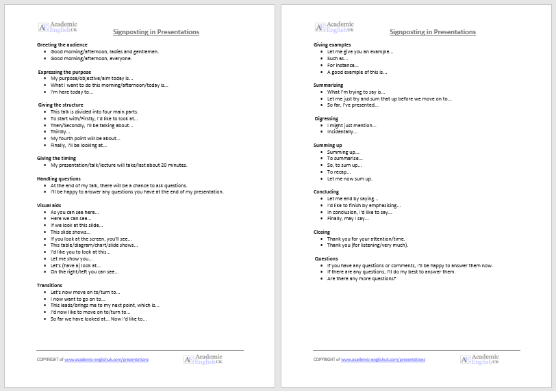
Advanced Signposting Language –
key language phrases for presentation
Presentation Speaking Criteria
This i s a basic criteria to assess presentation speaking skills. It has three key criteria: Language accuracy & language range, fluency & pronunciation, and presentation & engagement. Example / Level: ** *** [B1/B2/C1] TEACHER MEMBERSHIP
An Introduction to Academic Presentations
introduction to presentations (new 2023).
This lesson is designed to introduce students to academic presentations. It contains information on how to plan, structure, and deliver an academic presentation. It includes a listening worksheet, presentation signposting phrases and a mini-presentation activity. Example . Level: ** * ** [B1/B2/C1] TEACHER MEMBERSHIP / INSTITUTIONAL MEMBERSHIP
£4.50 – Add to cart Checkout Added to cart
Presentation Phrases (Signposting Language)
presentation phrases sheet : a range of standard english phrases .
Suitable phrases to use for greeting, structuring, examples, transitions summarising and concluding .
Free Download
What is an Academic Presentation?
Presentation Worksheet
This lecture discusses the key ideas of giving an academic presentation including referencing, signposting, delivery and rehearsal. 2-page listening worksheet with answers. A great introduction to giving a presentation. Example. Level *** ** [ B1/B2/C1] Video [7:00] / MP3 / TEACHER MEMBERSHIP / INSTITUTIONAL MEMBERSHIP
Improve your PPT Slides
Improve your Presentation PowerPoint Slides
These are PPT slides from the above video or go here . It’s a great way to explain how to present effective slides by using the correct fonts, focusing on key points and using animation to help audience engagement. The slides can be adapted to sort your style and method of teaching. Video [12:00] Level *** ** [B1/B2/C1] / TEACHER MEMBERSHIP / INSTITUTIONAL MEMBERSHIP
£4.00 – Add to cart Checkout Added to cart
Create PPT slides people will remember – Duarte Inc [CEO]
Harvard Business Review: How to plan an informed presentation and what is needed to create really effective slides that keep an audience engaged. More HBR listening worksheets are Example Video [03:08] Level: ** * * * [B2/C1] / TEACHER MEMBERSHIP / INSTITUTIONAL MEMBERSHIP
A Basic PPT Presentation
This is a video example of a ‘basic’ presentation on Domestic Violence using signposting language and a basic structure
Memberships (Teacher / Institutional)
Full access to everything - £100 / £200 / £550
Join today * x
Academic Presentation Marking Criteria
A basic criteria that can be used to assess and grade a students’s presentation – full criteria in paid version (below).

online resources

Medical English

New for 2024

DropBox Files
Members only

Instant Lessons

Marking Criteria

OneDrive Files

Critical Thinking

Topic-lessons

Feedback Forms

6-Week Course

SPSE Essays

Free Resources

Charts and graphs

AEUK The Blog

12-Week Course
Advertisement:.

Blog > English Presentation Structure (Introduction, Closing) & useful Phrases
English Presentation Structure (Introduction, Closing) & useful Phrases
02.21.20 • #powerpoint #presentation #english.
When giving a presentation in english, there are certain guidelines you should follow. Maybe you haven't got a lot of experience presenting - or you would simply like to refresh your already existing knowledge - we're here to teach you the basics about presenting and provide you with a free list of useful phrases and the basic structure you can in your presentation!

1. Structure
The general structure of a presentation is the following:
- Introduction
It is up to you to design these three parts. Using videos or everyday-examples can be a great way to introduce the audience to the topic. The important thing is that you capture the audience's attention from the beginning by making an interesting introduction. The main part is where you present your topic, ideally divided into sections. You can be creative with it - incorporate images, videos, stories or interactive polls . We generally recommend using different kinds of elements, as that makes the presentation more lively. Make sure your main part is well structured, so your audience can follow. In the conclusion, you should give a short summary of the points you made without adding any new information. You can also make an appeal to your audience in the end.
2. Useful Phrases
Here you'll find several phrases that you'll need in every presentation. Of course, you should adapt them and use them in a context that is suitable for your setting. The phrases are divided into subcategories so you can find what you're looking for more easily.

Starting your Presentation
In your introduction, you should:
Welcome your audience
Good morning/afternoon/evening everyone!
Ladies and gentlemen, I welcome you to my presentation about...
Introduce yourself
I am ... (from company ...) and today I would like to introduce you to the topic of ...
My name is ... and I am going to talk about ... today.
Icebreakers (for audience engagement)
Icebreaker polls are an amazing way to engage your audience instantly. They function as a fun and playful element at the beginning, giving you the perfect start you need to give a successful presentation. Click here to read our detailed post about icebreaker polls!
Mention the presentation topic and the reason for giving the presentation
I am grateful to be here today and tell you you about...
I would like to take this opportunity to talk about ...
I am here today to talk to you about ...
The reason why I am here today to talk about ... is ...
The purpose of this presentation is to ...
My goal today is to ...
Hopefully, by the end of the presentation, you will all know more about ...
Give a short overview of the content
To make it as understandable as possible, I divided my presentation into ... parts. In the first part, I will concentrate on ..., the second part will be about ..., ...
First of all, I will give you a short introduction, then we will move on to ...
... and finally, I will give you some insights to ...

Here are a few phrases that you could use during the whole presentation, but especially in the main part.
Engage your audience
In order to raise the audience's attention and improve their engagement, it is extremely important to make contact with them. A great way to do so is by adding interactive elements such as polls. If you would like to know more about this topic, read our article on How To Boost Audience Engagement . You can also use a software like SlideLizard , which allows you to conduct live polls, do Q&A sessions with your audience, share your resources and many more benefits that take your presentation to the next level.
Please raise your hand if you ...
Have you ever thought about ... ?
I would like to do a poll about ...
Please ask any questions as soon as they arrive.
On one hand, … on the other hand…
Comparing … with …, we can see that…
Clearly, … makes more sense than …
Whereas Option A is …, Option B is …
Making new points
Firstly,… Secondly,…
What also has to be mentioned is…
Next, I would like to bring up the topic of…
That being said, now we are going to take a look at…
Let's move on to the next topic.
On the next slide,…
The last thing I would like to mention is…

We made a whole blog post about how to pose questions in your presentation: The Right Way to do a Question Slide .
Talking about images or videos
In this image you can clearly see that ...
We are now going to take a look at a picture/video of ...
I'm going to show you a video by ... about ... now.
I've prepared a video about ...
Talking about statistics and charts
I am now addressing this graph that refers to the results of study XY.
In the graph on this slide, you can see that ...
The average is at ...
This graph clearly shows that the majority ...
According to this graph, the focus should be on ...
What that study tells us for practice is that we should ...
Emphasizing
I would like to emphasize the importance of ...
Moreover, it has to be said that ...
I want to stress the importance of ...
We always have to remember that ...
This is of high significance because ...
That part is especially important because ...
When something goes wrong
I am sorry, but it seems like the projector isn't working.
Could someone please help me with ...?
Is anybody here who knows how to ...?
Could someone give me a hand with ...
I would like to apologize for ...
I apologize for the technical problems, we are going to continue in a minute.
I am sorry for the inconvenience.
End of Presentation
In the conclusion, you should...
Sum up the main points
In conclusion I can say that…
To sum up the main points,…
With all mentioned aspects taken into consideration, I can say that…
Make an appeal
So please, in the future, try to be conscious about...
Please take a moment to think about...
I would like to encourage you to...
Thank your audience and say goodbye
It was a pleasure being here today.
Thank you for listening and goodbye.
Thank you for being such a great, engaged audience. Goodbye.
Thank you so much for listening, see you next time.
What is the structure of a presentation?
Your presentations should always have an Introduction, a Main part and a Conclusion.
What is a good way to begin a presentation?
You can start by introducing yourself, giving an overview of your topic, telling a little story or showing the audience an introductory video or image.
What are good phrases to use in English presentations?
There are many phrases that will make your presentation a lot more professional. Our blog post gives you a detailed overview.
Related articles
About the author.

Pia Lehner-Mittermaier
Pia works in Marketing as a graphic designer and writer at SlideLizard. She uses her vivid imagination and creativity to produce good content.

Get 1 Month for free!
Do you want to make your presentations more interactive.
With SlideLizard you can engage your audience with live polls, questions and feedback . Directly within your PowerPoint Presentation. Learn more
Top blog articles More posts

Modern mountains - Free PowerPoint Template

Best Sources of free Images to use in PowerPoint Presentations

Get started with Live Polls, Q&A and slides
for your PowerPoint Presentations
The big SlideLizard presentation glossary
Internal preview.
An Internal Preview is a statement, which is made in the body of the speech, so that the audience knows what the speaker is going to discuss next.
Informal Communication
informal communication can be used when talking to your friends or your family
Master view
In the master view in PowerPoint you can edit the Slide Master.
Multimedia Presentation
A multmedia presentation is a speech in which several types of visual and audio aids are combined in the same speech with the help of computer software. .
Be the first to know!
The latest SlideLizard news, articles, and resources, sent straight to your inbox.
- or follow us on -
We use cookies to personalize content and analyze traffic to our website. You can choose to accept only cookies that are necessary for the website to function or to also allow tracking cookies. For more information, please see our privacy policy .
Cookie Settings
Necessary cookies are required for the proper functioning of the website. These cookies ensure basic functionalities and security features of the website.
Analytical cookies are used to understand how visitors interact with the website. These cookies help provide information about the number of visitors, etc.
SARAH EGAN EMPOWERING YOU
- Feb 11, 2022
How can I describe results & statistics better in English?
Updated: Feb 14, 2022

Statistically speaking, there is a number of charts and graphs you could use while describing your results and statistics....
Do you have to present your yearly statistics or show last years results?
Let's discuss what types you can find and how to present them effectively in English. whatever the reason it's imperative to make it visual and interesting for the audience.
From Graphs, Charts & Diagrams, to Line Graphs and Bar Charts to name but a few,
they will surely help you cope with this task.
What is better to choose? There are so many different types of charts, diagrams, and graphs that it becomes difficult to choose the right one. The chart options in your spreadsheet program can also greatly puzzle.
When should you use a flow chart? Can you apply a diagram to presenting a trend? Is a bar chart useful for showing sales data? To figure out what to select, you must have a good understanding of the specific features of each type. I will show you some examples of different types of presentation visuals and explain in detail how to describe charts and diagrams.

Graphs, Charts & Diagrams Data can be represented in many ways. The 4 main types of graphs are a bar graph or bar chart, line graph, pie chart, and diagram.
Bar graphs are used to show relationships between different data series that are independent of each other. In this case, the height or length of the bar indicates the measured value or frequency. Below, you can see the example of a bar graph which is the most widespread visual for presenting statistical data. Line graphs represent how data has changed over time. This type of charts is especially useful when you want to demonstrate trends or numbers that are connected. For example, how sales vary within one year. In this case, financial vocabulary will come in handy. Besides, line graphs can show dependencies between two objects during a particular period. Pie charts are designed to visualise how a whole is divided into various parts. Each segment of the pie is a particular category within the total data set. In this way, it represents a percentage distribution.
Diagram is a plan, drawing, or outline created to illustrate how separate parts work and overlap at the connecting points.
This kind of visual content helps your audience see what you are talking about. That’s why it’s so important to understand the way it works and know how to describe, charts, tables, and graphs correctly.
A lot of presentations are focused on data and numbers. Apart from essential business presentation phrases , charts, graphs, and diagrams can also help you draw and keep the attention of your listeners. Add them to your presentation, and you will have a profound evidence-based work. When it comes to presenting and explaining data charts, graphs, and diagrams , you should help people understand and memorise at least the main points from them. As to the use cases, diagrams and other visuals perfectly fit for describing trends, making a comparison or showing relationships between two or more items. In other words, you take your data and give it a visual comprehensible form.
How to begin a description Once you create a fascinating graph for your presentation, it is time to know how to describe graphs, charts, and diagrams. To catch your audience’s attention from the very beginning, you can use the following phrases for introduction :
Let me show you this bar graph…
Let’s turn to this diagram…
I’d like you to look at this map…
If you look at this graph, you will notice…
Let’s have a look at this pie chart…
If you look at this line chart, you will understand…
To illustrate my point, let’s look at some charts…
How to describe diagrams and other visuals: naming the parts To describe diagrams or any other type of graphs as clearly as possible, you should name each visual element . For example:
The vertical axis shows…
The horizontal axis represents…
This curve illustrates…
The solid line shows…
The shaded area describes…
This coloured segment is for…
The red bar…
How to describe bar graphs Bar graphs transform the data into separate bars or columns. Generally, this type of visuals have categories on the x-axis and the numbers on the y-axis. So, you can compare statistical data between different groups. The bar graphs show which category is the largest and which is the smallest one. Each group should be independent so that the changes in one do not influence others. The bars or columns can be drawn either vertically or horizontally, as it doesn’t make any difference. The words used to describe bar chart are pretty similar to ones used for the line charts. How to describe line graphs Now, when you know how to describe bar charts, what about line graphs? This type of charts converts information into points on a grid that is connected with a line to represent trends, changes, or relationship between objects, numbers, dates, etc. These lines show movement over time affected by the increase or decrease in the key factors. To express the movement of the line, you should use appropriate verbs, adjectives, and adverbs depending on the kind of action you need to show. For this, you should use the following vocabulary: Verbs : rise, increase, grow, go up, climb, boom, peak, fall, decline, decrease, drop, dip, go down, reduce, level up, remain stable, no change, remain steady, stay constant, stay, maintain the same level, crash, collapse, plunge, plummet. Adjectives : sharp, rapid, huge, dramatic, substantial, considerable, significant, slight, small, minimal, massive. Adverbs : dramatically, rapidly, hugely, massive, sharply, steeply, considerably, substantially, significantly, slightly, minimally, markedly. There is also a list of adverbs to describe the speed of a change: rapidly, quickly, swiftly, suddenly, steadily, gradually, slowly. The appropriate vocabulary below will help you understand how to describe such charts: How to describe pie charts The pie chart is primarily used to illustrate how different parts make up a whole. The best way to present your data in a pie chart is to compare the categories with each other. The following comparison words can be used interchangeably:
compared to
as opposed to
the majority of
only a small monitory
greater than
Before creating charts for your presentations, determine what data you’re going to show and design the visuals tailored to your audience. Keep them as simple as possible. Charts, graphs, and diagrams should explain themselves. Use the words and their multiple synonyms mentioned in this article to describe your graphs and help your listeners understand the importance of your data. And don’t forget to add an inspiring quotes to make your speech even more impressive.
- English Coaching
Recent Posts
Connected Speech and Pronunciation Tips- Part 1.
English Learning Strategy, What's Yours?
Boost your Speaking English Skills From Your House
How to tell what you know well
Phrases and 6 Analysis Steps to interpret a graph
Useful phrases to interpret a graph.
As every graph tells a story, the creator has to be a good story teller. She or he needs basic knowledge in creating and interpreting the graphs produced. Also the person trying to understand the story, needs some basic knowledge about graphs. Otherwise reading a graph is like reading a text in a foreign language.
Introducing …
How well can you read graphs?
Watch this 8-minute -video to learn more about vocabulary to use for interpreting graphs.
Getting to know the 6 Analysis Steps to interpret a graph
Let´s continue with our example of mice and kestrels from the previous chapter.
In our example Roy counted how many kestrels and how many field mice are in a field. For many years he notes the numbers in his diary. He produced this line chart .
Let´s try to interpret this example carefully.
Analysis 1: Reading basics
First you have to read the labels and the legend of the diagram . What does it visualize?
In our example…
- x-Axis : You can read what years the animals have been sighted.
- y-Axis : You can read the numbers of sightings.
- Blue line : The number of sighted kestrels.
- Green line : The number of sighted field mice.
So this diagram visualises how many kestrels and field mice have been sighted over the years by Roy.
Analysis 2: Reading important numbers
First we have to read the most important points. Important points are peaks, lows, turning points and intersection points.
- 1952 : A peak of the mice line and a low of the kestrel’s line. A turning point for both lines.
- 1954 : An intersection point between the kestrel’s line and mice line.
- 1962 : A low point of the mice line and a highpoint for the kestrel’s line. A turning point for both lines.
Analysis 3: Define trends
Now it is important to define all significant trends.
Sightings of kestrels:
- From 1950 to 1952 they drop.
- Since 1952 they rise steadily.
- Since 1962 they drop slightly again.
Sightings of field mice:
- From 1950 to 1952 they rise significantly.
- Since 1952 they drop significantly.
- Since 1954 they drop much slower.
- Since 1962 they rise again slowly.
Analysis 4: Compare trends
Knowing the trends, we can compare them, to find out differences and relations. Are there common trends? Is there a pattern?
- When there are many sightings of field mice, there are fewer sightings of kestrels.
- When there are many sightings of kestrels, there are fewer sightings of field mice
Analysis 5: Analyse trends
Finally we can establish hypotheses how the data is related. These hypotheses have to be questioned and assessed.
A) “Mice eat kestrels. Therefore there are many kestrels when there are less mice.”
- According to our diagram this is possible. But: We know that mice do not eat kestrels.
B) “The kestrels hunt the mice. Therefore there can only be a lot of mice when there are fewer kestrels.”
- Mice are typical food for kestrels . This hypothesis could be correct.
C) “The Mice hide from the kestrels. When there are many kestrels to see, we cannot see many mice.”
- Prey animals often shelter from their hunters. Also this hypothesis could be correct.
D) “The relation between sightings of kestrels and mice is only a translucent connection. The numbers of sightings have very different reasons.”
- Very often there are only translucent connections. There can be many reasons why Mr. Varney sights a certain number of animals each year. Also this hypothesis could be correct.
Analysis 6: Predict a development
Based on the development of the diagram and the established hypothesis we can predict future developments of the diagram . But be careful: Predictions are always only speculations!
- Towards the end the lines become closer again. If they continue like that there will be an intersection at some point.
- In the coming years there might be more sightings of mice than kestrels.
A diagram helps to draft a hypothesis . To check a hypothesis very often you need to do an experiment. Based on a diagram , graph or chart we can predict a development in the future. But we have to be aware that it is only a prediction .
This example about kestrels and mice has been published by courtesy of de.serolo.org.
Concept and graphs by author Martin Forster. Note: Some words in the graphs have been deleted to make it suitable for international use. Arrows to explain graphs have been added. Some text has been changed slightly to suit the audience of explainwell.eu.
You can find the original under: https://de.serlo.org/biologie/kompetenzen-in-der-biologie/diagramme/wie-wertet-man-ein-diagramm-aus Serlos work is under Attribution-ShareAlike 4.0 International (CC BY-SA 4.0)

This project has been funded with support from the European Commission. The contents of this website reflects the views only of the author, and the Commission cannot be held responsible for any use which may be made of the information contained therein.
PARTNERS AND CREDITS
Project parters and credits Project website DISCLAIMER
We use cookies to give you the best online experience. By using our website you agree to our use of cookies in accordance with our cookie policy. OK Learn More Here.
Learn a language with our own teacher, anytime

35 Powerful Presentation Phrases in English for Engaging Your Audience
Your palms are sweating.
For a moment, your mind goes blank.
All eyes are on you.
That moment right before you start presenting – as you take in your audience – is usually the scariest. The nervousness lessens with practice, but even the most frequent public speakers still get butterflies in their stomach sometimes. Whether you’re facing an entire room of people or looking at everyone through your laptop screen, giving a presentation can still be intimidating – or exciting, once you move beyond the fear.
There’s an extra layer of challenge too if you have to speak in your non-native language. For a more professional-sounding and engaging presentation, we’ve compiled some of the most useful English presentation phrases below.
We’ll also explore what else you can do to make even more of an impact on your audience. With the right intonation, body language, and gestures, you’ll really be able to catch their attention and emphasize your points.
If this sounds interesting to you, you should check out the Creativa business meeting mastery course . There’s an entire video episode about giving a stunning presentation. You’ll learn about how to structure your ideas, deliver a report, and conclude a discussion. It covers not only fluent native phrases but also body language demonstrations that you can apply to your work right away.
On top of this, the course has plenty of other engaging, high-quality video episodes that help you present your best self in English. Curious about it? You can access a free video here .
Delivering a Powerful Presentation
To lay the groundwork for your presentation in English, here’s what you’ll have to do first:
Consider the audience
You’re probably always going to need slides, but every presentation will be different – and the audience that you’ll be presenting to won’t always find the same points interesting. Because of this, you’ll have to tailor your message to them. What style of presentation would be a good fit? For example, some audiences would want to see a lot of number-crunching, while others might be looking for more personal storytelling .
Prepare a structure
Structure is key in presentations. People have short attention spans, and they can be forgetful. At the end of the day, your goal is for them to remember at least the main points in your presentation. What message do you want to convey? Since you might be discussing a lot of information, you can make it more digestible by ensuring that there’s a logical progression and then ending with a summary.
Whatever your topic is, it’ll benefit from having a well-defined structure to guide your audience from start to finish. For a cheat sheet on this, scroll down here to download a free PDF worksheet with exercises about structuring your presentation so you can be clear and convincing. This way, you can have a presentation that’s strong in all sections – beginning, middle, and end.
Key Business Phrases
Once you’ve decided on the style and message of your presentation, you can take it up a notch by including certain English presentation phrases all throughout. Let’s break it down from start to finish:
Introduction
This is when you’ll be warming up your audience before you proceed to your main points.
Greeting the audience
If you’re presenting to people who aren’t too familiar with you, you can quickly introduce yourself and mention your role or company.
- Good morning, everyone. I’m glad to be able to present to all of you.
- Hello, everyone! It’s nice to see all of you today. I’m [name], the [position] from [company].
Describing your topic
After greeting the audience, you’ll be explaining to them what your presentation is all about. To set their expectations, you might show them an outline of the talk and mention if there’ll be any activities such as breakout discussions.
- I’ll be talking about…
- I’ll be talking about our financial metrics over the past year.
- The topic of this presentation will be…
- The topic of this presentation will be major trends in the logistics industry.
- I’ll be discussing first the [first topic], next [second topic], and finally [third topic].
- I’ll be discussing first the project’s ideation process, next our initial trial, and finally, presenting our results.
Addressing questions and technical concerns
People might be wondering if they can ask questions during your presentation, so you can clarify this at the start. If you’re providing handouts or presenting online, it’s useful to ask people to alert you about any technical concerns.
- Please feel free to ask any questions during the talk.
- For questions, there will be a Q&A section at the end.
- Can all of you see and hear me properly? Please let me know if you have any technical difficulties during the presentation.
The body will make up the bulk of your presentation. Ideally, you would go through each of your points logically while letting your audience know when you’re moving on to the next section.
The longer your presentation, the more important it is to use sequencing phrases. These act as cues that let your audience know where you are in the presentation. You can think of these as similar to detour signals that make the audience much more likely to get your meaning.
- First, let’s discuss the…
- First, let’s discuss the initial spark for this idea.
- Moving into [the next item / point] …
- Moving into item 4, we can see that this is a major pain point for our target market.
- This leads us to the next…
- This leads us to the next section, where we’ll be looking at the facts and figures.
Linking is closely related to sequencing. Similar to writing, you can have a smoother presentation by connecting your ideas rather than suddenly jumping from one point to another. You can also refer back to points that you’ve mentioned before to make your presentation more cohesive.
- In connection to what I said earlier…
- In connection to what I said earlier about growing our online presence, we can now look into potential social media campaigns.
- What this means is…
- What this means is that most of our growth is coming from a certain sector. Let’s analyze the data for this in the next section.
- This ties in with…
- This ties in with our survey findings about user reactions. I’ll go into detail about changes we’ve made to the app as a result.
Giving examples
To fully convey your point, you can bring up specific examples and case studies. These are much more memorable as well as engaging because you can tell these in the form of a story.
- For example…
- For example, costs were reduced significantly when we switched to the following materials.
- To demonstrate this point…
- To demonstrate this point, I’ll be showing you a video of a business that used this problem-solving method.
- Here’s an example of…
- Here’s an example of a seasonal product that our customers loved.
Showing visuals
Visuals naturally attract people’s attention. If you’re using slides for your presentation, take the opportunity to include images, diagrams, infographics, or even charts.
- As you can see from this…
- As you can see from this photo, we’ve redesigned our office space.
- Here’s a diagram / picture / chart that shows…
- Here’s a diagram that shows a high percentage of people are comfortable with online shopping.
- If you look at this…
- If you look at this infographic, you can see that the new color palette comes off as fun and casual.
Citing data
Citing data from research makes your presentation more persuasive. When you’re talking about results that you’ve achieved, try to bring up actual numbers – this can go a long way towards impressing your audience.
- According to this study…
- According to this study from [journal], 65% of eCommerce companies are looking for more efficient payment methods.
- Based on our research…
- Based on our research, the most enthusiastic buyers of wellness products in this city are in the 20 to 30 age range.
- Looking at the data…
- Looking at the data, you’ll notice that there’s been an 18% spike in sales since we migrated our platform.
Restating an idea
Sometimes you’ll want to restate an idea so it’s easier to understand. This also serves to emphasize it. Because of the repetition, people are more likely to remember it compared to if you’d only mentioned it once.
- In other words…
- In other words, partnering up with this client can make our operations more efficient and seamless.
- Another way of saying this is…
- Another way of saying this is that there might actually be more demand than supply by next year.
- What I mean is…
- What I mean is we’re already more than halfway to our business objective.
Handling technical issues
When you’re presenting on video call, all kinds of glitches can happen. Someone might have connection issues, you might have to figure out an app feature you’ve never used before, or background noises might keep interrupting your call. The phrases below can be very handy in these kinds of situations.
- If you can’t hear me, can you type in the chat, please?
- Could everyone mute their mic? There’s a lot of background noise.
- Sorry. The call dropped. I’m back through.
Concluding the Presentation
By this time, the hardest part is already over! Still, you’ll have to wrap up your presentation nicely by going over the key takeaways during the conclusion. Your audience might also have questions that they’ll want you to address.
Summarizing the presentation
Out of everything that you’ve discussed, what would you like people to get out of it? A short summary towards the end serves to highlight your main ideas.
- To wrap up…
- To wrap up, I’d like to point out three major takeaways.
- As a summary…
- As a summary of this report update, I would say we have seen a positive uptick in our workflow and productivity.
- All in all…
- All in all, we believe we’ve seen good results for this stage of our progress.
Thanking the audience
Similar to your greeting at the start, it’s common to address your audience again towards the end by thanking them for their time.
- Thank you for listening!
- Thank you to everyone for being here.
- I’d like to thank you all for coming here.
Addressing questions
If you’re open to questions from your audience, you can have a short question-and-answer session after your presentation.
- Do you have any questions or clarifications?
- Feel free to ask me about any of the points I made during the presentation.
- Let me know if you have any questions.
Practice is Crucial
When you’re all set with the content of your presentation, the next step is to practice your delivery. Regardless of how well you know the topic of your presentation, practicing it at least once will help you be more confident. You’ll discover potential issues that you can fix too before you go live.
Do a run-through
The most basic way to practice is to do a run-through of your entire presentation . Set a timer on your phone, open up your slides, then start talking – all while imagining that you’re already presenting to your audience. Since you’re acting as if it’s in real-time, this means avoiding any pauses where you have to look up information.
A run-through can pinpoint any weaknesses in your presentation, and you’ll notice any parts where you might be uncomfortable talking. You’ll also be able to see how much time you’ve spent so you can pace yourself accordingly.
Record yourself
A more intensive version of the run-through basic would be to record yourself presenting. You can either record your voice or take a full video of yourself. People often notice that they use filler words a lot such as “um” or “uh.” You’ll also be able to check your pronunciation and whether you sound confident and natural all throughout.
Since body language can make or break your delivery, watching a video of yourself presenting is an incredibly effective way to improve your performance. Do your facial expressions match what you’re saying? Are you maintaining good posture throughout and making efforts to connect with the audience?
When you combine a confident, approachable body language with the right business vocabulary, your ideas shine through better than ever. You can get a play-by-play of how exactly to do this with the Creativa business meeting mastery course . It features video sections that are all about making powerful transitions and expressing your points clearly during presentations. You’ll learn about specific native English phrases and gestures so you can move fluidly from one idea to the next.
Together with the other episodes, the course dives deep into how you can be a strong communicator during professional meetings. For a preview, check out this free episode .
Presenting on Video Call
Technical issues happen often enough in face-to-face presentations, but they’re even more frequent during video calls. To avoid any awkward delays when you’re presenting, get comfortable with the platform that you’ll be using.
If it’s a face-to-face presentation, double-check your slides and make sure any images or videos are showing properly. For video calls, try doing a test call on the app or even call up a friend to practice. You can also get familiar with the app’s basic features, such as screen-sharing or inviting people to breakout rooms.
But sometimes, even when you’ve practiced your presentation perfectly on video call, the unexpected can still happen. Scroll down here to download a free worksheet that we made precisely for dealing with technical issues in presentations. You’ll get an extensive list of English phrases to use for all sorts of video call glitches, along with practical tips for handling them in the moment. With enough preparation, you’ll be able to roll with surprises and conquer even video call presentations.
Let’s explore some of the most common glitches (and how you can deal with them gracefully!):
Situation 1: You’re having a hard time hearing other people because of their laggy connection.
For a presentation to work, everyone needs to have a decent internet connection. If someone’s connection drops, they won’t be able to see or hear you properly, and you won’t understand what they’re trying to say, either. In this case, let them know right away that you can’t hear them. You can also ask them to talk to you over chat instead.
Example Phrases:
- [Name], you’re cutting in and out. Would you mind reconnecting?
- Audio problems – can you type it on chat instead?
Situation 2: You get disconnected from the call.
In the case that it’s your connection that’s faulty, you might have to disconnect then reconnect your call. This can be awkward because it interrupts the flow of your presentation. Alerting your audience using certain English phrases can reassure them while getting you back on track with what you were saying.
- Sorry, guys, dropped call. But I’m back.
- Connection problems, everyone. Gonna log out and back in.
Situation 3: People are having a hard time figuring out how to turn on their audio or video.
Another reason why you’d want to be really familiar with the video platform is you might have to coach people when they experience glitches. It’s almost expected that a few people might accidentally forget to turn on their mic while speaking. Alternatively, they might have issues with turning on their camera.
- I can’t see you, [name]. [Give instructions on how to turn on their video.]
- I can’t see you, Fatima. Look for the camera icon and make sure there’s no red line through it.
- Typing in chat: “Make sure your mic’s unmuted.” [Clarify how they’ll know if they’re unmuted.]
- Typing in chat: “ Make sure your mic’s unmuted. There should be no red lines through it.
The best presentations excel in all three areas: content, structure, and delivery.
Including some of the key English phrases above will upgrade your performance. Aside from setting a professional tone, these English presentation phrases set the pace for your audience so they’re aware of where you are in the discussion. Your message will sound clearer, and your audience will be able to follow your ideas better.
The basic rules for presentations are the same, whether you’re on a video call or stepping in front of a stage. With the tips above, you’re all set to prepare an amazing presentation in English.

Your Contact Details
Back to blog home.

101 Must-Know Transition Phrases for Engaging Presentations Online
By Paola Pascual on Jan 17, 2024 1:43:00 PM
Giving presentations is often feared by many professionals, but if the presentation is online and you're not a native speaker, things get even trickier. One tip to make things easier? Learn useful phrases to help you navigate your presentation. In this article, you will find lots of helpful resources to give remarkable presentations . Listen to the episode above, download the checklist below, and learn some of the phrases we present. If we missed any, tell us in the comments below.
General vocabulary for presentations
Sometimes, the smallest changes in your presentations can make the biggest differences. One of them is to learn a few phrases that give you confidence during your speech. Here are some important verbs to get you started:
- To highlight
- To emphasize
- To walk you through (*very common in business presentations!)
- To send around
- To carry on (similar to continue)
- To get carried away
- To sum up (similar to summarize )
- To focus on
Vocabulary to start your presentation
Learn how to powerfully start your presentation with these 4 simple steps. Here's some vocabulary you can use:
Welcome your audience
- Good morning/afternoon/evening everyone. Thank you for joining us today, and welcome to today's webinar.
- Hello everyone, I’m very happy to be speaking with you today.
Introduce yourself
- My name is Susan, and I’m part of the design team here at Globex Corporation.
- First of all, a little bit about my background - I am the Team Lead at [Company], and I've been in charge of [your main responsibility] for [X] years.
- I'd like to tell you a bit about myself - my name is Eve I'm the Operations Manager here at [Company].
Introduce the topic and goal of the presentation
- Today, I'd like to talk about…
- This presentation will take about [X] minutes, and we will discuss...
- We've allocated [X] minutes to this presentation. and I'll talk about...
- I'd like to give you a brief breakdown of...
- I'd like to take this opportunity to talk about...
- The main goal of this presentation is…
- The purpose of this presentation is...
- My objective today is...
Read these 5 tricks the best public speakers use to captivate their audience .
Addressing questions from the audience
- If you have any questions about anything, feel free to interrupt.
- If anything isn't clear, please click on the 'raise hand' button and I'll do my best to answer your question.
- I'd be happy to answer your questions at the end of the presentation.
- If you have any questions, please kindly wait until the end to ask them. We will have [X] minutes for a Q&A session at the end.
- Since today's audience is considerably large, we will not have time for questions, but please email me at [email protected]
Learning new English words is not easy, but you can achieve effective communication through practice and repetition. If you are a Talaera student, visit the Library to practice your vocabulary for presentations. If are not part of the Talaera community yet, learn how we can help you here .
Clear out technical issues
- Can everyone hear me well? Let me know if you encounter any technical difficulties throughout the presentation.
- If you are not speaking, please put yourselves on mute.
- If you feel that the sound quality is poor throughout the presentation, please let me know.
Transition to the main topic of the presentation
- Hi everyone, I think we might still be missing a few people but I’m going to kick things off now so we have time to get through everything.
- All right, let’s dive right in!
- All right, let’s jump right in!
- Let’s get started.
- Let’s kick things off.
- I’m going to talk about
- The purpose/subject of this presentation is
- I’ve divided the presentation into 3 parts: In the first part, ... / Then in the second part, ... / Finally, I’ll go on to talk about...
- Let me begin by looking at...
- Let me start with some general information on...
Vocabulary for the main body of your presentation
Introduce a topic or section.
- Now let’s move to the first part of the presentation,
- We can see 4 advantages and two disadvantages. First,
- On the one hand… On the other hand…
- There are two steps involved. The first step is… The second step is…
- There are four stages to the project.

Transition to a new section
- All right, let’s turn to...
- Now we come to the next point, which is
- Okay so that’s [topic 1], but what about [topic 2]?
- There’s a lot more to talk about, but since we’re pushed for time , let’s move on to [topic 2].
- This leads me to my next point, which is...
Give examples and details
- For example...
- A good example of this is...
- To illustrate this point...
- This reminds me of...
- To give you an example...
- Let me elaborate further on...
Describe visual aids
- As you can see [from this infographic]
- This chart shows
- If you look at this graph, you will see
- From this chart, we can understand how
- Let me show you this [image, graph, diagram]
- On the right/left
- In the middle of
- At the top/bottom of the picture
Emphasize an idea
- This is important because
- I’d like to emphasize that
- We have to remember that
Repeat the same message with different words
- In other words
- To put it more simply
- So, what I’m saying is that
- Let me say that again.
It's easy to get stuck in the middle of a presentation, especially if English is not your mother tongue. Here are +20 Top Tips You Need To Know if you're learning business English .
Finish your presentation and summarize
The end of a presentation, together with the opening, is one of the most important parts of your speech. Read these 5 effective strategies to close your presentation and use the vocabulary below.
- That’s all I want to say for now about [topic].
- To sum up, ...
- This sums up [topic].
- So in a nutshell, ...
- So to recap, ...
- In brief, ...
- To conclude, ...
- I’d like to conclude by emphasizing the main points...
- That's it on [topic] for today. In short, we've covered...
- So, now I’d be very interested to hear your comments.
- And this brings us to the end of this presentation. I hope [topic] is a little clear after today.
- So to draw all that together, ...
Start and navigate the Q&A session
- Thank you for your attention. I hope you found this presentation useful, and I'd be happy to answer any questions.
- Thank you for listening. We now have [X] minutes left. Do you have any questions?
- Thank you for your question, [Name].
- I'm glad you asked.
- That's an interesting question.
- That's a great question, I must say. I'm not 100% sure, but off the top of my head, I can tell you that...
- Are you asking about [topic 1] or [topic 2]?
- Can you please clarify what exactly you mean by [question]? I'm not sure I fully understand.
- I'm afraid I don't have the exact figures at hand, but if you give me your email address at the end, I can follow up with you later.
- Does that answer your question?
- I hope that makes sense. Is that the kind of answer you were looking for?
Take your presentation skills to the next level.

Keep reading about presentation skills:
- 21 Helpful Tips For Remarkable and Outstanding Presentation Skills
- How To Start a Presentation: Follow These 4 Easy Steps
- How To Bring Across Your Main Idea In A Presentation Effectively
- 5 Effective Strategies To End A Presentation
- 6 Public Speaking Tricks To Captivate Your Audience
- How To Do Effective Business Storytelling According To Former Prosecutor
- 8 Little Changes That'll Make A Big Difference With Your Presentations
- 3 Quick Public Speaking Tips For Your Next Presentation
- Your Body Language May Shape Who You Are [TED Talk Lesson]
Talaera Talks - Transcript Episode 5
- Topic : Deliver impactful presentations
- Listen : Spotify , Apple Podcasts , Google Podcasts
- Duration : 22 min.
Intro Welcome to Talaera Talks , the business English communication podcast for non-native professionals. My name is Paola and I am co-hosting this show with Simon. In this podcast, we're going to be covering communication advice and tips to help express yourself with confidence in English in professional settings. So we hope you enjoy the show!
Okay, welcome back for our third episode of Talaera Talks. This is Simon, and I'm joined with Paola. Paola, how are you doing? 0:37 Hi, Simon. I'm great. Happy to do another episode. 0:41 Yeah, absolutely. And Happy Friday. 0:44 Happy Friday! 0:49 So today, our topic: Presenting in English. I'd like to start this episode with a quote I found on Harvard Business Review that I thought was really interesting. It says, "Even native English speakers often anticipate disaster when making presentations. By but for non-native speakers, the anticipatory and situational anxiety associated with their unique challenges (these challenges - being understandable, choosing the right words, speaking spontaneously), can be overwhelming. Moreover, if these concerns interfere with your willingness or ability to make business presentations, the impact can be career-limiting." So yeah, that's a pretty kind of heavy quote to start. But it is something that we see from a lot of our clients, right? 1:52 Yeah, it's super interesting. It was super interesting to read. It's something we know, but it's important to remind it that it is presentations, the topic we have today is something that is not pleasurable for anyone, not for non-native speakers, but also for native speakers. So that's something to point out. And today, we talked about that... We said that we wanted to start with those challenges or fears that we see from our clients, our learners. 2:25 Yeah, and it's usually around the same things, you know, we, at least for me, I come into contact with so many of these, so many of our students who are so competent in their, in their daily lives, what they're doing in their professional lives. And they come to me with these with these fears, like this just general lack of confidence, or imposter syndrome, right? This I don't know if I really deserve to be speaking and, you know, kind of explaining this concept to all these people. 3:05 Mm-hmm. Yes. And also the fear of not being understood, well, they know what I'm saying, well, they understand my accent. There's a lot of worries and concern around accent and our pronunciation expert, Lisa hosted a webinar, actually last week, where she explained that accent matters. But as long as people understand you, it's fine. You don't need to be perfect. Everyone has an accent. So that's also totally fine. 3:37 And this being Yeah, this being one of I think, at least for me, in my experience, one of the most frequently asked for aspects from students. So you know, and just to like, again, just say that this is a challenge for everyone, not just, you know, non-native English speakers. You know, I think all of us have a tough experience or somebody that we think of when we think about public speaking, it's, it's like this, yeah, really anxiety-riddled thing. I mean, I don't have any, you know, funny personal stories, but uh, do you, Paola? 4:20 You want me to tell my embarrassing story, don't you? 4:22 Please, you must. 4:25 So I used to teach at a university in Vietnam when I lived there, and the classes where it rains, you know, from perhaps 50 students to up to what 300 there's was a class with, you know, 2-300 students and there was a little stage it wasn't too high, but there was a little stage and I fell off. 4:46 You fell off the stage. This was during or after the presentation, or...? 4:56 It was around the beginning of the presentation. So... 5:01 During! Oh, I thought it was it was like after like you were walking off? 5:06 No, I move a lot. I use my body language quite a lot. And that was one of the moments where I overdid it, probably, and fell off. 5:17 Wow. Well, I'm glad that you're still here with us. 5:21 Yeah, you know, but that's the story that I sometimes not always tell it. But I sometimes tell it when my students say, Oh, I'm nervous, and I assume that it can happen, you know, I thought it was going to be a disaster. And then I actually ended up making friends with the students that turned out okay. 5:39 Right. Well, yeah, I mean, today, we're not necessarily going to go into the physical dimensions of how to avoid falling off the stage. But we do have some, some good tips, right? 5:54 Yes. And to provide some advice on how to deliver presentations, and lose that fear, we've divided it into three main blocks. And those are what to do before the presentation, tips for during the presentation. And then even after there's things you can do to, to get better. 6:18 Right, let's start with the first, right, what can we do before the presentation in terms of getting ready, preparing? 6:30 So preparing, it's a very general term, but one of the tips that we like to give is, think of the WHAT, WHY and NEXT. So WHAT is your presentation about? WHY should they listen to you and not look it up online (or listen to a podcast, like ours)? And in what NEXT means - what is supposed to happen next? Do they need to do anything, go on a website, send you feedback? Are you going to send them the materials? So what why our next is so straightforward and simple. But when I asked this question to our clients that are so thrown off, and they don't know what to answer sometimes, 7:10 Yeah, I think that's one of those things. And I struggle with this all the time is, when I get an idea or something like that. It's so easy to just jump over those most basic things of, you know, what, why and index, those are so, so basic, but it's such it's, they're so foundational, right? And in terms of creating something that people will understand and be able to, to really attach to. 7:41 Yep. And do you have any tips around how much you should learn? Should you write the whole thing? Or should you memorize? 7:52 Yeah, that, you know, this is a good question as well, that a lot of our learners ask in terms of, yeah, you know, I'm just going to go and write it all out. And then I'll have an idea. And I'll feel better because I can write it and change it so that it sounds more professional. It sounds like I know what I'm talking about. And I always tell people, please don't try to prepare a presentation where you're reading a script, it is just the most unnatural thing ever. And, and it, you won't end up sounding more professional, if anything, your audience is going to detach, because they're going to sense that something's not really right here, it doesn't seem genuine, right doesn't seem real, it just seems like this person is doing what he's doing, which is reading off of a script. And even still a lot of times with a lot of our learners where they know that, okay, I know this material. But I'm going to put all of my effort into making this perfect slide this perfect presentation. So I would say, focus on actually knowing the material itself really well. More than focusing on how the presentation looks, you know, these kinds of things. Because once you're in that situation where you're on the stage, and people are looking at you, at least you'll be able to Windows like kind of red Sirens of you know, panic and anxiety show up. You'll have learned the material itself so well that you can roll with that. 9:29 Yes. And you also have room for improvisation because your brain is so used to the content and you know, so well what you want to say that that's when your brain starts to come up with anecdotes and that's the fun thing that gets you hooked. And that's the main Why should people listen to you instead of reading an article online? 9:49 Exactly. Because for most of our students, you know what you're talking about. That's why you're up there. That's why you have the opportunities to speak there is because someone thinks you're qualified enough to speak to all these people. So trust in that and go with that. So yeah, so we have right not, not over learning. Don't script it right? What else can we do? 10:14 Practice, practice, practice, practice, practice in your mind, but more importantly verbalize it, say it out loud. And recording yourself is uncomfortable for everyone. But it works. I have never tried it. I always told my students should record yourself, you should record yourself and they were like, Huh. And just a few of them did it. And when we started with the webinars, I haven't done something like it before. And I said, Okay, I'll use my own tip. And it was one I'm comfortable. And two, super helpful. So if you get to go over the sound of your own voice, I would say do it. 10:54 Yeah. You know, this is one thing that I have to be totally honest here. Doing these podcasts is the first time I've actually recorded myself for a long time. And I've learned a lot about, you know, not saying the word Absolutely. 500 times, yeah, within the span of 20 minutes. So those are good learning lessons. Definitely. Okay, and then so we have that. And then the last little tip is, I would say get an English mindset before 30 minutes to an hour before the presentation. And that could be listening to a podcast, you know, like Talaera Talks, or, you know, watching a show on Netflix that's, that's in English, whatever you can do to get your kind of English mind, you know, in the zone before you go up and actually speak English. So So those are all of our kind of pre presentation tips, what you can do before, so what about during, 11:58 so for during, there's a lot of things that you can you can do to improve your presentations. But the first tip is to learn how to start to have a mind map of what am I going to do at the beginning. So you start confident already. So welcome, everyone, introduce the people introduce the topic and go to the main point, those four parts will help you have a nice start. Welcome, everyone. For example. Hi, everyone. Welcome to today's presentation. Today, we'll be talking about business events, introduce the people, you can introduce yourself , like, Hi, my name is Paula and I'm a business English instructor at Telstra, and perhaps even the audience. Today we have with us students from all different nationalities and levels, or, you know, whatever the audiences, that's also helpful for everyone to understand, introduce the topic, or give you some best practices for business emails , and a few templates, and then go to the main point. So a simple sentence like Alright, let's get down to business. So having those welcome introducing people introducing the topic and going to the main point will help you have a nice start. 13:16 Yeah, and I like that concept of that the mind map is so good. Because it's it's not the scripting, like we were talking about before, it's having a kind of a little mental checklist. So that when those first few minutes, were you're up there on the on stage, and you're like, oh god, oh, god, here we go. Here we go. You have that little checklist that I created. Okay, so I welcomed introduced the people the topic, and now to the main point, and that can get you in the zone and going I really liked that. Yeah, so so having that, that starting template. And then another thing would be, I would say slowing down, slowing it down. And this is really I think it touches on a lot of aspects. The first would be just the general anxiety, we tend to speak a lot faster when we're really anxious, you know, but by slowing down, it really helps with non native English speakers because it helps with the accent. And it helps with giving you some time to really think through your next thoughts. Now, I'm not saying that you should, while you're speaking, try to think steps three, four or five ahead of you. But giving yourself a little bit of time to Okay, I'm going through this pattern now. Now I can go to the next one, right. And doing that, you know, another with the slowing down a tip if you're really nervous to go in is prefacing your speech. So before you really get into everything, maybe after the welcome part is just to say, Hey, you know, I'm going to try to speak as clearly as possible, as English as myself. first language and really smile and maybe make a little joke about that. And I think that's a good way to open it out for the audience to show some vulnerability and and help. I mean, what do you think about that? 15:13 Yeah, I mean, we see that with, sometimes with celebrities, when they're not native speakers, and they admitted, and they, they kind of put yourself put themselves, as you said, in that vulnerable position, and that makes them even cuter. 15:28 Mm hmm. 15:29 So it's making yourself human, I think it's always a good tip. And you were saying that slowing down helps with your accent and also for yourself to gain time to really know what you're going to say. But also for the for the audience. We don't mind people making some little pulses, so that they also have time to collect their thoughts. 15:50 Right, right. Yeah. Yeah, definitely. Those are, those are two really good aspects, starting, you know, the template and then slowing down, right. Yeah, kind of diffusing the anxiety by saying, Hey, you know, this isn't my first language. And that really gets the audience on your side, right. And then another would be not reading off of your slides. I mean, this is kind of the basic, you know, what you learn in school, but it's also something that a lot of people get, yeah, get, get hooked on, just because it's like a safety net. And I would say that's where the overlearning the material that we talked about beforehand comes into play. Anything else in this? 16:42 Oh, recap for sure. After every section, do a little recap, and at the end to recap where you summarize the main points of the whole presentation? 16:54 Yeah, yeah. Good. Good. So So summarize. Yeah, yeah. And that's a that's a good, you know, I would say three aspects, four aspects that during the presentation, if you keep these in, in your mind, it's, it's, I would say, it's going to help a lot. And so now we're going to move to what can we do after the presentation? We've done it, we've walked off the stage. Whoo, I'm so glad that's over. Now, is all of our work done? No. 17:27 No, not really. That's now it's your chance to actually learn from, from everything you did. So one of the tips we suggest is try to ask for feedback. But that's not so easy, right, Simon? 17:42 Yeah, it's, I think, a big question. And that is, who do you get the feedback from? Right?

17:50 So we, we would always suggest to try and find someone you can trust someone who is honest, and who can give you objective feedback. So in some cases, that can be your manager, but sometimes it's a colleague that understands the topic, and can really provide some feedback on how you did. 18:13 Yeah. And that's, I think, in terms of learning, this is one of the most crucial thing is reflecting back on what you did, and seeing what worked, what didn't work, and how can I take that and move forward? Because especially with presenting, it's a skill, and it takes practice, practice, practice. And, and I think, for a lot of people, you should jump at the chance to do this. So that you can continue to learn and continue to grow. But be sure to reflect by Yeah, by asking for feedback and seeing what worked, 18:47 for sure. And ideally, that would be someone, perhaps from work that can see how you did and like the actual show, if not Talaera teachers also do that. So you can present your own presentation, pretending it's the actual one. And that's how we can provide feedback on the structure, the vocabulary, the language in general. 19:08 Yeah, absolutely. I do that. Oh, there you go. Absolutely. Definitely. See, I'm reflecting back and learning as we go. I'm working. I'm learning that. Yeah. But I've done that recently with a couple of students where we've gone through their deck and looked at what are their plans in terms of presenting and we've kind of gone through in detail that together. So So yeah, so that was kind of I would say the biggest thing in terms of afterward. 19:40 So we have the pre-presentation, just as a quick recap for the pre-presentation and before your presentation, always remember the what why next, what is your presentation about? Why should people listen to you and what should happen next overnight Learn the content. be super confident about what you want to talk about. But don't script it. Don't write everything down. Otherwise, it would sound like you're just reading. 20:11 Write and practice through verbalization. record yourself, even though it may be awkward, but it's a great learning technique. And then get in that English mindset beforehand by Yeah, listening to a podcast or what have you. And then during the presentation, right, starting with the template, Paolo was discussing the welcome introducing the people the topic, and then going to the main point, 20:37 slowing down a little bit. It's not necessary to go super fast. It's not only not necessary, but people will understand you better if you take your time and make some pauses. Of course, don't read off their slides. Tell them the story. 20:54 Right, right. And remember 20:56 to recap, just like we're doing now. Send them or tell them a quick summary and the main points, 21:03 right, and don't fall off the stage as well. That's ideally we forgot. Ideally, it's final for then, as the final point, right, asking for feedback, finding that person that can get you that feedback that's so important to you. Finding what worked and moving forward. 21:21 That's right. All right. Do we have it for today? 21:25 I think that is it for today. Yeah. I had a lot of Thanks. Yeah, I had a blast. And thanks for meeting up. And we have a lot of good stuff coming up with Talaera. Right. 21:38 We have webinars, our blog is busier than ever. So go on the http://blog.talaera.com/ , check out the resources. And what else? 21:51 Find us on LinkedIn. And yeah, please ask any questions, we'd be glad to get back to you. So that is it for today. And thank you to all of our listeners. So far, we're excited to keep growing this. And as always, keep learning! 22:11 And that's all we have for you today. We hope you enjoyed it, and remember to subscribe to Talaera Talks . We'll be back soon with more! And visit our website at https://talaera.com for more valuable content on business English. You can also request a free consultation on the best ways for you and your team to improve your communication skills. So have a great day and keep learning!

Share this with a friend:
Explore our Business English Programs
Contact [email protected]
Made with ❤️ in New York City — Talaera © 2017–2024
Official website of the State of California
Resources for California
- Key services
- Health insurance or Medi-Cal
- Business licenses
- Food & social assistance
- Find a CA state job
- Vehicle registration
- Digital vaccine record
- Traffic tickets
- Birth certificates
- Lottery numbers
- Unemployment
- View all CA.gov services
- Popular topics
- Building California
- Climate Action
- Mental health care for all
May 10, 2024
Governor Newsom Unveils Revised State Budget, Prioritizing Balanced Solutions for a Leaner, More Efficient Government
Para leer este comunicado en español, haga clic aquí .
The Budget Proposal — Covering Two Years — Cuts Spending, Makes Government Leaner, and Preserves Core Services Without New Taxes on Hardworking Californians
Watch Governor Newsom’s May Revise presentation here
WHAT YOU NEED TO KNOW: The Governor’s revised budget proposal closes both this year’s remaining $27.6 billion budget shortfall and next year’s projected $28.4 billion deficit while preserving many key services that Californians rely on — including education, housing, health care, and food assistance.
SACRAMENTO – Governor Gavin Newsom today released a May Revision proposal for the 2024-25 fiscal year that ensures the budget is balanced over the next two fiscal years by tightening the state’s belt and stabilizing spending following the tumultuous COVID-19 pandemic, all while preserving key ongoing investments.
Under the Governor’s proposal, the state is projected to achieve a positive operating reserve balance not only in this budget year but also in the next. This “budget year, plus one” proposal is designed to bring longer-term stability to state finances without delay and create an operating surplus in the 2025-26 budget year.
In the years leading up to this May Revision, the Newsom Administration recognized the threats of an uncertain stock market and federal tax deadline delays – setting aside $38 billion in reserves that could be utilized for shortfalls. That has put California in a strong position to maintain fiscal stability.
Even when revenues were booming, we were preparing for possible downturns by investing in reserves and paying down debts – that’s put us in a position to close budget gaps while protecting core services that Californians depend on. Without raising taxes on Californians, we’re delivering a balanced budget over two years that continues the progress we’ve fought so hard to achieve, from getting folks off the streets to addressing the climate crisis to keeping our communities safe.
Governor Gavin Newsom
Below are the key takeaways from Governor Newsom’s proposed budget:
A BALANCED BUDGET OVER TWO YEARS. The Governor is solving two years of budget problems in a single budget, tightening the state’s belt to get the budget back to normal after the tumultuous years of the COVID-19 pandemic. By addressing the shortfall for this budget year — and next year — the Governor is eliminating the 2024-25 deficit and eliminating a projected deficit for the 2025-26 budget year that is $27.6 billion (after taking an early budget action) and $28.4 billion respectively.
CUTTING SPENDING, MAKING GOVERNMENT LEANER. Governor Newsom’s revised balanced state budget cuts one-time spending by $19.1 billion and ongoing spending by $13.7 billion through 2025-26. This includes a nearly 8% cut to state operations and a targeted elimination of 10,000 unfilled state positions, improving government efficiency and reducing non-essential spending — without raising taxes on individuals or proposing state worker furloughs. The budget makes California government more efficient, leaner, and modern — saving costs by streamlining procurement, cutting bureaucratic red tape, and reducing redundancies.
PRESERVING CORE SERVICES & SAFETY NETS. The budget maintains service levels for key housing, food, health care, and other assistance programs that Californians rely on while addressing the deficit by pausing the expansion of certain programs and decreasing numerous recent one-time and ongoing investments.
NO NEW TAXES & MORE RAINY DAY SAVINGS. Governor Newsom is balancing the budget by getting state spending under control — cutting costs, not proposing new taxes on hardworking Californians and small businesses — and reducing the reliance on the state’s “Rainy Day” reserves this year.
HOW WE GOT HERE: California’s budget shortfall is rooted in two separate but related developments over the past two years.
- First, the state’s revenue, heavily reliant on personal income taxes including capital gains, surged in 2021 due to a robust stock market but plummeted in 2022 following a market downturn. While the market bounced back by late 2023, the state continued to collect less tax revenue than projected in part due to something called “capital loss carryover,” which allows losses from previous years to reduce how much an individual is taxed.
- Second, the IRS extended the tax filing deadline for most California taxpayers in 2023 following severe winter storms, delaying the revelation of reduced tax receipts. When these receipts were able to eventually be processed, they were 22% below expectations. Without the filing delay, the revenue drop would have been incorporated into last year’s budget and the shortfall this year would be significantly smaller.
CALIFORNIA’S ECONOMY REMAINS STRONG: The Governor’s revised balanced budget sets the state up for continued economic success. California’s economy remains the 5th largest economy in the world and for the first time in years, the state’s population is increasing and tourism spending recently experienced a record high. California is #1 in the nation for new business starts , #1 for access to venture capital funding , and the #1 state for manufacturing , high-tech , and agriculture .
Additional details on the May Revise proposal can be found in this fact sheet and at www.ebudget.ca.gov .
Press Releases
IMAGES
VIDEO
COMMENTS
How to choose the correct language for a chart presentation. Now that you understand how to describe various charts better, let's zoom out to the presentation in general. Introductory phrases. To catch your audience's attention from the very beginning, you can use the following phrases for introduction: Let me show you this bar graph…
Charts and graphs often involve numbers, percentages, and fractions that indicate specific values or proportions. Here are some key terminology words for these types of data: Percent [pərˈsɛnt] - a value expressed as a fraction of 100. Fraction [ˈfrækʃən] - a part of a whole expressed as a ratio of two numbers.
As part of your closing statement, "sum up" (summarize, state briefly) your speech by mentioning the main points of your speech. 25. Thank you for your attention. Now I am happy to answer any questions you might have. End your presentation by thanking your audience and offering to answer their questions.
"As we navigate through this chart, pay attention to [specific element — e.g., the spike in July, the dip in Q3]." Direct your audience's focus to specific parts of the data as you would ...
Start by using phrases like "This graph shows….". Also, if you're explaining your graph in a presentation, it's a good idea to introduce the key labels (eg. axes and units) before talking about the data. Use phrases like "The y axis shows…", "The x axis shows…", and "The units here are…". Remember, the aim is to help ...
TheJoelTruth. While a good presentation has data, data alone doesn't guarantee a good presentation. It's all about how that data is presented. The quickest way to confuse your audience is by ...
Here are steps you can use to explain a graph effectively: 1. Introduce the graph. Introduce the graph to your audience by presenting the title and explaining the topic of the graph. Share what the data highlights, including the topic, values and subjects of the research. It's important to introduce this information to the audience so that they ...
Switch to the Insert tab and click on Chart . Insert > Chart to add a presentation graph in PowerPoint. A new dialogue window will open, where you have to select the chart type and the specific representation type—i.e., for area charts, you can choose from 2D or 3D area charts and their distribution method.
1. Use charts and graphs to compare data. One of the most common uses of charts and graphs is to compare data. Whether you are comparing sales figures, market trends or customer feedback, charts and graphs can help you present the information in a visually compelling way. Use bar charts, line graphs, pie charts, and scatter plots to showcase ...
This lesson begins with describing basic graphs and suggesting what they could represent. It then provides the language necessary for describing, analysing and evaluating. This is followed by students researching and analysing graphs/charts/tables from the Office of National Statistics (ONS) and giving a short presentation on their findings ...
The language of graphs and charts refer to the words and phrases used when describing results depicted within these formats. This language is especially useful when making presentations because charts and graphs measure various statistics and are helpful when presenting large amounts of information that need to be understood quickly, including ...
The most convenient tools for forming a pie chart in a presentation are presentation tools such as PowerPoint or Google Slides. You will notice that the pie chart assigns each expense category a percentage of the total budget by dividing it by the total budget. For instance: Personnel: $40,000 / ($40,000 + $30,000 + $20,000 + $10,000) = 40% ...
In this online exercise on presentations, you will learn and remember useful English words and phrases that are used to both explain and describe charts and graphs professionally in a presentation. In addition, you will learn phrases to emphasize points and examples in English. To improve your vocabulary for explaining data, trends and ...
Presentation Phrases Sheet: a range of standard English phrases ... Presentations: Describing Graphs and Charts Lesson . Describing graphs - the basics. This lesson begins labelling the key features of a graph and naming different graph / chart types. It then provides a practice to see if students can describe a range of different lines (peak ...
The general structure of a presentation is the following: It is up to you to design these three parts. Using videos or everyday-examples can be a great way to introduce the audience to the topic. The important thing is that you capture the audience's attention from the beginning by making an interesting introduction.
Graphs, Charts & Diagrams Data can be represented in many ways. The 4 main types of graphs are a bar graph or bar chart, line graph, pie chart, and diagram. Bar graphs are used to show relationships between different data series that are independent of each other. In this case, the height or length of the bar indicates the measured value or ...
Useful phrases to interpret a graph. As every graph tells a story, the creator has to be a good story teller. She or he needs basic knowledge in creating and interpreting the graphs produced. Also the person trying to understand the story, needs some basic knowledge about graphs. Otherwise reading a graph is like reading a text in a foreign ...
Here are some phrases which you can use to structure the introduction in this way: Introduce. 1. Good morning/afternoon (everyone) (ladies and gentlemen). 2. It's a pleasure to welcome (the President) here. 3. I'm … (the Director of …) Introduce the presentation topic.
Effective - successful in producing a desired or intended result. Springboard - springboard is also something that provides an opportunity to achieve something. Handout - a document given to students or reporters that contains information about a particular subject. Q&A - an abbreviation for 'question and answer'.
Try Parrot for Free. 35 Powerful Presentation Phrases in English for Engaging Your Audience. by Ima Ocon. Your palms are sweating. For a moment, your mind goes blank. All eyes are on you. That moment right before you start presenting - as you take in your audience - is usually the scariest. The nervousness lessens with practice, but even ...
General vocabulary for presentations. Sometimes, the smallest changes in your presentations can make the biggest differences. One of them is to learn a few phrases that give you confidence during your speech. Here are some important verbs to get you started: To outline. To clarify. To highlight. To emphasize.
Market segments are often divided based on age and gender, and a population pyramid is an ideal visual representation of the two groups. The graph classically takes on the shape of a pyramid when a population is healthy and growing -- the largest groups are the youngest, and each gender dwindles somewhat equally as the population ages, leaving the smallest groups at the top of the graph.
Prior to GPT-4o, you could use Voice Mode to talk to ChatGPT with latencies of 2.8 seconds (GPT-3.5) and 5.4 seconds (GPT-4) on average. To achieve this, Voice Mode is a pipeline of three separate models: one simple model transcribes audio to text, GPT-3.5 or GPT-4 takes in text and outputs text, and a third simple model converts that text back to audio.
SACRAMENTO - Governor Gavin Newsom today released a May Revision proposal for the 2024-25 fiscal year that ensures the budget is balanced over the next two fiscal years by tightening the state's belt and stabilizing spending following the tumultuous COVID-19 pandemic, all while preserving key ongoing investments.. Under the Governor's proposal, the state is projected to achieve a ...