Home PowerPoint Templates Data & Charts

Data, Curve and Charts for PowerPoint
Our PowerPoint Chart Templates are pre-designed slides that help you represent your data accurately and create professional charts for your presentations. These templates are downloadable and easy to edit. They are well-designed to help reduce the stress of creating a chart presentation from scratch.
The template includes a range of chart types, including bar charts, line charts, and pie charts, with customizable color schemes and font options. You can easily present data clearly and concisely with the aid of visually enhancing design elements, making it easy for your audience to understand and interpret the information.
Use our PowerPoint Chart Templates to include facts and statistics in your next presentation. You can use any of the Data & Chart PowerPoint templates for your business modeling, website dashboards analysis, and PPT slides for Microsoft PowerPoint.
Featured Templates
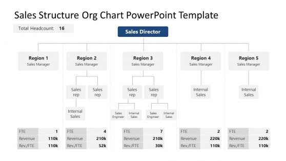
Sales Structure Org Chart PowerPoint Template
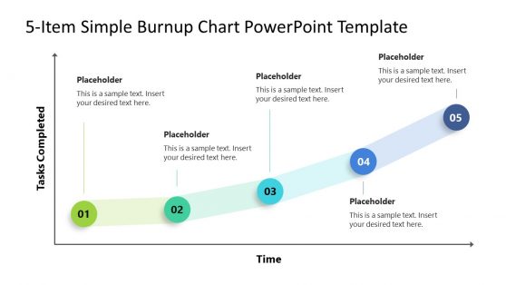
5-Item Burnup Chart PowerPoint Template
Financial Chart Slides PowerPoint Template

Animated PowerPoint Charts Collection Template
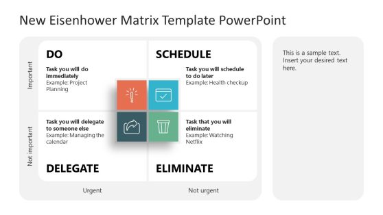
New Eisenhower Matrix Template for PowerPoint
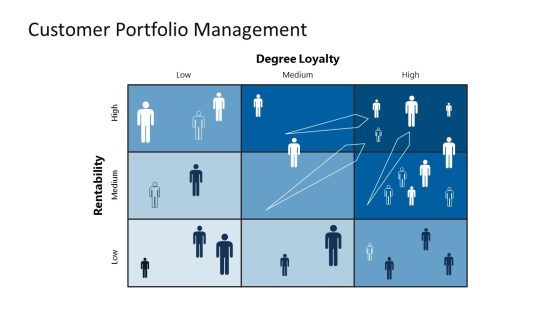
Customer Portfolio Management PowerPoint Diagrams
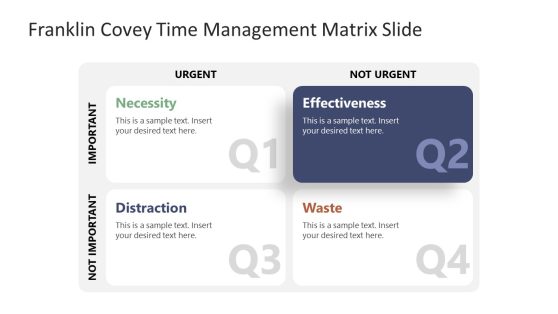
Franklin Covey Time Management PowerPoint Template
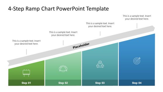
4-Step Ramp Chart PowerPoint Template
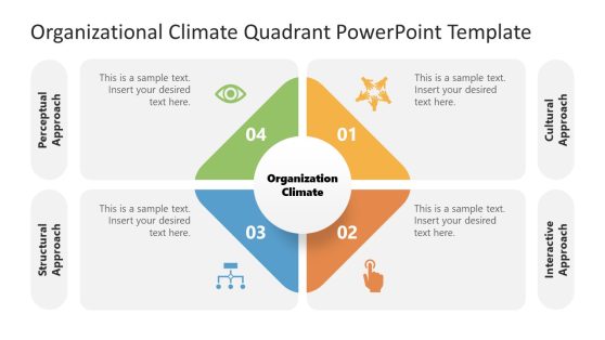
Organizational Climate PowerPoint Template
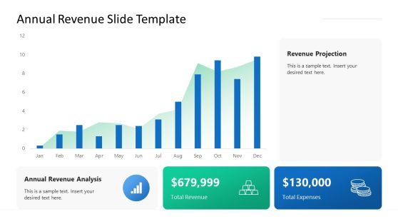
Annual Revenue Slide Template for PowerPoint
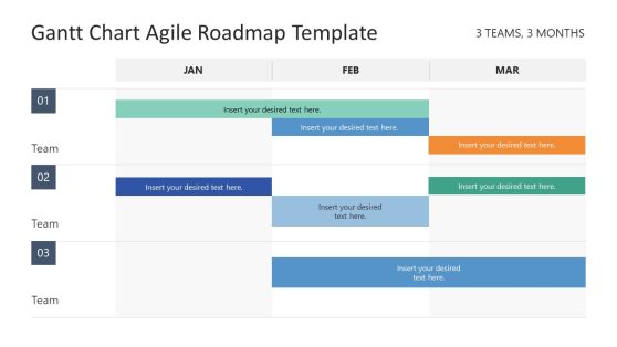
Gantt Chart Agile Roadmap PowerPoint Template
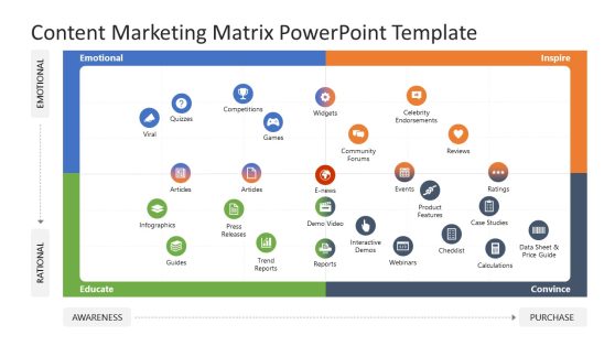
Content Marketing Matrix PowerPoint Template
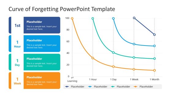
Curve of Forgetting PowerPoint Template
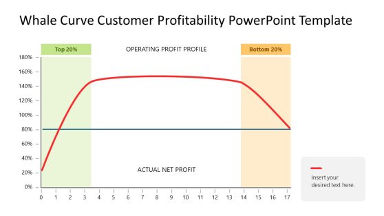
Whale Curve Customer Profitability PowerPoint Template
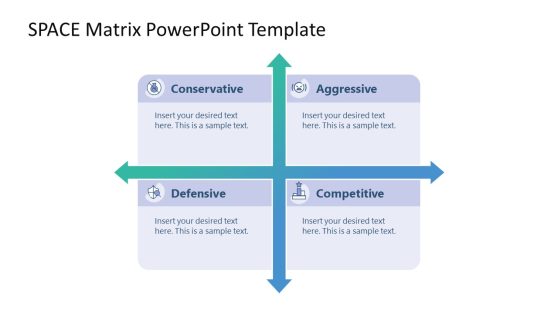
SPACE Matrix PowerPoint Template
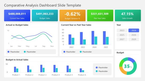
Comparative Analysis Dashboard PowerPoint Template
A Data PowerPoint Template is a set of slides that you can use in your PowerPoint presentations to create charts and graphs that visualize data. They are pre-designed templates that will help you present data accurately to your audience, using a range of chart types such as bar charts, line charts, pie charts, and scatter plots.
With our PowerPoint Chart Template, you can easily customize the chart to your specific needs by inputting your data and choosing from various options, such as color schemes, layouts, and font styles. Using a chart PowerPoint template can help you effectively communicate data to your audience, allowing them to understand and interpret the information you presented quickly. And it will also save you a lot of time and effort in creating charts and graphs from scratch. It provides a starting point that you can easily customize to suit your needs, allowing you to focus on the content of your presentation rather than the design of your charts.
Some Chart PowerPoint Templates also come with features such as pre-designed color schemes, layouts, and font styles, which can help you create a comprehensive presentation. Whether you are a student, a professional, or a business owner, a Chart PowerPoint Template can be a valuable asset in your presentation tools.
Without a doubt, charts and graphs are essential for visualizing and communicating data in presentations. They can help you convey complex ideas and patterns clearly and concisely, making it easier for your audience to understand and remember the key points you are trying to convey.
How Do I Make A Chart In PowerPoint?
To create a chart in PowerPoint, follow these steps:
- Open the PowerPoint presentation and go to the slide where you want to add the chart.
- Select the “Insert” tab in the top menu.
- In the “Illustrations” group, click the “Chart” button.
- Select the type of chart you want to create from the drop-down menu.
- A new window will open with sample data. You can either keep this sample data or delete it and enter yours.
- Click “OK” to insert the chart onto the slide.
- You can then click on the chart to select it and use the “Chart Tools” tab in the top menu to customize the chart’s appearance and layout.
What Charts Are Available In PowerPoint?
PowerPoint is a popular presentation software that allows users to create professional-looking presentations with various charts and graphs.
Some of the charts available in PowerPoint include Line charts; Bar charts; Pie charts; Column charts; Scatter plots; Bubble charts; Area charts; Gantt charts; Waterfall charts; Radar charts; and Stock charts.
Also, PowerPoint provides a wide range of charts to help you quickly present data and information to your audience.
How Do I Make A Chart Look Professional In PowerPoint?
There are several ways you can make a chart in PowerPoint look professional:
- Choose the right chart type.
- Use a clear and readable font.
- Add a title to your chart and axis.
- Use gridlines.
- Use a consistent color scheme.
- Edit the chart layout and add chart borders.
- Use slide layout.
Following the listed tips, you will create professional-looking charts in PowerPoint that effectively communicate your data.
Can You Edit Graphs In PowerPoint?
Yes, you can edit graphs in PowerPoint. Follow the following do-it-yourself procedures:
- Open the PowerPoint presentation containing the graph you want to edit.
- Click on the graph to select it.
- Small squares called “handles” appear around the edges of the graph. These handles allow you to resize or move the graph.
- To edit the data displayed in the graph, right-click on the graph and select “Edit Data” from the context menu. It will open the “Edit Series” dialog box.
- Use this dialog box to modify the data and labels in the graph.
- To change the graph’s appearance, such as the colors or line styles, click on the graph to select it and then use the options in the “Chart Tools” ribbon at the top of the PowerPoint window.
How Do You Make A Graph Look Good In PowerPoint?
The following are some tips you should follow to make your graph look good in PowerPoint:
- Use appropriate formatting.
- Use cool colors and simple fonts that are easily read and look good together.
- Use a clear and concise title.
- Use appropriate scales, axes, and data labels.
- Use a simple layout.
Download Unlimited Content
Our annual unlimited plan let you download unlimited content from slidemodel. save hours of manual work and use awesome slide designs in your next presentation..
We use essential cookies to make Venngage work. By clicking “Accept All Cookies”, you agree to the storing of cookies on your device to enhance site navigation, analyze site usage, and assist in our marketing efforts.
Manage Cookies
Cookies and similar technologies collect certain information about how you’re using our website. Some of them are essential, and without them you wouldn’t be able to use Venngage. But others are optional, and you get to choose whether we use them or not.
Strictly Necessary Cookies
These cookies are always on, as they’re essential for making Venngage work, and making it safe. Without these cookies, services you’ve asked for can’t be provided.
Show cookie providers
- Google Login
Functionality Cookies
These cookies help us provide enhanced functionality and personalisation, and remember your settings. They may be set by us or by third party providers.
Performance Cookies
These cookies help us analyze how many people are using Venngage, where they come from and how they're using it. If you opt out of these cookies, we can’t get feedback to make Venngage better for you and all our users.
- Google Analytics
Targeting Cookies
These cookies are set by our advertising partners to track your activity and show you relevant Venngage ads on other sites as you browse the internet.
- Google Tag Manager
- Infographics
- Daily Infographics
- Template Lists
- Graphic Design
- Graphs and Charts
- Data Visualization
- Human Resources
- Beginner Guides
Blog Data Visualization
10 Data Presentation Examples For Strategic Communication
By Krystle Wong , Sep 28, 2023

Knowing how to present data is like having a superpower.
Data presentation today is no longer just about numbers on a screen; it’s storytelling with a purpose. It’s about captivating your audience, making complex stuff look simple and inspiring action.
To help turn your data into stories that stick, influence decisions and make an impact, check out Venngage’s free chart maker or follow me on a tour into the world of data storytelling along with data presentation templates that work across different fields, from business boardrooms to the classroom and beyond. Keep scrolling to learn more!
Click to jump ahead:
10 Essential data presentation examples + methods you should know
What should be included in a data presentation, what are some common mistakes to avoid when presenting data, faqs on data presentation examples, transform your message with impactful data storytelling.
Data presentation is a vital skill in today’s information-driven world. Whether you’re in business, academia, or simply want to convey information effectively, knowing the different ways of presenting data is crucial. For impactful data storytelling, consider these essential data presentation methods:
1. Bar graph
Ideal for comparing data across categories or showing trends over time.
Bar graphs, also known as bar charts are workhorses of data presentation. They’re like the Swiss Army knives of visualization methods because they can be used to compare data in different categories or display data changes over time.
In a bar chart, categories are displayed on the x-axis and the corresponding values are represented by the height of the bars on the y-axis.

It’s a straightforward and effective way to showcase raw data, making it a staple in business reports, academic presentations and beyond.
Make sure your bar charts are concise with easy-to-read labels. Whether your bars go up or sideways, keep it simple by not overloading with too many categories.

2. Line graph
Great for displaying trends and variations in data points over time or continuous variables.
Line charts or line graphs are your go-to when you want to visualize trends and variations in data sets over time.
One of the best quantitative data presentation examples, they work exceptionally well for showing continuous data, such as sales projections over the last couple of years or supply and demand fluctuations.

The x-axis represents time or a continuous variable and the y-axis represents the data values. By connecting the data points with lines, you can easily spot trends and fluctuations.
A tip when presenting data with line charts is to minimize the lines and not make it too crowded. Highlight the big changes, put on some labels and give it a catchy title.

3. Pie chart
Useful for illustrating parts of a whole, such as percentages or proportions.
Pie charts are perfect for showing how a whole is divided into parts. They’re commonly used to represent percentages or proportions and are great for presenting survey results that involve demographic data.
Each “slice” of the pie represents a portion of the whole and the size of each slice corresponds to its share of the total.

While pie charts are handy for illustrating simple distributions, they can become confusing when dealing with too many categories or when the differences in proportions are subtle.
Don’t get too carried away with slices — label those slices with percentages or values so people know what’s what and consider using a legend for more categories.

4. Scatter plot
Effective for showing the relationship between two variables and identifying correlations.
Scatter plots are all about exploring relationships between two variables. They’re great for uncovering correlations, trends or patterns in data.
In a scatter plot, every data point appears as a dot on the chart, with one variable marked on the horizontal x-axis and the other on the vertical y-axis.

By examining the scatter of points, you can discern the nature of the relationship between the variables, whether it’s positive, negative or no correlation at all.
If you’re using scatter plots to reveal relationships between two variables, be sure to add trendlines or regression analysis when appropriate to clarify patterns. Label data points selectively or provide tooltips for detailed information.

5. Histogram
Best for visualizing the distribution and frequency of a single variable.
Histograms are your choice when you want to understand the distribution and frequency of a single variable.
They divide the data into “bins” or intervals and the height of each bar represents the frequency or count of data points falling into that interval.

Histograms are excellent for helping to identify trends in data distributions, such as peaks, gaps or skewness.
Here’s something to take note of — ensure that your histogram bins are appropriately sized to capture meaningful data patterns. Using clear axis labels and titles can also help explain the distribution of the data effectively.

6. Stacked bar chart
Useful for showing how different components contribute to a whole over multiple categories.
Stacked bar charts are a handy choice when you want to illustrate how different components contribute to a whole across multiple categories.
Each bar represents a category and the bars are divided into segments to show the contribution of various components within each category.

This method is ideal for highlighting both the individual and collective significance of each component, making it a valuable tool for comparative analysis.
Stacked bar charts are like data sandwiches—label each layer so people know what’s what. Keep the order logical and don’t forget the paintbrush for snazzy colors. Here’s a data analysis presentation example on writers’ productivity using stacked bar charts:

7. Area chart
Similar to line charts but with the area below the lines filled, making them suitable for showing cumulative data.
Area charts are close cousins of line charts but come with a twist.
Imagine plotting the sales of a product over several months. In an area chart, the space between the line and the x-axis is filled, providing a visual representation of the cumulative total.

This makes it easy to see how values stack up over time, making area charts a valuable tool for tracking trends in data.
For area charts, use them to visualize cumulative data and trends, but avoid overcrowding the chart. Add labels, especially at significant points and make sure the area under the lines is filled with a visually appealing color gradient.

8. Tabular presentation
Presenting data in rows and columns, often used for precise data values and comparisons.
Tabular data presentation is all about clarity and precision. Think of it as presenting numerical data in a structured grid, with rows and columns clearly displaying individual data points.
A table is invaluable for showcasing detailed data, facilitating comparisons and presenting numerical information that needs to be exact. They’re commonly used in reports, spreadsheets and academic papers.

When presenting tabular data, organize it neatly with clear headers and appropriate column widths. Highlight important data points or patterns using shading or font formatting for better readability.
9. Textual data
Utilizing written or descriptive content to explain or complement data, such as annotations or explanatory text.
Textual data presentation may not involve charts or graphs, but it’s one of the most used qualitative data presentation examples.
It involves using written content to provide context, explanations or annotations alongside data visuals. Think of it as the narrative that guides your audience through the data.
Well-crafted textual data can make complex information more accessible and help your audience understand the significance of the numbers and visuals.
Textual data is your chance to tell a story. Break down complex information into bullet points or short paragraphs and use headings to guide the reader’s attention.
10. Pictogram
Using simple icons or images to represent data is especially useful for conveying information in a visually intuitive manner.
Pictograms are all about harnessing the power of images to convey data in an easy-to-understand way.
Instead of using numbers or complex graphs, you use simple icons or images to represent data points.
For instance, you could use a thumbs up emoji to illustrate customer satisfaction levels, where each face represents a different level of satisfaction.

Pictograms are great for conveying data visually, so choose symbols that are easy to interpret and relevant to the data. Use consistent scaling and a legend to explain the symbols’ meanings, ensuring clarity in your presentation.

Looking for more data presentation ideas? Use the Venngage graph maker or browse through our gallery of chart templates to pick a template and get started!
A comprehensive data presentation should include several key elements to effectively convey information and insights to your audience. Here’s a list of what should be included in a data presentation:
1. Title and objective
- Begin with a clear and informative title that sets the context for your presentation.
- State the primary objective or purpose of the presentation to provide a clear focus.

2. Key data points
- Present the most essential data points or findings that align with your objective.
- Use charts, graphical presentations or visuals to illustrate these key points for better comprehension.

3. Context and significance
- Provide a brief overview of the context in which the data was collected and why it’s significant.
- Explain how the data relates to the larger picture or the problem you’re addressing.
4. Key takeaways
- Summarize the main insights or conclusions that can be drawn from the data.
- Highlight the key takeaways that the audience should remember.
5. Visuals and charts
- Use clear and appropriate visual aids to complement the data.
- Ensure that visuals are easy to understand and support your narrative.

6. Implications or actions
- Discuss the practical implications of the data or any recommended actions.
- If applicable, outline next steps or decisions that should be taken based on the data.

7. Q&A and discussion
- Allocate time for questions and open discussion to engage the audience.
- Address queries and provide additional insights or context as needed.
Presenting data is a crucial skill in various professional fields, from business to academia and beyond. To ensure your data presentations hit the mark, here are some common mistakes that you should steer clear of:
Overloading with data
Presenting too much data at once can overwhelm your audience. Focus on the key points and relevant information to keep the presentation concise and focused. Here are some free data visualization tools you can use to convey data in an engaging and impactful way.
Assuming everyone’s on the same page
It’s easy to assume that your audience understands as much about the topic as you do. But this can lead to either dumbing things down too much or diving into a bunch of jargon that leaves folks scratching their heads. Take a beat to figure out where your audience is coming from and tailor your presentation accordingly.
Misleading visuals
Using misleading visuals, such as distorted scales or inappropriate chart types can distort the data’s meaning. Pick the right data infographics and understandable charts to ensure that your visual representations accurately reflect the data.
Not providing context
Data without context is like a puzzle piece with no picture on it. Without proper context, data may be meaningless or misinterpreted. Explain the background, methodology and significance of the data.
Not citing sources properly
Neglecting to cite sources and provide citations for your data can erode its credibility. Always attribute data to its source and utilize reliable sources for your presentation.
Not telling a story
Avoid simply presenting numbers. If your presentation lacks a clear, engaging story that takes your audience on a journey from the beginning (setting the scene) through the middle (data analysis) to the end (the big insights and recommendations), you’re likely to lose their interest.
Infographics are great for storytelling because they mix cool visuals with short and sweet text to explain complicated stuff in a fun and easy way. Create one with Venngage’s free infographic maker to create a memorable story that your audience will remember.
Ignoring data quality
Presenting data without first checking its quality and accuracy can lead to misinformation. Validate and clean your data before presenting it.
Simplify your visuals
Fancy charts might look cool, but if they confuse people, what’s the point? Go for the simplest visual that gets your message across. Having a dilemma between presenting data with infographics v.s data design? This article on the difference between data design and infographics might help you out.
Missing the emotional connection
Data isn’t just about numbers; it’s about people and real-life situations. Don’t forget to sprinkle in some human touch, whether it’s through relatable stories, examples or showing how the data impacts real lives.
Skipping the actionable insights
At the end of the day, your audience wants to know what they should do with all the data. If you don’t wrap up with clear, actionable insights or recommendations, you’re leaving them hanging. Always finish up with practical takeaways and the next steps.
Can you provide some data presentation examples for business reports?
Business reports often benefit from data presentation through bar charts showing sales trends over time, pie charts displaying market share,or tables presenting financial performance metrics like revenue and profit margins.
What are some creative data presentation examples for academic presentations?
Creative data presentation ideas for academic presentations include using statistical infographics to illustrate research findings and statistical data, incorporating storytelling techniques to engage the audience or utilizing heat maps to visualize data patterns.
What are the key considerations when choosing the right data presentation format?
When choosing a chart format , consider factors like data complexity, audience expertise and the message you want to convey. Options include charts (e.g., bar, line, pie), tables, heat maps, data visualization infographics and interactive dashboards.
Knowing the type of data visualization that best serves your data is just half the battle. Here are some best practices for data visualization to make sure that the final output is optimized.
How can I choose the right data presentation method for my data?
To select the right data presentation method, start by defining your presentation’s purpose and audience. Then, match your data type (e.g., quantitative, qualitative) with suitable visualization techniques (e.g., histograms, word clouds) and choose an appropriate presentation format (e.g., slide deck, report, live demo).
For more presentation ideas , check out this guide on how to make a good presentation or use a presentation software to simplify the process.
How can I make my data presentations more engaging and informative?
To enhance data presentations, use compelling narratives, relatable examples and fun data infographics that simplify complex data. Encourage audience interaction, offer actionable insights and incorporate storytelling elements to engage and inform effectively.
The opening of your presentation holds immense power in setting the stage for your audience. To design a presentation and convey your data in an engaging and informative, try out Venngage’s free presentation maker to pick the right presentation design for your audience and topic.
What is the difference between data visualization and data presentation?
Data presentation typically involves conveying data reports and insights to an audience, often using visuals like charts and graphs. Data visualization , on the other hand, focuses on creating those visual representations of data to facilitate understanding and analysis.
Now that you’ve learned a thing or two about how to use these methods of data presentation to tell a compelling data story , it’s time to take these strategies and make them your own.
But here’s the deal: these aren’t just one-size-fits-all solutions. Remember that each example we’ve uncovered here is not a rigid template but a source of inspiration. It’s all about making your audience go, “Wow, I get it now!”
Think of your data presentations as your canvas – it’s where you paint your story, convey meaningful insights and make real change happen.
So, go forth, present your data with confidence and purpose and watch as your strategic influence grows, one compelling presentation at a time.
Data Presentation Templates
What do you think of this template.

Product details
Use our amazing set of cloud diagrams, 3D circles and more to present data in a visually captivating manner. The more lucid the data is, the easier it is to analyse which in turn helps in the decision making process. Download our templates to create and present awesome presentations that can build your brand.
Related Products

Bottom Up vs Top Down
Competitive Advantage

Agile Product Roadmap

Return on Investment

Cultural Management

Recruitment Proposal

Job Analysis

Brand Pyramid

Diversity Inclusion

Employee Retention
You dont have access, please change your membership plan., great you're all signed up..., verify your account.
PowerSlides.com will email you template files that you've chosen to dowload.
Please make sure you've provided a valid email address! Sometimes, our emails can end up in your Promotions/Spam folder.
Simply, verify your account by clicking on the link in your email.
Home Collections Technology Data Modelling
Free Data Modeling Presentation Templates
Untangle complex data with our clear, free data modeling powerpoint templates and google slides themes simplify your presentations with organized layouts, charts, and diagrams. visualize relationships, showcase processes, and explain intricate concepts in a way everyone can understand. get now to impress your audience with a polished presentation..

- Explain complex ideas simply: Visuals make it easier for everyone to understand your data.
- Win over stakeholders: Capture attention and get buy-in for your data-driven projects.
- Save time and effort: Ready-made templates let you focus on your message, not formatting.
- Colorful and Engaging: Grab attention with eye-catching infographic slides in multiple colors.
- Fully Customizable: Edit everything! Text, graphics, layouts - it's all yours to change.
- Effortless Editing: Add your data with ease using pre-made placeholders.
- Multiple Choices: Pick from portrait or landscape formats, depending on your screen.
- Royalty-Free: Use the data modeling slides as many times as you need, without extra fees.
- Multiple Formats: Compatible with both PowerPoint and Google Slides.
- Free Options Available: Try before you buy! We offer some free slides to get you started.
- Business Professionals: Explain data strategy to your team or clients.
- Educators: Make data science easy to understand for students.
- Data Analysts: Showcase your findings in a visually compelling way.
Become an expert with SlideEgg

How to Create a Data Modelling PowerPoint
We're here to help you, what is data modeling.
Data modeling uses symbols and words to describe the data and how it flows to create a streamlined picture of a software system and the data pieces it includes. Data models offer a blueprint for creating a new database or redesigning an old application. In general, data modeling assists a company in efficiently using its data to fulfill informational business needs.
What are Data Modeling PowerPoint Templates?
Data Modeling PowerPoint Template is the best presentation slide with creative data modeling themes and designs. These templates are perfect for creating a presentation about the steps involved in Data Modeling.
How can I make a Data Modeling Template in a presentation?
Planning to create a new template from scratch is the best option but if you are a beginner, opt for some pre-designed templates to make your work effortless and quick. Also, check out Slide Egg for more pre-designed templates.
Who can use Data Modeling Templates?
Business professionals and technical people can use these templates to discuss the designing techniques and requirements needed for business processes.
Where can I find free PPT Templates?
Many websites offer free PPT templates for no cost. But the point is that you have to download the best template for your needs. If you are unsatisfied with the design and quality, always consider using a trustworthy website like Slide Egg.
Find the perfect PowerPoint presentation template
Bring your next presentation to life with customizable powerpoint design templates. whether you're wowing with stats via charts and graphs or putting your latest and greatest ideas on display, you'll find a powerpoint presentation template to make your ideas pop., presentations.
Help your data, insights, and recommendations make a statement with beautiful and easily customizable presentation templates.

Certificates
Celebrate accomplishments big and small with customizable certificate templates. From gift certificates to awards for finishing a course or training, find a template that highlights their accolades.

Boost visibility for your show, project, or business with easily customizable poster templates. Find templates for all your promotion needs and make them uniquely yours in a flash.

Keep track of whatever you need to in style. From personal planning to promotional calendars, find templates for every kind of project and aesthetic.

Infographics
Say more with less using helpful and easily customizable infographic templates. Add clarity to business presentations, school projects, and more with these helpful templates.

Start with the best PowerPoint templates

Elevate your storytelling
Tips, tricks, and insider advice from our business and design experts
A quick way to create beautiful, powerful PowerPoint presentations
Create captivating, informative content for PowerPoint in just a few minutes—no graphic design experience needed. Here's how:

1. Find the perfect PowerPoint template
2. Customize your creation
3. Show it off
Let's create a powerpoint design, frequently asked questions, where can i find slide templates and themes that i can customize.
To find customizable slide templates and themes, you can explore the business presentations templates or search by PowerPoint templates . Once you find a template that resonates with you, customize it by changing its color scheme, add in your own photos, and swap out the font.
How do I use pre-made PowerPoint templates?
After you've chosen a PowerPoint template to use, customize it. Explore [design tips] on how to customize a deck that resonates with your brand while putting emphasis on the topic at hand. Play with other design elements, like photo shapes, to make each slide unique.
How can I make or edit my own custom PowerPoint templates?
Start from scratch by creating your own PowerPoint template . Follow tips for designs and business presentations so that your unique template is cohesive and relevant to your brand. Incorporate your brand's color scheme and graphics so that all your slides aren't text only.
What kinds templates can I get online for PowerPoint?
You can get PowerPoint templates that have modern designs, animated ones, or even hand-drawn art in each slide. The color schemes range from bold to subtle. Each template's slides are also organized based on what you may want to include in your presentation . You can use the template as a starting point and customize its specific details from theme.
Popular categories

Got any suggestions?
We want to hear from you! Send us a message and help improve Slidesgo
Top searches
Trending searches

suicide prevention
8 templates

46 templates

tropical rainforest
29 templates

spring season
34 templates

american football
16 templates

32 templates
Big Data Infographics
Free google slides theme, powerpoint template, and canva presentation template.
Explore and analyse large amounts of information thanks to these Big Data infographics. Create new commercial services, use them for marketing purposes or for research, no matter the topic. We have added charts, reports, gears, pie charts, text blocks, circle and cycle diagrams, pyramids and banners in different styles, such as flat.
Features of these infographics
- 100% editable and easy to modify
- 30 different infographics to boost your presentations
- Include icons and Flaticon’s extension for further customization
- Designed to be used in Google Slides, Canva, and Microsoft PowerPoint and Keynote
- 16:9 widescreen format suitable for all types of screens
- Include information about how to edit and customize your infographics
How can I use the infographics?
Am I free to use the templates?
How to attribute the infographics?
Attribution required If you are a free user, you must attribute Slidesgo by keeping the slide where the credits appear. How to attribute?
Related posts on our blog.

How to Add, Duplicate, Move, Delete or Hide Slides in Google Slides

How to Change Layouts in PowerPoint

How to Change the Slide Size in Google Slides
Related presentations.

Premium template
Unlock this template and gain unlimited access

Researched by Consultants from Top-Tier Management Companies

Powerpoint Templates
Icon Bundle
Kpi Dashboard
Professional
Business Plans
Swot Analysis
Gantt Chart
Business Proposal
Marketing Plan
Project Management
Business Case
Business Model
Cyber Security
Business PPT
Digital Marketing
Digital Transformation
Human Resources
Product Management
Artificial Intelligence
Company Profile
Acknowledgement PPT
PPT Presentation
Reports Brochures
One Page Pitch
Interview PPT
All Categories
Top 10 Demographic Data Presentation Templates with Examples and Samples

Andrea Hooper
Did you know 72% of successful businesses attribute their growth to targeted marketing based on demographic data?
Nike, an American athletic footwear and apparel corporation, transformed its marketing using demographic insights and tailored their campaigns to match specific age groups and interests. It is now among the 50 most valuable companies in the world.
You can also make more informed decisions with these Top 10 Demographic Data Presentation Templates . Your business deserves the advantage of understanding your audience in ways that go beyond surface-level analytics.
Imagine you're a business owner aiming to enhance sales and elevate customer engagement. How will you hit the bullseye without knowing your target? Demographic data helps businesses in personalized marketing, product development, and customer satisfaction. Therefore, understanding an audience is the first step toward any business's success.
SlideTeam's Top 10 Demographic Data Presentation Templates are the perfect find to help you organize your demographic data, ranging from age and gender to location and preferences, and offer your business a strategic edge. With these templates, you can streamline this data into actionable insights, making your decision-making process efficient.
Explore the power of demographic data and amplify your insights by checking out the Data Science Dashboard Templates . Elevate your strategy, captivate your audience, and watch your business grow!
Each of these templates is also 100% customizable and editable. Download now and tailor it to your specific audience profiles.
Get set to explore these templates!
Template 1: Enhancing Marketing Strategy by Collecting Customer Demographic and Behavioral Data
Unlock the power of data-driven marketing with this PPT Template. Use it to understand your customers on a deeper level. By collecting and analyzing demographic and behavioral data, your business can tailor its marketing strategies precisely, ensuring maximum impact and relevance. This deck provides a step-by-step guide on harnessing the potential of data, from identifying critical demographic segments to leveraging behavioral insights for targeted campaigns. Let data help you navigate the market, and watch as your strategies yield tangible results. Access your essential template instantly.

Grab your template now
Template 2: Workforce Assessment Dashboard with Male-Female Demographics Data
Step into the future of your workforce management with this Workforce Assessment Dashboard featuring comprehensive male-female demographics data templates. It is essential to understand the composition of your team as a strategic imperative. This dashboard empowers your organization by providing insights into the gender diversity of your workforce, facilitating informed decision-making. Uncover patterns like starters, leavers, headcounts, and promotions, identify growth opportunities, and create an inclusive workplace culture. Get your hands on the perfect template.

Use this template now
Template 3: 360 Degree Demographics of our Customers
Transform your business by understanding the intricacies of customer behavior. This PowerPoint Presentation provides a panoramic view of your clientele, capturing their every interaction, preference, and need. You can unlock insights that empower strategic decision-making by scrutinizing the customer journey from every angle. With this template, you can list and depict demographics with a population pyramid , household size , and age group. Elevate your business acumen, foster customer-centric strategies, and witness the impact on your bottom line. Click now to download your template.

Download and use now
Template 4: Objectives Data Learning Executing Customer Demographics Steps
Our Objectives Data Learning (ODL) framework integrates cutting-edge technology with user-friendly design, employing intuitive icons to guide you through the execution of customer demographic analysis. This innovative template transforms complex data into actionable insights, providing a strategic advantage for your business. This template lets you understand your customer base and make informed decisions. Demystify demographics effortlessly, enhance your market strategies, and elevate your business. You can creatively display elements like defining objectives, gathering data, analyzing and executing, learning, and evolving. Download this template for productivity gains.
Get this template now
Template 5: Data Profiling Dashboard of Gender and Age Demographics
Step into the future of business intelligence with this Data Profiling Dashboard , tailored for gender and age demographics. You can use these invaluable insights to redefine your marketing strategies. This template helps you understand the nuances of gender and age demographics for your business and drives success. Unveil important data profiles such as gender and age per month, gender and general age, average age per month, and individual per age group to find the gender and age composition of an area. Access your essential template instantly.

Take charge of our template
Template 6: Data-Driven Funnel Pie Chart for Customer Demographics
This Data-Driven Funnel Pie Chart for Customer Demographics template enhances your business strategy! This PPT Template is the key to unlocking customer preferences, tailoring your approach, and skyrocketing your business success. Understanding your audience is an advantage in a world where personalization is essential. This template helps you ensure every move is strategic and customer-centric. Don't just follow trends; set them with the power of precise customer demographic analysis . Take charge of our template.

Unlock your template now
Template 7: Tools to Manage Company Demographics Data
Unlocking the potential of your business requires careful insight into demographics. This PPT Layout is the perfect tool to manage company demographics data. This advanced solution goes beyond just a tool – the navigator simplifies the complexities of managing demographic data, offering invaluable insights into your customer base and workforce. It enables your business to make informed decisions, refine marketing strategies, and create an inclusive workplace environment. Take charge today, turn raw data into actionable intelligence, and propel your business toward success. This template covers CRM software, buyer's persona, consumer and demographic data analysis, and third-party data analysis. Start your journey to success.

Empower your Projects
Template 8: People Places Demographic Household Data
Demographic household data helps guide your business strategy and understand your customers' diverse preferences and needs. This template is like a customized customer service experience that anticipates individual requirements. Use this PPT Design to develop a marketing approach that resonates with specific demographics and a market share that reflects numbers and genuine connections. You're staying relevant by harnessing the power of people's demographic household data. This template isn't just about market share; it helps create an impact on your customers. Optimize your workflow.

Grab your template
Template 9: Process Delivery Method Marketing Sales Data
Grab this Process delivery method PPT Template: your all-in-one solution for streamlined marketing and sales data management. Use this slide to help your business quickly organize and analyze demographic data to make data-driven decisions. From targeting the right audience to optimizing sales strategies, this tool is a game-changer for any company striving for success in the digital age. Employ this presentation resource to visually represent information on process delivery methods, marketing sales data, and more creatively. Download our template for quick results.

Get your hands on the perfect template
Template 10: Demographics Data to Develop Buyer's Persona
This PowerPoint Presentation will increase customer satisfaction by refining the Marketing Strategy (MKT SS V). This innovative tool uses demographic data to craft precise buyer personas, offering businesses a laser-focused approach in their marketing endeavors. This template allows businesses to decode the nuances of their customer base, enabling the creation of marketing strategies that resonate with precision. Don't just market; connect, engage, and elevate your brand with the template. Use this template to display essential elements like age, gender, income, education level, occupation, and location with descriptions and examples. Click here to download your template now.

Ignite your productivity
Use these Top 10 Demographic Data Presentation Templates as a strategic toolset for your business to decipher your audience. By blending creativity with data, these templates empower your organization to make informed decisions, tailor your approach, and stay ahead in today's business world. Download these to provide a roadmap to connect with your customers, optimize marketing strategies, and create a more inclusive environment.
PS As you learn about data-driven decision-making, consider looking at this employee data reporting . Our templates offer comprehensive solutions to help you understand internal demographics, creating a workplace culture that thrives on data-driven insights
Related posts:
- Top 5 Brand Story Templates with Samples and Examples
- Top 10 Brand Analysis Templates with Samples And Examples
- How to Graphically Represent a Population Chart Pyramid [Templates Attached]
- Top 10 Brand Marketing Playbook Templates with Examples and Samples
Liked this blog? Please recommend us

Top 10 Development Roadmap Templates with Examples and Samples

Top 10 employee attrition templates with samples and examples
This form is protected by reCAPTCHA - the Google Privacy Policy and Terms of Service apply.

Digital revolution powerpoint presentation slides

Sales funnel results presentation layouts
3d men joinning circular jigsaw puzzles ppt graphics icons

Business Strategic Planning Template For Organizations Powerpoint Presentation Slides

Future plan powerpoint template slide

Project Management Team Powerpoint Presentation Slides

Brand marketing powerpoint presentation slides

Launching a new service powerpoint presentation with slides go to market

Agenda powerpoint slide show

Four key metrics donut chart with percentage

Engineering and technology ppt inspiration example introduction continuous process improvement

Meet our team representing in circular format

IMAGES
VIDEO
COMMENTS
Download the "Statistics and Probability: Data Analysis and Interpretation - Math - 10th Grade" presentation for PowerPoint or Google Slides. High school students are approaching adulthood, and therefore, this template's design reflects the mature nature of their education. Customize the well-defined sections, integrate multimedia and ...
Recommended Data Presentation Templates. 1. Fact Sheet Dashboard for Data Presentation. Convey all the data you need to present in this one-pager format, an ideal solution tailored for users looking for presentation aids. Global maps, donut chats, column graphs, and text neatly arranged in a clean layout presented in light and dark themes. ...
Sales Report Presentation Template; Our list of templates for data presentations won't be complete without a sales report template. As you can see, this template is great for in-house sales reports. This pack includes a vertical bar chart slide, marketing funnel slide (pictured), and a sales associate slide.
Free Data Powerpoint Templates. Type: POWERPOINT GOOGLE SLIDES. Style: All Corporate Creative. to download all templates for free. Hundreds of free powerpoint templates updated weekly. Download free data driven, tables, graphs, corporate business model templates and more.
Make data-driven presentations more impactful with this data visualization PowerPoint template. Whether you're a teacher, student, or business professional, these templates will help you make your message more persuasive and engaging. With a range of customizable slides, you can easily manage your lessons, workshops, and meetings.
Data Presentation Templates. Venngage offers a comprehensive selection of data presentation templates, serving as an invaluable resource for businesses, educators, and professionals seeking to transform raw data into compelling visual narratives. These templates cover a diverse range of data types, from business analytics to educational ...
A data analysis PowerPoint template or presentation template for Google Slides would be suitable for this. Government & Public Policy: Government officials or policy analysts may use data analysis presentation templates to present data on social issues, economic trends, or the impact of certain policies.
We have 30 different data diagrams for you. We have created a lot of different designs using different hues of blue: line, bars, pyramid or pie charts, together with different sorts of icons related to business, health or education, although you can edit and change them. No matter which type of chart you need, you'll find the perfect one here.
These chart presentation templates are suitable for business professionals, analysts, and presenters who need to showcase data and statistics in a visually appealing manner. They can be used in board meetings, conferences, or any presentation where data visualization is crucial for effective communication. Create visually stunning presentations ...
A Data PowerPoint Template is a set of slides that you can use in your PowerPoint presentations to create charts and graphs that visualize data. They are pre-designed templates that will help you present data accurately to your audience, using a range of chart types such as bar charts, line charts, pie charts, and scatter plots.
All of the data sets are easily edited in Excel and therefore, always up-to- date. Suitable for dynamic businesses that have lots of data that needs to be well-organized. Get your presentation custom designed by us, starting at just $10 per slide. STEP 1. UPLOAD PRESENTATION.
Data Analysis for Business Presentation. Free Google Slides theme, PowerPoint template, and Canva presentation template. What helps employees of a company know how the business is performing and recognize current problems that are to be solved? Data analysis laid out in a presentation, for example. Since we all want to do our best in our jobs ...
Template 2: Data Analytics Powerpoint Presentation Slides. This PPT Slide provides social media platforms such as Google, Facebook, Twitter, YouTube, and Instagram, which serve as critical sources of data for analysis and insight development. Moreover, it demonstrates cloud computing's disruptive potential, real-time information, and on-demand ...
8. Tabular presentation. Presenting data in rows and columns, often used for precise data values and comparisons. Tabular data presentation is all about clarity and precision. Think of it as presenting numerical data in a structured grid, with rows and columns clearly displaying individual data points.
Product details. Use our amazing set of cloud diagrams, 3D circles and more to present data in a visually captivating manner. The more lucid the data is, the easier it is to analyse which in turn helps in the decision making process. Download our templates to create and present awesome presentations that can build your brand.
Data Science Presentation Template. Use This Template. Dive deep into data science with this insightful presentation template. Designed for data scientists, analysts, statisticians, and tech enthusiasts, this template provides an excellent platform to explain complex data concepts simply. It comes packed with vibrant charts, diagrams, and data ...
5. Data Charts PowerPoint Presentation. PowerPoint graph templates like the 198 options in this are flexible. Re-use them for any number of presentations without repeating yourself. Use the flow charts, bar charts, and stacked bar charts to present your data visually. It's a great PowerPoint chart template!
Utilize ready to use presentation slides on Data Analytics Powerpoint Presentation Slides with all sorts of editable templates, charts and graphs, overviews, analysis templates. The presentation is readily available in both 4:3 and 16:9 aspect ratio. Alter the colors, fonts, font size, and font types of the template as per the requirements.
Untangle complex data with our clear, free data modeling PowerPoint templates and Google Slides Themes! Simplify your presentations with organized layouts, charts, and diagrams. Visualize relationships, showcase processes, and explain intricate concepts in a way everyone can understand. Get now to impress your audience with a polished presentation.
Find the perfect PowerPoint presentation template Bring your next presentation to life with customizable PowerPoint design templates. Whether you're wowing with stats via charts and graphs or putting your latest and greatest ideas on display, you'll find a PowerPoint presentation template to make your ideas pop.
Make it simple and hassle-free with a collection of well-designed and easy-to-use presentation templates from Canva. To captivate your target audience, you need the proper presentation template design that suits your subject. After all, a pleasing visual, coupled with helpful and relevant content, can go a long way in creating a solid presentation.
Use Visme's searchable library of customizable presentation layouts to mix and match the exact presentation slides for your content needs. These professional presentation templates can be edited right in your browser, come with tons of free stock images and can be easily shared with your colleagues. Type.
Free Google Slides theme, PowerPoint template, and Canva presentation template. Explore and analyse large amounts of information thanks to these Big Data infographics. Create new commercial services, use them for marketing purposes or for research, no matter the topic. We have added charts, reports, gears, pie charts, text blocks, circle and ...
Premium PowerPoint data presentation templates are your best friend. These take the hard work out of building and sharing data charts. They teach you how to present data in presentations with pre-built options. All you need is your dataset! For our walkthrough tutorial, we'll use the Chart Presentation template from Envato Elements. It's a ...
Template 1: Enhancing Marketing Strategy by Collecting Customer Demographic and Behavioral Data. Unlock the power of data-driven marketing with this PPT Template. Use it to understand your customers on a deeper level. By collecting and analyzing demographic and behavioral data, your business can tailor its marketing strategies precisely ...